Part 2— EDA (Distributions, Relationships, Separability)
This is part 2 of the Iris dataset guide. Part 1 (loading + sanity checks) is here: link. The whole project table of contents is here…
Part 2— EDA (Distributions, Relationships, Separability)
This is part 2 of the Iris dataset guide. Part 1 (loading + sanity checks) is here: *link. The whole project table of contents is here: project TOC.*
In part 1 we made sure the data is loaded correctly and performed a sanity check on it. Now we get to EDA (Exploratory Data Analysis), where we stare at different plots, figures, and graphs to see what the data has from a high up point of view.
EDA is not about proving things. It’s about building intuition and checking whether the dataset behaves the way we expect. If your plots look weird, it’s usually the data, not “the model’s fault.”
This step is heavy on background info and ML/Statistics terms, I’ll try my best to help you undersatnd why things are done the way there are and how things build off themselves.
What we’re doing in this step
In this section we’ll:
- Plot univariate distributions (feature-by-feature)
- Visualize pairwise relationships (scatter matrix)
- Build class separability intuition
- Check feature correlation
- Answer: “What patterns do we expect a model to learn?”
Before we plot: quick setup
We’ll use the df we built in Part 1 (features + target + species). If you’re running this notebook fresh, make sure you’ve run the Part 1 cells first so df, feature_cols exist.
1) Univariate plots: feature distributions
The first thing we’ll be doing is looking at Univariate plots. Now you might be asking what those are. Univariate plots visualize one variable at a time (one feature’s values and how often they occur). The most common examples are histograms, density plots, and box/violin plots. So, a histogram of heights in a classroom or box plot of scores on a exam.
In our Iris context, the “variables” are the four measurements (sepal/petal length/width). A univariate plot answers: What does one feature’s distribution look like, and how does it differ by species? If we split the plot by species, we can quickly see whether a single feature is informative (little overlap) or weak (lots of overlap). One big reason to look at these plots is that they give fast intuition for what a model might learn. With Iris, spoiler, you’ll typically see petal_length and petal_width separate classes much better than the sepal features. That sets expectations. Later, if a model says the opposite, it’s a sign something might be wrong.
Univariate plots are often where you catch issues early, like missing values coded as -999/0/etc, broken sensors (a feature stuck at one value), heavy skew (needing log/scale), outliers that dominate training, or suspicious near-perfect separation that hints at data leakage.
Let’s get to coding…
Continuing the notebook from Step 1, create a new coding cell for these plots.
for col in feature_cols:
    plt.figure()
    for species, group in df.groupby("species"):
        plt.hist(group[col], bins=15, alpha=0.6, label=species)
    plt.title(f"{col} distribution by species")
    plt.xlabel(col)
    plt.ylabel("count")
    plt.legend()
    plt.tight_layout()
    plt.show()
This block generates univariate plots for each feature, meaning we look at one measurement at a time and see how its values are distributed for each species. We loop through every column in feature_cols (our four numeric features) and draw a histogram for that feature.
Inside each feature’s plot, we split the data by species using df.groupby("species"). That gives us three groups (setosa, versicolor, virginica), and we overlay three histograms on the same chart. The alpha=0.6 makes the bars slightly transparent so overlap is visible instead of turning into a solid blob.
A few details worth calling out:
bins=15controls how many histogram buckets we use. More bins = more detail, fewer bins = smoother/less noisy. Meaning the number of the groups over the whole range, for example 0.0cm — 0.2cm for 10 buckets aka bars over the whole range vs 0.0cm — 0.05cm for 20 buckets aka bars over the whole range.plt.title(...),plt.xlabel(...),plt.ylabel(...),plt.legend(),plt.tight_layout()add labels, legends, and make the plot readable.
What we should see: for Iris, the petal features (especially petal_length and petal_width) usually show much clearer separation between species than the sepal features. If the distributions for a feature overlap heavily across all three species, that feature alone won’t separate classes well and the model will need to combine multiple features to make good predictions.
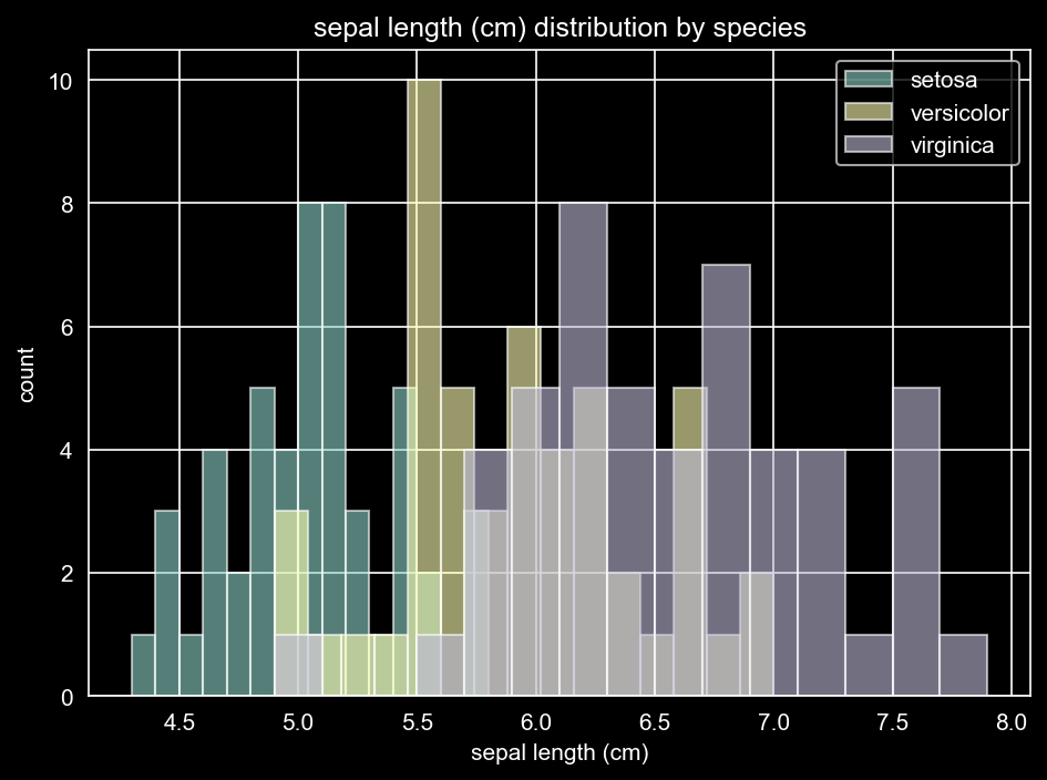
Sepal Length by Count by Species

Petal Length by Count by Species
From these univariate histograms (Showing 2 out of 4 above, I will leave the other 2 for you to discover), we’re basically asking: does this single measurement already separate the classes, or do the species overlap a lot? What you should notice is that the petal measurements usually do the heavy lifting. Petal length (shown above) and petal width tend to show clear separation, especially for setosa, which clusters at much smaller petal values than the other two species. In contrast, the sepal features (especially sepal width) overlap more across species, which means they’re weaker on their own. The key way to interpret these plots is by looking at overlap: less overlap implies the feature is more predictive by itself; more overlap implies the model will need to combine features to separate classes. Also, pay attention to spread and shape: wider distributions suggest more variability within a species, which often makes boundaries fuzzier and errors more likely (usually in the versicolor vs virginica region). As you can see, setosa is tightly clustered in the lower end of petal length separated vs the other two species are more spread out in the higher end of petal length with some overlap.
From these univariate histograms, we’ve finished the first EDA pass and learned something immediately useful: petal_length and petal_width carry most of the signal, with setosa clustering in a noticeably smaller range and separating cleanly from the other two species. The sepal features, on the other hand, show much more overlap, which suggests they’re weaker on their own and mostly help when combined with other features. The big interpretation rule here is overlap: less overlap = easier classification using that feature, while heavy overlap = the model will need multiple features to tease classes apart (and you can already predict most errors will be versicolor vs virginica).
In real-world datasets, these plots can reveal much messier problems. A suspicious spike at a specific value (like 0 or -999 or -1, etc) often means missing values were encoded as real numbers or something similar. A feature that looks almost like a single bar (nearly constant) can signal a broken sensor/logging bug. A long right tail can indicate heavy skew (common with money, time, counts), where a log transform or robust scaling might help. You might also see extreme outliers that stretch the axis and hide the real distribution. Now that we’ve understood each feature on its own, the next step is to look at pairwise relationships (scatter plots / scatter matrix) to see how features interact and how separable the species become when we consider two measurements at once.
2) Pairwise relationships: scatter matrix
Univariate plots are a great first pass, but they force each feature to “prove itself” alone. In real ML problems, separation usually comes from combinations of features, not single columns. A feature might look overlapping and weak by itself, yet become highly informative when paired with another measurement. That’s why the next step is pairwise visualization: instead of asking “does this one feature separate species?”, we ask “what happens when we view the dataset in 2D slices?”
A scatter plot is the simplest version of that: each point is one flower, positioned by two features and colored by species. This matters because it shows geometry, and classifiers basically learn geometric boundaries. If you see tight, separated clusters, you can already predict the model will do well. If you see overlap zones, you can already predict where mistakes will happen. If everything looks like one mixed cloud, then either the features aren’t informative, the boundary needs to be nonlinear, or the data/labels are messy.
Rather than manually picking feature pairs, a scatter matrix (scatterplot matrix) shows every feature against every other feature in one grid. For Iris, that’s a 4×4 layout: off-diagonal cells are scatter plots (feature A vs feature B), and the diagonal typically shows a distribution for each feature. This quickly answers: which pairs separate species best, where do classes overlap, and which features look strongly related (potential redundancy). It also surfaces common data issues that histograms can miss, like discretization/rounding (striped bands), extreme outliers (points far away), or separation that looks suspiciously perfect (a real-world leakage red flag).
In Iris, this is usually where things become visually obvious: petal length and petal width views tend to produce the cleanest clusters, with setosa often separating sharply, while versicolor vs virginica overlap more in a fuzzy border region. That overlap isn’t “bad,” it’s just the dataset telling you where classification will be hardest and where errors will concentrate later. Now that we’ve built intuition from 1D distributions and 2D relationships, we’re ready to generate the scatter matrix and interpret it like a model would: clusters, overlap pockets, and the patterns we expect it to learn.
Let’s get to coding…
Continuing the notebook from the univariate section, create a new code cell for the scatter matrix. (Note: this snippet includes an import for teaching purposes. In a “clean” notebook, you’d keep all imports in the top import cell as mentioned in Part 1.)
import seaborn as sns

sns.pairplot(
    df,
    hue="species",
    vars=feature_cols,
    diag_kind="hist",
    palette="bright"
)
plt.show()
This block creates a pairplot (Seaborn’s nicer version of a scatter matrix). It shows every feature plotted against every other feature, with each point colored by species. It’s one of the fastest ways to see which feature combinations create clean clusters vs messy overlap.
Here’s what each argument is doing and why:
df****We pass the full DataFrame so Seaborn has access to both the feature columns’ data for plotting and thespecieslabel for coloring.vars=feature_colsThis tells Seaborn to only use the numeric feature columns in the grid. We don’t wanttargetin here because it’s just 0/1/2 and doesn’t represent a real measurement, so doesn’t make sense in a feature comparison.hue="species"This colors points by the class label (setosa, versicolor, virginica). Withouthue, the plot is just a indistinguishable pile of dots.diag_kind="hist"The diagonal plots show each feature’s distribution. Using"hist"makes these match what we did in the univariate section, so you can interpret the diagonal as “quick distribution recap” without flipping back. There are other options, but “hist” works best for our case.palette="bright"This just chooses high-contrast colors so the classes are easy to distinguish. It doesn’t change the analysis, it just helps with aesthetics.
Finally, plt.show() renders the figure.
How to read it quickly: focus on the off-diagonal scatter plots and look for tight clusters with little overlap (good separability) versus mixed clouds (harder separability). For Iris, you’ll typically see that petal_length vs petal_width gives the cleanest separation, especially for setosa, while versicolor vs virginica overlap more and will be the harder classification boundary later. You will also notice that technically the plots repeat across the diagonal, because comparing petal length vs sepal width is same as sepal width vs petal length, but people sometimes find viewing the same graph but flipped helps identifying clusters.

Scatter Plot of Features
From this scatter matrix (pairplot), we’re asking a slightly different and more powerful question than we did with univariate plots: not “does one feature separate the species?”, but “do pairs of features create visible clusters?” The univariate histograms already hinted that petal measurements were doing most of the work, but here we can actually see the class geometry in 2D. The big Iris takeaway usually shows up fast: when you plot petal_length vs petal_width, the points form much cleaner, more compact clusters, with setosa separating almost perfectly from the other two species. At this point it becomes clear the real challenge isn’t “can we classify Iris,” it’s “how well can we separate versicolor vs virginica,” because those two still overlap across multiple feature-pair views, which is exactly where most model errors tend to concentrate later.
This grid also helps you spot two important ideas at once: redundancy and “feature teamwork.” Some pairs move together in a strong, almost line-like relationship (especially the petal measurements), which signals correlation and shared information. That doesn’t mean one feature is useless, but it does mean they’re partially telling the same story, and models may not gain much from treating them as totally independent. On the flip side, many sepal-based pair plots tend to look like mixed clouds with heavy overlap, which matches what we saw earlier: sepal features are generally weaker alone and often only help when combined with stronger features or used as small refinements around the boundaries.
In real datasets, pairplots are also where “quiet problems” start to show themselves. Curved or U-shaped relationships can hint that linear models might struggle unless you add interactions or use non-linear approaches. Isolated mini-clusters can suggest sub-populations, data collection differences, or hidden segments that a single global boundary won’t capture well. And if you ever see separation that looks too perfect, it can be a red flag for leakage (like a feature accidentally encoding the label), especially when the dataset wasn’t supposed to be that clean. Iris is famously tidy, but this is the exact place you’d catch those issues in messier data.
At this point, we’ve confirmed something important: combining features makes classes more separable than any single feature alone, and for Iris the petal measurements dominate that separation. The scatter matrix is great for discovery, but it’s not great for deep viewing because everything is compressed into tiny squares, so the next step is to zoom in on the most informative pair (for us this is petal_length vs petal_width) and build more direct “class separability intuition” with one focused plot.
3) Build class separability intuition
At this point we’ve done two useful but very “wide” passes over the data: we looked at each feature by itself, and then we scanned every feature pair in the scatter matrix. That’s perfect for discovery, but it’s not great for building a clear mental model because your attention gets split across sixteen tiny plots. So now we’re going to do something more focused and more practical: pick one “money plot” and use it to build intuition for how separable the classes really are when you give the model its best shot.
For Iris, that money plot is almost always petal_length vs petal_width. This pair tends to produce the cleanest and most interpretable geometry: setosa usually forms a tight cluster in the small-petal corner, clearly separated from the other species, while versicolor and virginica sit closer together and overlap along a fuzzy boundary. That overlap region is the heart of the problem. It’s basically the dataset telling you in advance where the classifier will hesitate and where most mistakes will live, even if overall accuracy ends up looking high.
The goal here isn’t to “prove” separability or declare victory before modeling. It’s to answer a grounded, almost low-tech question: if you had to draw decision boundaries by hand, where would you struggle? When you can point to a specific overlap pocket and say “this is where errors should happen,” you’ve created a built-in verification step for later. If your model starts making errors outside that overlap region, that’s a sign something might be off (feature scaling issues, label mix-ups, leakage, or a bug in preprocessing). And in real-world datasets, this same step often reveals messier patterns too: classes that separate only with curved boundaries, clusters that suggest subgroups, or features that look informative until you realize the separation is driven by an artifact.
Once we lock in that 2D intuition with a single focused plot, we can move from “I think this should be learnable” to “I know exactly what a model should learn first, and where it should still struggle,” which sets us up nicely for the next coding step.
Let’s get to coding…
Continuing the notebook from the pairplot section, create a new code cell for the focused separability plot.
# Focused separability plot: petal_length vs petal_width
plt.figure(figsize=(6, 5))
for species, group in df.groupby("species"):
    plt.scatter(
        group["petal length (cm)"],
        group["petal width (cm)"],
        label=species,
        alpha=0.8
    )
plt.title("Class separability: petal length (cm) vs petal width (cm)")
plt.xlabel("petal length (cm)")
plt.ylabel("petal width (cm)")
plt.legend()
plt.tight_layout()
plt.show()
This code creates a single focused scatter plot to show how well the species separate using just two features: petal length (cm)(x-axis) and petal width (cm)(y-axis). Instead of looking at the entire pairplot grid, we zoom in on the most informative feature pair so it’s easier to interpret.
Here’s what each part is doing:
for species, group in df.groupby(“species”)Splits the dataset into 3 chunks, one per species.speciesis the label (setosa/versicolor/virginica).groupis the subset of rows for that speciesplt.scatter(group["petal length (cm)"], group["petal width (cm)"], label=species, alpha=0.8)Plots that species’ points on a 2D plane (each dot = one flower). x-axis = petal length. y-axis = petal width.label=speciesis so we can show a legend.alpha=0.8helps overlap look less messy.
What this gives you: a focused, interpretable view of class separability in a single 2D slice of the feature space. By plotting petal_length against petal_width and coloring by species, we can quickly assess whether the classes form distinct clusters (suggesting the problem is easier) or whether they overlap (indicating an inherent source of ambiguity and likely misclassifications). This plot also builds an intuitive expectation for model behavior: setosa should be straightforward to separate, while most difficulty will come from the overlap between versicolor and virginica. We’ll carry this intuition forward into the modeling section and use it as a sanity check when we evaluate results and decision boundaries.

Petal Length (cm) vs Petal Width (cm) scatter plot
From this class separability plot, we’re asking a more practical question than the univariate histograms: if we only look at two features at once (petal length and petal width), do the species form distinct clusters or do they still overlap? And here the answer is pretty clear. Setosa sits in its own tight cluster in the bottom-left corner (small petal length and width), with a visible gap between it and the other classes. That tells us that in this 2D feature space, separating setosa should be straightforward for almost any reasonable classifier.
The more interesting part is what happens with versicolor vs virginica. You can see they occupy the same general region of the plot, with partial overlap around the middle boundary (roughly where petal width is ~1.4–1.8 and petal length is ~4.5–5.5). That overlap is the “hard zone,” and it’s exactly where we should expect most misclassifications later. Even if a model is strong overall, this region suggests the dataset itself contains ambiguity when viewed through these two features alone.
The key interpretation rule here is still overlap, but now it’s overlap in 2D:
- Clear separation in the plane means a model can draw a clean decision boundary.
- Overlapping clouds mean errors are unavoidable without additional features or a more expressive boundary.
In real-world datasets, this kind of plot is also a fast way to spot issues and structure: you might see curved separations (hinting that a linear model will struggle), isolated multiple “mini-clusters” (possible subpopulations), or extreme outliers far from the main cloud (which can distort scaling and boundaries). For Iris, the takeaway is simple and useful: petal length + petal width explain most of the separability, and the “real” classification challenge is mainly versicolor vs virginica. Next, we’ll back that intuition up with a quick correlation check and start connecting these visual patterns to what we expect a model to learn.
4) Check feature correlation
After staring at distributions and scatter plots, it’s helpful to do one quick “numbers pass” that summarizes what we’ve been seeing. That’s where correlation comes in. Correlation is a simple way to quantify whether two features tend to move together in a linear way. A strong positive correlation means larger values of one measurement usually come with larger values of the other, a strong negative correlation means one goes up as the other goes down, and values near zero mean there’s no strong linear relationship. In the Iris dataset, we’re not using correlation to claim anything causal about flowers. We’re using it for a much more practical purpose: figuring out whether some features are basically describing the same underlying thing (like “overall petal size”) in slightly different ways.
In machine learning terms, correlation helps answer a question that matters for both modeling and interpretation: how redundant are our features? Highly correlated features aren’t automatically bad, and models can still perform great with them, but they do change how you interpret what’s happening. For example, in linear models, correlated inputs can make coefficients feel “unstable” because multiple features can share credit for the same signal, even if predictive performance stays strong. Correlation is also a lightweight sanity check. If a relationship looks wildly off compared to what your plots suggested (or what basic domain intuition would expect), it can hint at issues like swapped columns, unit mistakes, scaling bugs, or accidental preprocessing changes.
This step ties directly to what we’ve already learned in Parts 1–3. The univariate plots suggested that petal measurements carry most of the predictive signal, and the pairwise plots made it obvious that petal_length vs petal_width creates the cleanest class geometry, with most confusion concentrated in the versicolor vs virginica overlap pocket. A correlation check is the natural follow-up because it turns those visual impressions into a compact numeric summary. In Iris, you’ll typically see that the petal features are strongly positively correlated, which matches why that 2D view looked so structured, while some sepal relationships are weaker or noisier, matching why those plots looked more mixed. Once we compute and visualize the correlation matrix, we’ll have a clearer picture of which features “travel together,” which ones add more independent information, and how that might shape modeling decisions later.
Let’s get to coding…
Continuing the notebook from the focused separability plot, create a new code cell for a correlation heat map.
# Compute correlation
corr = df[feature_cols].corr()

plt.figure(figsize=(8, 6))
sns.heatmap(
    corr,
    mask=mask,               # Only show the bottom half
    annot=True,              # Write the numbers automatically
    fmt=".2f",               # Format to 2 decimal places
    cmap="coolwarm",         # Diverging color map (Red=High, Blue=Low)
    vmin=-1, vmax=1,         # Ensure the scale is always -1 to 1
    center=0,                # Neutral color is at 0
    square=True,             # Make cells square
    linewidths=.5,           # Add thin lines between cells
    cbar_kws={"shrink": .8}  # Make colorbar a bit smaller
)
plt.title("Feature Correlation Matrix", fontsize=16, pad=20)
plt.show()
This block computes the pairwise correlation between our numeric features and visualizes it as a heatmap. Think of it as a compact “relationship table” where each cell answers: how strongly do these two features move together? Instead of plotting points like a scatterplot, correlation compresses the relationship down to a single number between -1 and +1:
- +1 means the two features increase together almost perfectly (strong positive relationship). If one goes up, so does the other and if one does down, so does the other.
- 0 means no strong linear relationship
- -1 means one increases as the other decreases (strong negative relationship). If one goes up, the other goes down
Here’s what each part is doing:
corr = df[feature_cols].corr()
Computes the Pearson correlation matrix for just the feature columns (not the target/species). The result is a square matrix where:
- rows = features
- columns = features
- each cell = correlation between that row’s feature and that column’s feature
sns.heatmap(corr, ...)
Turns that matrix into a grid of colored squares:
- Color encodes strength + direction (positive vs negative correlation)
- Numbers inside cells (because
annot=True) give exact values, so you don’t have to guess from color alone
A few key arguments worth calling out:
mask=maskCorrelation matrices are symmetric: correlation(A, B) = correlation(B, A). So the top-right half is redundant. Masking lets us show just one triangle (usually the lower half) to reduce visual clutter.annot=True,fmt=".2f"Writes correlation values directly in each cell and formats them to 2 decimals. This makes the plot both visual and precise.cmap="coolwarm",center=0,vmin=-1,vmax=1This ensures the colors always mean the same thing:- warm colors = positive correlation
- cool colors = negative correlation
- neutral color = near 0 And forcing the scale to [-1, 1] prevents misleading color ranges when correlations are mild.
square=True,linewidths=.5,cbar_kws={"shrink": .8}Pure readability: square cells, light grid lines so cells don’t blur together, and a slightly smaller colorbar.
What we should expect to see:
For the Iris dataset, you’ll typically notice:
- petal length and petal width show a strong positive correlation (they tend to grow together)
- petal features often correlate with sepal length to some degree
- sepal width is usually less strongly correlated with the others (often weaker relationships)
This plot helps explain what we already saw in the earlier EDA steps. The pairplot and the focused separability scatter suggested that petal measurements dominate class separation. The correlation heatmap backs that up from a different angle: petal features tend to move together (shared signal), which is consistent with why they form clean structure in 2D plots and why models often rely heavily on them. In other words, correlation is the “summary statistic” version of the patterns you just visually confirmed.

Feature Correlation Matrix
From this correlation heatmap, we’re asking a more “summary-stat” version of the pairplot question: which features move together so consistently that they’re likely carrying overlapping information? Each square is a Pearson correlation between two measurements, ranging from -1 (move in opposite directions) to +1 (rise/fall together), with deeper red meaning stronger positive correlation and deeper blue meaning stronger negative correlation. The standout result here is the very strong correlation between petal length and petal width (~0.96), which tells us those two features largely track the same underlying “petal size” signal. That lines up perfectly with what we saw earlier: when we plotted petal length vs petal width, the species formed clean, structured clusters because those measurements change together in a predictable way.
The other big pattern is that sepal length is also strongly positively correlated with the petal features (about 0.87 with petal length and 0.82 with petal width), suggesting that larger flowers tend to have both longer sepals and larger petals. In contrast, sepal width shows weak-to-moderate negative correlations with the others (around -0.12 with sepal length, -0.43 with petal length, and -0.37 with petal width), meaning wider sepals don’t reliably increase with overall flower size and may even trend the other way in this dataset.
From this correlation check, we get a clean, numeric summary of what the earlier plots were already hinting at: the petal measurements move together extremely strongly, with petal length and petal width showing near lockstep correlation (about 0.96). That means a big chunk of the dataset’s predictive signal is concentrated in a shared “petal size” factor, which explains why petal-based scatter plots produced the clearest clustering and why most reasonable models will lean heavily on those features. We also see sepal length tracking positively with the petal features, while sepal width is comparatively weaker and even mildly negative against several measurements, reinforcing the idea that sepals contribute more as supporting context than as primary separators. At this point, our EDA story is consistent across multiple views: petal features dominate separation, setosa should be easiest, and the real ambiguity lives in the versicolor vs virginica region.
Over the first two parts of this guide, we’ve done the “boring but essential” work that makes the modeling section meaningful. In Part 1, we loaded the Iris dataset, confirmed the shapes and labels look correct, and made sure we’re not training on garbage without realizing it. In Part 2, we built intuition with foundational EDA: univariate histograms showed that the petal features (especially petal length and petal width) carry much more class signal than the sepal features; the scatter matrix then made the geometry obvious, where combining features produces clearer clusters than any single measurement alone; and the focused petal length vs petal width plot sharpened the key separability insight: setosa separates cleanly, while most ambiguity (and future errors) will live in the versicolor vs virginica overlap zone. Finally, the correlation heatmap backed this up numerically, showing that petal length and petal width move almost in lockstep, meaning much of the predictive signal is concentrated in a shared “petal size” factor.
The next step is to start the first step in modeling, without accidentally cheating. What that means, is in the next article. In the next article, we’ll split the data into train and test sets with reproducibility and class balance in mind. This is where EDA becomes a sanity check for modeling: if our classifier struggles on setosa or claims sepal width is the dominant feature, we’ll know to investigate rather than blindly assume correctness.
These techniques are deliberately “foundational.” Histograms, pairwise plots, separability slices, and correlation checks cover a huge amount of ground for small tabular datasets like Iris, and they generalize well as a default starting toolkit. More advanced EDA exists (dimensionality reduction, feature importance probes, partial dependence, clustering diagnostics, leakage detection workflows), but those tools tend to matter more once the dataset is larger, messier, higher-dimensional, or has real-world failure modes. For Iris, this level of EDA is exactly the right amount: enough to build intuition, catch obvious issues early, and set clear expectations before we ever fit a model. Those more advance EDA’s I will explore in future more complex datasets.
FAQ
What is EDA?
EDA (Exploratory Data Analysis) is the step where you inspect and visualize your dataset to understand what’s inside before modeling. It’s not about proving hypotheses. It’s about spotting patterns, weirdness, and “does this data behave like I think it does?”
How does EDA help us in creating models?
EDA helps you set expectations and avoid dumb mistakes:
- Shows which features carry signal (petal features in Iris).
- Reveals overlap zones where errors are likely (versicolor vs virginica).
- Catches data problems early (missing values encoded as -999, duplicates, near-constant features, outliers).
- Guides preprocessing choices (scaling, transformations, handling skew).
- Helps choose model complexity (linear boundary vs non-linear patterns).
What are the foundational/common EDA techniques?
The usual starter kit:
- Summary stats: mean/median/std, min/max, counts, missingness.
- Univariate plots: histograms, density plots, box/violin plots.
- Bivariate plots: scatter plots, grouped boxplots, bar charts (for categorical).
- Pairwise visualization: scatter matrix / pairplot.
- Correlation checks: correlation matrix/heatmap.
- Group comparisons: split by label/class and compare distributions.
For small tabular datasets like Iris, this covers a lot.
What are univariate plots (not just histograms) and what do they tell us?
Univariate plots show one feature at a time. They tell you:
- the shape of the distribution (normal-ish, skewed, multi-peaked)
- the spread/variance (tight vs wide)
- outliers (extreme points that can distort training)
- whether values look reasonable (or suspicious)
Common univariate plots beyond histograms:
- Density/KDE plot: smoother version of a histogram.
- Box plot: median, quartiles, outliers.
- Violin plot: distribution shape + summary stats combined.
- Bar chart (for categorical variables): counts per category.
What is a pairwise scatter matrix, and what do they tell us? What do scatter plots in general tell us?
A scatter plot shows two features at once (x vs y). It tells you:
- whether there’s a relationship (linear, curved, none)
- whether groups form clusters
- where there’s overlap (harder classification)
- whether there are outliers or weird patterns
A scatter matrix (scatterplot matrix / pairplot) is just a grid of scatter plots showing every feature against every other feature. It’s great for quickly answering:
- which feature pairs separate classes best?
- which pairs look redundant (move together)?
- do the classes look clustered or mixed?
In Iris, petal length vs petal width is the “money plot” because the clusters are obvious.
What is feature correlation (and correlation in general)? What does it tell us?
Correlation is a number (usually between -1 and +1) that measures how strongly two variables move together in a linear way:
- +1: rise/fall together strongly
- 0: no strong linear relationship
- -1: move in opposite directions strongly
Feature correlation tells you:
- which features are likely redundant (shared signal)
- which features are mostly independent
- whether relationships match what you saw visually in scatter plots
Important: correlation is not causation, and it mostly captures linear relationships.
What do you mean they’re highly correlated and redundant but also together they separate the species better?
“Highly correlated” means two features share a lot of information (petal length and petal width both represent “petal size”). So yes, they’re somewhat redundant.
But plotting them together can still show separation better because:
- redundant doesn’t mean useless. It often means they reinforce the same signal.
- even if they move together, the clusters can still separate cleanly in 2D space, especially across classes.
- models can still benefit because the decision boundary might be cleaner using both than using either alone.
In Iris: petal length and width are strongly correlated, but that “petal size axis” is exactly what separates setosa cleanly.
What are some other advanced EDA techniques, and when would they be used?
When the dataset is bigger, messier, or higher-dimensional, you’ll often add tools like:
- Dimensionality reduction (PCA, t-SNE, UMAP): visualize many features in 2D/3D.
- Clustering (k-means, hierarchical): look for natural groupings or subpopulations.
- Outlier detection (Isolation Forest, z-score rules): find anomalies worth investigating.
- Feature importance probes (simple models, permutation importance): quick check of “what matters.”
- Partial dependence / ICE plots: understand how a feature influences predictions (more model-aware EDA).
- Leakage checks: suspiciously perfect separability, features that encode the label, time-based leakage patterns.
Is EDA done only on training data or the full dataset?
For learning and toy datasets, people often explore the full dataset. In real pipelines, you usually do deeper EDA on the training split to avoid leaking information from test data into decisions.
Can EDA “lie” to you?
Yes. Small sample sizes, noisy data, and bad binning/scales can make patterns look stronger or weaker than they are. EDA builds intuition, not guarantees.
What does “separability” mean?
It’s how cleanly classes can be split in feature space. Less overlap = easier classification. More overlap = harder boundary and more expected errors.
Does high correlation mean we should drop a feature?
Not automatically. It depends on the model and the goal (performance vs interpretability). Correlation is a signal to think, not a command to delete columns.
What about cleaning the data? When is that done and why?
Data cleaning usually happens before serious EDA and before modeling, because messy data can make your plots and stats lie. In practice, it’s iterative: you do a quick clean (fix obvious issues), run EDA, discover new problems, clean again, repeat.
Cleaning exists to prevent garbage-in-garbage-out problems like:
- missing values encoded as real numbers (0, -1, -999)
- duplicates, inconsistent labels, weird units
- impossible values (negative length, dates in the future, etc.)
- outliers caused by logging/sensor errors
Iris is clean, so cleaning is minimal, but real datasets almost always need it.
How do you do pairwise plots if there are tons of features?
You usually don’t brute-force a full pairplot when there are lots of features. It becomes unreadable and slow. Common approaches:
- subset features first (top-k by variance, domain relevance, or quick model importance)
- sample rows (pairplots don’t need 5 million points to show structure)
- use correlation heatmaps to find strong relationships, then pairplot just those pairs
- use dimensionality reduction (PCA/UMAP/t-SNE) to visualize many features in 2D
- use targeted plots: “feature vs target” or “top features vs each other”
The goal stays the same: find structure and overlap, just without melting your laptop.
How would EDA differ for a real-world dataset that isn’t as clean or small as Iris?
Real-world EDA spends more time on “is this dataset trustworthy?” before it spends time on “can we model it?” You’d typically add:
- missingness analysis (how much, where, and is it systematic?)
- label quality checks (inconsistent labeling, class imbalance, noisy annotations)
- leakage checks (time leakage, ID leakage, post-outcome features)
- distribution shifts (train vs test, region A vs region B, time period changes)
- heavy skew, outliers, and weird encoding (text-as-numbers, mixed units)
Iris is ideal for learning EDA mechanics. Real datasets are where EDA becomes half detective work, half damage control.
How do you choose the “money plot”?
The money plot is the one that gives you the clearest intuition for separation vs overlap with minimal complexity. Good ways to choose it:
- look at the pairplot and pick the pair with the most visible class clustering
- prioritize pairs involving features that looked strong in univariate plots
- pick the pair that highlights the “hard boundary” (where most errors will happen)
- optionally confirm with simple correlation or quick feature importance probes
In Iris, petal_length vs petal_width usually wins because it shows clean structure fast.
What do highly correlated features mean for a model?
Highly correlated features usually mean redundancy: they share information. What that implies depends on the model and your goal:
- For many models, performance won’t collapse. The model just gets two similar signals.
- For linear models, interpretation gets trickier: coefficients can become unstable because correlated features can “share credit.”
- For distance-based methods (k-NN) or gradient-based models, correlated features can overweight one underlying factor unless you scale/regularize.
Bottom line: high correlation is a prompt to think about redundancy and interpretability, not an automatic “delete this column” command.
메타데이터
- post_id
- df6c45f32ec0
- slug
- part-2-eda-distributions-relationships-separability-df6c45f32ec0
- url
- https://medium.com/@nagasameer/part-2-eda-distributions-relationships-separability-df6c45f32ec0
- canonical_url
- https://medium.com/@nagasameer/part-2-eda-distributions-relationships-separability-df6c45f32ec0
- author_url
- https://medium.com/@nagasameer
- status
- ok
- fetched_at
- 2026-06-25 16:53:31






