Data Visualization Examples That Make Data Speak — DataViz Weekly
Discover four fresh data visualization projects showcasing how well-built charts and maps making the story in the data clear.
Data Visualization Examples That Make Data Speak — DataViz Weekly

On its own, a table of numbers rarely tells you much. The right visualization gives that data a voice and lets the story inside it come through.
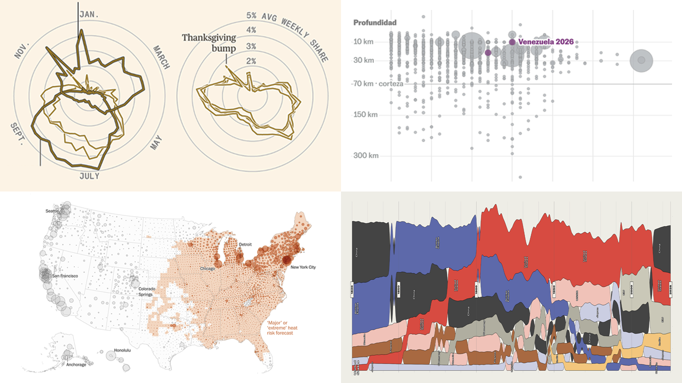
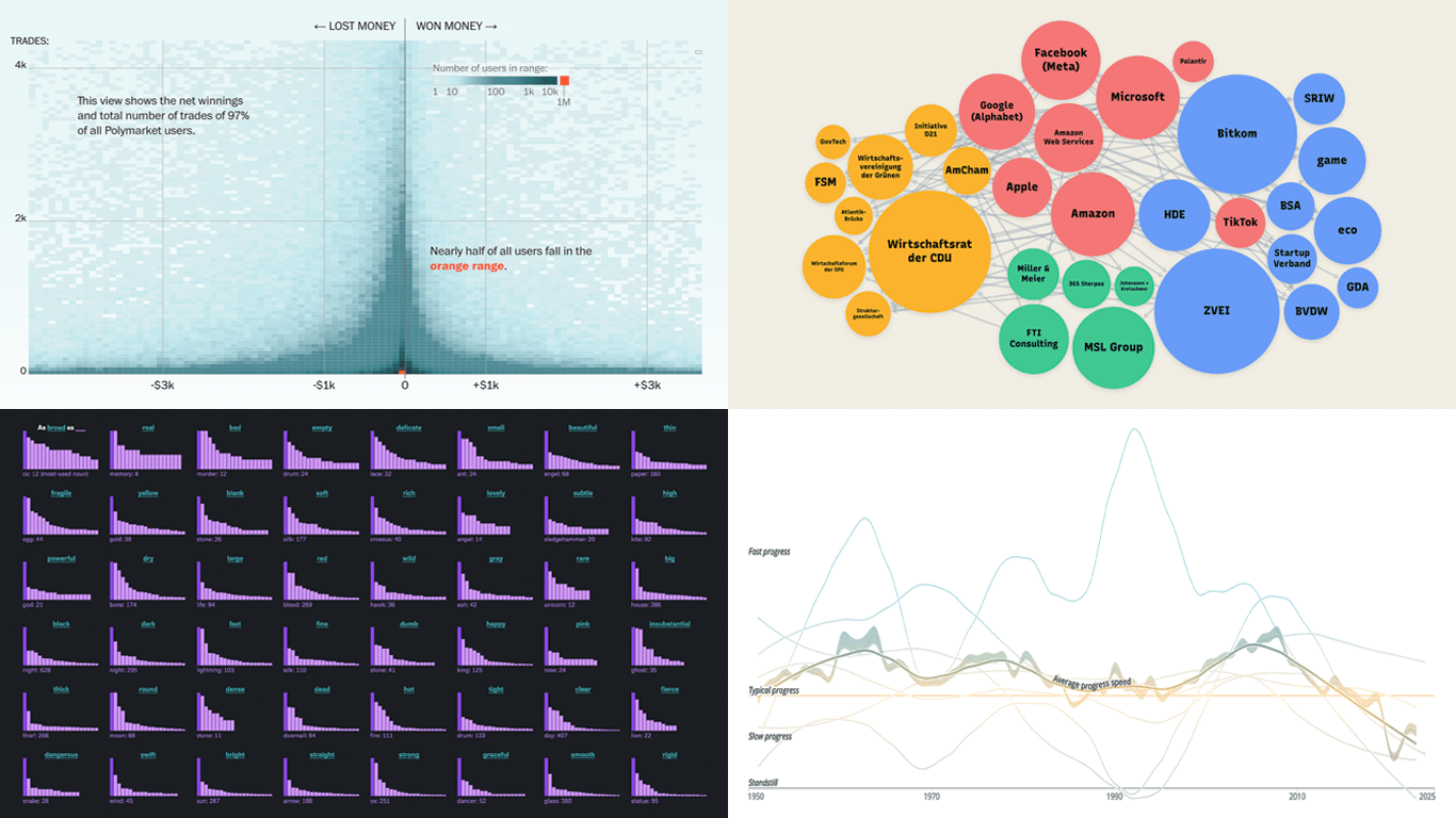
This is what we look for when we pick projects for DataViz Weekly, our regular roundup of recent data visualization examples we found most interesting. Here are the four in this edition:
- Ancestry across America — The New York Times
- Seinfeld in data and sound — Andy Kirk
- 2026 World Cup through charts and maps — Reuters
- Heat exposure across Europe — Klimadashboard

Ancestry Across America

Over roughly 250 years, the United States has absorbed more than 100 million immigrants. The mix of backgrounds in any given place reflects which groups arrived there and when.
The New York Times built an interactive choropleth map that colors every census tract by the ancestries its residents reported to the Census Bureau. Where several groups live side by side, the tract’s color blends them, drawing on nearly 200 possible identities grouped into categories like European, African, Asian, and Mexican, Central or South American. A search box jumps to any city, town, or neighborhood, and can also highlight where a single ancestry is most concentrated. Zoom in and the finer mix within individual neighborhoods comes into view.
The map anchors a companion article on how immigration shaped the country. Animated transitions trace the geography of Italian, African American, Scandinavian, Mexican, Chinese, and Native American roots one at a time. Voronoi treemaps then break the foreign-born population into regions of origin across four snapshots from 1850 to 2024, and a line chart follows the immigrant share by region of birth over time. The piece ends by zooming into the ancestry of individual cities like Los Angeles, Chicago, and Honolulu.
👉 See the map on The New York Times, and read the accompanying article, “How a Nation of Immigrants Traces Its Roots”, by Albert Sun, Jeff Adelson, and Larry Buchanan.
Seinfeld in Data and Sound

Seinfeld ran for nine seasons between 1989 and 1998 and is often counted among the most influential sitcoms ever made. Its humor was built on the everyday interactions of a small central cast.
Andy Kirk built a digital edition of a long-running visual investigation into the patterns of laughter, character interaction, and location use across every episode of the show. It opens with a timeline plotting all 180 broadcast episodes across the nine seasons. At its heart is a browsable catalogue of episode “compositions.” Each one pairs a visual breakdown of the episode with a sonified version of its scenes, played back as short jazz pieces built from sounds tied to the show.
From there, the project works through its threads one by one. Separate sections examine the screen time and laughs generated by the four lead characters, then the supporting cast, then the locations where scenes play out, with trends tracked across episodes and seasons. An interactive tool at the end lets you see how often any given combination of characters and locations appears.
👉 Check out the project on Andy Kirk’s website, developed with Anne-Marie Dufour and with sonification by Miriam Quick and Duncan Geere of Loud Numbers.
2026 World Cup Through Charts and Maps

The 2026 World Cup has expanded to 48 national teams, the most in the tournament’s history. Matches are being played across cities in the United States, Canada, and Mexico.
Reuters has been covering the tournament in a continuously updated hub of data graphics that spans teams, venues, and trends, using many chart and map types. Its most recent article at the time of writing looks at why lightning can stop a match. A bar chart ranks the 16 stadiums by the lightning strikes recorded near each one over the past decade, colored by whether the venue has an enclosed roof or sits open to the sky. A polar chart breaks those same totals down by hour. A grid of small maps then shows the density of past strikes around each stadium, within the eight-mile radius that forces play to stop.
The article before it turns to foreign-born players across the competing squads. A bar chart ranks national teams by how many of their players were born abroad, with Curacao at the top. A Sankey diagram then links birthplaces on one side to the teams those players turn out for on the other, tracing the paths that run through the squads.
👉 Explore the feature on Reuters. The lightning article is by Simon Scarr, Han Huang, and Adolfo Arranz. The foreign-born players article is by Mayank Munjal and Divya Rajagopal.
Heat Exposure Across Europe

Large parts of Europe have been gripped by extreme heat in recent weeks, with several countries recording their hottest June temperatures on record. Heatwaves across the continent are becoming more frequent and more dangerous.
Klimadashboard built an interactive map that lays a live weather grid over a population grid, estimating how many people across Europe are exposed to dangerous heat right now. Each dot is a grid cell. Its size reflects the number of residents there, and its color reflects the selected measure. The default view shows the difference from average. It captures how much hotter or colder each area is today than its 1961 to 1990 norm, running from blue below the baseline to red above it. Two other views recolor the map by today’s peak air temperature and by a feels-like measure that adds in humidity and wind.
The page opens with a summary panel beside the map. It reports how many people in Europe are currently in cells above a chosen temperature threshold, alongside how far the day is running above the long-term average. The figures refresh hourly. A country selector narrows those totals to any single nation, clicking a country opens a national breakdown, and hovering a cell gives local detail. A settings control changes the date or the heat threshold.
👉 Discover the tracker at heat-tracker.eu.
That is our selection for this edition. Each project shows data visualization doing its core job, letting the data itself carry the point. We will be back with more examples worth your attention next week:
👉 DataViz Weekly on AnyChart Blog 👉 DataViz Weekly on Medium.
Originally published at https://www.anychart.com on July 3, 2026.
메타데이터
- post_id
- e29675189d75
- slug
- data-visualization-examples-that-make-data-speak-dataviz-weekly-e29675189d75
- url
- https://medium.com/data-visualization-weekly/data-visualization-examples-that-make-data-speak-dataviz-weekly-e29675189d75
- canonical_url
- https://medium.com/data-visualization-weekly/data-visualization-examples-that-make-data-speak-dataviz-weekly-e29675189d75
- author_url
- https://medium.com/@anychart
- status
- ok
- fetched_at
- 2026-07-08 21:20:17