Mouse Interactivity with SVG Mask
Comparing different methods of mouse interactivity with d3 area and line charts.
Mouse Interactivity with SVG Mask
A comparison of different approaches for making interactive charts using D3.js
One of the best parts about building data visualizations for the web is providing users with interactivity. Many times when looking over a PDF or a printout I find myself instinctually mousing over or clicking on an element to get more information.
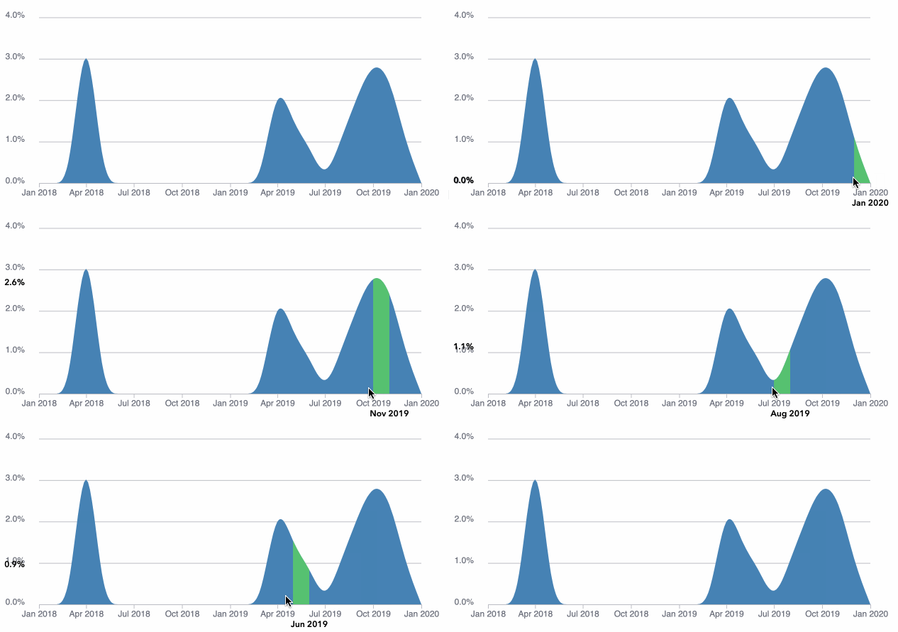
Animating mouse events on area chart
TLDR; The Angular and React sample code for the below examples can be found on GitHub and an example app can be found as a static site on AWS.
With line charts, adding a transparent Voronoi diagram with d3-delaunay on top helps users interact with lines of any thickness. As shown in the line chart below, when a user mouses into a Voronoi cell (light blue polygon) the closest point on a line to that cell is activated.
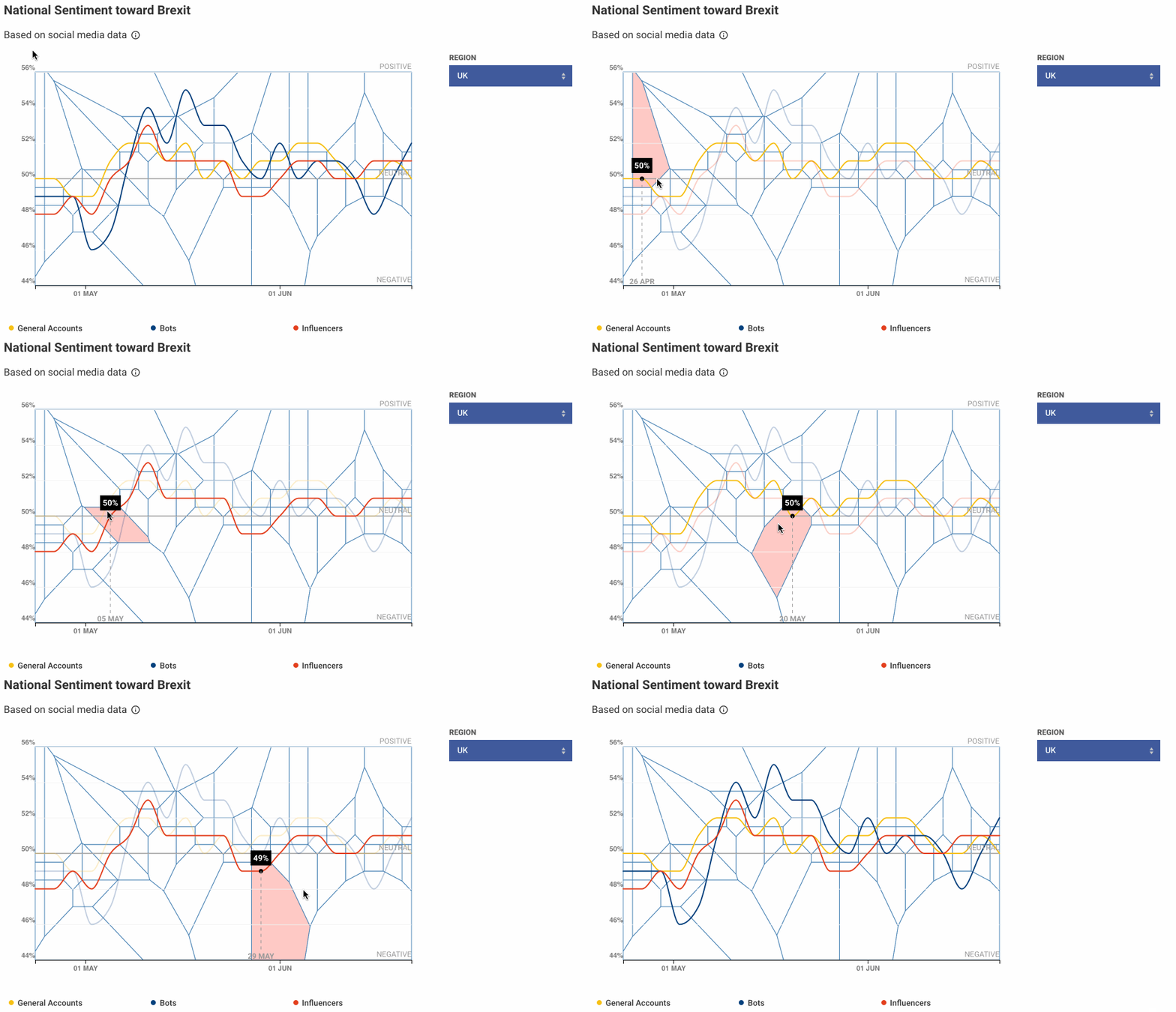
Voronoi diagram for mouse interactivity on line chart. Source: https://uk.political-atlas.com/nationwide
With an area chart, interactivity becomes a bit harder because the area chart is drawn using a single SVG path when rendered with d3.
One option is adding a single mouse event to the entire chart, but in many cases that’s not useful. Often a visitor to a time-series area or line chart is looking for information on a specific time period. For example in the chart below, a user may be interested in mousing over the period between April and July to better understand the precipitous drop which is not possible in this current iteration.
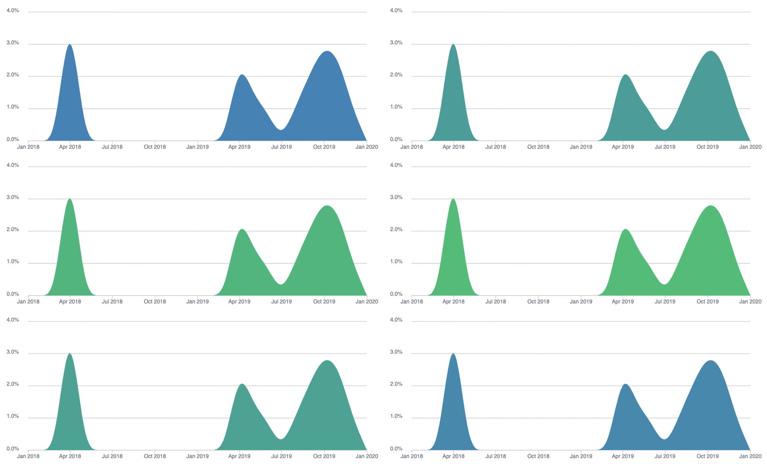
A single mouse event on the entire area path
A second option is adding transparent (style=fill: transparent; stroke: transparent;) rectangles to the area chart to handle mouse events. This works well when a user wants to see a tooltip over a point, but it is still quite complicated to highlight the precise curved area of the chart.
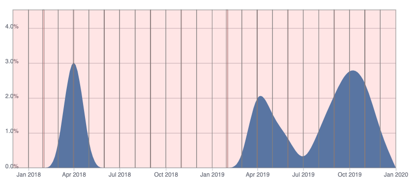
Transparent rectangles for handling mouse events
A third option is combining the transparent rectangles of the second option with an SVG mask to highlight the precise interacted area.
Masking is a feature of SVG that has the ability to fully or partially hide portions of an object through the use of simple or complex shapes…Think of masks as a way to accept the visible region already defined by an object’s shape.
— Envato
This may seem like overkill, but it has its upside: not only are you showing the highlighted area, but you can also quickly visualize the change from one period to another. For example, in the image below, you can immediately see that in April 2019 the y-value was around 2% and has dropped to 1.4% in May 2019.
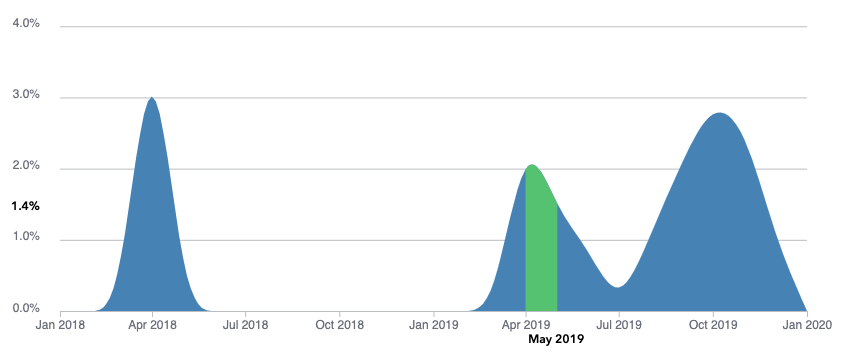
Applying an SVG Mask to highlight a section of an area chart
To get a better understanding of what’s happening with the SVG mask, let’s break it apart without the mask. As shown below, the area is drawn with a white background, while the rest of the chart is drawn with a blue background (and green where highlighted). The color of the masking shape defines the opacity of the shape that uses the mask. The closer the color of the masking shape is to white, the more opaque the shape using the mask will be. (In this case the blue and green are fully opaque when they are drawn over the white area mask.)
[embed]
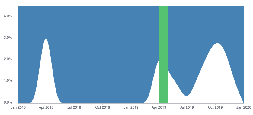
HTML elements without the mask
Christopher Lanoue is a Creative Technologist/Data Visualization Engineer who is currently the Director of Engineering and Innovation at Graphicacy with a focus on designing and building innovative and creative solutions for mission-driven clients all over the world.
메타데이터
- post_id
- e2bbe38bca05
- slug
- mouse-interactivity-with-svg-mask-e2bbe38bca05
- url
- https://medium.com/@calanoue/mouse-interactivity-with-svg-mask-e2bbe38bca05
- canonical_url
- https://medium.com/@calanoue/mouse-interactivity-with-svg-mask-e2bbe38bca05
- author_url
- https://medium.com/@calanoue
- status
- ok
- fetched_at
- 2026-06-17 16:37:43





