Creating a Toggle Pill
As part of a project I am currently working on, I decided to add a toggle pill similar to that shown above with the options Files (PDF) and…
Creating a Toggle Pill
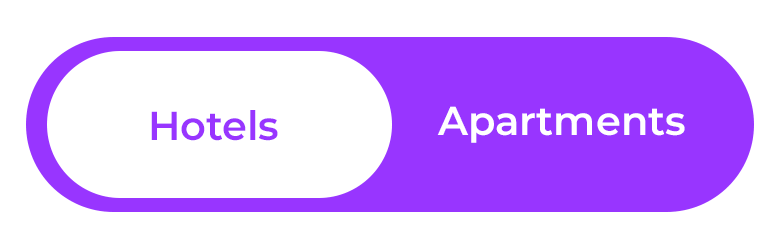
Figure 1. An example of a simple toggle pill with choices “Hotels” and “Apartments”
As part of a project I am currently working on, I decided to add a toggle pill similar to that shown above with the options Files (PDF) and Snippets shown below.

Figure 2. The toggle pill used in the project discussed in this article
Under the hood, a toggle pill operates essentially the same as a radio button group, wherein a set or pair of options is presented with the user only to select one at time. Below is a detailed explanation of relevant parts of the HTML, CSS, and jQuery.
HTML / CSS
The Toggle Container Control
<!-- Toggle -->
<div class="toggle-container">
<div class="segmented-control">
<input type="checkbox" id="table-toggle" />
<label class="segmented-option" data-value="documents">Files (PDF)</label>
<label class="segmented-option" data-value="snippets">
Snippets
</label>
<div class="segmented-slider"></div>
</div>
</div>The toggle-container defines the base structure with four visible components, the segmented-control which is visually shown as the light-gray background contains the input and the segmented-option labels. The table-toggle checkbox is the meat of the whole operation. The light-blue segmented-slider shows the user which option is selected.
The segmented-control is defined with a relative position in order to give the segmented-slider a context for its absolute position. The toggle-control displayed as flex, and the segmented-control is displayed as inline-flex which places the labels side-by-side.
.toggle-container {
  margin: 20px 0;
  display: flex;
  align-items: center;
  gap: 15px;
}

.segmented-control {
  position: relative;
  display: inline-flex;
  background-color: #2c2f33;
  border-radius: 40px;
  padding: 4px;
  cursor: pointer;
  font-weight: bold;
  user-select: none;
}

.segmented-option {
  position: relative;
  z-index: 2;
  padding: 8px 16px;
  text-align: center;
  transition: color 0.2 ease;
  cursor: pointer;
  color: #b0b3b8;
  width: 200px;
}

.segmented-option.active {
  color: #ffffff;
}

.segmented-control:nth-child(3) {
  padding-right: 200px;
}
The z-indices of the segmented-slider and the segmented-option elements ensures that the label for the selected option consistently appear on top of the slider. The segmented-slider’s rounded rectangle shape is set with the width, height, and border-radius. The substance of the visual effect is defined in by the transition property in conjunction with the #table-toggle:checked pseudo class. The cubic-bezier property argument causes the animation, a simple translation of the slider along the x-axis limited to the space of the segmented-control, to accelerate and decelerate naturally. The color of the text also changes to be consistent with whether or not the toggle pill
/* Pill shaped */
.segmented-slider {
  position: absolute;
  top: 4px;
  left: 4px;
  width: calc(50% + 12px);
  height: calc(100% - 8px);
  background-color: #2196f3;
  border-radius: 32px;
  transition: transform 0.25s cubic-bezier(0.4, 0, 0.2, 1);
  z-index: 1;
}

#table-toggle {
  visibility: collapse;
}

#table-toggle:checked ~ .segmented-slider {
  transform: translateX(calc(100% - 32.5px));
}

.toggle-label {
  font-weight: bold;
}
The Toggled Containers
<!-- Content -->
<div id="table-container-documents" class="table-container"></div>
<div
  id="table-container-snippets"
  class="table-container table-container-hidden">
</div>
Here the principle is fairly simple. Both of the table-containers are defined identically, but with the latter defaulting to table-container-hidden.
.table-container {
  margin-top: 20px;
}

.table-container-hidden {
  display: none;
}
jQuery
With the structure, styles, and animation defined in HTML and CSS, we turn to jQuery to define our desired behavior.
$(document).ready(() => {
  const $toggle = $("#table-toggle");
  const $documentContainer = $("#table-container-documents");
  const $snippetContainer = $("#table-container-snippets");
  const $options = $(".segmented-option");
  const hiddenClass = "table-container-hidden";

  // updateToggle helper function defined in the code snippet below

  $options.on("click", function () {
    const isChecked = $toggle.prop("checked");
    const newValue = $(this).data("value");
    const shouldBeChecked = newValue === "snippets";

    if (shouldBeChecked !== isChecked)
      $toggle.prop("checked", shouldBeChecked).trigger("change");
  });

  $toggle.on("change", function () {
    updateToggle($(this).is(":checked"));
  });

  updateToggle($toggle.is(":checked"));
});
The principle is rather simple, namely the default is to show the Document Container, so the table-toggle element not being checked represents this state. If the element is checked, then the state changes to hide the Document Container and show the Snippet Container. The other styles are changed in the process to ensure that the toggle pill moves from the previously selected option to the currently selected option.
function updateToggle(checked) {
    if (checked) {
      $options.first().removeClass("active");
      $options.last().addClass("active");
      $documentContainer.addClass(hiddenClass);
      $snippetContainer.removeClass(hiddenClass);
    } else {
      $options.first().addClass("active");
      $options.last().removeClass("active");
      $documentContainer.removeClass(hiddenClass);
      $snippetContainer.addClass(hiddenClass);
    }
  }
The End Result
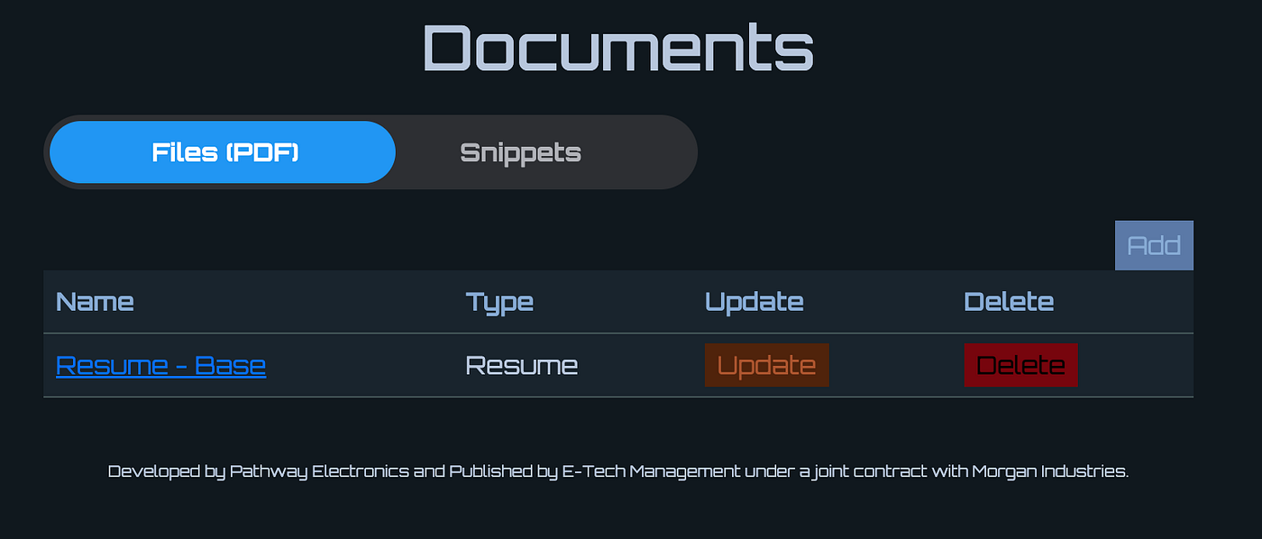
Figure 3. The default state showing the toggle pill with “Files (PDF)” selected and the Documents Container displayed
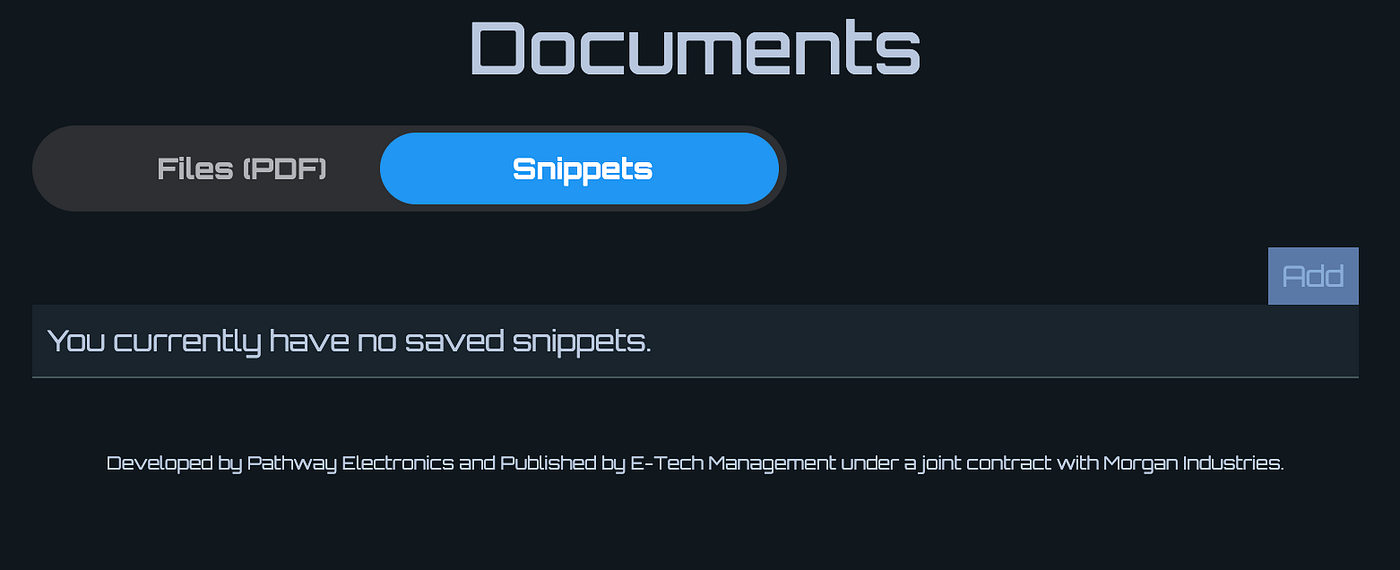
Figure 4. The the toggle pill is now shown with “Snippets” selected and the Documents Container hidden and the Snippets Container now displayed
메타데이터
- post_id
- e4d1bb620ddd
- slug
- creating-a-toggle-pill-e4d1bb620ddd
- url
- https://medium.com/@samswank/creating-a-toggle-pill-e4d1bb620ddd
- canonical_url
- https://medium.com/@samswank/creating-a-toggle-pill-e4d1bb620ddd
- author_url
- https://medium.com/@samswank
- status
- ok
- fetched_at
- 2026-07-10 15:36:45