How can a UX audit improve website conversions?
Short answer: Your website is not generating leads because friction sits between intent and action. Traffic is rarely the problem. The…
How can a UX audit improve website conversions?
Short answer: Your website is not generating leads because friction sits between intent and action. Traffic is rarely the problem. The average website converts only 2.9% of visitors into leads (Flint, 2026). The other 97% leave because forms ask too much, pages load too slowly, value props stay vague, or trust signals are missing. A UX audit finds the exact drop-off points your analytics cannot explain. It diagnoses why users hesitate, then ranks fixes by revenue impact. Optimizing checkout and form design alone can lift conversions by 35.26% (Baymard Institute). Most lead problems are structural, not cosmetic. A UX audit replaces guesswork with a ranked list of conversion-blocking issues you can act on this quarter. Fix friction first. Then scale traffic.
TL;DR
- Most websites fail to generate leads because of UX friction, not low traffic. The average site converts under 3% of visitors (Flint, 2026).
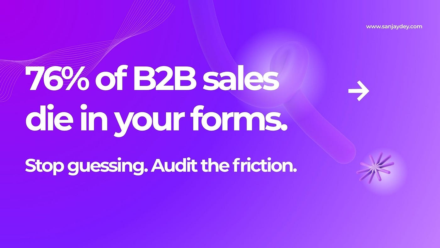
- Over 76% of B2B online sales are lost to form abandonment (Flint, 2026). Long forms and missing trust signals are the biggest leaks.
- A UX audit diagnoses where and why users drop off, then ranks fixes by business impact.
- Optimized checkout and form design can lift conversion rates by 35.26% (Baymard Institute).
- A 1-second load delay cuts conversions measurably. B2B sites loading in 1 second convert 3x better than those at 5 seconds (Flint, 2026).
- This guide covers the audit process, a practical checklist, regional context, and an FAQ built for answer engines.
Table of Contents
- The Real Reason Your Website Is Not Generating Leads
- What a Website UX Audit Actually Is
- The 6 Friction Points That Kill Conversions
- How a UX Audit Improves Website Conversions
- The UX Audit Process: A Step-by-Step Walkthrough
- UX Audit Checklist for Conversion Optimization
- UX Audit vs Redesign: Which Do You Need?
- Geographic Relevance: USA, UK, UAE, Australia, India
- Answer Capsules
- Tools and Resources
- FAQ
- Conclusion
- About the Author
The Real Reason Your Website Is Not Generating Leads
I have audited enterprise platforms and small business sites for over two decades. The question I hear most is the same every time. “We get traffic. Why is my website not generating leads?”
The instinct is to buy more traffic. That instinct is wrong. More visitors into a leaky funnel just means more lost visitors.
Here is the uncomfortable math. The average website converts 2.9% of visitors into leads (Flint, 2026). Some baselines run even lower. Flint puts the typical figure at 2.23% of visitors. For B2B SaaS specifically, the average site converts just 1.1% of visitors into known leads (Docket, 2026).
That means 97 to 99 of every 100 visitors leave with no trace. No form. No demo request. No contact detail.
You already paid to bring those people in. The failure happens after they arrive.
Traffic is not your problem. Friction is. And friction is exactly what a website UX audit is built to find.
Most teams cannot see their own friction. You have looked at your homepage for months. You read what you meant to say, not what a first-time visitor actually sees. That blind spot is normal. It is also expensive.
There is good news in the numbers. B2B sites that lift conversion from 2% to 3% add 100 leads per month from 10,000 visitors, with zero extra ad spend (Flint, 2026). The opportunity is not out there in new traffic. It is already on your site.
I have written before about why 90% of websites fail on bad UX. The pattern holds: the failure is rarely the product. It is the experience around it.
What a Website UX Audit Actually Is
A website UX audit is a structured diagnosis of why visitors fail to complete a goal. It inspects every step from landing to conversion and identifies the specific points where users hesitate, get confused, or quit.
It is not a design opinion. It is not a list of things that look dated.
A good audit produces a ranked list of conversion-impacting issues, each tied to evidence and each tied to a business outcome. The output is not a 60-page document. It is a prioritized action roadmap.
The distinction matters. Cosmetic feedback tells you a button color feels off. A UX audit tells you that 76% of B2B sales leak out of form abandonment, then shows you which three fields on your form cause it.
An audit blends two data types. Quantitative data shows where users drop off: analytics, funnels, heatmaps. Qualitative data shows why: session replays, usability testing, heuristic evaluation. You need both. Analytics tells you the checkout page loses 60% of users. It cannot tell you the shipping cost appeared too late. Only watching real sessions reveals that.
This is the part most guides skip. They treat the audit as a checklist exercise. The real value sits in connecting the drop-off to the cause to the fix.
The 6 Friction Points That Kill Conversions
After auditing platforms across SaaS, ecommerce, and service businesses, the same friction points appear again and again. Six of them do most of the damage.
1. Form Friction
This is the single largest leak in most funnels. Over 76% of B2B potential online sales are lost to form abandonment (Flint, 2026).
Long forms punish high-intent visitors. The ones who push through are the most patient, not the ones with the most budget.
The fix is direct. Single-field forms convert at an average of 23.4%, nearly triple the rate of four-field equivalents (Unbounce, via Amra & Elma, 2026). Cutting a form from four fields to three can boost conversions by up to 50%. AI progressive profiling then recovers the missing data later, with one benchmark recovering 78% of additional data points within 30 days.
Ask for less. Recover the rest after the lead is in.
2. Slow Page Speed
Speed is not a vanity metric. It is a conversion metric.
B2B websites loading in 1 second convert 3x better than those taking 5 seconds (Flint, 2026). Every second of delay costs revenue. This is one of the highest-ROI fixes an audit surfaces, because it usually needs engineering effort, not a redesign.
3. Vague Value Proposition
Many sites use abstract slogans and feature lists instead of stating the outcome they deliver. Visitors cannot tell, in seconds, whether the service solves their problem. So they leave.
A homepage has roughly five seconds to answer one question: “Is this for me?” If the headline does not answer it, the audit flags it first.
4. Missing Trust Signals
Trust friction is quiet but lethal. 29% of form abandonment is driven by security concerns (Flint, 2026). No privacy reassurance, no recognizable logos, no reviews near the action point: hesitation wins.
WCAG 2.2 AA compliance also functions as a trust and SEO signal. Fully compliant websites now average a 19.3% higher conversion rate than non-compliant peers (Web Accessibility Initiative study, 2026).
5. Choice Overload
Competing calls to action, bloated navigation, and no clear priority force visitors to decide without guidance. Most do not decide. They leave.
One audit I reviewed found a 23% conversion improvement after a single change: simplifying a navigation menu that had grown bloated with too many options (Linear, 2025).
6. Weak Calls to Action
The CTA is often the most under-tested element on a page. Personalized CTAs convert 202% better than generic ones (Martal, 2026). CTAs surrounded by white space can lift conversions by 232% (The Frank Agency, 2026).
These are not small tweaks. They are the difference between a bounce and a booked call.
That brings up a related problem most teams ignore until launch day: they fix the page but never check whether the fix actually moved the number. An audit builds that measurement in from the start.
How a UX Audit Improves Website Conversions
A UX audit improves website conversions by replacing assumptions with evidence. Instead of guessing why leads dry up, you get a diagnosis.
The mechanism is simple. The audit isolates each friction point. It quantifies the cost of each. It ranks fixes by impact, not by preference. Your team then executes against a list where the highest-revenue fix sits at the top.
The numbers support the approach. Website UX improvements can magnify conversions by more than 200% when speed, clean CTAs, personalization, and usable layouts are addressed together (ElectroIQ, 2026). Optimizing checkout design alone can boost ecommerce conversion rates by 35.26%, based on Baymard Institute research across 200,000+ hours of UX testing.
Here is the part that earns the audit its budget. Conversion optimization often delivers better ROI than traffic acquisition. Lifting a B2B site from 2% to 3% adds 100 leads per month from the same 10,000 visitors (Flint, 2026). You are not paying for new clicks. You are recovering leads you already paid for.
There is a trade-off worth naming. An audit works only when the team acts on it. A ranked roadmap that sits unread changes nothing. The audit is the diagnosis. Implementation is the cure. Skipping the second step is the most common reason audits disappoint.
Speed-to-lead compounds the gains. Responding to a lead within 60 seconds boosts conversions by 391% (Flint, 2026), yet the average B2B response time is 42 to 47 hours. An audit that fixes the form but ignores the follow-up leaves money on the table. The funnel does not end at submit.
If you want a deeper view of how interface decisions move revenue, I cover the mechanics in detail in my breakdown of UX design mistakes that quietly kill conversions and in this guide to conversion rate optimization through UX fixes.
[ALT: Diagram showing a conversion funnel with friction points marked at form, page speed, and CTA stages]
The UX Audit Process: A Step-by-Step Walkthrough
A useful UX audit follows a repeatable sequence. Here is the process I use.
Step 1: Define the Conversion Goal
Start with the single action that matters. A demo request. A contact form. A purchase. Everything in the audit is measured against that goal.
Without a defined goal, an audit drifts into opinion. With one, every finding has a clear yes-or-no relevance test.
Step 2: Map the User Journey
Trace the real path from entry to conversion. Where do visitors land? Where do they go next? This user journey analysis exposes the steps where intent turns into hesitation.
Step 3: Run Quantitative Analysis
Pull the data. Funnel reports show drop-off rates. Heatmaps show where attention dies. Bounce rates above 70% signal a mismatch between expectation and content. This stage tells you where the leaks are.
Step 4: Run Qualitative Analysis
Now find out why. Watch session replays. Run a moderated usability test with five users. Conduct a heuristic evaluation against established usability principles. This stage explains the numbers from Step 3.
Step 5: Diagnose Root Causes
Group the findings. Information gaps, where about 46% of top ecommerce sites show insufficient product content (Linear, 2025). Interaction cost, where steps are too many. Cognitive load, where the page asks the brain to work too hard.
Step 6: Rank Fixes by Impact
Score each issue on conversion impact and implementation effort. High impact and low effort goes first. This is where the audit becomes a plan.
Step 7: Test and Measure
Ship the fix. Then prove it. A/B testing produces 37 to 49% average conversion gains among teams that test consistently (Martal, 2026). Yet only 17% of marketers actively A/B test landing pages. Measurement is what separates a real audit from a redesign with extra steps.
I break down the full methodology, including heuristic frameworks, in my guide to mastering UX audits step by step.
[ALT: Seven-step UX audit process flowchart from goal definition to testing and measurement]
UX Audit Checklist for Conversion Optimization
Use this as a starting scan. It is not exhaustive. It is the set of items that surface the most lead loss.
Messaging and clarity
- Headline states a specific outcome, not an abstract slogan
- A first-time visitor can tell who the site is for in five seconds
- Each page has one primary action, clearly prioritized
Forms and conversion points
- Forms ask for the minimum fields needed to qualify a lead
- Error states are clear, inline, and human
- Trust signals sit next to the form: privacy note, logos, reviews
Performance
- Pages load in under 2 seconds on mobile
- Images are compressed and properly sized
- Core Web Vitals pass on key conversion pages
Navigation and structure
- Navigation is lean, with no competing or duplicate paths
- Key information is surfaced, not buried
- The path to conversion is obvious from any entry page
Accessibility
- Site meets WCAG 2.2 AA standards
- Color contrast ratios pass
- All images carry meaningful alt text
Mobile experience
- Mobile conversion rate is within range of desktop
- Tap targets are large enough and well spaced
- Forms are usable on a phone without zooming
For accessibility specifically, I recommend pairing this with my deeper write-up on accessibility-first design and WCAG 2.2 standards.
UX Audit vs Redesign: Which Do You Need?
This is the question most agencies will not answer honestly, because a redesign is a bigger engagement.
A UX audit and a full redesign are not the same investment, and they do not solve the same problem.
FactorUX AuditFull RedesignGoalDiagnose why conversions failRebuild the site structure or brandCostLower, scopedHigh, multi-monthRiskLow, evidence-ledHigh, can lose what workedSpeedFindings in 2 to 4 weeksMonths to launchOutputRanked fix roadmapNew siteBest whenTraffic is fine, leads are notBrand or platform is genuinely outdated
The honest guidance: start with the audit. Most lead problems are structural friction, not visual age. A redesign without a diagnosis often rebuilds the same friction in a new skin. The audit tells you whether you need a scalpel or a rebuild.
If you do find a redesign is justified, my comparison of Webflow versus WordPress for 2026 helps frame the platform decision.
Geographic Relevance: USA, UK, UAE, Australia, India
UX expectations and conversion drivers shift by market. A useful audit accounts for local behavior and regulation.
United States
The US market is the most CRO-mature of the five. Forrester’s Digital Experience Index reports brands using AI-driven funnel personalization pushed average conversion rates to 6.8% in 2026, with top performers exceeding 14.3%. US buyers expect fast, personalized, mobile-first experiences. Speed-to-lead is a competitive weapon here, since responding within 60 seconds lifts conversions by 391% (Flint, 2026). For US SaaS founders, the audit priority is form friction and follow-up routing.
United Kingdom
UK conversion behavior rewards clarity and trust. Following the EU Accessibility Act enforcement, WCAG 2.2 AA compliance is now a measurable conversion driver, with compliant sites averaging 19.3% higher conversion (WAI, 2026). UK B2B buyers research thoroughly before contact, so transparent pricing and credible proof reduce hesitation. Audits for UK clients weight trust signals and accessibility heavily.
UAE and Middle East
The UAE market is mobile-dominant and conversion-sensitive to language and payment options. Bilingual experiences, with proper right-to-left support, materially affect completion rates. Trust signals carry extra weight in a market where premium positioning is common. Audits here check mobile flow, localized payment methods, and whether the value proposition reads clearly in both English and Arabic contexts.
Australia and New Zealand
Australian buyers are mobile-led, with mobile traffic share at or above 70% across many sectors. The conversion gap between mobile and desktop is a recurring audit finding. Australian consumers also respond strongly to clear privacy handling. For Australian service businesses, the audit focus is mobile parity, page speed, and a single uncluttered conversion path.
India
India is the fastest-growing digital market of the five, with a young, mobile-first user base. Connection speed variability makes performance optimization decisive: a lightweight, fast-loading site converts far better. Price transparency and trust proof reduce hesitation among value-conscious buyers. Audits for Indian businesses prioritize speed, mobile-first layout, and clear, jargon-free messaging.
Answer Capsules
Why is my website getting traffic but no leads?
Traffic without leads almost always points to a conversion problem, not a traffic problem. The average website converts only 2.9% of visitors into leads (Flint, 2026), and B2B SaaS sites average just 1.1% (Docket, 2026). The leak usually sits in one of three places. Forms ask for too much, causing the 76% of B2B sales lost to form abandonment (Flint, 2026). Pages load too slowly, since a 5-second load converts 3x worse than a 1-second load. Or the value proposition is too vague for visitors to see relevance. A UX audit pinpoints which of these is costing you leads.
How much can a UX audit improve conversion rates?
A UX audit can improve conversion rates significantly when the findings are implemented. Optimizing checkout and form design alone can lift conversions by 35.26%, based on Baymard Institute research across 200,000+ hours of UX testing. Broader UX improvements covering speed, CTAs, personalization, and layout can magnify conversions by more than 200% (ElectroIQ, 2026). The exact gain depends on your starting point and how much friction exists. Sites with severe friction see the largest gains. The audit itself does not improve anything: implementation does.
Is a UX audit worth it for a small business?
Yes, for most small businesses a UX audit is worth it because it costs far less than a redesign and targets the highest-impact fixes first. Conversion optimization often delivers better ROI than buying more traffic. A B2B site lifting conversion from 2% to 3% gains 100 extra leads per month from 10,000 visitors, with no added ad spend (Flint, 2026). For a small business with a fixed marketing budget, recovering leads already paid for is the more efficient path. The audit gives a ranked list, so even a small team can fix the top items first.
Tools and Resources
A practical UX audit draws on a small, reliable toolset.
- Google Analytics 4 for funnel and drop-off data
- Google PageSpeed Insights and Core Web Vitals for performance diagnosis
- Session replay tools such as Hotjar or Microsoft Clarity to watch real behavior
- Heatmap tools to see attention and scroll depth
- Moderated usability testing with five representative users
- Heuristic evaluation against established usability principles
- A/B testing tools to validate fixes before full rollout
The tool matters less than the discipline. Data collection without a defined conversion goal produces noise. For research methodology, the Nielsen Norman Group and the Interaction Design Foundation remain the most reliable references. For ecommerce-specific benchmarks, Baymard Institute is the standard.
FAQ
What is a website UX audit?
A website UX audit is a structured evaluation of how users move through a site and where they fail to complete a goal. It combines quantitative data, such as analytics and heatmaps, with qualitative data, such as session replays and usability testing. The output is a ranked list of conversion-blocking issues, each tied to a business outcome and an implementable fix.
Why is my website not generating leads despite good traffic?
Good traffic with no leads means friction is blocking conversion. The average site converts under 3% of visitors (Flint, 2026), so most traffic naturally leaves. The fixable causes are usually long forms, since 76% of B2B sales are lost to form abandonment, slow page speed, vague messaging, or missing trust signals. A UX audit identifies which specific cause applies to your site.
How long does a UX audit take?
A focused UX audit typically takes two to four weeks. The first week covers goal definition and quantitative analysis. The second covers qualitative research, including session replays and usability testing. The remaining time covers diagnosis, prioritization, and the delivery of a ranked roadmap. Complex enterprise platforms take longer. The deliverable should always be a prioritized action list, not a long opinion document.
What is the difference between a UX audit and a CRO audit?
A UX audit and a CRO audit overlap heavily, but the key difference is scope. A UX audit examines the entire user experience, including usability, accessibility, and satisfaction. A CRO audit focuses specifically on actions that drive conversions, such as form completion and checkout. In practice, a strong UX audit includes conversion analysis, since usability and conversion are closely linked.
How do I increase leads with a UX audit?
To increase leads with a UX audit, you first run the diagnosis, then implement the ranked fixes. Start by defining the conversion goal. Map the user journey. Identify drop-off points with analytics, then explain them with session replays. Fix the highest-impact friction first, usually form length and page speed. Then A/B test each change to confirm it lifted the number.
Can a UX audit help a SaaS website?
Yes. SaaS websites have high customer acquisition costs, so every conversion point matters. The average B2B SaaS site converts just 1.1% of visitors into leads (Docket, 2026). A UX audit examines the path from landing page to trial signup to paid conversion, finding friction at each step. SaaS audits often focus on onboarding clarity, demo request forms, and pricing page transparency.
How often should I run a UX audit?
For most businesses, a full UX audit once a year is reasonable, with lighter checks each quarter. Run an audit sooner if conversions drop suddenly, if traffic grows but leads stay flat, or after a major site change. Continuous testing through A/B experiments should run between formal audits, since teams that test consistently see 37 to 49% average conversion gains (Martal, 2026).
Does a UX audit help SEO and AI search visibility?
Yes, indirectly but meaningfully. UX signals such as page speed, mobile usability, and accessibility influence search rankings. WCAG 2.2 AA compliance, a common audit output, correlates with both higher conversion and stronger SEO signals. Clear structure and fast pages also help content surface in AI-driven answer engines, which increasingly weight usability and clarity.
Conclusion
Your website is not generating leads because friction stands between visitor intent and visitor action. The data is consistent across every market. Most sites convert under 3% of visitors. Most lost leads leak from forms, slow pages, vague messaging, and missing trust.
A UX audit fixes the right problem. It stops the guesswork. It replaces opinion with a ranked, evidence-led roadmap that puts the highest-revenue fix first.
The single most important shift is this. Stop buying traffic to cover a leaking funnel. Diagnose the funnel. The leads you want are already arriving. They are just leaving before they convert.
If your traffic is healthy but your lead numbers are not, an audit is the most efficient next step you can take. I work with SaaS founders, agency owners, and in-house marketing teams to diagnose exactly where leads are lost and what to fix first. You can book a free UX consultation to talk through your site, or explore more of my UX strategy and conversion writing for practical guidance you can apply now.
Fix friction first. The traffic you already have is enough.
About the Author
Sanjay Dey is a Senior UX/UI Designer and Digital Strategist with over 20 years of experience designing user-centric web, mobile, and analytics dashboard solutions for global enterprises. He has delivered UX strategy and interaction design for clients including ArcelorMittal, Adobe, NatWest Bank UK, ITC, Adani, and Government of India initiatives. He writes on conversion-focused UX at sanjaydey.com and consults with businesses across the USA, UK, UAE, Australia, and India.
Data Sources
- Flint, B2B Website Traffic to Lead Conversion Statistics (2026)
- Baymard Institute, Checkout Usability Research
- Docket, 7 Reasons B2B Companies Lose Website Leads (2026)
- Amra & Elma, Conversion Rate Optimization Statistics (2026)
- The Frank Agency, Conversion Rate Optimization Statistics (2026)
- ElectroIQ, Conversion Rate Optimization Statistics (2026)
- Martal, Conversion Rate Statistics for B2B (2026)
- Linear, Conversion Rate Optimization Audit (2025)
- Neil Patel, Conversion Rate Optimization Guide
- UX Design Institute Blog
메타데이터
- post_id
- e52ca2ff02ab
- slug
- how-can-a-ux-audit-improve-website-conversions-e52ca2ff02ab
- url
- https://medium.com/@webdesignerindia/how-can-a-ux-audit-improve-website-conversions-e52ca2ff02ab
- canonical_url
- https://medium.com/@webdesignerindia/how-can-a-ux-audit-improve-website-conversions-e52ca2ff02ab
- author_url
- https://medium.com/@webdesignerindia
- status
- ok
- fetched_at
- 2026-06-09 15:37:30