The Complete Glossary of UI/UX Design Terms Every Beginner Must Know
(100+ Terms. Plain English. Real Examples. Bookmark This.) 📚
The Complete Glossary of UI/UX Design Terms Every Beginner Must Know
(100+ Terms. Plain English. Real Examples. Bookmark This.) 📚
🏗️ A. Foundational UX Concepts
Affordance 🖐️
What something looks like it does, based on its visual design.
Example: A button that looks raised and pressable has good affordance because it signals “click me.” A flat grey rectangle with no visual cues has poor affordance because users can’t tell it’s interactive.
Card Sorting 🃏
A research method where participants organize topics or features into groups that make sense to them. Used to inform information architecture decisions.
Example: You give users 30 cards with feature names written on them. They group the cards however feels natural. The patterns that emerge tell you how to organize your navigation.
Cognitive Load 🧠
The total amount of mental effort required to use a product. High cognitive load = frustrated users. Low cognitive load = smooth experience.
Example: A checkout form that asks for 15 fields on one screen creates high cognitive load. Breaking it into 3 shorter steps reduces it significantly.
Conversion Rate 📈
The percentage of users who complete a desired action out of the total number who had the opportunity.
Example: If 100 users visit your pricing page and 8 click “Start Free Trial,” your conversion rate is 8%.
Design Thinking 💡
A human-centered problem-solving process with 5 stages: Empathize, Define, Ideate, Prototype, and Test. Not a linear process, more of a mindset.
Empathy Map 🗺️
A visual tool used to summarize what a user says, thinks, feels, and does in relation to a specific experience. Used to build understanding before designing.
Ethnographic Research 🔬
Observing users in their natural environment to understand real behavior rather than reported behavior. What people say they do and what they actually do are often very different.
Feature Prioritization ⭐
The process of deciding which features to build first based on user value, business value, and effort required. Common frameworks include MoSCoW (Must Have, Should Have, Could Have, Won’t Have) and RICE scoring.
Gestalt Principles 👁️
A set of psychological principles that explain how humans naturally group visual elements. Key principles include proximity, similarity, continuity, closure, and figure-ground.
Example: Items placed close together are perceived as related (proximity). This is why related form fields are grouped together in good UI design.
Heuristic Evaluation 🔍
An expert review of a product against a set of established usability principles (heuristics). The most well-known set is Jakob Nielsen’s 10 Usability Heuristics.
Information Architecture (IA) 🗂️
The structural design of how content and features are organized within a product. A well-designed IA means users can find what they need without thinking too hard.
Example: The navigation structure of a website, the category hierarchy of an e-commerce store, or the menu structure of a mobile app.
Jakob’s Law ⚖️
Users spend most of their time on other products. They expect your product to work the same way as the products they already know. Departing too far from conventions creates confusion.
Jobs to Be Done (JTBD) 🔧
A framework that frames user behavior in terms of the “job” they are trying to accomplish, rather than demographics or personas.
Example: Instead of saying “young professionals use our app,” JTBD says “users hire our app to feel organized and in control of their schedule.”
Mental Model 🧩
The internal understanding a user has about how something should work, based on their past experiences. Good design matches users’ mental models instead of fighting them.
Example: Users expect a shopping cart icon to lead to a list of items they’ve selected. A designer who uses a different metaphor breaks the mental model.
Persona 👤
A fictional but research-based representation of a target user type. Used to keep design decisions anchored to real user needs rather than assumptions.
Example: “Maya, 28, freelance graphic designer, uses her phone primarily, values speed and minimal friction in task completion.”
Progressive Disclosure 📦
Showing users only the information they need at each step of a task, revealing more complexity only when needed.
Example: A settings page that shows basic options by default with an “Advanced Settings” link that reveals more options when clicked.
Usability ✅
How easily users can learn, use, and remember how to use a product. Measured across effectiveness (can they do it?), efficiency (how long does it take?), and satisfaction (how did it feel?).
User-Centered Design (UCD) 🎯
A design philosophy where the needs, goals, and limitations of end users are the primary focus at every stage of the design process.
User Journey Map 🛤️
A visualization of the end-to-end experience a user has while interacting with a product or service, including their actions, emotions, and pain points at each stage.
User Story 📖
A short, simple description of a feature written from the user’s perspective.
Format: “As a [type of user], I want to [action] so that [benefit].”
Example: “As a new user, I want to reset my password easily so that I don’t get locked out of my account.”
🎨 B. UI Design Terms
Above the Fold 📱
The portion of a screen visible to the user without scrolling. Content placed above the fold gets the most attention and should communicate the most important information.
Alignment 📐
The visual relationship between elements on a screen. Good alignment creates order, consistency, and visual connection between related elements.
Atomic Design ⚛️
A methodology for building design systems where UI components are broken into five levels: Atoms (smallest elements), Molecules (groups of atoms), Organisms (complex sections), Templates (page-level layouts), and Pages (final screens with real content).
Baseline Grid 📏
A consistent vertical spacing system based on a fixed unit (commonly 8px) that all elements snap to. Creates visual rhythm and consistency across a design.
Breadcrumb 🍞
A secondary navigation element that shows the user’s current location within a site’s hierarchy.
Example: Home > Products > Electronics > Laptops
Card 🃏
A UI component that groups related content and actions about a single subject into a contained, visually distinct unit.
Example: A product card in an e-commerce store showing an image, name, price, and “Add to Cart” button.
Call to Action (CTA) 📣
A UI element (usually a button or link) that prompts the user to take a specific desired action.
Example: “Start Free Trial,” “Get a Quote,” “Download Now.”
Color Hierarchy 🎨
The use of color to guide the user’s attention and communicate the relative importance of different elements on a screen. Primary actions typically use the most prominent color.
Component 🧱
A reusable, self-contained UI element that can be placed in multiple contexts throughout a design. Components are the building blocks of design systems.
Example: A button, an input field, a navigation bar, a modal.
Contrast ☀️
The difference in visual properties (color, lightness, size) between elements. High contrast improves readability and accessibility. WCAG requires a minimum 4.5:1 contrast ratio for body text.
Dark Mode 🌙
A UI color scheme that uses dark backgrounds with light text, designed to reduce eye strain in low-light environments and save battery on OLED screens.
Design Token 🔐
A named variable that stores a design decision (color value, spacing size, font size) so it can be used consistently and updated globally across a design system.
Example: --color-primary: #2563EB is a design token. Change it once and it updates everywhere.
Empty State 📭
The state of a screen when there is no content to display. A well-designed empty state guides users toward their next action rather than showing a blank screen.
Example: A task app showing “No tasks yet. Tap + to add your first task.”
Flat Design ▪️
A visual design style that uses minimal ornamentation, no gradients or shadows, and focuses on clean typography and solid colors. Associated with early iOS 7 and Material Design.
Grid System 📊
A set of invisible vertical and horizontal lines that create a consistent structure for placing elements on a screen. Most web grids use 12 columns.
Hero Section 🦸
The large, visually prominent section at the top of a webpage or app screen, typically containing the headline, primary CTA, and key visual.
Hamburger Menu 🍔
The three-horizontal-line icon that opens a navigation drawer or menu, most commonly used in mobile UI to save screen space.
Hierarchy 📶
The visual organization of elements to communicate their relative importance. Created through size, weight, color, and spacing.
Iconography 🔷
The visual system of icons used within a product. Good iconography is consistent in style, size, and visual weight across all icons used.
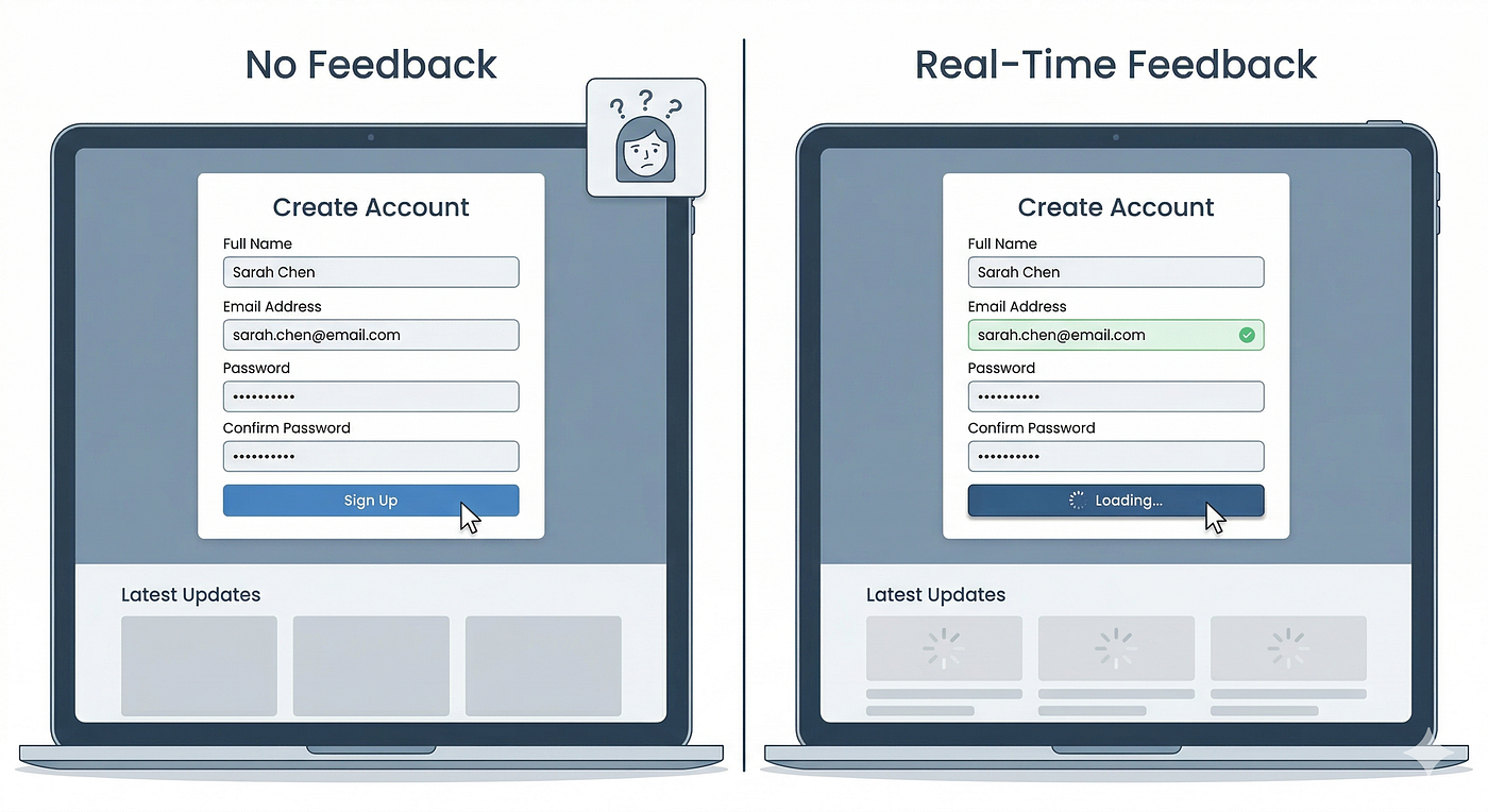
Loading State ⏳
The visual treatment of an interface element while content is being fetched. Good loading states use skeleton screens or progress indicators to communicate that something is happening.
Microinteraction ✨
A small, contained interaction that serves a single purpose: a button press animation, a like heart pulse, a form validation tick, a loading spinner.
Example: The heart animation when you like a post on Instagram.
Modal 💬
A UI element that appears on top of the current screen to display focused content or request a user action, temporarily blocking interaction with the background.
Example: A confirmation dialog asking “Are you sure you want to delete this?”
Navigation Pattern 🧭
The structural approach used to help users move through a product. Common patterns include tab bars, hamburger menus, sidebars, breadcrumbs, and bottom navigation.
Negative Space (White Space) ⬜
The empty areas between and around elements in a design. Used intentionally to improve readability, focus attention, and create a sense of refinement.
Overlay 📋
A UI element that appears on top of the existing screen content without fully replacing it. Includes modals, tooltips, dropdowns, bottom sheets, and side drawers.
Padding ↔️
The space between the content inside an element and its outer border. Not the same as margin, which is the space outside an element.
Primary Action 🥇
The most important action available on a screen. Visually emphasized with color, size, or position to direct user attention.
Example: A filled button labeled “Save Changes” next to a ghost button labeled “Cancel.”
Neumorphism 💠
A UI style that uses soft shadows and highlights on same-color backgrounds to create a subtle extruded or pressed look. Looks beautiful, but has significant accessibility issues with low contrast.
Skeleton Screen 👻
A placeholder loading state that shows the layout of content before it loads, using grey blocks where text and images will appear. Feels faster than a spinner because it shows progress.
Snackbar 🍫
A brief notification that appears at the bottom of the screen to provide lightweight feedback about an action.
Example: “Email sent” appearing briefly after hitting send.
Toast Notification 🍞
Similar to a snackbar. A small, auto-dismissing notification that provides non-critical feedback without interrupting the user’s flow.
Toggle 🔄
A UI control that switches between two states (on and off). Common in settings screens for enabling or disabling features.
Tooltip 💭
A small, contextual label that appears on hover or focus to provide additional information about a UI element.
Typography Scale 🔤
A set of predefined font sizes based on a mathematical ratio, used consistently across a design for visual harmony.
🔬 C. UX Research Terms
A/B Testing 🔀
Testing two versions of a design (A and B) with different user groups simultaneously to see which performs better on a defined metric.
Example: Showing 50% of users a blue CTA button and 50% a green CTA button, then measuring which version generates more clicks.
Affinity Diagram 🗒️
A method of organizing large amounts of qualitative research data by grouping insights into themes. Typically done with sticky notes (physical or digital).
Benchmarking 📏
Measuring a product’s performance against established standards or competitors to identify areas for improvement.
Contextual Inquiry 🏠
A research method where a researcher observes and interviews users while they work in their natural environment, rather than in a lab or testing session.
Desirability Testing 💝
Research that measures users’ emotional and aesthetic response to a design using a set of descriptive words. Used to understand brand perception and emotional impact.
Diary Study 📓
A longitudinal research method where participants document their experiences, thoughts, and behaviors over time (days or weeks) in response to a set of prompts.
Five-Second Test ⏱️
Showing a design to a participant for exactly 5 seconds, then asking what they remember or understood. Used to test first impressions, hierarchy clarity, and brand recall.
Focus Group 🗣️
A moderated discussion with a group of 5 to 8 participants exploring their attitudes, perceptions, and reactions to a product, concept, or experience.
Guerrilla Testing 🎯
Quick, informal usability testing done with whoever is available (coffee shop patrons, colleagues outside the team, friends), with minimal preparation.
Heatmap 🔥
A visual representation of where users click, move their cursor, or look on a screen, using color to show frequency. Hot (red) areas = most activity. Cool (blue) areas = least activity.
Moderated Testing 🎤
User testing where a researcher is present (in person or remote) to guide the session, ask follow-up questions, and observe the participant’s behavior in real time.
Net Promoter Score (NPS) 📊
A metric that measures user loyalty by asking “How likely are you to recommend this product to a friend?” on a 0 to 10 scale.
Qualitative Research 💬
Research that collects non-numerical data: what users say, feel, think, and do. Methods include interviews, observation, and diary studies.
Quantitative Research 🔢
Research that collects numerical data: how many, how often, what percentage. Methods include analytics, surveys, and A/B testing.
Screener 📋
A set of questions used to qualify participants before a research study to ensure they match the target user profile.
System Usability Scale (SUS) 🎯
A standardized 10-question survey used to measure perceived usability. A score above 68 is considered above average; above 80 is excellent.
Task Analysis 📌
Breaking down a complex user task into individual steps to understand what users need to do, know, and decide at each stage.
Think-Aloud Protocol 🗣️
A research method where participants verbalize their thoughts while completing a task. Reveals the reasoning behind user behavior, not just the behavior itself.
Unmoderated Testing 📱
User testing conducted without a researcher present. Participants complete tasks on their own using a testing platform. Faster and cheaper than moderated testing, but less nuanced.
Usability Testing 🧪
Observing real users completing specific tasks on a product to identify usability problems, collect qualitative feedback, and measure task success rates.
User Interview 🎙️
A one-on-one research conversation between a researcher and a participant, used to explore attitudes, motivations, mental models, and experiences.
🛠️ D. Design Process Terms
Design Brief 📄
A document that defines the goals, constraints, target audience, and success criteria for a design project before work begins.
Design Critique 💬
A structured review of design work where feedback is given based on how well the design meets defined goals, not personal preference.
Design Debt 💳
The accumulated backlog of design inconsistencies, unresolved problems, and outdated patterns that build up in a product over time when quick decisions are made without a long-term system.
Design Handoff 📤
The process of transferring finalized design files and specifications to developers for implementation. Includes annotated screens, component specs, and interaction documentation.
Design Sprint 🏃
A 5-day process (developed at Google Ventures) for rapidly prototyping and testing a solution to a specific problem. Stages: Map, Sketch, Decide, Prototype, Test.
Design System ⚙️
A complete collection of reusable components, tokens, guidelines, and documentation that teams use to build consistent digital products at scale. Includes both design files and coded components.
Discovery Phase 🔭
The early stage of a project where the team researches the problem space, user needs, and business context before any design work begins.
Double Diamond 💎
A design process model showing two phases: Discover and Define (understanding the problem) followed by Develop and Deliver (creating the solution).
Ideation 💡
The creative stage of the design process where many possible solutions are generated without judgment. The goal is quantity first, quality second.
Iteration 🔄
The process of repeatedly refining a design based on feedback and testing. Good design is never finished in one pass.
Minimum Viable Product (MVP) 🚀
The simplest version of a product that delivers enough value to test with real users and gather meaningful feedback. Not the minimum version of a product, but the minimum valuable one.
Mockup 🖥️
A static, high-fidelity visual representation of a final design. More detailed than a wireframe but less interactive than a prototype.
Prototype 🔧
An interactive model of a design used for testing and validation. Can range from low-fidelity (clickable wireframe) to high-fidelity (near-production-quality interactive demo).
Sitemap 🗺️
A visual diagram showing the structure and hierarchy of all pages or screens in a product, and how they connect to each other.
Sprint 📅
A fixed time period (usually 2 weeks) during which a team completes a defined set of design or development work.
User Flow 🔁
A diagram that shows the path a user takes through a product to complete a specific task, from entry point to completion.
Example: A user flow for sign-up: Landing Page > Sign Up Form > Email Verification > Welcome Screen > Dashboard.
Wireframe ⬛
A low-fidelity layout showing the structure and content hierarchy of a screen, without visual design elements like color, typography, or imagery.
📐 E. Accessibility and Standards
ARIA (Accessible Rich Internet Applications) ♿
A set of HTML attributes that define how content should be announced by screen readers and other assistive technologies.
Color Blindness 🎨
A condition affecting 1 in 12 men and 1 in 200 women where certain colors are difficult to distinguish. The most common type confuses red and green. Good UI never relies on color alone to communicate meaning.
Focus State 🔵
The visual indicator showing which interactive element is currently selected via keyboard navigation. Critical for accessibility and often overlooked in visual design.
Inclusive Design 🌍
Designing products that can be used by people across a spectrum of abilities, ages, languages, and circumstances. Goes beyond accessibility compliance to proactively include diverse users.
Screen Reader 🔊
Assistive technology that reads screen content aloud for users with visual impairments. Popular screen readers include VoiceOver (iOS and macOS) and TalkBack (Android).
Touch Target 👆
The tappable area of an interactive element on a touchscreen. WCAG recommends a minimum size of 44x44px to prevent mis-taps.
WCAG (Web Content Accessibility Guidelines) 📋
The international standard for web and app accessibility, published by the W3C. Levels are A (minimum), AA (standard), and AAA (enhanced). Most products aim for WCAG 2.1 AA compliance.
⚡ F. Prototyping and Interaction Terms
Animation 🎬
Movement in a UI used to communicate transitions, feedback, or state changes. Good animation is purposeful and brief. Bad animation is decorative and slow.
Component State 🔄
The different visual and functional conditions a component can be in.
Common states: Default, Hover, Focused, Active, Disabled, Loading, Error, Success.
Drag Interaction 🖱️
An interaction where the user clicks and holds an element to move it across the screen. Used in card stacks, sliders, sortable lists, and swipe mechanics.
Gesture 👋
A touch input action used to trigger interactions on touchscreen devices.
Common gestures: Tap, double-tap, swipe, pinch, long press, scroll.
Hotspot 🎯
A defined interactive area in a prototype that triggers a navigation or action when clicked or tapped.
Interaction Design (IxD) 🖥️
The design of interactive behaviors: what happens when a user clicks, taps, swipes, or types. Focused on the quality of the feedback and the feel of the interaction.
Micro-animation ✨
A small, brief animation used to provide feedback, guide attention, or communicate state change.
Example: A checkbox that bounces slightly when checked.
Scroll Animation 📜
An animation triggered by the user’s scroll position, used to reveal content, animate elements, or create parallax effects.
Smart Animate 🪄
A Figma-specific prototyping feature that automatically creates smooth transitions between matching layers across two frames, simulating real product animations.
State Machine 🔀
A model that defines all possible states an interface or component can be in and the conditions that trigger transitions between those states.
Transition ➡️
The animation that plays when a user navigates between two screens or states. Common transitions include fade, slide, push, and cover.
📏 G. Metrics and Performance
Bounce Rate 🏃
The percentage of users who leave a page without taking any action or navigating further. High bounce rate often signals a mismatch between user expectation and page content.
Churn Rate 📉
The percentage of users who stop using a product over a given time period.
DAU / MAU 📊
Daily Active Users and Monthly Active Users. Metrics that measure how many users engage with a product in a given time period. DAU/MAU ratio indicates stickiness.
Drop-off Rate 📍
The percentage of users who abandon a specific step in a flow without completing it.
Example: If 40% of users leave at the payment screen in a checkout flow, that screen has a 40% drop-off rate.
Engagement Rate 💬
A measure of how actively users interact with a product, typically expressed as interactions per session or percentage of active users completing a key action.
Funnel 🔽
A visualization of the steps users take toward a goal, showing how many users complete each step and where they drop off.
Retention Rate 🔁
The percentage of users who return to use a product after their first session, measured over a defined time period (day 1, day 7, day 30).
Session Duration ⏱️
The average amount of time a user spends in a product per visit.
Task Completion Rate ✅
The percentage of users who successfully complete a specific task in a usability test or in production analytics.
Time on Task ⏰
How long it takes a user to complete a specific task. A proxy for efficiency: shorter time usually means the design is easier to use.
Conclusion 🎓
You now have 100+ terms in your design vocabulary.
But knowing the words is only the starting point.
The goal is to use them in context: in design reviews, in conversations with developers, in your portfolio case studies, and in your own thinking about the problems you’re solving.
Every senior designer you admire once didn’t know what “affordance” meant. Now you do. 💙
메타데이터
- post_id
- e5dc26db2402
- slug
- the-complete-glossary-of-ui-ux-design-terms-every-beginner-must-know-e5dc26db2402
- url
- https://medium.com/@atnoforuiuxdesigning/the-complete-glossary-of-ui-ux-design-terms-every-beginner-must-know-e5dc26db2402
- canonical_url
- https://medium.com/@atnoforuiuxdesigning/the-complete-glossary-of-ui-ux-design-terms-every-beginner-must-know-e5dc26db2402
- author_url
- https://medium.com/@atnoforuiuxdesigning
- status
- ok
- fetched_at
- 2026-06-09 15:37:30