From Default to Publication-Ready: Transforming Matplotlib Histograms
Seven Steps From a Default Chart to Something Worth Publishing
From Default to Publication-Ready: Transforming Matplotlib Histograms
Seven Steps From a Default Chart to Something Worth Publishing
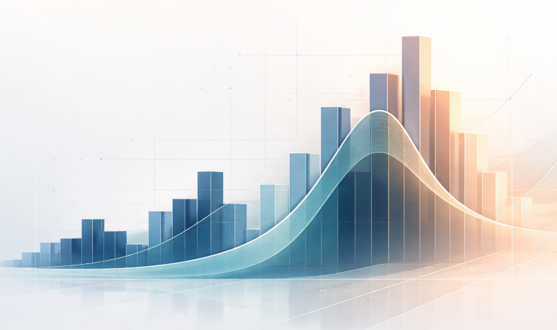
When working with matplotlib the default plots that are generated can be somewhat plain and difficult to read. **I have discussed this several times in the past**. However, with some effort and a few coding tweaks we can convert the default plots into something that is fit to be placed in a publication.
In this article we will be looking at the histogram.
A histogram can actually tell you quite a lot. It can show the overall shape of a distribution, reveal skew, hint at bimodality, help spot outliers, and make it easier to compare groups when used carefully.
The problem is that the default matplotlib version doesn’t make much of that clear. You get a set of blue bars, automatic binning, and very little else to help the reader interpret what they are looking at.
In this article, we will take a default plt.hist() chart and improve it step by step into something you would be more comfortable including in a report or publication. The example uses made-up porosity data that is a common measurement within petrophysics and geology, but the steps and techniques can equally be applied to any dataset.
The Starting Point
To keep things simple, I will use some made-up porosity data. The values are designed to look realistic enough for demonstration purposes, with a slightly right-skewed distribution similar to what you might see in subsurface data.
import matplotlib.pyplot as plt
import numpy as np

np.random.seed(42)
porosity = np.random.beta(a=2.0, b=9.5, size=1000) * 0.45

fig, ax = plt.subplots()
ax.hist(porosity)
plt.show()
Before any styling, the default histogram looks like this:

What you get is the standard matplotlib histogram: blue bars, automatic binning, no axis labels, and very little context for the reader. It is not incorrect, but it does very little to help interpret the distribution.
Step 1: Label Your Axes
This sounds obvious, but it gets skipped more often than it should, especially in exploratory notebooks. An unlabelled histogram is not much use to anyone who did not make it.
fig, ax = plt.subplots(figsize=(8, 5))
ax.hist(porosity)
ax.set_xlabel('Porosity (fraction)', fontsize=12)
ax.set_ylabel('Count', fontsize=12)
ax.set_title('Porosity Distribution', fontsize=14)
plt.show()
This is a small change, but it immediately makes the chart easier to interpret. The reader can now see what is being plotted, what the bar heights represent, and what the figure is about.
Step 2: Choose Your Bin Count Deliberately
The number of bins has a big effect on how a histogram reads, so it is worth choosing it deliberately rather than leaving it entirely to the default behaviour.
There is no single correct answer.
Fewer bins emphasise the overall shape. More bins reveal more local variation, which might be useful structure or might just be noise. Too many bins and the histogram becomes very difficult to interpret. For many distributions, somewhere between 20 and 50 bins is often a reasonable place to start.
Working out the right number of bins may take some trial and error.
fig, ax = plt.subplots(figsize=(8, 5))
ax.hist(porosity, bins=40, color='steelblue', edgecolor='white', linewidth=0.5)
ax.set_xlabel('Porosity (fraction)', fontsize=12)
ax.set_ylabel('Count', fontsize=12)
ax.set_title('Porosity Distribution', fontsize=14)
plt.show()
The edgecolor='white' with a thin linewidth separates adjacent bars cleanly, which makes it much easier to read the boundaries between bins, especially where counts are similar.
Step 3: Add a KDE Overlay
A KDE (kernel density estimate) curve over the histogram can make the overall distribution shape easier to follow without getting too distracted by the individual bins. It is especially useful for seeing whether a distribution is broadly unimodal, bimodal, or slightly skewed in one direction.
To overlay a KDE on the histogram properly, the histogram needs to be normalised to density so that both sit on the same vertical scale.
import matplotlib.pyplot as plt
import numpy as np
from scipy.stats import gaussian_kde

fig, ax = plt.subplots(figsize=(8, 5))
ax.hist(
    porosity,
    bins=40,
    color='steelblue',
    edgecolor='white',
    linewidth=0.5,
    density=True,
    alpha=0.7
)

kde = gaussian_kde(porosity)
x_range = np.linspace(porosity.min(), porosity.max(), 300)
ax.plot(x_range, kde(x_range), color='#1a3a5c', linewidth=2)

ax.set_xlabel('Porosity (fraction)', fontsize=12)
ax.set_ylabel('Density', fontsize=12)
ax.set_title('Porosity Distribution', fontsize=14)
plt.show()
Switching to density=True changes the y-axis from count to density, so the axis label needs to change as well. That is a small detail, but an important one.

The KDE is useful as a visual guide, but it is still a smoothed estimate rather than the raw distribution itself. It helps show the overall shape, but it should not be treated as more “true” than the histogram underneath it.
A KDE curve on a single histogram is useful. When you need to compare distributions across several formations at once, stacking them as a ridgeline plot often gives a cleaner read. I’ve written about that approach on Medium. Link at the end.
Step 4: Annotate Key Statistics
The mean and median usually sit invisibly inside a histogram. Adding vertical lines for both can give the reader a couple of useful reference points straight away, especially when the distribution is skewed and the two values do not sit in the same place.
fig, ax = plt.subplots(figsize=(8, 5))
ax.hist(porosity, bins=40, color='steelblue', edgecolor='white',
        linewidth=0.5, density=True, alpha=0.7)

kde = gaussian_kde(porosity)
x_range = np.linspace(porosity.min(), porosity.max(), 300)
ax.plot(x_range, kde(x_range), color='#1a3a5c', linewidth=2)

mean_val = porosity.mean()
median_val = np.median(porosity)

ax.axvline(mean_val, color='#e63946', linewidth=1.8, linestyle='--',
           label=f'Mean: {mean_val:.3f}')
ax.axvline(median_val, color='#6a1b9a', linewidth=2.0, linestyle='-.',
           label=f'Median: {median_val:.3f}')

ax.legend(fontsize=11)
ax.set_xlabel('Porosity (fraction)', fontsize=12)
ax.set_ylabel('Density', fontsize=12)
ax.set_title('Porosity Distribution', fontsize=14)
plt.show()
For porosity data, knowing the mean and median in the same glance as the distribution shape is practically useful. If the distribution is right-skewed, as porosity data often is, the mean will sit noticeably to the right of the median.
Step 5: Clean Up the Visual Noise
When creating figures for publication it is often worth reducing unnecessary “chart junk”. These are elements of the chart that are not always needed. In this case we can remove the top and right spines to help reduce this clutter and keep the reader’s focus firmly on the data.
fig, ax = plt.subplots(figsize=(8, 5))
ax.hist(porosity, bins=40, color='steelblue', edgecolor='white',
        linewidth=0.5, density=True, alpha=0.7)

kde = gaussian_kde(porosity)
x_range = np.linspace(porosity.min(), porosity.max(), 300)
ax.plot(x_range, kde(x_range), color='#1a3a5c', linewidth=2)

mean_val = porosity.mean()
median_val = np.median(porosity)

ax.axvline(mean_val, color='#e63946', linewidth=1.8, linestyle='--',
           label=f'Mean: {mean_val:.3f}')
ax.axvline(median_val, color='#6a1b9a', linewidth=2.0, linestyle='-.',
           label=f'Median: {median_val:.3f}')

ax.spines['top'].set_visible(False)
ax.spines['right'].set_visible(False)
ax.tick_params(labelsize=11)
ax.legend(fontsize=11)

ax.set_xlabel('Porosity (fraction)', fontsize=12)
ax.set_ylabel('Density', fontsize=12)
ax.set_title('Porosity Distribution', fontsize=14)
plt.show()
This is a small change, but it shifts the visual weight onto the data rather than the frame around it.
Step 6: Add a Sample Count Annotation
One thing a histogram rarely includes is the number of observations behind it. For petrophysical data, where sample counts vary substantially depending on the well and the interval being examined, this matters. A smooth-looking distribution built on 40 samples tells a different story than one built on 4,000.
ax.annotate(f'n = {len(porosity):,}',
            xy=(0.97, 0.95), xycoords='axes fraction',
            ha='right', va='top', fontsize=11,
            color='#555555')
Drop this in before plt.show().It’s a small detail, but it gives the reader a better sense of how much data the histogram represents.

Step 7: Final Polish
A few final changes can help bring everything together: a softer background to reduce contrast slightly, consistent font sizing across the figure, and a more informative title than the generic “Porosity Distribution”.
These are more general styling choices and come down to preference. For example, you may not want to change the background colour, especially if the figure is going into a journal article.
fig, ax = plt.subplots(figsize=(8, 5))
fig.patch.set_facecolor('#fafafa')
ax.set_facecolor('#fafafa')

ax.hist(porosity, bins=40, color='steelblue', edgecolor='white',
        linewidth=0.5, density=True, alpha=0.7)

kde = gaussian_kde(porosity)
x_range = np.linspace(porosity.min(), porosity.max(), 300)
ax.plot(x_range, kde(x_range), color='#1a3a5c', linewidth=2)

mean_val = porosity.mean()
median_val = np.median(porosity)

ax.axvline(mean_val, color='#e63946', linewidth=1.8, linestyle='--',
           label=f'Mean: {mean_val:.3f}')
ax.axvline(median_val, color='#6a1b9a', linewidth=2.0, linestyle='-.',
           label=f'Median: {median_val:.3f}')

ax.spines['top'].set_visible(False)
ax.spines['right'].set_visible(False)
ax.tick_params(labelsize=11)
ax.legend(fontsize=11, framealpha=0.5)

ax.annotate(f'n = {len(porosity):,}',
            xy=(0.97, 0.95), xycoords='axes fraction',
            ha='right', va='top', fontsize=11, color='#555555')

ax.set_xlabel('Porosity (fraction)', fontsize=12)
ax.set_ylabel('Density', fontsize=12)
ax.set_title('Histogram of Simulated Porosity Values', fontsize=14)

plt.tight_layout()
plt.savefig('porosity_histogram.png', dpi=300, bbox_inches='tight')
plt.show()
What Changed and Why It Matters
The final chart and the starting point contain exactly the same data. What changed is how much of that data is actually readable. A reader can now see the overall distribution shape, the central tendency, whether the mean and median diverge, and how many samples sit behind the histogram, all without any extra explanation.
Most of these improvements took only a few lines of code. None of them required anything especially advanced. The histogram was always capable of showing this information. The default settings just did not do much to bring it forward.
A histogram works well when you’re looking at one distribution at a time. When you need to compare porosity across several formations simultaneously, the overlapping bars and separate panels start to get in the way. In a separate article I look at ridgeline plots, which stack KDE curves vertically so every formation shares the same x-axis and differences in shape, skew, and spread are visible in a single glance.
-> Ridgeline Plots in Matplotlib: An Underused Way to Compare Distributions
메타데이터
- post_id
- e654c87aa50f
- slug
- from-default-to-publication-ready-transforming-matplotlib-histograms-e654c87aa50f
- url
- https://medium.com/data-science-collective/from-default-to-publication-ready-transforming-matplotlib-histograms-e654c87aa50f
- canonical_url
- https://medium.com/data-science-collective/from-default-to-publication-ready-transforming-matplotlib-histograms-e654c87aa50f
- author_url
- https://medium.com/@andymcdonaldgeo
- status
- ok
- fetched_at
- 2026-06-09 14:34:10