Claude vs The Calorie Tracker
Back in 2023 I decided to get fit. It began with a gym membership in March that year. By August I realised the importance of nutrition…
Claude vs The Calorie Tracker
Back in 2023 I decided to get fit. It began with a gym membership in March that year. By August I realised the importance of nutrition. Going to the gym without watching what you eat is a bit like painting a fence in the rain.
I was already tracking my gym progress with a Google sheet. I added a new sheet to track macros (protein, fats, carbs), calories, and body weight. I have counted everything I’ve eaten every day of my life since then. In March 2024 I bought a body fat scale, and started tracking those numbers too.
In 2024 I did some AI Model Training work. In summer 2025 I started learning Data Analysis — R, SQL, Python. A natural progression from my Google sheets. Last night I thought it might be fun to see what **Claude** could do. I fed Claude my fitness data in a csv and asked for some visualisation ideas. We decided to use Python. Here’s what happened:
Animated Weekly Calorie Tracker
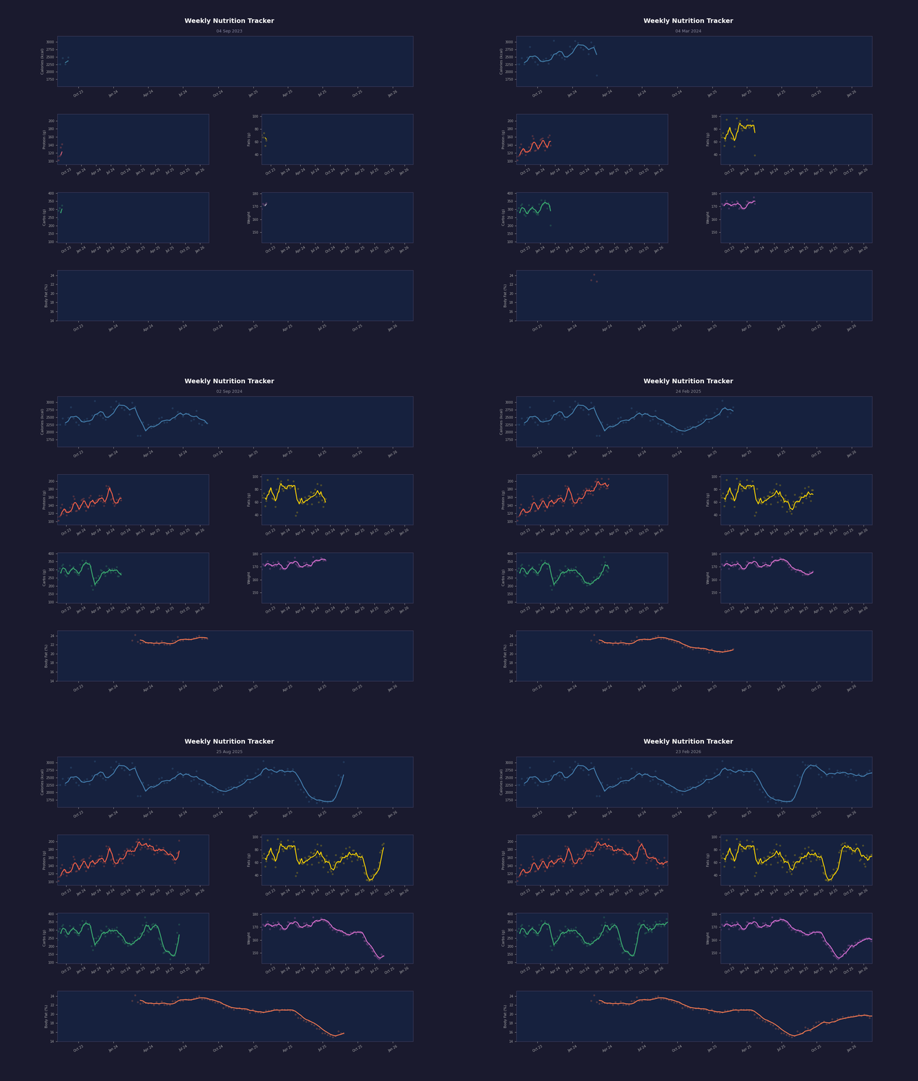
This entire viz took maybe 10 mins to create, from initial prompt to final output. I have gif and **mp4** versions of this.
You can clearly see the dedicated 3-month cut phase I went through in summer 2025 to shave off some body fat — and the inevitable “bounce back hump” right after.
You can see a smaller cut I undertook in April 2024 ahead of a month-long overseas job where I knew I would be eating a lot of awesome food on company expenses.
You can see how my protein level remained high during the cuts (as it should).
And you can see exactly when I bought my body fat scale.
If you’re a fitness obsessive or you work as a nutritionist or PT you probably already have something like this is place for yourself or your clients. If you don’t, it’s easy to make. I’ll go into detail and include the code below, but first here’s a couple of similar things I was able to make with Claude.
This cool calorie calendar heatmap:

Daily Calorie Intake as a Heatmap Calendar
You can see the cuts again, but also a broader trend of heavier calorie intake throughout winter months — most likely because winter foods tend to be fat-heavy.
And here’s a static line-chart showing daily macro intake with a 30-day rolling average. The faint dots in the background show the individual days, the thick line is the rolling average to smooth out the noise:

Daily Macro Line Chart with 30-Day Rolling Average
I also made a couple of other charts that didn’t turn out to be very useful, and the whole lot took less than an hour from start to end. There’s a lot of “AI = Bad” sentiment floating around at the moment, but it’s good to remember that AI is just a tool, and tools are good.
Here’s the code (full copyable block at the end) and some detailed explanations for the animated chart in case you’d like to build one yourself:
ANIMATED NUTRITION CHART BREAKDOWN
You’ll need pandas, matplotlib and pillow installed, so run:
pip install pandas matplotlib pillowIf pip isn’t recognised, try:
python -m pip install pandas matplotlib pillowFor your data, you’ll need to export your sheet as a csv. My csv data includes averaged figures for each week, one week per row. My columns are: Date, Protein, Fats, Sat Fats, Carbs, Sugars, Calories, Weight, Body Fat.
My date format is yy.mm.dd, and I like to separate the saturated fats from the overall fats and the sugars from the carbs in my data. These totals are recombined within the code below since the overall figures are all I need for this chart. If your data doesn’t split your macros up in this way, you can modify the code accordingly.
The first part of the code sets the environment up:
import pandas as pd
import matplotlib.pyplot as plt
import matplotlib.animation as animation
from matplotlib.gridspec import GridSpec
The next part reads in the data. My csv was called FOT.csv:
df = pd.read_csv('/kaggle/input/datasets/maxwellhicks/weekly-nutrition/FOT.csv', parse_dates=['Date'], dayfirst=False, date_format='%y.%m.%d')
df = df.sort_values('Date').reset_index(drop=True)
And this part recombines the split fats and carbs totals:
df['Fats'] = df['Fats'] + df['Sat Fats']
df['Carbs'] = df['Carbs'] + df['Sugars']
Now the juicy stuff starts happening
WINDOW = 4

cols_to_animate = ['Calories', 'Protein', 'Fats', 'Carbs']
for col in cols_to_animate:
    df[f'{col}_roll'] = df[col].rolling(window=WINDOW).mean()

df['Weight_roll'] = df['Weight'].rolling(window=WINDOW).mean()
df['Body Fat_roll'] = df['Body Fat'].rolling(window=WINDOW).mean()
“WINDOW = 4” sets a variable. We’re using weekly data so a window of 4 means “look at the last 4 rows”, which equates to roughly one month of data.
The “cols_to_animate” line is a list of the column names we want to process. Storing them in a list means we can handle all four in one go rather than writing the same line four times.
The “for col in cols_to_animate:” line and the line right after it is a “for loop”. This loops through each of the four column names in turn. For each one it creates a brand new column in the dataframe. The “f’{col}_roll’” part is an f-string — it just slots the column name into the string, so you end up with new columns called Calories_roll, Protein_roll, and so on.
The “.rolling(window=WINDOW).mean()” is the key bit — for each row it looks back at the current row and the 3 rows before it (because WINDOW = 4, remember?), and calculates the average of those 4 values. This smooths out day-to-day spikes and makes the underlying trend easier to see.
The last two lines do exactly the same thing as the loop, just written out individually. Weight and Body Fat were left out of the loop because they’re not in the “cols_to_animate” list — they’re handled separately since I am most interested in the weight and body fat figures in this chart (they’ll eventually have bigger display boxes too). It’s slightly repetitive and could have been folded into the loop, but it feels clearer like this.
The next part sets up the “figure” (like a blank canvas) for the plot elements to fit into:
fig = plt.figure(figsize=(14, 11))
fig.patch.set_facecolor('#1a1a2e')
gs = GridSpec(4, 2, figure=fig, hspace=0.55, wspace=0.35)
fig.subplots_adjust(top=0.88)
fig.suptitle('Weekly Nutrition Tracker', color='white', fontsize=14, fontweight='bold', y=0.95)

ax_cal    = fig.add_subplot(gs[0, :])
ax_prot   = fig.add_subplot(gs[1, 0])
ax_fats   = fig.add_subplot(gs[1, 1])
ax_carbs  = fig.add_subplot(gs[2, 0])
ax_weight = fig.add_subplot(gs[2, 1])
ax_bf     = fig.add_subplot(gs[3, :])

axes        = [ax_cal, ax_prot, ax_fats, ax_carbs, ax_weight, ax_bf]
roll_cols   = ['Calories_roll', 'Protein_roll', 'Fats_roll', 'Carbs_roll', 'Weight_roll', 'Body Fat_roll']
raw_cols    = ['Calories',      'Protein',      'Fats',      'Carbs',      'Weight',      'Body Fat']
labels      = ['Calories (kcal)', 'Protein (g)', 'Fats (g)', 'Carbs (g)', 'Weight', 'Body Fat (%)']
plot_colours = ['steelblue', 'tomato', 'gold', 'mediumseagreen', 'orchid', 'coral']
The first line creates the “blank canvas”, in this case an area of 14 inches by 11 inches. The next line sets the colour for the background, using a hex code (#1a1a2e). The third line makes an invisible grid of 4 rows and 2 columns. “hspace” controls the size of vertical gaps and “wspace” controls the size of horizontal gaps, using fractions. The “fig…” lines create space for a chart title, and render the title.
The next section with 6 lines beginning with “ax” places the 6 chart panels into the grid — one for each category (Protein, Carbs, etc). The “(gs[1, 0])” part specifies which cell in the grid to use, in this case row 1, column 0. The “:” symbol means “span all columns”, which is allows the weight and body fat graphs to be wider.
The “axes” line collects the six panels into a list we can use to loop through later, and the following lines assign things like labels and colours to each panel — the first panel in the axes list gets associated with the 1st listed attribute in all the other lists, the 2nd gets the 2nd, and so on (so ax_cal, Calories_roll, Calories, Calories (kcal), steelblue all belong to the same property, list item number 1).
The next section sets up a few more important cosmetic elements:
for ax in axes:
    ax.set_facecolor('#16213e')
    ax.tick_params(colors='#aaaaaa', labelsize=7)
    ax.xaxis.label.set_color('#aaaaaa')
    ax.yaxis.label.set_color('#aaaaaa')
    for spine in ax.spines.values():
        spine.set_edgecolor('#444466')

date_min = df['Date'].min()
date_max = df['Date'].max()

def get_ylim(col, pad=0.1):
    mn = df[col].min(skipna=True)
    mx = df[col].max(skipna=True)
    rng = mx - mn
    return mn - rng * pad, mx + rng * pad

ylims = [get_ylim(c) for c in raw_cols]
For “for ax in axes” loop loops through every panel and applies the same styling to each one (label colours, tick mark colours, label sizes, panel outlines (called spines) etc). The same function wil appear in the animation section later because the code redraws every panel from scratch. This block just sets things up for the first frame.
The two “date” lines establish the earliest and latest dates in the data and stores them as variables. It’s used to fix the x-axis so it stays consistent across every frame. Without it, the x-axis would rescale as new data appeared which would not look good.
The “def get_ylim” section does something similar with the y-axis. It finds the minimum and maximum values, and then adds 10% breathing room on either side (“pad=0.1”) so it looks nice. The “skipna=True” ignores any blank cells, which exist in the data because the Body Fat figures started later than the rest.
The last line is neat. It’s a list comprehension, which is a way of building one list by using another list. This line goes through each column in the “raw_cols” list and grabs two numbers from each (the min and max y-axis values).
Next is the animation section:
def animate(i):
    frame = df.iloc[:i+1]

    for ax, rcol, rawcol, label, colour, ylim in zip(axes, roll_cols, raw_cols, labels, plot_colours, ylims):
        ax.clear()
        ax.set_facecolor('#16213e')
        ax.tick_params(colors='#aaaaaa', labelsize=7)
        for spine in ax.spines.values():
            spine.set_edgecolor('#444466')

        ax.scatter(frame['Date'], frame[rawcol], color=colour, alpha=0.2, s=10, zorder=1)
        ax.plot(frame['Date'], frame[rcol], color=colour, linewidth=1.8, zorder=2)

        ax.set_xlim(date_min, date_max)
        ax.set_ylim(ylim)
        ax.set_ylabel(label, color='#aaaaaa', fontsize=8)
        ax.xaxis.set_major_formatter(plt.matplotlib.dates.DateFormatter('%b %y'))
        ax.tick_params(axis='x', rotation=30)

    current_date = df['Date'].iloc[i].strftime('%d %b %Y')
    fig.texts[1:] = []
    fig.text(0.5, 0.91, current_date, ha='center', color='#8888aa', fontsize=9)
The “def animate(i)” defines a function that accepts a single number i. When the animation runs it calls this function repeatedly, passing in an incrementing number each time (0, 1, 2, 3, and so on) up to the number of rows in the data. Each call produces one frame of the animation.
The “frame = df.iloc[:i+1]” part is what creates the “drawing” effect. “iloc[:i+1]” means “give me all the rows from the start up to and including row i”. So on frame 0 you get 1 row, on frame 1 you get 2 rows, on frame 50 you get 51 rows, and so on. Each frame has one more week of data than the last, which is why the chart “grows” from left to right.
The “for ax…” line is where all those parallel lists from earlier pay off. “zip” stitches them together so that on each iteration you get one item from each list simultaneously: one panel, its rolling column name, its raw column name, its label, its colour, and its y axis range, all perfectly matched up. This lets us draw all six panels in one loop rather than writing the same block of code six times.
The “ax.clear()” line wipes the panel completely blank before redrawing it. This is necessary because each frame needs to show a slightly longer line than the last. Without clearing it first, each frame would just draw on top of the previous one and you’d end up with a mess.
The next four lines reapply the styling because the “ax.clear()” part wiped everything.
The “ax.scatter” and “ax.plot” lines draw the data. “scatter” plots each individual value as a faint dot. “alpha=0.2” makes them 80% transparent and “s=10” makes them small. “plot” draws the rolling average as a solid line. The “zorder” values control layering: 2 sits on top of 1, so the rolling average line always appears in front of the scatter dots.
The next two lines (with zx.set_xlim / y_lim) fix the axis ranges to the values we calculated earlier. Without these, matplotlib would automatically rescale the axes on every frame to fit whatever data is currently visible, which would make everything jump around rather than show the line smoothly growing across a stable chart.
The next three lines reapply the y axis label, format the x axis dates as “Aug 23” style strings, and rotate the x axis labels 30 degrees so they don’t overlap, all of which also get wiped by “ax.clear()” and need reapplying each frame.
The final three lines of this section update the incrementing date which is shown at the top of the charts. “iloc[i]” gets the current row’s date, and “.strftime(‘%d %b %Y’)” formats it as something readable like “14 Aug 2023”. “fig.texts.clear()” wipes any previously written date, otherwise the date from every previous frame would stack up on top of one another. Then the current date is rewritten fresh. This happens outside the inner loop because it only needs to be done once per frame, not once per panel.
The final section produces the output files:
SKIP = 1
frames = range(WINDOW, len(df), SKIP)

ani = animation.FuncAnimation(fig, animate, frames=frames, interval=80)

print("Saving animation... this may take a minute.")
ani.save('Nutrition History.gif', writer='pillow', fps=15)
ani.save('Nutrition History.mp4', writer='ffmpeg', fps=15)
print("Done! Saved as Nutrition History")
“SKIP = 1” controls how many rows to advance between each frame. With “SKIP = 1” every single week gets its own frame. If you changed it to 2 you’d skip every other week, making the animation twice as fast and the file half the size. It’s a handy dial to turn if you want to adjust the pacing without changing the fps.
The “frames = range(WINDOW, len(df), SKIP)” part builds the sequence of i values that get passed into “animate(i)” one by one. It starts at WINDOW (which we set to 4) rather than 0 because the first four rows don’t have enough preceding data to calculate a rolling average yet — starting there avoids a blank or misleading opening. It ends at “len(df)” which is just the total number of rows, and steps forward by “SKIP” each time.
The “ani = …” line assembles the animation. It takes the figure, the animate function, and the list of frame numbers, and wires them together. “interval=80” sets the delay between frames in milliseconds when previewing the animation in an interactive window. It doesn’t affect the exported file speed, which is controlled by fps instead.
The two “ani.save…” lines render the actual files. Each one runs through every frame in the sequence, calls “animate(i)” to draw it, captures the result, and stitches all the frames together into the output file. “fps=15” means 15 frames per second in the final file. 135 rows of data and “SKIP = 1” equals about 9 seconds of animation. The two lines produce both a GIF and an MP4 from the same animation. If you only need one, delete or comment out the other.
The “print” lines provide feedback in the terminal so you know the script is running and when it has finished. Since the rendering can take a minute or two, it’s reassuring to see confirmation rather than staring at a frozen cursor wondering if something has gone wrong.
And that’s that. Here’s the full code in one block:
ANIMATED NUTRITION CHART FULL CODE
import pandas as pd
import matplotlib.pyplot as plt
import matplotlib.animation as animation
from matplotlib.gridspec import GridSpec

# --- Load & clean data ---
df = pd.read_csv('YOURDATA.csv', parse_dates=['Date'], dayfirst=False, date_format='%y.%m.%d')
df = df.sort_values('Date').reset_index(drop=True)

# Recombine split macros into totals
df['Fats'] = df['Fats'] + df['Sat Fats']
df['Carbs'] = df['Carbs'] + df['Sugars']

# Rolling average window (in weeks — 4 = ~1 month)
WINDOW = 4

cols_to_animate = ['Calories', 'Protein', 'Fats', 'Carbs']
for col in cols_to_animate:
    df[f'{col}_roll'] = df[col].rolling(window=WINDOW).mean()

df['Weight_roll'] = df['Weight'].rolling(window=WINDOW).mean()
df['Body Fat_roll'] = df['Body Fat'].rolling(window=WINDOW).mean()

# --- Set up figure ---
fig = plt.figure(figsize=(14, 11))
fig.patch.set_facecolor('#1a1a2e')
gs = GridSpec(4, 2, figure=fig, top=0.90, hspace=0.55, wspace=0.35)
fig.subplots_adjust(top=0.88)
fig.suptitle('Weekly Nutrition Tracker', color='white', fontsize=14, fontweight='bold', y=0.95)

ax_cal    = fig.add_subplot(gs[0, :])
ax_prot   = fig.add_subplot(gs[1, 0])
ax_fats   = fig.add_subplot(gs[1, 1])
ax_carbs  = fig.add_subplot(gs[2, 0])
ax_weight = fig.add_subplot(gs[2, 1])
ax_bf     = fig.add_subplot(gs[3, :])

axes        = [ax_cal, ax_prot, ax_fats, ax_carbs, ax_weight, ax_bf]
roll_cols   = ['Calories_roll', 'Protein_roll', 'Fats_roll', 'Carbs_roll', 'Weight_roll', 'Body Fat_roll']
raw_cols    = ['Calories',      'Protein',      'Fats',      'Carbs',      'Weight',      'Body Fat']
labels      = ['Calories (kcal)', 'Protein (g)', 'Fats (g)', 'Carbs (g)', 'Weight', 'Body Fat (%)']
plot_colours = ['steelblue', 'tomato', 'gold', 'mediumseagreen', 'orchid', 'coral']

for ax in axes:
    ax.set_facecolor('#16213e')
    ax.tick_params(colors='#aaaaaa', labelsize=7)
    ax.xaxis.label.set_color('#aaaaaa')
    ax.yaxis.label.set_color('#aaaaaa')
    for spine in ax.spines.values():
        spine.set_edgecolor('#444466')

date_min = df['Date'].min()
date_max = df['Date'].max()

def get_ylim(col, pad=0.1):
    mn = df[col].min(skipna=True)
    mx = df[col].max(skipna=True)
    rng = mx - mn
    return mn - rng * pad, mx + rng * pad

ylims = [get_ylim(c) for c in raw_cols]

def animate(i):
    frame = df.iloc[:i+1]

    for ax, rcol, rawcol, label, colour, ylim in zip(axes, roll_cols, raw_cols, labels, plot_colours, ylims):
        ax.clear()
        ax.set_facecolor('#16213e')
        ax.tick_params(colors='#aaaaaa', labelsize=7)
        for spine in ax.spines.values():
            spine.set_edgecolor('#444466')

        ax.scatter(frame['Date'], frame[rawcol], color=colour, alpha=0.2, s=10, zorder=1)
        ax.plot(frame['Date'], frame[rcol], color=colour, linewidth=1.8, zorder=2)

        ax.set_xlim(date_min, date_max)
        ax.set_ylim(ylim)
        ax.set_ylabel(label, color='#aaaaaa', fontsize=8)
        ax.xaxis.set_major_formatter(plt.matplotlib.dates.DateFormatter('%b %y'))
        ax.tick_params(axis='x', rotation=30)

    current_date = df['Date'].iloc[i].strftime('%d %b %Y')
    fig.texts[1:] = []
    # fig.suptitle('Weekly Nutrition Tracker', color='white', fontsize=14, fontweight='bold', y=0.95)
    fig.text(0.5, 0.91, current_date, ha='center', color='#8888aa', fontsize=9)

# --- Render ---
SKIP = 1
frames = range(WINDOW, len(df), SKIP)

ani = animation.FuncAnimation(fig, animate, frames=frames, interval=80)

print("Saving animation... this may take a minute.")
# ani.save('Nutrition History.gif', writer='pillow', fps=15)
# ani.save('Nutrition History.mp4', writer='ffmpeg', fps=15)
print("Done! Saved as Nutrition History")
메타데이터
- post_id
- e6c9394eaeab
- slug
- claude-vs-the-calorie-tracker-e6c9394eaeab
- url
- https://medium.com/@maxhicks/claude-vs-the-calorie-tracker-e6c9394eaeab
- canonical_url
- https://medium.com/@maxhicks/claude-vs-the-calorie-tracker-e6c9394eaeab
- author_url
- https://medium.com/@maxhicks
- status
- ok
- fetched_at
- 2026-06-23 03:48:11