When Pain Points in Service Design Hold Users Hostage
A critique of the service design of the Línea Urquiza, a suburban train line connecting the City of Buenos Aires with its surrounding…
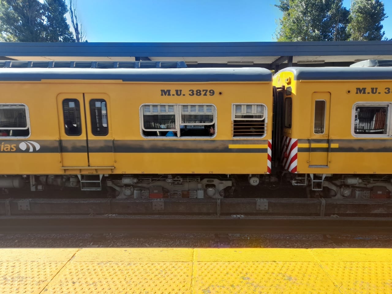
A nostalgic aesthetic that masks a system built on constraint. From the outside, a vintage postcard; from the inside, the reality of the captive user.
When Pain Points in Service Design Hold Users Hostage
A critique of the service design of the Línea Urquiza, a suburban train line connecting the City of Buenos Aires with its surrounding province in Argentina, in 2026.
Since the pandemic began in 2020, my professional lifestyle changed radically. I started working remotely and continue to do so today. This shift was a relief: for years, public transportation had been my primary means of commuting, and I had learned to live with systematic service design failures, across both public and private operators, particularly in rail transportation.
These deficiencies, which directly impact the user experience, are rarely identified or addressed. Not due to lack of awareness, but, so I suspect, because improving the service has never been a real priority for the companies responsible.
Today, I use public transportation mainly to travel to my personal and creative activities after work. Among them, the Urquiza line. I make this distinction intentionally: commuting to a hobby is not the same as commuting daily to work, as most passengers do. And it is precisely from this contrast that this article emerges.
As a UX designer, I am used to identifying pain points, analyzing them, and working collaboratively to resolve them. In this case, however, I am also a user. An inevitably biased one — but a user nonetheless. And by experiencing this service from the inside, I was able to identify pain points shared by the majority of passengers. Pain points that are not just inconvenient, but indefensible from a service design perspective.
Identified Pain Points
Aesthetically appealing infrastructure, functionally obsolete
From a nostalgic point of view, the train cars may appear charming. The 1970s design remains intact: green upholstered seats, manually operated vertical windows, and wood-like wall paneling. It feels like a sepia-toned postcard from another era.

The Infrastructure Paradox: 21st-century personal technology trapped in a 1970s service design. High-speed connectivity meets structural obsolescence, forcing the user to adapt to a system that refused to evolve.
For the occasional tourist, this aesthetic may be appealing. For the frequent passenger, it is a burden.

Manual exhaust fans: The only active resource in a system without air conditioning. Ineffective under extreme heat, forcing users to rely on manually operated windows as a structural constant.
None of the cars have air conditioning. The ventilation system is inadequate and directly conflicts with the roof materials, which absorb heat under the sun. The outcome is predictable: heat accumulation, extreme humidity, and a physically uncomfortable, exhausting experience. During the summer, I have consistently sweated inside these cars. This is not an exception — it is a structural condition of the service.
The problem here is not aesthetic. It is functional. The design has failed to evolve in response to climate conditions and real user needs.
Lack of visibility and predictability at intermediate stations
Unlike terminal stations, intermediate stations do not provide screens displaying real-time arrival information.

Zero predictability: The absence of real-time countdown displays forces users to monitor the horizon for incoming trains. A service design failure that replaces control with uncertainty.
At the station where I usually get off, there is no system indicating the status of incoming trains. The only reference is a digital clock, which is clearly insufficient. Waiting becomes an exercise in uncertainty: staring into the distance and trying to guess whether a train is approaching.
On other train lines and in the subway system, countdown displays play a crucial role: they reduce anxiety, restore a sense of control, and allow users to manage their waiting time. Their absence here is not a minor oversight. It is a serious service design failure that removes predictability and turns waiting into a passive, frustrating experience.
The Normalization of Poor Service
Each time I used this service and encountered these pain points, I took mental notes from my role as a UX designer, not as an external observer, but as someone embedded in the system.
The day I became a UX designer was the day I visually understood the difference between a dirt road and a paved one.
Today, when analyzing this service, I see the same pattern. But I no longer interpret it as an isolated design flaw. What emerges instead is a common denominator shared by all user profiles within this system: the captive user.
The captive user doesn’t choose. They tolerate. They adapt. They lower their expectations.
When this happens consistently, poor service stops being perceived as an anomaly and becomes the norm.
Transfers as Reinforcement of a Systemic Problem
The only subway line that connects with this train is the Línea B in the City of Buenos Aires. And rather than improving the experience, this transfer reinforces the same pattern of deficient service design.
The Line B cars, like the train, are rooted in a 1970s design: aged upholstery, visibly poor cleanliness of seats and floors, wood-like wall finishes and manually operated vertical windows. Added to this are inadequate ventilation and the complete absence of air conditioning. When I mention the windows and how to open and close them, I’m also talking about passenger safety. Any passenger could fall out of a window and land next to the tracks.
The user does not transition into a better-designed system. They remain trapped within the same ecosystem of shortcomings, just in a different format.
When Discomfort Becomes Part of the System
At this point, the problem is no longer aesthetic, technical, or budgetary. We are facing a clear pattern of normalized poor service. A design that does not fail, it works exactly as it was conceived.
A design that assumes the user:
- Has no real alternative
- Cannot leave the system
- Will not be heard (after repeated complaints were dismissed or minimized)
- Will learn to endure
A deliberate design decision
From a service design perspective, this is not an innocent omission. It is a deliberate decision made by transportation companies and by city and national transportation authorities.
Nothing described here happens by chance. The persistence of poor service, the repetition of the same shortcomings, and the total absence of evolution all point to a structural choice: designing for those who have no alternative.
The logic of the captive user
The captive user does not complain because they have learned it is useless. The system knows this, and relies on that silence.
Silence, in this context, is not a sign of acceptance. It is the expected outcome of a system designed around constraint rather than choice.
Design cannot be evaluated from a distance
If those responsible for designing and operating this service were daily users themselves, urgent change would not be a discussion, it would be a demand.
The conditions described throughout this article strongly suggest that no meaningful evaluation has been conducted from the user’s lived experience.
This is not the kind of service that can be assessed from an office. It must be tested in motion, in context, and under real conditions. Many of its failures become immediately evident after a single journey, especially during peak hours.
When service design is done at a distance, without inhabiting the system it governs, blind spots stop being accidental and become structural.

Manually operated doors that fail to close, breaking the cabin’s isolation and safety. A design that no longer fulfills its basic function.
The ethical consequence
When design is used to manage discomfort instead of eliminating it, it ceases to be a tool for improvement and becomes a mechanism of control.
And that, in any discipline, should trigger an ethical alarm.
메타데이터
- post_id
- e793f875d4a7
- slug
- when-pain-points-in-service-design-hold-users-hostage-e793f875d4a7
- url
- https://medium.com/@ticianapaura/when-pain-points-in-service-design-hold-users-hostage-e793f875d4a7
- canonical_url
- https://medium.com/@ticianapaura/when-pain-points-in-service-design-hold-users-hostage-e793f875d4a7
- author_url
- https://medium.com/@ticianapaura
- status
- ok
- fetched_at
- 2026-07-24 12:20:12