Biomedical Image Analysis Part 2 — Exploring Image Intensities with Histograms, CDF Normalization…
Hi everyone! In this second part of the series Biomedical Image Analysis, we’ll learn about interpreting histograms that display pixel…
Biomedical Image Analysis Part 2 — Exploring Image Intensities with Histograms, CDF Normalization, and Mask Creation
Hi everyone! In this second part of the series Biomedical Image Analysis, we’ll learn about interpreting histograms that display pixel values of an image, normalizing these images using the Cumulative Distribution Function (CDF), and creating masks automatically 👩💻🤩.
While automatic masks can be useful in certain cases, keep in mind that due to noisy data in real-life scenarios, manual segmentation and annotation are often required for more precise masks 😢.
However, if automatic segmentation provides accurate results, it can be a great tool to not spend time on manual annotation for training segmentation models. In the third part of this series, I’ll share more advanced methods for creating masks 😉!
So, without further ado, let’s start with some basics!
To begin, we will load a grayscale image of a bone fracture and display it, it’s easier to see the effect of normalization with X-rays 😅:
import imageio.v2 as imageio
import matplotlib.pyplot as plt

img = imageio.imread("fracture.jpg")

print("Image shape:", img.shape)
print("Minimum Pixel Value:", img.min())
print("Maximum Pixel Value:", img.max())

plt.imshow(img, cmap="gray")
plt.axis("off")
plt.show()
Image shape:(2880, 2304)
Minimum Pixel Value: 0
Maximum Pixel Value: 255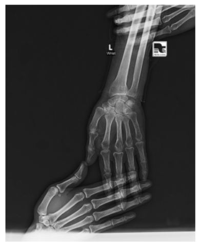
Visualization of a Bone Fracture
The shape attribute tells us the resolution of the image. This is crucial for understanding the data structure and how we might process it. For example, we will need to resize this image, if I want to use it to train a deep learning model, as my GPU will give an Out Of Memory error 😢.
The min() and max() functions return the darkest and brightest pixel values in the image, respectively. For grayscale images, these typically range from 0 (black) to 255 (white). By analyzing this range, we can determine if the image has high contrast or if some regions are underexposed, which we will see more, when we visualize these values with a histogram, which provide insights into the distribution of pixel intensities in an image.
We will use the scipy.ndimage.histogram function to calculate this distribution, and we will be using scipy.ndimage all the time throghout these series 😍.
import scipy.ndimage as ndi

hist = ndi.histogram(img, min=0, max=255, bins=256)
plt.plot(hist)
plt.show()
So, just to define the histogram again 😁:
A histogram is a graphical representation of the number of pixels at each intensity value. For example, if many pixels are dark, the histogram will have a peak at lower intensity values.
Histograms help identify if an image is too dark, skewed toward lower intensities, since 0 is black 😅, or too bright, skewed toward higher intensities, since 255 is white 😅. This can guide us in applying techniques like contrast enhancement.
Here, the histogram() function divides the intensity range (0-255) into 256 bins and counts the number of pixels in each bin. Plotting the histogram reveals how the pixel values are distributed across the image.

Histogram of the Pixel Values
We can see that, most pixel values are below 50, which means the image has a lot of dark areas, which is the case for CT or X-ray images, but still there are some values after 50, too, whcih are the gray-like and white-ish areas where the bones are.
Since the intensity distribution is uneven adn skewed to the right in this case, we can use histogram equalization, which redistributes pixel values to span the full intensity range, enhancing contrast.
hist = ndi.histogram(img, min=0, max=255, bins=256)

cdf = hist.cumsum() / hist.sum()
equalized_img = cdf[img] * 255

fig, axes = plt.subplots(2, 1)

axes[0].imshow(img, cmap="gray")
axes[1].imshow(equalized_img, cmap="gray")

for ax in axes:
  ax.axis("off")

plt.show()
The CDF shows the cumulative proportion of pixels up to each intensity value. By normalizing and using the CDF to remap pixel values, we can stretch the histogram across the full range of intensities.
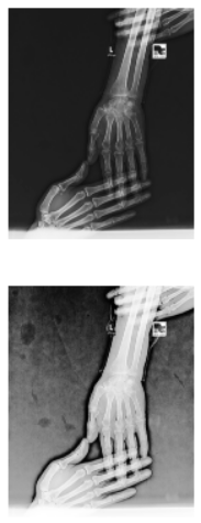
Original and Normalized Images
As we notice, equalized image has improved contrast, making features like fractures more apparent. However, note that this method might emphasize areas like the background, which isn’t always desirable for medical imaging 😢.
Let’s also look at the histogram and CDF plot:
hist = ndi.histogram(img, min=0, max=255, bins=256)

cdf = hist.cumsum() / hist.sum()

fig, axes = plt.subplots(2, 1, sharex=True)
axes[0].plot(hist, label='Histogram')
axes[1].plot(cdf, label='CDF')
plt.show()
Histogram and CDF Plot of the Pixel Values
Here, we can also see that almost 80% of the pixels have a value less than 50 in the CDF plot, which the histogram clearly shows with a peak around 30–35.
Okay, finally, let’s create some masks:
We can’t talk about masks, without knowing what masks in medical image analysis are, because they aren’t Halloween masks, right 🤣😶🌫️?

Masks are logical arrays where pixels meeting a condition, such as intensity > 32 are set to True, and others are False. This helps isolate regions of interest, such as bone tissue in medical images, and this will especially be very easy with np.where(), but we will learn about it in the third article 😁.
Also by combining masks, like mask1 & ~mask2 we can isolate specific structures, like non-bone tissues, to focus on critical areas for diagnosis or segmentation. Let’s create masks to highlight and analyze different parts of the image.
mask1 = img > 32
plt.imshow(mask1, cmap="gray")
plt.axis("off")
plt.show()
Mask 1 showing the whole tissue
Here, we can see with a low threshold like 32, the whole tissue, also some parts of the image, as the image is noisy.
mask2 = img > 64
plt.imshow(mask2, cmap="gray")
plt.axis("off")
plt.show()
Mask 2 showing the bones
When we double the threshold, we only see the bones, which are brighter areas in X-rays.
mask3 = mask1 & ~mask2
plt.imshow(mask3, cmap="gray")
plt.axis("off")
plt.show()
By taking the intersection of mask 1, which is the whole tissue, and the areas in the whole tissue, which aren’t a part of mask 2, as tilde means not in mask 2, we get the non-bone tissue.

Mask 3 showing the non-bone tissue
We have covered understanding the intensity distribution of images, normalizing them to enhance fracture visibility, and creating masks to highlight different parts of medical images. In the next article, we’ll learn about various more advanced filters we can apply to these images using the ndi.convolve() function 😉🥰. Stay tuned, and see you soon 👨💻!
YouTube: https://youtu.be/Yj_nGeMXZRc?si=uZme9JLMPJ8uvGLF
GitHub: https://github.com/Serurays/Biomedical_Image_Analysis
References:
메타데이터
- post_id
- e80251954dcd
- slug
- biomedical-image-analysis-part-2-exploring-image-intensities-with-histograms-cdf-normalization-e80251954dcd
- url
- https://medium.com/@serurays/biomedical-image-analysis-part-2-exploring-image-intensities-with-histograms-cdf-normalization-e80251954dcd
- canonical_url
- https://medium.com/@serurays/biomedical-image-analysis-part-2-exploring-image-intensities-with-histograms-cdf-normalization-e80251954dcd
- author_url
- https://medium.com/@serurays
- status
- ok
- fetched_at
- 2026-08-04 05:48:36