Ayos Ba? | UX Case Study for Public Service Access
Fostering transparency and citizen empowerment through civic-centered UI.
Ayos Ba? | UX Case Study for Public Service Access
Fostering transparency and citizen empowerment through civic-centered UI.
About the project
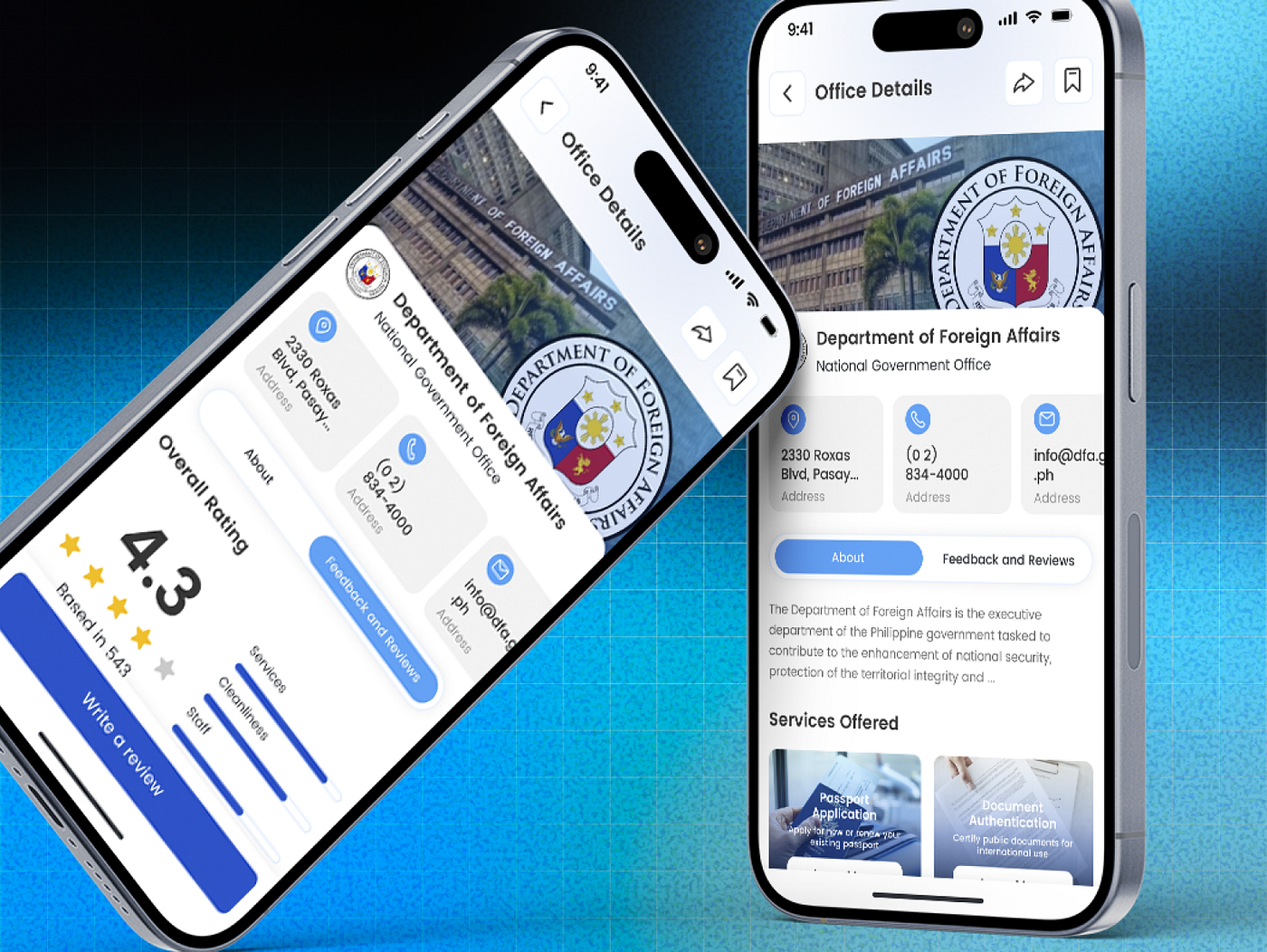
Ayos Ba? is a mobile-first government service review app built for Filipinos — designed to make public services more transparent, accountable, and people-centered. From submitting service waiting times, sharing complaints, and giving suggestions, to checking verified FAQs about government processes, Ayos Ba? empowers citizens to speak up, review their experiences, and encourage improvements in public offices.
The Challenge & Solution
Citizens heavily face a lack of transparent feedback mechanisms, public frustration due to long queues, and widespread confusion regarding basic office protocols.
Our goal was to design a centralized mobile platform where Filipinos can confidently express feedback. By introducing structured review monitoring, service time logs, and clear resource hubs, Ayos Ba? reduces friction and builds data transparency between the public and government agencies.
An instant first impression of trust and reliable civic engagement.
Onboarding & First Handshake
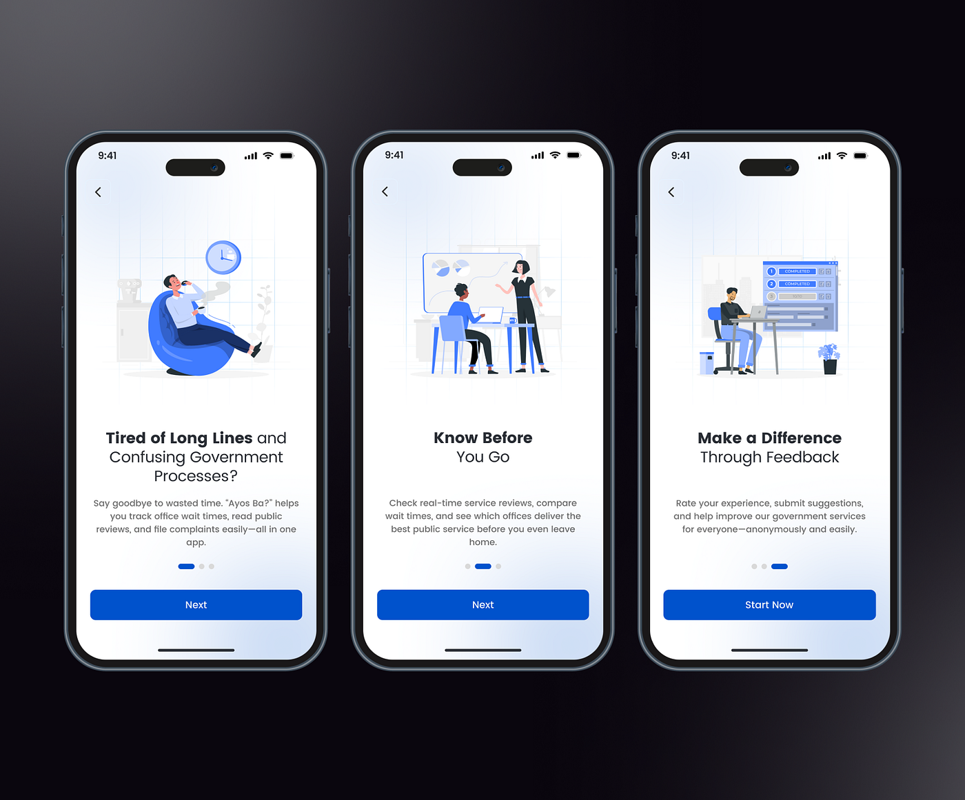
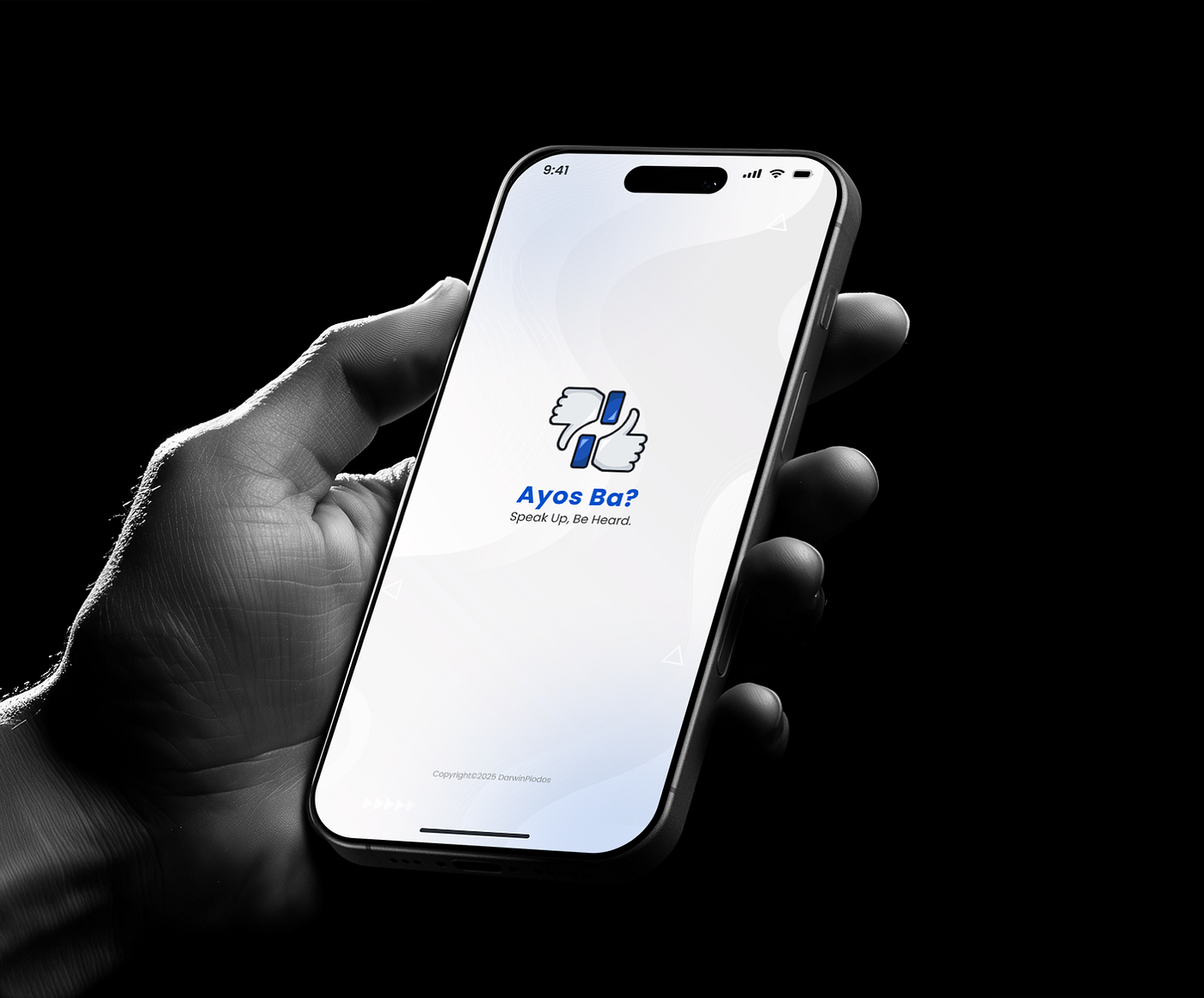
The user journey begins with a clean, professional splash screen that clearly establishes the app’s civic identity. It transitions smoothly into a sequence of simplified onboarding flows that highlight key features, ensuring users immediately understand the app’s purpose, security measures, and community benefits right away.
Secure access engineered for effortless public participation.
Authentication & Verification
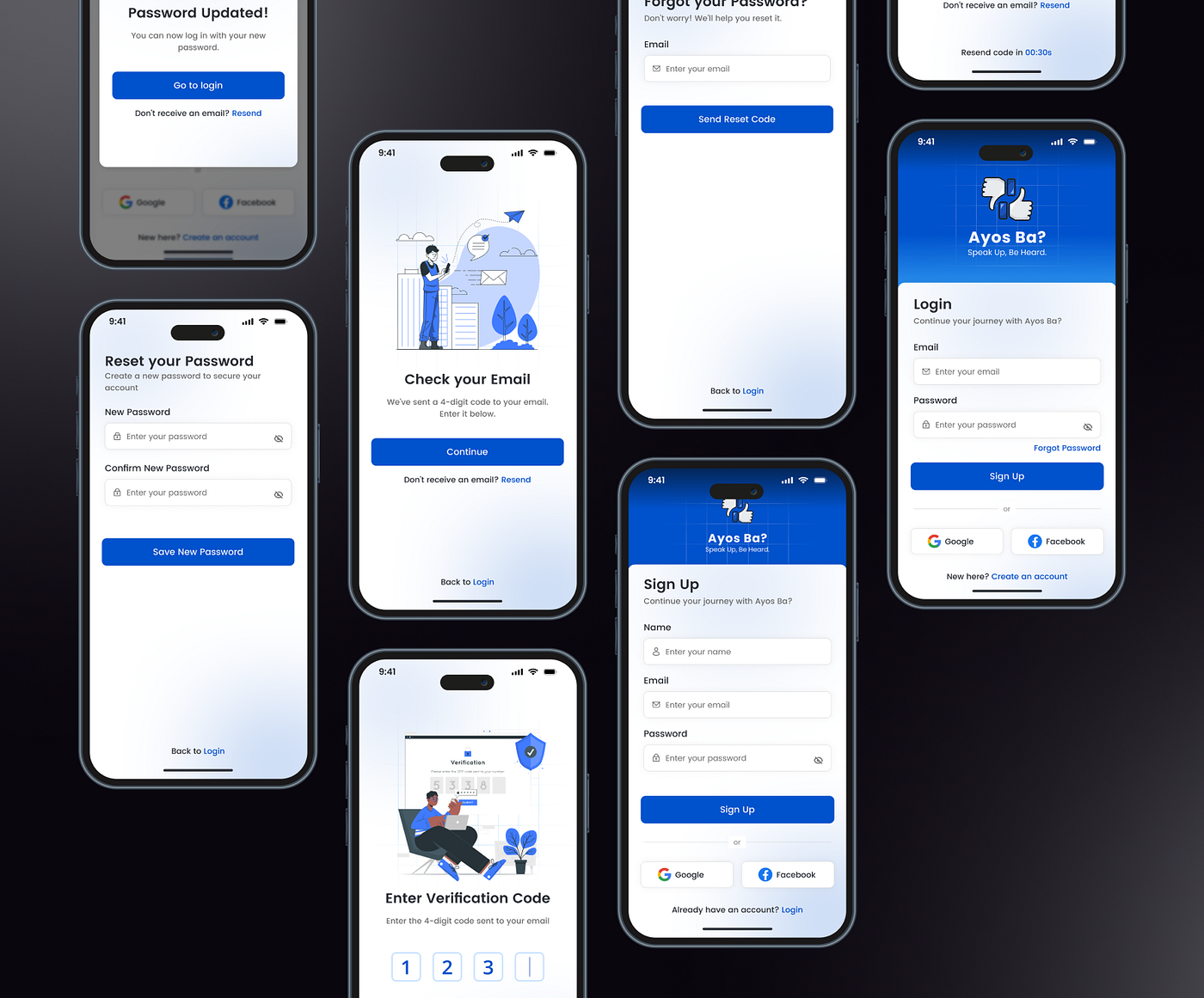
The login and registration architecture balances strict data security with total ease of use. Featuring a secure flow from email OTP verification to hassle-free password resets, each interface is designed with highly accessible typography and intuitive input steps, ensuring quick, friction-free entry for citizens.
A user-friendly command center connecting citizens to essential public offices.
The Central Hub
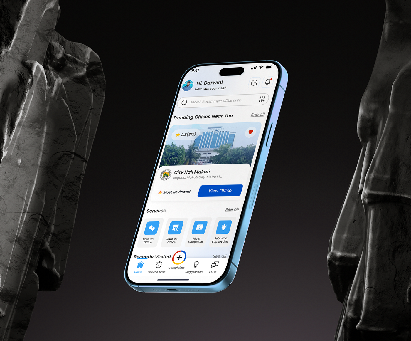
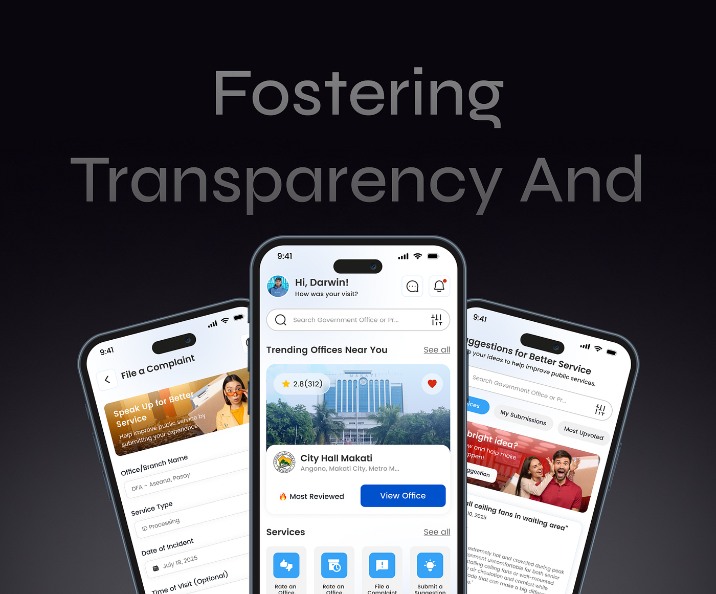
The Home Screen acts as the definitive central hub for civic services. It offers an organized, highly intuitive homepage layout that connects people to nearby government offices instantly. Users can view trending offices, track their recently visited locations, or directly launch critical actions like logging waiting times, filing a complaint, or writing a suggestion with a single tap.
Bridging constructive public feedback with actionable civic insights.
Offices Directory & Smart Map
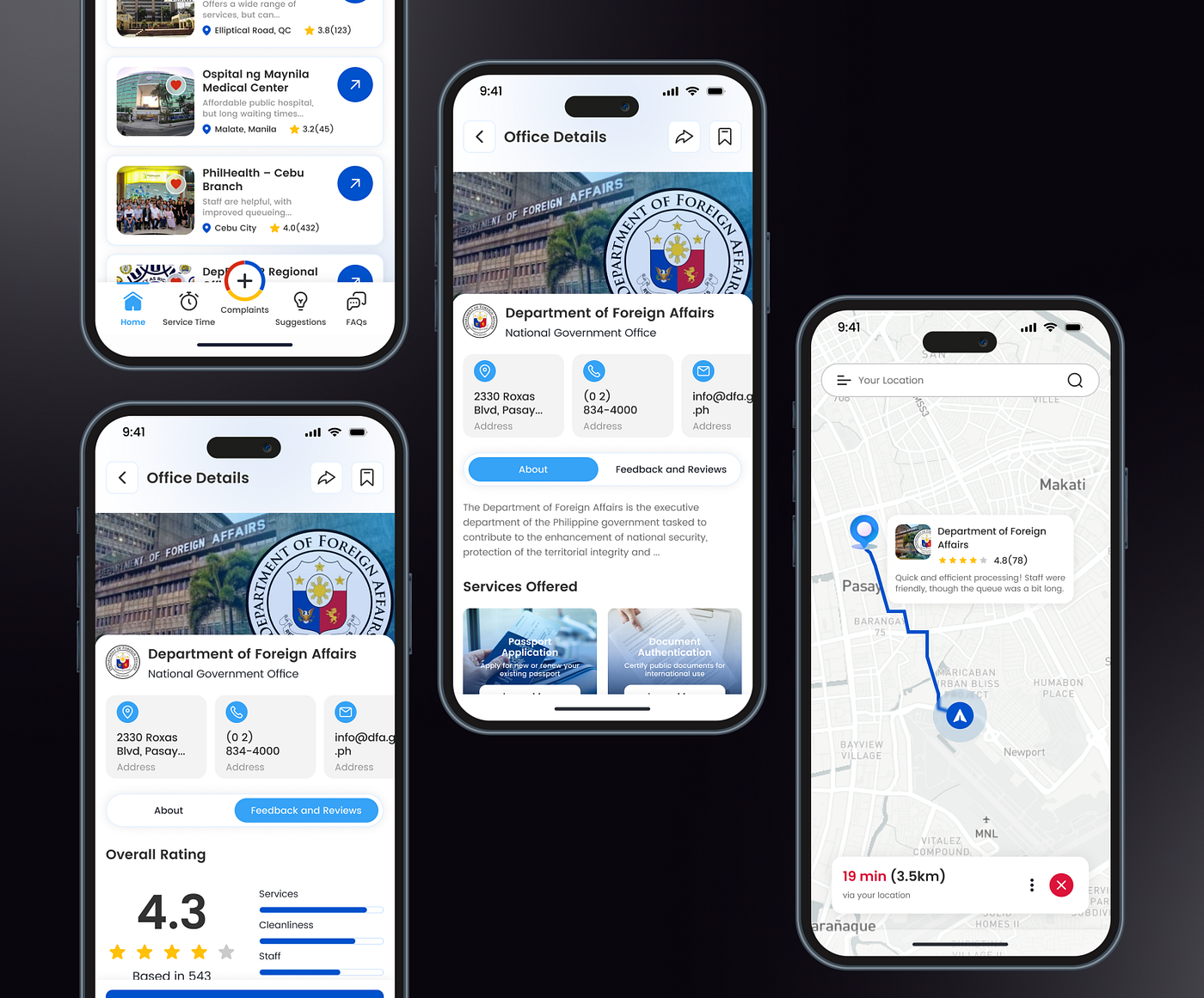
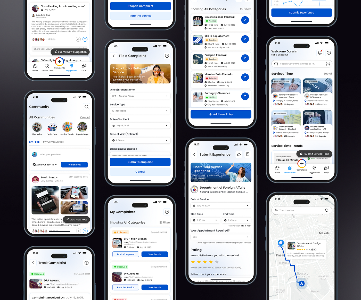
A comprehensive list view paired with a smart navigation map to help citizens find and track localized government offices seamlessly.
Service Time Logs
A crowd-sourced tracking mechanism that allows users to submit and view live, accurate waiting times for specific public transactions.
Structured Complaint Flows
An easy, step-by-step reporting portal where users can confidently file complaints and easily track the resolution status under “My Complaints.”
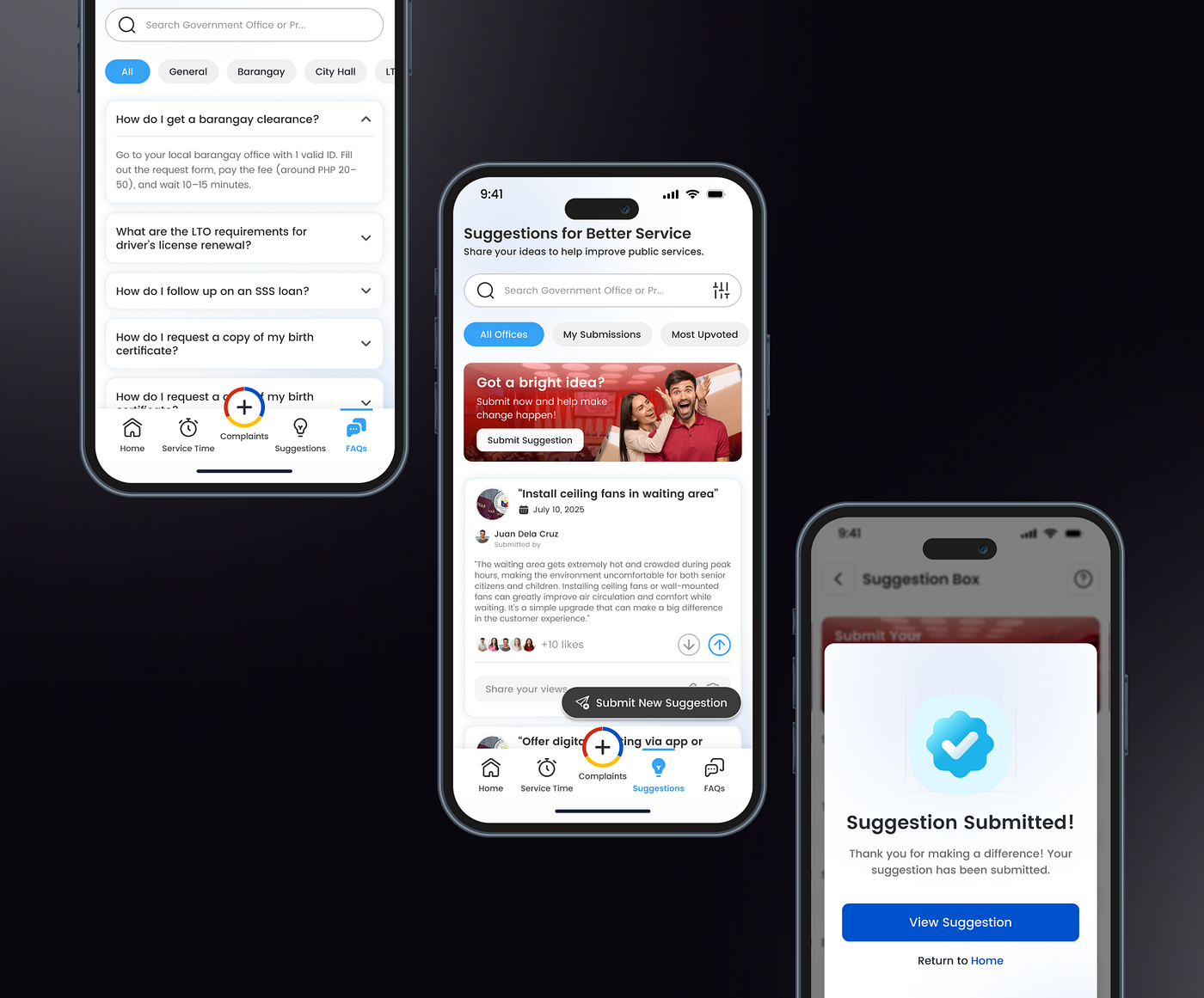
Community Suggestion Box
A collaborative feedback canvas where citizens can share constructive ideas and browse suggestions left by the community.
Frequently Asked Questions
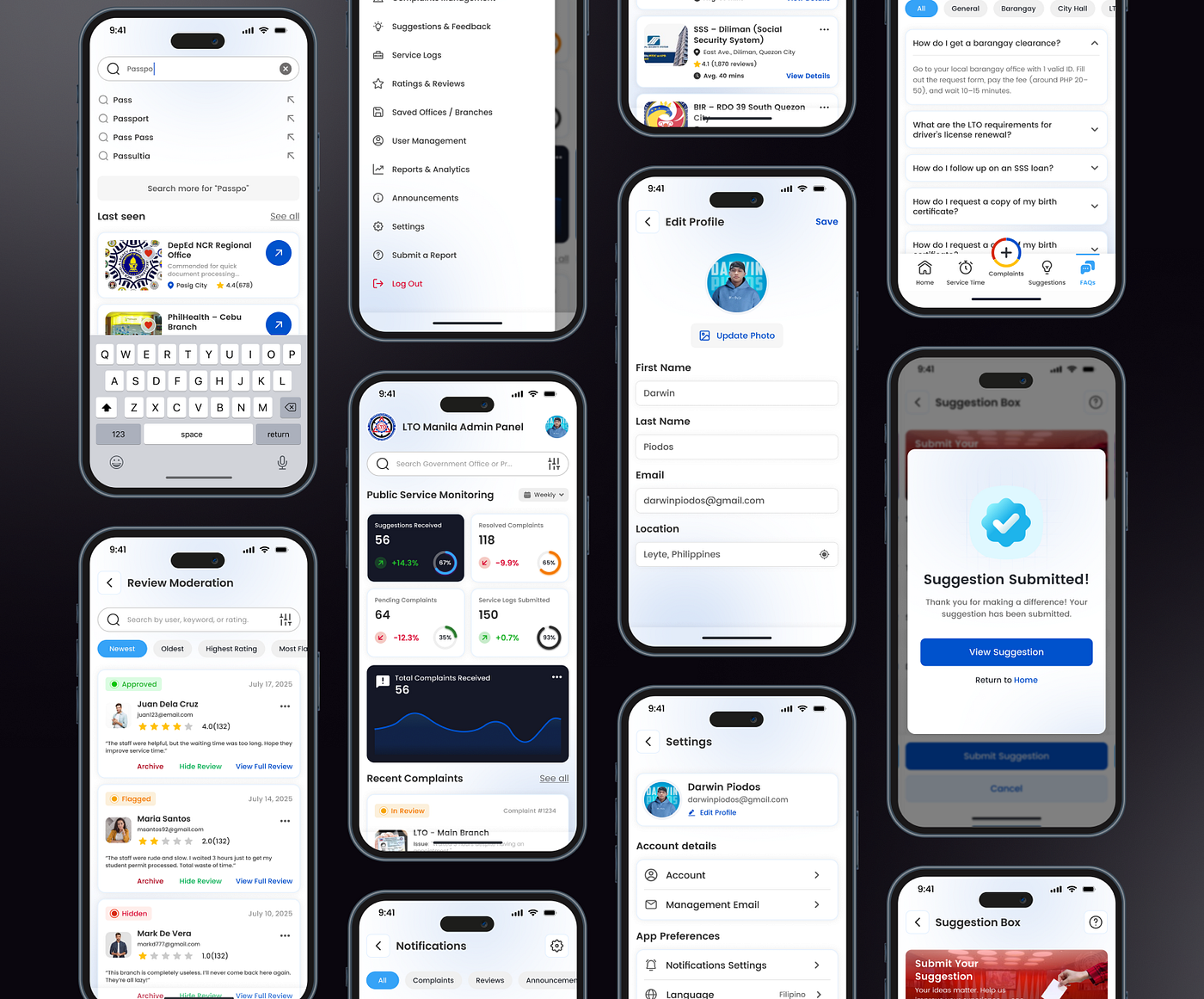
A centralized repository of clear, verified information to eliminate confusion surrounding basic government transactions and protocols.
Admin Dashboard & Alerts
A robust portal built for agency accountability, alongside real-time user notification flows and personalized profile controls.
A replica, scalable civic tech model optimized for deep digital inclusion.
System Ecosystem Sneak Peek
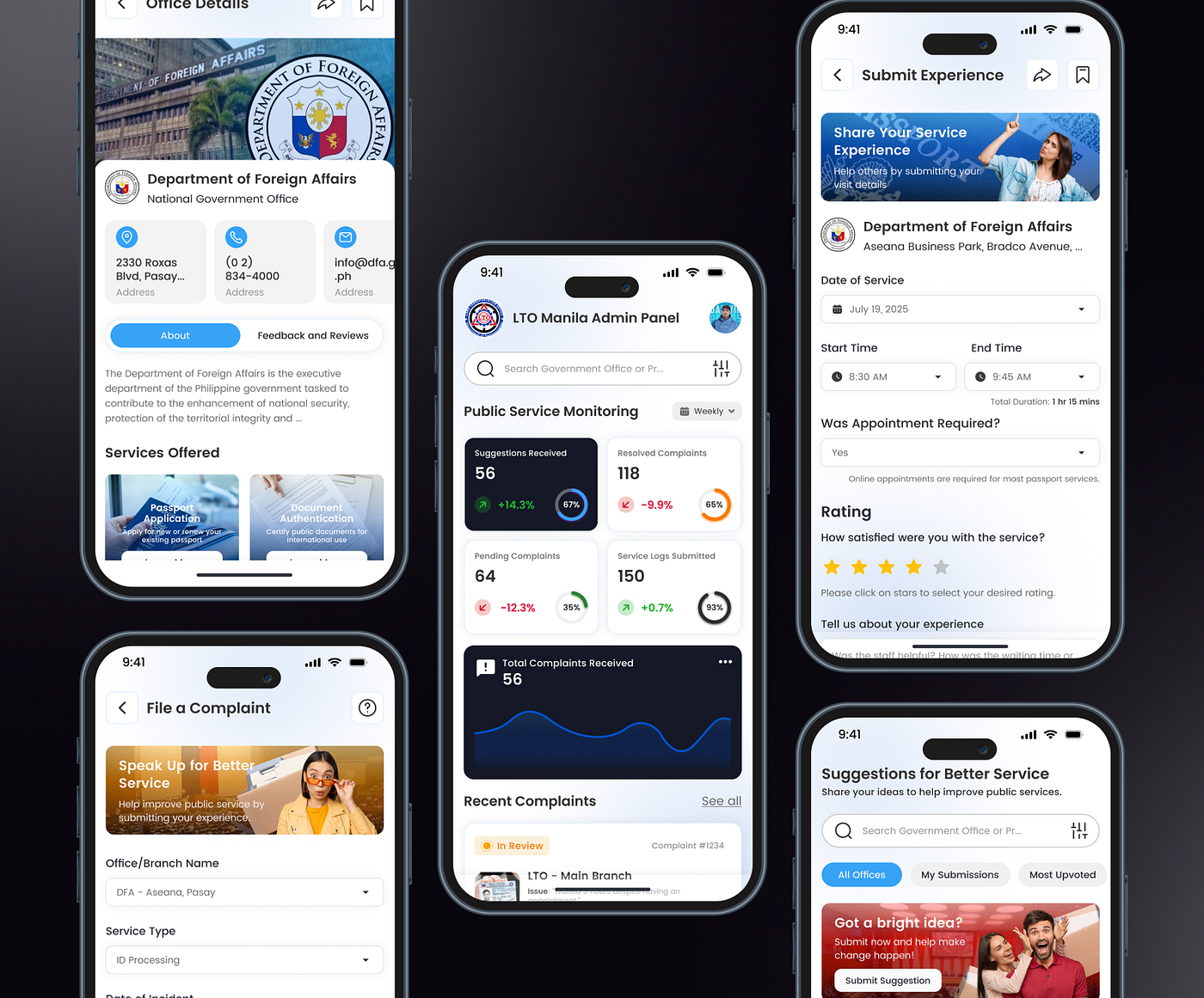
A close look at the supporting interface architectures across the system. These remaining screens maintain a strict visual hierarchy, clean container spacing, and localized iconography. Every touchpoint is systematically optimized to reduce cognitive load and remain highly functional under high-stress public reporting scenarios.
A smarter way to share feedback — powered by the people, for the people. 🇵🇭💡
If you want to see better public service delivery through design, hit “L” to show some love!
🔗 Want to see the full UX research, metrics, and wireframe methodologies?
Explore the deep end-to-end case study on my portfolio profiles:
- 💼 Behance: https://www.behance.net/darkpiodos
- 🔗 LinkedIn: https://www.linkedin.com/in/uiux-darwin-piodos/
- 📝 Notion: https://www.notion.so/Ayos-Ba-UX-Case-Study-for-Public-Service-Access-37d35ee7208d8026827dd20254eca1c3?source=copy_link
- 📸 Instagram: https://www.instagram.com/darwindivinopiodos24/
- 👥 Facebook: https://www.facebook.com/darwinuiux
- 🏀 Dribbble: https://dribbble.com/darkpiodos
Interested in working together? Let’s talk!: darkpiodos-gmail-com
메타데이터
- post_id
- e80463b63e56
- slug
- ayos-ba-ux-case-study-for-public-service-access-e80463b63e56
- url
- https://medium.com/@darkpiodos/ayos-ba-ux-case-study-for-public-service-access-e80463b63e56
- canonical_url
- https://medium.com/@darkpiodos/ayos-ba-ux-case-study-for-public-service-access-e80463b63e56
- author_url
- https://medium.com/@darkpiodos
- status
- ok
- fetched_at
- 2026-07-30 20:36:18