Please, don’t use Roboto again
Typefaces are made to carry identities, stories, voices. Your ideas deserve more than Roboto.

Photo by Zany Jadraque on Unsplash
Please, don’t use Roboto again
Typefaces are made to carry identities, stories, voices. Your ideas deserve more than Roboto.
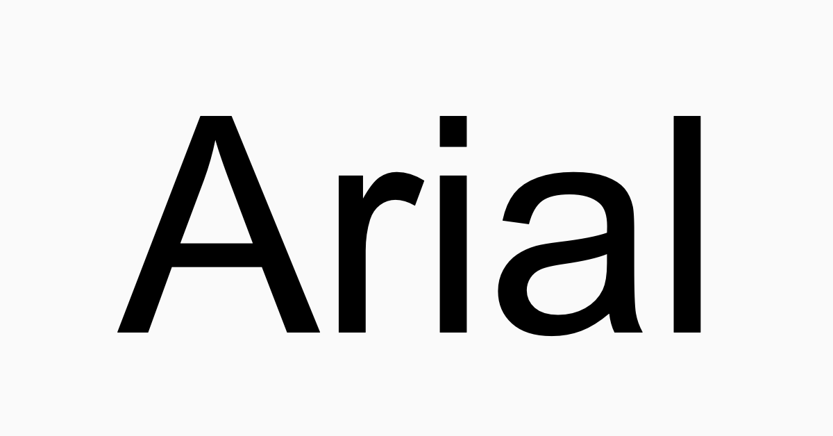
While it’s already common in graphic design to use indie typefaces or less famous ones, the world of UX seems to like using much fewer fonts. Then the visual identity of new products misses some spices. Worse, we find less and less diversity and more and more the same fonts. Yes, I am pointing at you Roboto, Raleway, Lato, and Poppins. These fonts look good, they have great qualities, but don’t we deserve stronger and more characterful types online?
Time is money: why font became so uniform
It feels that the whole web is running on the same style of font today as if legibility and uniformity took over the graphic identity.
This trend is built at the image of a world which seems to now be craving for graphic uniformity and simplicity. Probably it is just representative of this race for attention: we need customers to understand our message quickly and clearly. Which font is a better candidate for that task than a sans-serif Helvetica-like typeface? It’s literally as if our messages were always dressed in suits and ties. It could fit everywhere, it looks serious, you know it will accomplish its mission and that’s great when our main task is to be effective and efficient. But outside of work, it’s time to take off the suit. Imagine going to your best friend’s birthday or a reggae concert, dressed like that. Of course, you can do it, but wouldn’t you express much more of your complex identity wearing your favorite shirt and the matching pair of shoes that you found on this cute little market in Spain?
If your message would be spoken, its typeface would be its voice. It truly builds an identity.

IKEA / IBM
The diversity of font is real outside of the screens and they represent products and brands under their best face. Whether it’s about the body, title, or logotype, the typefaces play a major role.
Typefaces tell things without even speaking…
Typography can sometimes be perceived as a preoccupation from experts for experts. The reality is that a letterform can express a lot about a message. They are the first incarnation of our ideas on a webpage. They have a truly visceral function, talking directly to your heart. It does it to typography fans and believes me we can truly be excited seeing a new type. In practice, it does it to anyone more or less consciously. At several layers of perception, the curves of a font evoke something.
The visceral level
At the first sight, they can trigger emotions from something as obvious as its rigidity but as well tiny details like a prolonged serif. This is the level that gives this nonliteral meaning to your message:
- a tone: whether you are speaking slowly and quietly in a bookstore or talking loudly on a beach
- a language register: whether you are talking respectfully to the old librarian or in a friendly way
- an intention: whether you are giving an irrefutable truth or a simple suggestion

DTL Documenta (Frank E. Blokland) / Hobo (Morris Fuller Benton)
The identity level
This level can be the strongest and most perceptible aspect. The font can strongly evoke the identity associated with what they are used for. Some fonts will directly remind you of a realm like western movies. Others will less literally evoke a culture like eastern Europe or Russia.
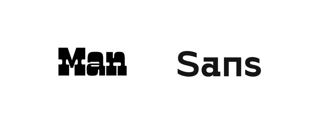
Manicotti (David Jonathan Ross) / Gosha Sans (Pangram Pangram)
…even without going nuts
Of course, sans-serif ones are great, too, especially for their legibility on screens. I’m sorry, Roboto, I didn’t want to hurt you, you are just a victim of your success. Every great font has been drawn with specific usage in mind and Roboto has been designed for screens. It’s true that among all typefaces, not many have been designed for screens since the first line. So we had to adopt what made the most sense especially when we deal with half pixels. But today, we have no more excuse to not use more complex typefaces. And even without going crazy, you can already add a pinch of spice to your identity with a sans-serif typeface as Genius or Toggl did it.

GT Haptik (Grillitype) / Programme (Optimo)
Behind the lines
Typefaces can seem to be the fruit of a purely artistic process looking for the perfect glyph and most balanced fonts. In practice, we can find out that their form follows their function when they are made for a particular usage or under technical constraints.
Take Optima, its letterforms come from Roman capitals which were engraved in the rocks. The shape of letters was thicker towards the extremities while being thinner towards the center of the glyphs. When its author Hermann Zapf drew it, he kept these details through subtle curves which give this typeface such a unique charm.

Optima (Ermann Zapf)
In some cases, they even carry a story or values. More recent and purposeful examples are the fonts from Vocaltype, inspired by social movements. The type designer Tré Seals brought some of the most powerful revolutions of the last century back to letterforms: from women’s demonstration in Buenos Aires to the 1963 March On Washington For Jobs and Freedom.

Eva (Tré Seals)
Through his typefaces, Tré Seals does not only give a new voice to these movements but also creates a new playground for creativity. The result is made of contrasted, culturally impregnated, and sometimes insane characters.
In a similar register, and supporting BLM, Sam Rowe designed the strong and powerful display font “Revolt”. The designer built “an angry font for angry people.”

Revolt (Sam Rowe)
Dare to pay for your fonts
You get it, typefaces can express much more than displaying information. The good news is that the world overflows of extraordinary foundries which will for sure let you find the perfect dress for your message. The bad news is that you will probably have to pay for it.
Not paying for your fonts became the new normal. Even though that’s a fantastic tool, Google Fonts truly contributed to that trend. They made a wide registry of fonts accessible to anyone. Fonts are then easy to install but most of all easy to find. I remember struggling with finding the good way to import font faces in the right format in CSS while we have now nothing more than a line to copy-paste. It changed the game and they became the most famous source of free typefaces with over 41 trillion total font views. Sadly, you can count the gems in the catalog on your 2 hands. Out of 1000+ types, most are Helvetica copies, Futura cousins, but just a few are really awesome and strong. If you want a font with a stronger character and well-balanced shapes, it is not the best place to look for.
Google Fonts is not alone, do not forget that we still have websites like Dafont (do you remember?). But we can be glad that it has been replaced in the role of main free font provider. Even if it contained fun fonts, it used to be a registry of some very bad quality typefaces.
Free fonts are cool and the idea that it is now accessible to anyone is wonderful. I used to love having access to such a catalog as a younger graphic design student. But if you can afford it, dare to chase for paying typefaces, believe me, they are on average of much better quality and diverse. A free font does not mean bad font systematically. Just to understand that type designers don’t come up with a brand new typeface with 16 font-weights and styles during a big weekend intensively using Illustrator. The reality is that a great type takes years to be drawn. Yes, years! Typography is an art that requires patience and passion. Research and design involved deserve to be paid.
If you want proof of what I’m saying, just browse randomly in Font In Use. Then, fall in love with some types and you will see that they are most probably not free. Investing in a font is just investing in your product. What does $45 represent in the lifespan of your product? Open your wallet for hidden gems, they will make a difference.
Of course, the price of a typefaces does not makes it better. The proof is that many awesome typefaces are free. And of course, the price is not the only parameter: the usage of the type and technical constraint will guide the decision as well. But one thing is sure is that your eye will always be the best judge.
메타데이터
- post_id
- e80e48358bef
- slug
- please-dont-use-roboto-again-e80e48358bef
- url
- https://medium.com/design-bootcamp/please-dont-use-roboto-again-e80e48358bef
- canonical_url
- https://medium.com/design-bootcamp/please-dont-use-roboto-again-e80e48358bef
- author_url
- https://medium.com/@giardiv
- status
- ok
- fetched_at
- 2026-06-13 16:00:06