The Architecture of Choice: 10 UX Rules for the AI Era
Beyond the Pixel: The Only Guide to User Experience Design You Will Ever Need in 2026
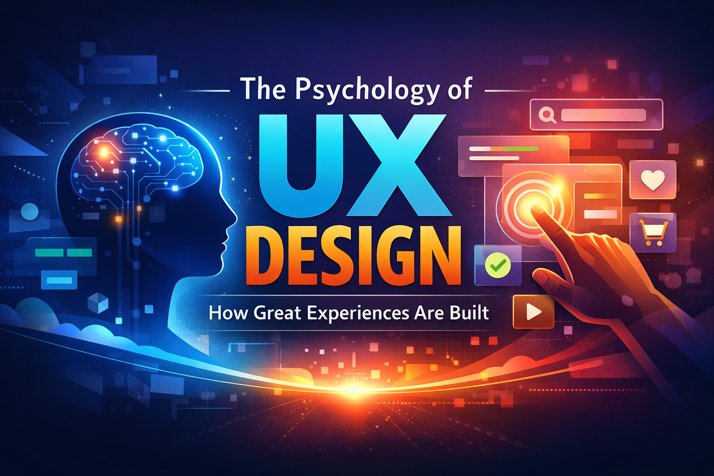
ai generated image
The Architecture of Choice: 10 UX Rules for the AI Era
Beyond the Pixel: The Only Guide to User Experience Design You Will Ever Need in 2026
Master the invisible psychology and AI breakthroughs that turn casual browsers into lifelong loyalists.
You have likely heard that design is about how something looks. If that were true, the most beautiful websites would always win. But we both know that is not the case. You have visited stunning websites that felt like a maze, and you have used plain, almost boring apps like Craigslist or Wikipedia that you return to day after day. This is because design is actually about how something works. It is about the invisible friction between a human mind and a digital system. In 2025, as artificial intelligence begins to generate interfaces on the fly, understanding the core laws of human behavior is no longer a luxury for specialists: it is the survival kit for anyone building anything in the digital age.
I have spent years analyzing why some products go viral while others rot in the app store. What I found is that the winners do not guess. They do not follow “vibes.” They follow a set of psychological principles that are hardwired into our biology. These are not just rules: they are the laws of the digital universe. In this guide, I am going to take you deep into the ten essential User Experience rules every designer, founder, and product manager must follow. We are going to look at the “why” behind the “how,” explore the massive shift toward AI driven intent, and prove exactly why a single button change can be worth three hundred million dollars.
Too Long: Did Not Read
Design is not a coat of paint: it is the architecture of human intent. Great User Experience, or UX, focuses on reducing the “cognitive load,” which is the mental effort required for a person to get what they want. By leveraging established psychological laws like Jakob’s Law (familiarity), Hick’s Law (simplicity), and Fitts’s Law (accessibility), you can create interfaces that feel intuitive. As we enter 2025, the industry is shifting from static screens to “Generative UI,” where interfaces are created in real time based on what the user wants to do. This “No UI” future means that your value as a designer is shifting from drawing pixels to defining goals. Investing in UX is the highest leverage move a business can make, often returning one hundred dollars for every one dollar spent by slashing acquisition costs and engineering loyalty through trust.
Key Technical Breakthroughs Explained for Everyone
The world of design is moving faster than ever because of three massive shifts in how computers and humans talk to each other.
Generative User Interfaces
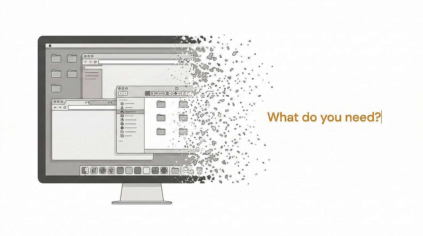
Traditionally, a designer would draw every single screen you see. If you wanted to change your password, someone had to design that specific page. In 2025, we are moving toward Generative UI. This means the computer understands your goal and builds a temporary, disposable interface just for you. Imagine walking into a house where the doors and furniture literally move to exactly where you need them as you think about what you want to do. That is what a Generative UI does for digital products.
The Competence Inversion
For decades, the rule was “Human in the Loop.” We used AI to help us, but a human always checked the work. We are now seeing a “Competence Inversion.” In many tasks, inserting a human to tweak or verify an AI actually lowers the quality of the result. Humans are slower, biased, and often “correct” the AI with wrong intuition. This means we are shifting from being “builders” to “directors.” We set the vision, and the machine executes with a level of precision we simply cannot match.
Multimodal Interaction
We are finally moving past just tapping and clicking. Multimodal design allows you to use voice, gestures, eye tracking, and even your emotions to control a system. Breakthroughs in AI mean a fitness app can now “see” your form through a camera, “hear” you say you are tired, and automatically lower the weight of a smart gym system. The interface is becoming invisible because it is finally learning to speak our language instead of forcing us to speak its.
Potential Industry Impact
The move toward these rules is creating a tectonic shift in the business world.
- Efficiency and Speed: Companies using mature design systems and AI automation are launching features up to fifty percent faster than their competitors.
- The Death of the Pixel Pusher: Designers who only know how to draw screens are being replaced by “UX Generalists” who understand business strategy, data, and psychology.
- The Ethical Reckoning: There is a global crackdown on “dark patterns,” which are design tricks used to manipulate people. In 2025, ethical design is no longer a “nice to have” but a legal and commercial necessity.
- Accessibility as Innovation: Designing for people with disabilities is no longer just about compliance: it is driving new technologies like voice control and gesture recognition that benefit everyone.
Rule 1: Jakob’s Law and the Power of the Familiar
Jakob Nielsen, a pioneer in the field, famously stated that users spend most of their time on other websites. This is the foundation of Jakob’s Law. It means that when someone arrives at your product, they are already carrying a heavy baggage of expectations. They expect your search bar to be at the top. They expect your logo to take them home. They expect your “settings” to be represented by a gear icon.
The Mental Model Analogy
Think of it like getting into a rental car. Whether it is a Ford or a Ferrari, you expect the steering wheel to be in front of you and the brakes to be on the floor. If a car company decided to be “innovative” and put the brakes on a touch screen menu, people would literally die. In the digital world, users do not die, but they do “bounce.” They leave your site and never come back because the cognitive friction of learning your unique system was too high.
Why Innovation is a Trap
It is incredibly tempting for a designer to want to “reinvent the wheel.” We want to be creative. But creativity should be applied to the value you provide, not the way users navigate. If you are building a flight booking app, use the pattern people already know: From, To, Date, Travelers. Do not make them use a 3D globe just because it looks cool. When you follow established patterns, you lower the “interaction cost.” This allows the user to focus on their goal rather than the tool they are using to achieve it.
Practical Application
I often tell my clients that if you have to explain how to use your website, you have already failed. The best interfaces are invisible because they match the mental model the user already has in their head.
Rule 2: Hick’s Law and the Burden of Choice
William Edmund Hick and Ray Hyman conducted a series of experiments in 1952 that changed design forever. They found that the time it takes for a person to make a decision increases logarithmically with the number and complexity of choices. This is Hick’s Law. If you give someone two options, they choose quickly. If you give them twenty, they might freeze and choose nothing at all. We call this “Analysis Paralysis”.
The Grocery Store Jam Study
There is a famous real world case study involving a grocery store. On one day, they offered a tasting of twenty four different types of jam. People loved the variety, but very few people actually bought a jar. On another day, they only offered six types of jam. While fewer people stopped to taste, the number of people who actually bought jam was ten times higher. Why? Because the mental effort required to compare twenty four jars was too high. The users felt overwhelmed and walked away.
The Art of Progressive Disclosure
You cannot always simplify your product down to two buttons. Sometimes, complexity is necessary. This is where “Progressive Disclosure” comes in. You should only show the user the information they need at that exact moment. Think of a complex checkout process. Instead of showing one giant page with fifty fields for shipping, billing, and payment, you break it into three steps. By showing only five fields at a time, you keep the user moving forward without triggering the “flight” response in their brain.
Strategies for Simplification
- Limit Navigation Options: Try to keep your primary menu to five or seven items.
- Use “Smart Defaults”: If most of your users are in the United States, pre select that as the country in your forms.
- Highlight the “Recommended” Path: Use visual weight to show the user the most common choice, like the “Standard” subscription tier.
- Hide Advanced Features: Use “More” or “Advanced Settings” menus to keep the main interface clean for novice users.
Rule 3: Fitts’s Law and the Geometry of Targets
Psychologist Paul Fitts discovered in 1954 that the time it takes to move to a target is a function of the distance to the target and the size of that target. In simple terms: big things that are close are easy to hit. Small things that are far away are hard to hit.
The Mobile Revolution
On a desktop, you have a precise mouse cursor. On a mobile phone, you have a clumsy thumb. Fitts’s Law is the reason why the most important buttons in your favorite apps are at the bottom of the screen. We call this the “Thumb Zone.” It is the area where your thumb naturally rests while holding a phone with one hand. If you put a “Buy Now” button at the very top left of a modern, giant smartphone, you are literally making your user work harder to give you money.
The Formula for Speed
In technical terms, the relationship is expressed as:

The Formula for Speed
Where $T$ is the time, $D$ is the distance, and $W$ is the width of the target. You do not need to be a mathematician to use this. You just need to realize that if you double the size of a button, you make it much faster for a user to interact with it. Conversely, if you place a “Delete” button right next to a “Save” button and make them both tiny, you are guaranteeing that someone will eventually delete their work by mistake.
Implementation Checklist
- Touch Target Size: Ensure interactive elements are at least 44 by 44 pixels.
- Padding and Spacing: Give buttons “breathing room” to prevent accidental taps.
- Strategic Placement: Keep primary actions like “Next” or “Search” within the thumb’s easy reach.
- Cursor Distance: On desktop, if a user clicks a menu, the sub menu should appear right next to where their mouse already is.
Rule 4: Miller’s Law and the Limits of Memory
In 1956, George Miller, a cognitive psychologist at Princeton, published a paper titled “The Magical Number Seven, Plus or Minus Two.” He discovered that the average human can only hold about seven pieces of information in their short term, working memory at one time. This is why phone numbers are “chunked” into groups of three or four. It is significantly easier to remember 555 0199 than it is to remember 5550199.
The Cognitive Load Analogy
Think of your user’s brain like a small desk. You can only fit a few things on that desk before they start falling off. If you ask a user to remember a price from page one, a discount code from page two, and a shipping estimate from page three, their “desk” is going to be a mess. By the time they get to the final checkout, they have forgotten the information, they feel stressed, and they are likely to abandon the purchase.
Designing for Working Memory
You should never force a user to remember something from one part of the interface to another. The information required to complete a task should be visible or easily retrievable right where they are. This is why “Breadcrumbs” are so useful in navigation: they tell the user exactly where they are without them having to remember the three clicks it took to get there.
Chunking Techniques
By “chunking” information into logical groups, you help the user process the data quickly and move toward their goal with less mental effort.
Rule 5: The Aesthetic Usability Effect
This is one of the most fascinating “hacks” in human psychology. Research has proven that users perceive aesthetically pleasing designs as more usable, even if they are not. If a website looks high end and professional, users are more likely to forgive minor bugs, slow loading times, and confusing navigation.
The Trust Factor
Aesthetics serve as a proxy for competence. Just as you might trust a doctor more if they are wearing a clean white coat in a modern office, a user trusts a brand more if their digital interface is clean, balanced, and beautiful. This is especially critical for apps involving money or health. Airbnb understood this early on. They realized that their growth was stalled because the photos of homes were amateur and ugly. They launched a professional photography program, and suddenly, people felt the platform was safer and more usable. The functionality did not change, but the “perception” of quality did.
When Beauty Becomes a Trap
While beauty can mask usability flaws, it cannot fix a broken product. If a user eventually realizes that a gorgeous app is impossible to navigate, their frustration will be even higher because they felt “tricked.” In 2025, we strive for a balance. Use high quality visuals to build initial trust, but ensure that the underlying architecture follows the other nine rules in this guide. Aesthetics should be the “welcome mat,” not the only thing in the house.
Elements of Visual Trust
- Consistency in Typography: Do not mix five different fonts: it looks chaotic.
- Strategic Use of White Space: “Breathing room” makes content feel more authoritative and easier to read.
- Rule of Thirds: Use a grid to place important elements where the eye naturally falls.
- Authentic Imagery: Avoid “corporate” stock photos of people shaking hands. Use real, high quality visuals that resonate with your audience.
Rule 6: Visibility of System Status (Heuristic 1)
This is the first of Jakob Nielsen’s famous ten usability heuristics. It states that the system should always keep users informed about what is going on, through appropriate feedback within a reasonable amount of time. There is nothing more stressful for a user than clicking a button and having nothing happen. Did it work? Did the site freeze? Should I click it again?.
The Anxiety Reduction Loop
Feedback is the antidote to uncertainty. When you click “Upload,” you should see a progress bar. When you click “Like,” the heart should turn red immediately. Uber is a master of this. When you are waiting for a ride, you do not just see a message saying “A car is coming.” You see a live map with a tiny car icon moving toward your location. That visual feedback makes the wait feel shorter and gives the user a sense of total control.
Managing the Doherty Threshold
Research by Walter Doherty found that human computer interaction is most productive when the system responds in less than 400 milliseconds. When the response takes longer, people start to lose focus and their “flow” is broken. If a task must take longer than 400 milliseconds, you must provide a visual cue. Use “Skeleton Screens” (grey placeholders that look like the content) to make the user feel like the site is loading faster than it actually is.
Feedback Types
- Immediate Micro interactions: Subtle animations that confirm a button was pressed.
- Loading States: Progress bars, spinners, or percentage indicators for longer tasks.
- Success Confirmations: “Message Sent” or “Order Confirmed” banners that appear briefly.
- System Health Alerts: Warning icons that show when a user is offline or a server is down.
Rule 7: User Control and the “Emergency Exit” (Heuristic 3)
Users often perform actions by mistake. They click “Delete” when they meant “Edit.” They send an email they regret. They subscribe to a service accidentally. A good interface should always provide a clearly marked “Emergency Exit” that allows the user to leave the unwanted state without going through a long, stressful process.
The Psychology of Safety
When a user knows they can “Undo” an action, they feel safe. This safety encourages them to explore your app and try out new features. If every action feels permanent and dangerous, the user will be hesitant and slow. Gmail’s “Undo Send” feature is perhaps the greatest example of this in history. It gives the user a ten second window to pull back an email. This single feature has saved millions of people from professional embarrassment and is one of the most loved parts of the Google ecosystem.
Designing for Regret
- The Undo Button: The ultimate safety net for any creative or destructive action.
- Clear “Cancel” Options: Every pop up or multi step flow should have a way to get out.
- Back Buttons: Never trap a user on a screen. Always let them go back to where they came from.
- “Are You Sure?” Dialogs: Use these sparingly for irreversible actions like deleting an account.
Rule 8: Consistency and Standards (Heuristic 4)
Consistency is the thread that holds a product together. It means that users should not have to wonder whether different words, situations, or actions mean the same thing. There are two types of consistency you must master: Internal and External.
Internal vs External Consistency
- Internal Consistency: This is about your own product. Your “Submit” buttons should always be the same color. Your headlines should always use the same font. Your icons should always follow the same style. If you use a “plus” sign for “Add” on one page and a “star” icon for “Add” on another, you are creating cognitive friction.
- External Consistency: This refers to Jakob’s Law. It means following the conventions of the world around you. If 99% of websites use a “gear” icon for settings, do not use a “wrench” just to be different. You want your users to be able to use your product without a manual because they have used a thousand other products just like it.
The Power of Design Systems
In 2025, the best companies do not design page by page. They use “Design Systems.” These are libraries of components (buttons, menus, forms) that are pre built and pre tested. This ensures that every part of the product looks and behaves exactly the same way. It also allows developers to build new features fifty percent faster because they are just “assembling” pre made parts rather than starting from scratch.
Rule 9: Error Prevention (Heuristic 5)
Even better than a great error message is a design that prevents the error from happening in the first place. We categorize errors into two types: Slips and Mistakes.
Slips vs Mistakes
- Slips: These occur when the user intends to do the right thing but accidentally does the wrong thing. For example, a typo in an email address or clicking the “Cancel” button instead of “Save” because they were too close together. We fix these by adding distance between buttons and using “Auto complete” to help with typing.
- Mistakes: These occur when the user has the wrong mental model. They think clicking “Clear” will save their work, for example. We fix these with confirmation dialogs and clear instructions that explain what a button will actually do before they click it.
Strategic Constraints
One of the best ways to prevent errors is to limit the user’s choices to only valid ones. For example, if you are asking for a date, use a calendar picker that prevents them from selecting a date in the past. If you are asking for a credit card number, do not let them type letters. By building “guardrails” into your interface, you make the user feel more competent and successful.
Rule 10: The 2025 AI Paradigm: Intent Based UX
The most significant change in design history is happening right now. For sixty years, we have designed for “Command Based” interfaces. You click a menu, you click a sub menu, you click a button. In 2025, we are moving to “Intent Based” interfaces. You tell the computer what you want, and it executes. This is the death of the traditional Graphical User Interface.
The Competence Inversion
As I mentioned earlier, we are realizing that humans are often a liability in the design process. Data shows that for many execution tasks, having a human “tweak” an AI output actually makes it worse. This means our role as designers is shifting. We are no longer the ones drawing the rectangles: we are the ones defining the “Rewards” and the “Goals.” We are moving from being “Artists” to being “Economists” who decide what value the system should create.
Generative UI and the “No UI” Future
In the near future, the best interface will be no interface at all. If you want to buy a pair of shoes, you will not browse a website. You will talk to an agent that knows your size, your style, and your budget. It will generate a single, custom screen showing you the top three options. You will click one, and you are done. The thousands of screens designers used to draw for “Category Pages” and “Filters” will become obsolete. We are moving from designing pages to designing intent.
Redefining Your Skills for 2025
- Master the Prompt: Learning to communicate with AI models is the new “Drawing.”
- Focus on Strategy: AI can handle the “Tactical” tasks like creating specs or mockups. You must focus on the vision and stakeholder alignment.
- Design for Agents: Ensure your system works as well for an AI assistant as it does for a human.
- Ethical Auditing: You must be the one to check the AI for bias and ensure it is not creating harmful or manipulative outcomes.
The Business of Design: How UX Drives Massive ROI
If you are a founder or a manager, you might think UX is a “nice to have” once you have enough money. The reality is that UX is the reason you get more money. The Return on Investment (ROI) of design is not a feeling: it is a set of hard numbers that directly influence your bottom line.
The Financial Power of UX
The 1:10:100 Rule
This is the most important concept for any business owner to understand. It represents the cost of fixing a usability error at different stages of a product’s life:
- $1: The cost to fix a problem during the research or wireframe phase.
- $10: The cost to fix that same problem once the code is already written.
- $100: The cost to fix the problem after the product has launched (including lost trust and emergency hotfixes). By spending money on UX at the beginning, you are not spending: you are saving ninety nine dollars for every one dollar you invest.
Case Studies in ROI
- ESPN.com: Saw a 35% increase in profits after a redesign focused on responsiveness.
- Virgin America: Reduced support calls by 20% and saw booking times become twice as fast.
- The $300 Million Button: By simply changing the text on a button from “Register” to “Continue,” an e commerce giant (rumored to be Best Buy) increased sales by 45% and unlocked an extra three hundred million dollars in annual revenue.
The Hidden Danger: Dark Patterns and AI Workslop
As we gain more power through AI and behavioral data, the temptation to use “Dark Patterns” grows. These are design choices that trick users into doing things they did not intend, like signing up for a hidden subscription or adding extra items to their cart.
The Brand Killer
While dark patterns can spike your metrics in the short term, they are catastrophic for your brand in the long term. Users today are highly sensitive to manipulation. Once a user feels “tricked,” trust is destroyed forever. In 2025, ethical design is becoming a competitive advantage. Companies that respect their users’ time and data are winning against the ones that use “Sneaky Subscriptions” and “Forced Continuity”.
Avoiding “AI Workslop”
A new danger in 2025 is “AI Workslop.” This is low effort, AI generated content and design that feels robotic, generic, and “empty.” Users can sense when a brand does not care enough to put in a human touch. To avoid this, you must use AI as a “Co pilot,” not an “Auto pilot.” Let the machine handle the repetition, but let a human provide the soul, the humor, and the unique point of view.
Sentence Patterns to Avoid (The AI-ism Ban List)
To keep your content feeling human and authoritative, I have compiled a list of phrases and patterns that are red flags for “robotic” writing. If you find yourself using these, it is time to rewrite.
Reading your writing out loud is the best way to catch these. If it sounds like a textbook, it is probably not going to connect with a modern audience.
Final Thoughts: The Path Forward
User Experience is not just a department in a tech company: it is a way of seeing the world. It is the empathy required to understand that your users are tired, distracted, and just want to get their work done. Whether you are following Jakob’s Law to provide comfort or leveraging AI to anticipate a user’s next move, the goal is always the same: make it easier for people to be successful.
In 2025, the tools will change. The screens might even disappear. But the human brain, with its limits on memory and its love for beauty and patterns, will remain the same. Master the psychology, embrace the AI revolution, and always design with a human soul. That is the only way to build products that people do not just use, but truly love.
If you found this guide helpful, I encourage you to look at your own product through these ten lenses today. Pick one rule: perhaps Hick’s Law or Visibility of System Status: and find one place where you can reduce friction. You will be surprised at how quickly small changes in design lead to massive changes in your business results.
메타데이터
- post_id
- e81f6a3d8a2b
- slug
- the-architecture-of-choice-10-ux-rules-for-the-ai-era-e81f6a3d8a2b
- url
- https://medium.com/activated-thinker/the-architecture-of-choice-10-ux-rules-for-the-ai-era-e81f6a3d8a2b
- canonical_url
- https://medium.com/activated-thinker/the-architecture-of-choice-10-ux-rules-for-the-ai-era-e81f6a3d8a2b
- author_url
- https://medium.com/@ankitgajera1111
- status
- ok
- fetched_at
- 2026-06-21 15:33:18