When a Visual Language Forgets Why It Looks the Way It Does, Can It Ever Mean Anything Again?
Tracing meaning through Athangudi tiles, Kanchipuram silk, and Swamimalai bronze
When a Visual Language Forgets Why It Looks the Way It Does, Can It Ever Mean Anything Again?
Tracing meaning through Athangudi tiles, Kanchipuram silk, and Swamimalai bronze
I grew up in Madurai, walking past the Meenakshi Amman temple’s gopuram more times than I can count. I saw kolam patterns drawn on doorsteps every single morning. I sat on Athangudi tile floors at relatives’ houses without ever once wondering what I was actually sitting on.
That’s the strange thing about growing up inside a visual tradition. You stop seeing it. The patterns become wallpaper, in the most literal sense. It took a final-year research project, a lot of second-guessing, and one uncomfortable discovery in a small town called Karaikudi for me to actually start looking.
This piece is a shorter, more readable version of that project. It was my capstone for a Communication Design degree, and the short version of the long version is this: I went looking for what makes a design system “authentic,” and I came back with a much stranger, much more useful answer than the one I expected.
Where this started
A year before this project, I wrote a paper called Beyond the Golden Ratio. It picked apart one of design education’s favorite myths: that the golden ratio, that famous 1.618 number, is some kind of universal law of beauty baked into nature, architecture, and typography. Spoiler: it mostly isn’t. Measure the Parthenon properly and it doesn’t actually conform. Measure a nautilus shell and it doesn’t either. The ratio survives mostly because it’s been repeated so often that repetition started to look like proof.
That paper argued for something simpler. Design decisions should follow function and cultural context, not inherited math dressed up as universal truth.
But that conclusion left me with an itch I couldn’t quite scratch. A function-first framework is still, underneath it all, a Western way of thinking about design. It still assumes clarity and efficiency are the point. So I started wondering what a design tradition would look like if it had never been built on that logic in the first place. Something older. Something that worked, for centuries, on completely different terms.
South Indian material culture turned out to be exactly that case. Not because it’s “purer” or more ancient in some romantic sense, but because it operates on a totally different foundation: sacred geometry, temple prescription, and a symbolic vocabulary that gets passed down rather than written down.
So the new project was born. I picked four material traditions to study closely: Athangudi floor tiles, Kanchipuram silk, Swamimalai bronze casting, and traditional woodcut motif stamps. All four, on the surface, speak a shared visual language. The same lotus. The same peacock. The same guardian creature. But that shared vocabulary hides some very different stories underneath.
The discovery that changed the whole project
Here’s where things got interesting, and a little uncomfortable.
Athangudi tiles are usually described as ancient indigenous craft, something that has quietly existed in Chettinad villages forever. That’s the story most people tell, and honestly, it’s the story I expected to confirm.
Fieldwork said otherwise. The tiles, it turns out, were invented in the 1890s. The Nattukottai Chettiars, a merchant community that had built serious wealth trading across Burma and Ceylon, wanted their new mansions to have the same encaustic tile flooring they’d seen in expensive Victorian imports. Importing British tiles at scale was too costly, so local artisans were handed samples and asked to recreate the look using what they had: laterite soil, natural pigments, and sun-drying instead of a kiln.
What came out of that process wasn’t a copy and wasn’t purely local invention either. It was a translation. The Victorian tiles supplied the grid logic, the symmetry, the idea of a repeatable pattern unit. The Chettinad craftsmen supplied the colour language and the production technique, both of which trace straight back to the same visual grammar found in kolam drawings and temple floor inlays.
So the “ancient indigenous craft” is, in fact, a 130-year-old colonial hybrid.
At first, this felt like it undermined my whole argument. If the tiles are a hybrid, how can they be evidence of some distinctly non-Western design system? But the discomfort turned out to be the most useful part of the research. Hybridity isn’t the opposite of a coherent tradition. It’s often exactly how traditions stay alive. South Indian material culture has always absorbed outside influence and run it through its own grammar. What makes something feel coherent isn’t purity. It’s the underlying logic that decides how foreign elements get translated into a shared visual language.
That reframing changed the question I was actually trying to answer. It stopped being “what survived colonialism intact” and became something sharper: what does authenticity even mean in a visual language that was hybrid from day one? And can meaning come back once the reasoning behind a form has been forgotten?
That question, in its full form, became the spine of the whole project: when a visual language forgets why it looks the way it does, can it ever mean anything again?
Three traditions, three completely different fates
To answer that, I needed a comparison. So I looked closely at what actually happened to tiles, silk, and bronze once colonial rule and, later, Indian independence reshaped the cultural landscape.
Here’s the short version: tiles nearly died. Silk survived, and arguably thrived. Bronze barely changed at all in a thousand years. Same region, same broad historical pressures, three wildly different outcomes. Understanding why became the analytical heart of the project.
Tiles: a status symbol that stopped meaning anything
Athangudi tiles worked, for decades, as a status marker. They told you a Chettiar family had money, taste, and international trade connections. That status function is exactly what kept the craft alive: demand from wealthy families sustained artisan livelihoods, which sustained the training of the next generation, which sustained the quality of the patterns.
Then independence happened, and India’s idea of modern shifted hard toward concrete, glass, and the international style. Suddenly, ornate tile floors read as embarrassing colonial-era excess rather than sophistication. And here’s the detail that surprised me most during fieldwork: this wasn’t colonial powers crushing the craft. It was the Chettiars themselves, and the artisans who served them, deciding the tradition was no longer worth passing on. I spoke with older artisans who told me, plainly, that they discouraged their own children from learning the trade. Not because there was no money in it. Because it felt backward.
That’s the project’s first real finding, and it’s a harder one than the usual colonial-destruction story: a visual language doesn’t necessarily die because it becomes hard to make. It dies when the community that gave it meaning stops needing that meaning.
Silk: saved by outsiders who decided it was valuable
Kanchipuram silk faced the same pressures and came out the other side almost untouched. The difference wasn’t purity. It was external validation.
When British colonial administrators started classifying Indian crafts against their own Arts and Crafts standards, silk weaving scored well. Around the same time, the Theosophical Society was actively promoting Bharatanatyam as a “respectable” classical art form, and Bharatanatyam’s costume happens to be the Kanchipuram silk sari. That single connection dragged silk out of being a regional craft and into being a national cultural symbol.
Colonial contact didn’t damage this tradition. It amplified it. Tiles had no equivalent outside advocate, so when the internal status function collapsed, nothing stepped in to replace it.
Bronze: the tradition that never needed permission from anyone
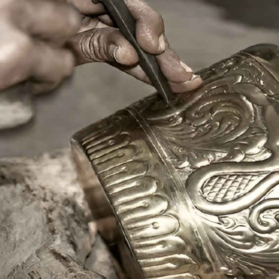
Swamimalai bronze casting is the extreme case, and honestly the most fascinating one. The lost-wax casting method used today is recognisably the same process described in Chola-era texts, more than a thousand years old. The proportions used to cast a Nataraja figure still follow the Shilpa Shastra, ancient prescriptive texts on iconometric measurement.
Why has this survived completely intact when tiles nearly vanished? Because the function bronze serves was never negotiable in the first place. A correctly cast, correctly consecrated bronze isn’t a representation of a deity. In the belief system that sustains the craft, it becomes the deity. You can’t argue a temple committee into accepting a cheaper, faster, industrially produced version of that, because efficiency was never the point. The sacred function can’t be substituted by anything quicker or cheaper, so modernisation simply had no leverage against it.
Put the three side by side and a pattern appears. Traditions survive disruption when their sustaining function is either non-negotiable, like bronze, or actively elevated by outside forces, like silk. The one that nearly died was the one whose sustaining function lived entirely inside its own community, with nothing propping it up from the outside. When that community’s aspirations shifted, the whole structure went with it.
The same five motifs, told differently by four materials
One of the more genuinely fun parts of the research was tracking five recurring motifs, the lotus, the peacock, the temple gopuram, the yaali, and geometric floral creepers, across all four material traditions. These aren’t random decorative choices. They come from a shared iconographic vocabulary rooted in Dravidian temple sculpture, and watching how each material bends that vocabulary to its own constraints tells you a lot about how meaning survives translation.
Take the lotus. In Agamic theology, it isn’t just a decorative flower. It represents the emergence of cosmic order out of primordial water. Vishnu’s feet rest on a lotus. Brahma sits on one. This isn’t symbolic in the loose way a dove represents peace in Western imagery. It’s closer to a technical specification. In bronze casting, the number of petals and the angle of the calyx are literally prescribed by the Shilpa Shastra texts. There is no room for artistic liberty there.
In silk, that same lotus becomes a woven border motif, flattened from three dimensions into two, but weavers describe it as “set,” meaning the exact stylisation is fixed by tradition rather than personal taste. In older tile patterns, it shows up as a geometric abstraction, a circle divided into petal shapes. In newer boutique tile revivals, though, it sometimes gets a more naturalistic, almost Victorian-floral treatment. That shift sounds small, but it isn’t. The old abstraction still carries the cosmological meaning. The naturalistic version carries only decoration.
The peacock tells an even sharper story. In the Dravidian tradition, the peacock is Murugan’s vehicle, and Murugan is about as specifically Tamil a deity as it gets. This isn’t a generic “peacocks are pretty” association. It’s an ethnic marker, documented as far back as Sangam-era literature from roughly two thousand years ago. In silk, the Myil Kann (peacock eye) motif carries that identity forward whether or not the weaver reproducing it consciously knows the mythology behind it. In hybrid tile patterns, though, the peacock usually gets rendered in the more naturalistic Victorian decorative style. It looks like a peacock. It just doesn’t carry the same symbolic weight anymore.
Then there’s the yaali, a composite guardian creature stitched together from a lion’s body, an elephant’s trunk, a serpent’s scales, and a peacock’s tail. In temple architecture, it guards thresholds, literally positioned at the boundary between sacred and ordinary space. When that same figure shows up at a home’s doorway, it isn’t decorative borrowing. It’s the same protective logic simply relocated. But in a lot of contemporary boutique tile work, the yaali gets stamped across hotel lobby walls with no threshold in sight. The form is completely intact. The job it’s supposed to be doing has vanished entirely.
That gap, between a motif looking right and a motif doing what it was built to do, turned out to be the most useful lens in the whole project.
One more motif is worth mentioning, because it’s the strangest translation of the bunch. Kanchipuram silk borders often carry a pattern called thazhampoo reku, named after the screw pine flower. But weavers use it as shorthand for something else entirely: the temple gopuram. The screw pine flower has a naturally ridged, tiered structure that echoes the tower’s silhouette, so weavers translate an architectural form into a botanical one, and back again, based purely on shared geometry. Nobody sat down and decided this by committee. It’s the kind of connection that only makes sense once you understand both forms are answering to the same underlying grammar, one that runs deeper than the category of “building” or “flower.”
What the fieldwork actually looked like
None of this came from a library. Most of it came from two visits to Karaikudi and Athangudi, a few notebooks, a lot of patient artisans, and a fieldwork plan that got rewritten more than once once I was actually on the ground.
The tile production process itself turned out to be a twelve-step sequence that takes anywhere from eight to eighteen days per tile. No electricity. No kiln. The pattern gets laid down as pigment on a flat glass mould, a mortar backing is poured over it, and the whole thing is left to sun-dry using the region’s laterite-rich soil, which chemically bonds with the cement as it cures. That soil is geographically bound. It can’t be sourced elsewhere and produce the same result. Neither can the sun-drying timeline, which depends on the specific humidity of the region. This is material specificity in the most literal sense: the tile isn’t just made in Chettinad. It’s made of Chettinad.
The interviews were where the project got its most important, and most contradicted, evidence. When I asked older artisans what made a pattern “authentically traditional,” almost none of them pointed to a historical archive or an old photograph. They pointed to difficulty. The patterns that took the longest to learn, the most complex interlocking geometry, the finest pigment gradients, those were the ones they called authentic. Authenticity, in their own understanding, was indexed to skill rather than to age. That’s a genuinely different definition than the one most heritage marketing uses, and it reframed a lot of how I thought about the revival trajectories later in the project.
The interviews weren’t uniformly hopeful, either, and I think it would be dishonest to smooth that over. Some artisans spoke with real pride about the current revival, pointing to new clients and younger family members finally learning the craft again. Others were more wary, and specifically named the boutique market as a mixed blessing rather than a clean win. High prices for “heritage” tiles create pressure to produce patterns that merely look traditional to a non-expert buyer, without requiring the years of training genuine production actually demands. Both of those reactions are true at once, and the research doesn’t try to flatten that tension into a single tidy conclusion.
Three ways “revival” actually plays out
Walk into any design showroom in Chennai or Bangalore today and you’ll find Athangudi tiles being sold as heritage products. That revival isn’t one thing, though. It’s actually three very different things wearing the same visual surface.
Authentic recovery is the rarest and hardest version. It needs several things to line up at once: artisans who genuinely know why a pattern looks the way it does, natural materials and traditional production methods, and a use context where the meaning is actually understood by the people living with it. This is happening, in pockets, through heritage architecture commissions and design school partnerships in Athangudi. The tiles get installed in homes that are actually lived in, where they’ll age the way traditional tiles always have.
Boutique heritage aestheticisation is the trickiest category, because it often looks identical to real recovery on the surface. High-quality reproduction, correct patterns, real artisans, natural pigments. The problem is context. These tiles end up in Bangalore apartments and restaurant interiors where nobody encountering them understands that the geometric pattern maps onto a specific proportion system, or that the yaali by the doorway is supposed to be guarding something. The form survives beautifully. The meaning gets quietly suspended. I want to be honest that this raises a genuinely difficult question I don’t think the research resolves cleanly: is that appreciation a form of appropriation, or is it a form of transmission that at least keeps the visual language alive and artisans employed? Both readings have a case.
Mass-produced pastiche is the least ambiguous of the three. Factory tiles with vaguely traditional-looking patterns, sold cheap through hardware chains. The proportions are simplified. The pigments are synthetic. And here’s the part that matters most: someone who grows up around these tiles learns a broken visual grammar as their reference point. When they eventually see the real thing, they might not even register it as better. Just different. That’s a deeper kind of damage than it sounds like, because it doesn’t just distort the object. It erodes a community’s ability to read the original correctly at all.
So, can meaning come back?
After all the fieldwork, the literature review, and a research methodology I ended up building myself (more on that in a second), here’s the answer the project actually landed on: yes, but only under specific conditions, and it’s rarer than most heritage marketing wants you to believe.
Four things have to be true at once. The knowledge chain between artisans has to be intact or rebuilt, not just documented in a photograph. The cultural context that gives a motif its meaning has to be understood by the people using the object, not just the people making it. The material specificity, the actual soil, the actual pigments, the actual technique, has to be maintained. And the object needs a real function, either the original one or a new one carrying equivalent weight, rather than existing purely as decoration.
Where all four line up, something real happens. A lotus tile made by an artisan who learned from their grandmother, using laterite soil and natural pigment, installed in a Chettinad home where the family understands it as a marker of their own history, genuinely means something. Not identically to what it meant in 1920, and not identically to what a lotus meant carved into a Chola-era temple wall. But something real, carried by the form and held up by the system around it.
Where those conditions aren’t met, the visual language doesn’t come back to life. It performs. And a performance, however well produced, isn’t the same thing as meaning.
The finding underneath all of this is the one I think matters most, and it’s genuinely a little uncomfortable: meaning in a visual system isn’t stored in the object. It’s stored in the relationship between the maker, the material, the community, and the function. Documentation and photographs can preserve the form indefinitely. They cannot preserve the reasoning behind it. That only survives through people teaching other people, hands-on, generation after generation. Break that chain, and you can still reproduce the shape. What you can’t reproduce is the “why.” And a form reproduced without its “why” is, by definition, pastiche, no matter how expensive it looks.
What I actually learned, beyond the theory
I want to end on something a little more personal, because the most honest part of this project wasn’t the framework. It was how wrong my early questions were.
I started out trying to ask whether South Indian brands had lost their audience’s trust by copying Western minimalism. My mentor, fairly, pointed out that brand trust depends on far too many variables, price, quality, distribution, to isolate visual language as a clean thing to study. That pivot toward material culture, toward objects where the visual language is the function rather than a marketing layer on top of something else, is what actually made the research possible.
The Karaikudi discovery, that supposedly ancient tiles are a 130-year-old colonial invention, could have derailed the whole project. Instead it became the thing that made the argument sharper. I also had to build my own methodology partway through, borrowing causal loop mapping from systems thinking, because standard design history tools were good at describing what happened to these crafts but bad at explaining why three traditions facing the same pressures ended up in such different places.
And there’s an ethical thread running underneath all of it that I don’t think gets discussed enough in design education. The artisans who let me document their process and speak honestly about their lives were sharing knowledge that has real economic value, and that same documentation, in the wrong hands, could make factory pastiche look more convincing. I didn’t publish detailed production specifications for that reason. It felt like the least I could do.
What changed most, though, wasn’t academic. It was how I see Madurai now. I can’t walk past a temple gopuram anymore without reading it as a design specification. I can’t look at a silk border without seeing prescription instead of decoration. I can’t look at a factory “traditional” tile without noticing exactly where its grammar breaks down.
That’s not nostalgia. It’s closer to finally having the vocabulary to read something I’d been looking at my whole life without actually seeing. Whether that’s useful for anything beyond a research report, I honestly don’t know yet. But it starts, I think, with learning to tell the difference between a visual language that still means something and one that has simply learned to look like it does.
메타데이터
- post_id
- e95d8f700263
- slug
- when-a-visual-language-forgets-why-it-looks-the-way-it-does-can-it-ever-mean-anything-again-e95d8f700263
- url
- https://medium.com/@sivabalan0976/when-a-visual-language-forgets-why-it-looks-the-way-it-does-can-it-ever-mean-anything-again-e95d8f700263
- canonical_url
- https://medium.com/@sivabalan0976/when-a-visual-language-forgets-why-it-looks-the-way-it-does-can-it-ever-mean-anything-again-e95d8f700263
- author_url
- https://medium.com/@sivabalan0976
- status
- ok
- fetched_at
- 2026-07-21 02:38:51