The Interface That Eats You: A UX Reading of Black Mirror’s Nosedive
A fictional rating system, real design choices, and what happens when an interface starts deciding who you are allowed to be.
The Interface That Eats You: A UX Reading of Black Mirror’s Nosedive
A fictional rating system, real design choices, and what happens when an interface starts deciding who you are allowed to be.
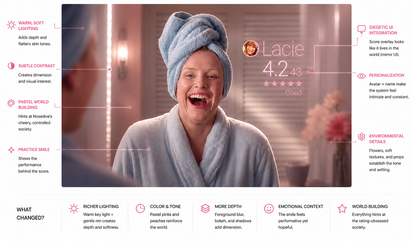
The first thing Lacie Pound does on screen is practice a laugh.
She tries it three different ways into a bathroom mirror. None of them sound real. None of them are meant to. The laugh is for a photo, the photo is for a post, and the post is for a score that will, by the end of the day, decide whether she gets to live in the apartment she wants.
This is the world of Nosedive, the season three opener of Black Mirror. It is also, quietly, one of the sharpest UX critiques on television. Read closely, the episode is a ninety-minute case study in what happens when a product team optimizes for a single metric and forgets to ask what gets sacrificed to feed it.
The Premise, Briefly
Everyone in this world wears a contact lens that overlays a five-star rating next to every other person they see (Brooker, 2016). Every interaction, a coffee handed across a counter, a hallway hello, a wedding speech, ends in a small thumb-swipe that nudges the other person’s score up or down. The average rating is social currency. It controls what apartments you can rent, what cars you can drive, what flights you can board, what neighborhoods will have you.
Lacie sits at a 4.2. She wants 4.5. A real estate agent has told her that a 4.5 unlocks a 20% discount on a luxury apartment. The plot is, essentially, her attempt to game her score upward in a weekend, and the slow, deliberate way the system grinds her down instead.
If you have not seen it, the rest of this piece will spoil it. Watch first if you can.
The Anatomy of the Score

The interface is almost invisible. That is the point.
There is no app to open, no dashboard to check. The score floats next to a person’s face the way a name tag might. A swipe up rates them five. A swipe down rates them one. There is no friction, no confirmation step, no cost. The most powerful UX move the show makes is taking the like button and welding it to a person.
Three details about the system deserve attention before any ethical analysis.
It is always on. Every face Lacie looks at carries a number. There is no neutral mode. Even the elevator is a leaderboard.
It is bidirectional and instant. A handshake, a smile, a brushed shoulder, all of these collapse into a rating that registers in the other person’s account before the moment is over. Feedback loops this short do not leave room for reflection.
It is asymmetric in power. A high rater’s vote moves your average more than a low rater’s. A nod from a 4.7 stranger is worth more than ten five-star ratings from service workers. The system rewards proximity to people who already have status, which is to say, the system manufactures a class structure and sells it back as merit.
“Most of your interactions are confined to your inner circle and they’re largely, pardon the term, mid-to low-range folks.” — Reputelligent consultant
The vocabulary tells you what kind of system this is. People are “primes.” Strangers are “peripherals.” Honest feedback becomes “a punch up.” A wedding becomes a “prestige bounce of 2 minimum.”
The Feature Map
Before the analysis goes deeper, here is the rating system broken into its discrete features and judged against the values framework Friedman and Kahn (2003) propose for value sensitive design. Verdicts are mine.

The rest of the article unpacks the four rubric anchors of this map: agency, values, authenticity, and cognitive load.
Human Agency: Two Verdicts
Friedman and Kahn (1992) frame human agency as the user’s capacity to act with intention and to author their own outcomes inside a system. A design that supports agency gives the user meaningful choice and meaningful recovery. A design that violates it leaves the user reactive, monitored, and unable to course-correct.
Two features in Nosedive fail this test cleanly.
Feature 1: The punitive multiplier. Verdict: Violates.
When Lacie loses her composure at the airport, a security officer invokes a 24-hour penalty in which all downvotes count double. The decision is unilateral. There is no review, no appeal, no cooling-off period the user can request. The trigger is also discretionary, the same officer could have warned her instead. From an agency standpoint, the user is now operating in a state where every routine interaction can damage her at twice the normal rate, and she cannot exit the state by behaving better, only by waiting it out. Recovery is decoupled from action. That is the textbook shape of an agency-violating system.
Feature 2: Score-gated access to basic infrastructure. Verdict: Violates.
Lacie cannot board the standby flight she needs because she sits at 4.183, just under the 4.2 threshold. The agent does not have the authority to make an exception, the system does not let her book the seat, and the seat goes empty. This is agency-violating in a specific way that the housing example also illustrates. The user retains the surface freedom to try, but the system has prefiltered the option space to whatever the score permits. Choice without options is a performance of autonomy, not autonomy itself.
Both features share the same design pattern. The system reads the score, makes the decision, and removes the human from the loop. Every interaction with the interface confirms that the user is acted upon by their reputation rather than acting through it.
Human Values: Five Verdicts
Using the value list from Friedman and Kahn (2003), here is the system judged on five distinct values, each tied to a specific feature.
Autonomy. Feature: score-gated access. Verdict: Violates. The user can vote however they want, but the system makes honest voting structurally expensive. Honest votes from low-status users are visible, and high-status raters notice them. Autonomy that costs you your housing is autonomy in name only.
Privacy. Feature: always-on overlay. Verdict: Violates. There is no version of going out in public without your score being visible to every stranger who looks at you. Privacy in the Friedman and Kahn sense is the user’s ability to control what is known about them. Nosedive removes that control as a precondition of leaving the house.
Informed consent. Feature: default participation. Verdict: Violates. The system is woven into housing, transit, employment, and friendship. There is no opt-out screen because there is no outside. Consent that is not refusable is not consent, it is a Terms of Service signed at birth.
Psychological well-being. Feature: continuous public scoring. Verdict: Violates. The product requires the user to perform impression management at all times in all contexts. Lacie’s anxiety, sleep loss, and emotional volatility are not personal failings, they are the predicted output of a system that never lets the user step out of view.
Social fairness. Feature: status-weighted voting. Verdict: Violates. The high-rater multiplier is the most deliberate inequality in the design. It guarantees that whoever already has status accumulates more of it faster, and whoever does not is structurally locked out. The system reproduces a class hierarchy and labels it as merit.
A sixth value, authenticity, gets its own section because it sits at the heart of what the episode is actually arguing.
Authenticity: Turkle (2007) and the Tethered Self
Turkle (2007), in Always-On/Always-On-You: The Tethered Self, argues that networked technologies do not just change what we do, they change what we are. When a person is reachable at every moment and visible to a continuous audience, the self stops being something one has and becomes something one maintains. The line between private interiority and public presentation goes soft. Authenticity, for Turkle, is what gets lost first.
Nosedive takes that observation and turns it into a hardware feature.
Feature: the one-tap rating, applied to every interaction. Verdict: Violates authenticity.
The cost of an honest reaction in this world is a possible downvote, and downvotes compound. So Lacie laughs at a smoothie she does not want. She compliments a child she has never met. She rehearses a wedding speech for a friendship that has not been emotionally active in years. None of these are lies in the conventional sense. They are the predictable behavior of a self that has been redesigned, by the interface, to optimize for the score.
The Naomi phone call is the cleanest illustration. Naomi invites Lacie to be maid of honor not because the friendship is alive but because, in her words, “the authenticity of a vintage bond low four at a gathering of this calibre played fantastically on all the simulations we ran.” Authenticity has been rebranded as a marketing asset. When Lacie’s score drops, the invitation is rescinded, because the asset is now untradeable. The relationship was never the point. The metric was.
The verdict reverses only once, in the holding cell. With the lens removed, Lacie and the man across from her trade insults that escalate into laughter. It is the only honest exchange in the episode. The interface had to be physically absent for it to happen. Verdict: Upholds authenticity. The design implication is uncomfortable, the most authenticity-supporting state of the system is the state in which the system is off.
Cognitive Cost: Proctor and Van Zandt on Mental Workload
Proctor and Van Zandt define mental workload as the cost of holding and processing information in working memory while performing a task, and they note that subjective workload is sensitive to perceived effort, not just objective task difficulty. They also distinguish primary tasks from secondary tasks, and treat the inability to suppress a secondary task as a marker of overload.
Feature: the always-on overlay. Concept: divided attention and continuous secondary-task load.
Lacie’s primary task at any moment is whatever she is doing in the world, ordering coffee, riding an elevator, sitting in traffic. Her secondary task is monitoring and influencing the rating she is receiving from everyone in the room. In a normal workload model, secondary tasks are bounded. They start, they end, the operator returns to baseline. In Nosedive the secondary task does not end. It runs while she eats, while she drives, while she sleeps next to her phone. This is the HCI implication that matters, the system does not just add load, it removes the user’s ability to ever be off-task.
You can watch the workload break down in real time. Once the penalty multiplier is active, Lacie’s behavior shows the classic markers of overload, narrowed attention, increased error rate, emotional dysregulation, and the abandonment of long-horizon planning in favor of frantic short-horizon reaction. By the wedding, her cognitive resources are spent. The speech that follows is not a character collapse. It is a workload failure, dramatized.
This is also why the holding cell scene plays as relief. The lens is gone, the secondary task is gone, and the user returns to a single primary task, which is talking to one other person. Workload theory predicts exactly the kind of release the audience sees on screen.
The Slide

Lacie’s collapse is structured. It is not a character flaw playing out, it is a system doing what it was built to do.
The triggers escalate in a clean arc. A two-star rating from a hotel charger encounter. A cancelled flight she cannot rebook because her score has dropped below the threshold. A profanity incident at the airport that puts her on a 24-hour double-damage multiplier. A two-star truck driver. A bike theft. A speech delivered in mud, at a wedding she was no longer invited to, in front of an audience whose downvotes carry a multiplier.
Each of these in isolation is a minor friction. The design choice that makes them catastrophic is the multiplier and the compounding effect. The penalty mode is a feedback loop that, once entered, accelerates rather than stabilizes. There is no graceful degradation. There is no rate limit. There is no path back.
A designer looking at this arc should recognize the shape. It is the shape of a system that optimizes for one variable and treats every other concern as out of scope.
The Last Laugh
The final scene is the most important one for any UX reader of the episode.
Lacie is in a holding cell. Her contact lens has been removed. The overlay is gone. Across from her, behind another set of bars, is a man whose score has long since fallen off the chart. They begin exchanging insults, building in volume and creativity, until both of them are shouting unfiltered, uncalculated obscenities at each other.
And they are laughing.
It is the only honest laugh in the episode. It is also the only moment in the episode where neither character is being rated. The two facts are the same fact. The release is the absence of the interface. That is a designer’s line.
What Designers Should Take From This
Nosedive is fiction, and fiction is allowed to exaggerate. But the design choices it dramatizes, public scoring, frictionless feedback, status-weighted votes, punitive multipliers, deep integration into housing and transit and employment, are not invented from scratch. Most of them already exist somewhere, in fragments, across products people use every day.
A few takeaways worth carrying back into actual practice:
A score is never just a score. The moment a number is attached to a person, that number starts to do work the designer did not necessarily authorize.
Frictionless feedback is not neutral. Removing the cost of rating someone changes who gets rated, when, and why.
The multiplier is the real design choice. Whether the system stabilizes or spirals, whether a bad day is recoverable or terminal, lives in the math behind the visible UI.
Calmness, autonomy, and authenticity are values. Designing past them is a choice, even when it does not feel like one.
Closing
The most uncomfortable thing about Nosedive is not the dystopia. The dystopia is loud. The uncomfortable thing is how recognizable the small moments are. The held smile. The performed laugh. The check of the phone. The small internal calculation before saying something true.
The episode does not need a contact lens to make its point. The contact lens is just the version of the interface where you can see the rating. The rest of the system, the constant audience, the constant performance, the constant cost of being unmeasured, is already running.
The design question it leaves with you is simple, and not rhetorical.
If you took the score off, who would be left?
References
Friedman, B., & Kahn, P. H. (1992). Human agency and responsible computing: Implications for computer system design. Journal of Systems and Software, 17(1), 7–14.
Friedman, B., & Kahn, P. H. (2003). Human values, ethics, and design. In J. A. Jacko & A. Sears (Eds.), The human-computer interaction handbook (pp. 1177–1201). Lawrence Erlbaum Associates.
Proctor, R. W., & Van Zandt, T. (2018). Human factors in simple and complex systems (3rd ed.). CRC Press.
Turkle, S. (2007). Always-on/always-on-you: The tethered self. In J. E. Katz (Ed.), Handbook of mobile communication studies (pp. 121–137). MIT Press.
Brooker, C. (Writer), & Wright, J. (Director). (2016). Nosedive [Television series episode]. In Black Mirror. Netflix.
메타데이터
- post_id
- e9e9616f8f85
- slug
- the-interface-that-eats-you-a-ux-reading-of-black-mirrors-nosedive-e9e9616f8f85
- url
- https://medium.com/@sid130803/the-interface-that-eats-you-a-ux-reading-of-black-mirrors-nosedive-e9e9616f8f85
- canonical_url
- https://medium.com/@sid130803/the-interface-that-eats-you-a-ux-reading-of-black-mirrors-nosedive-e9e9616f8f85
- author_url
- https://medium.com/@sid130803
- status
- ok
- fetched_at
- 2026-06-09 15:37:30