Why the best part of the flow isn't the end
South Korea’s “dopamine sites” let you order food that never arrives. Strip out the transaction and what’s left still works — which should…
Why the best part of the flow isn't the end
South Korea’s “dopamine sites” let you order food that never arrives. Strip out the transaction and what’s left still works — which should make designers curious.

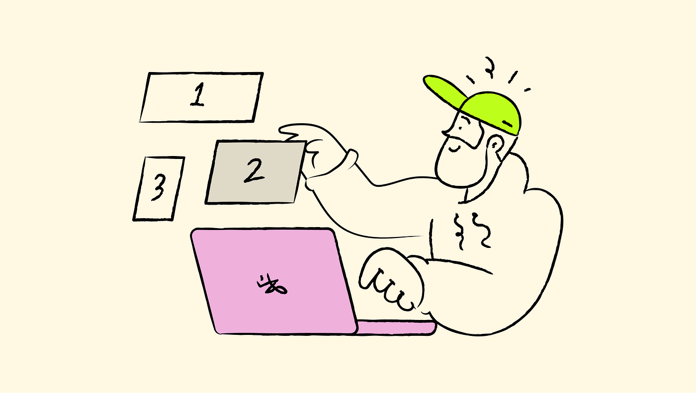
illustration by author
Sometimes, I find myself on whatever shopping site, building a basket I have no real intention of buying. I just sit with it for a few minutes, then close the app having ordered nothing but somehow feeling a weird level of ‘doneness’. Anyone relate? I’d always filed this under small private failures of willpower until a few days ago when I read that someone in Seoul had turned the exact same habit into an app, and it made me think that perhaps it was something more than weak will alone, but also a quite interesting design insight I’d been too caught up to notice before.
The app is called FoodNeverComes and it does exactly what the name threatens to do. You browse restaurants, fill a cart, enter an address and watch a courier set out on the interactive map. However, nothing actually arrives, because there is no kitchen and no courier behind any of it, only the theatre of ordering. It belongs to a small genre that Korean users have started calling “dopamine sites” (도파민 사이트), which also includes a page that mimics stepping outside for a cigarette with “colleagues” you’ll never meet. A lot of the coverage treats this as a sad symptom of a tired generation, and probably it is, but I’m more interested in it as a design artefact, because it breaks an assumption sitting underneath almost every flow I’ve ever shipped.

a screen of ther app foodnevercomes (source)
We design every flow towards its ending
Let’s think about how we draw a user journey: we start with an intent and we move towards a completion — be it a purchase, a submitted form, a booking confirmed, a food order — and we treat everything in between as steps to be shortened. The holy grail of conversion is about getting people to that final state with as little friction as possible because the end is the point, and the middle is overhead.
FoodNeverComes removes the ending and keeps everything else, and the surprising result is that people still come away satisfied. That sounds very counterintuitive, but the psychology underneath it is pretty solid; we just had it backward for years. Dopamine is mostly mentioned in the context of rewards, but in reality is the chemistry of anticipation, too. It spikes in the run-up to a thing rather than in the having of it, which is why the half-hour of waiting for a delivery seems to outperform the meal that ends it. The neuroscientist Kent Berridge nailed this down years ago when he separated “wanting” from “liking” — two things that feel as a single sensation to us, but that the brain runs on separate circuits: dopamine powers the wanting, and the liking, the actual pleasure of consuming the thing, turns out to be a much smaller signal than the appetite that preceded it.
In most consumer products, the payoff is attached to the end, so we’ve been crediting the wrong moment. The whole frictionless e-commerce paradigm for example — the one-click checkout, stored cards, a buy button that follows our attention wherever it goes, confetti and all that after confirmation — was all built on the premise that the purchase is the valuable moment and everything before it is friction to be filed away.

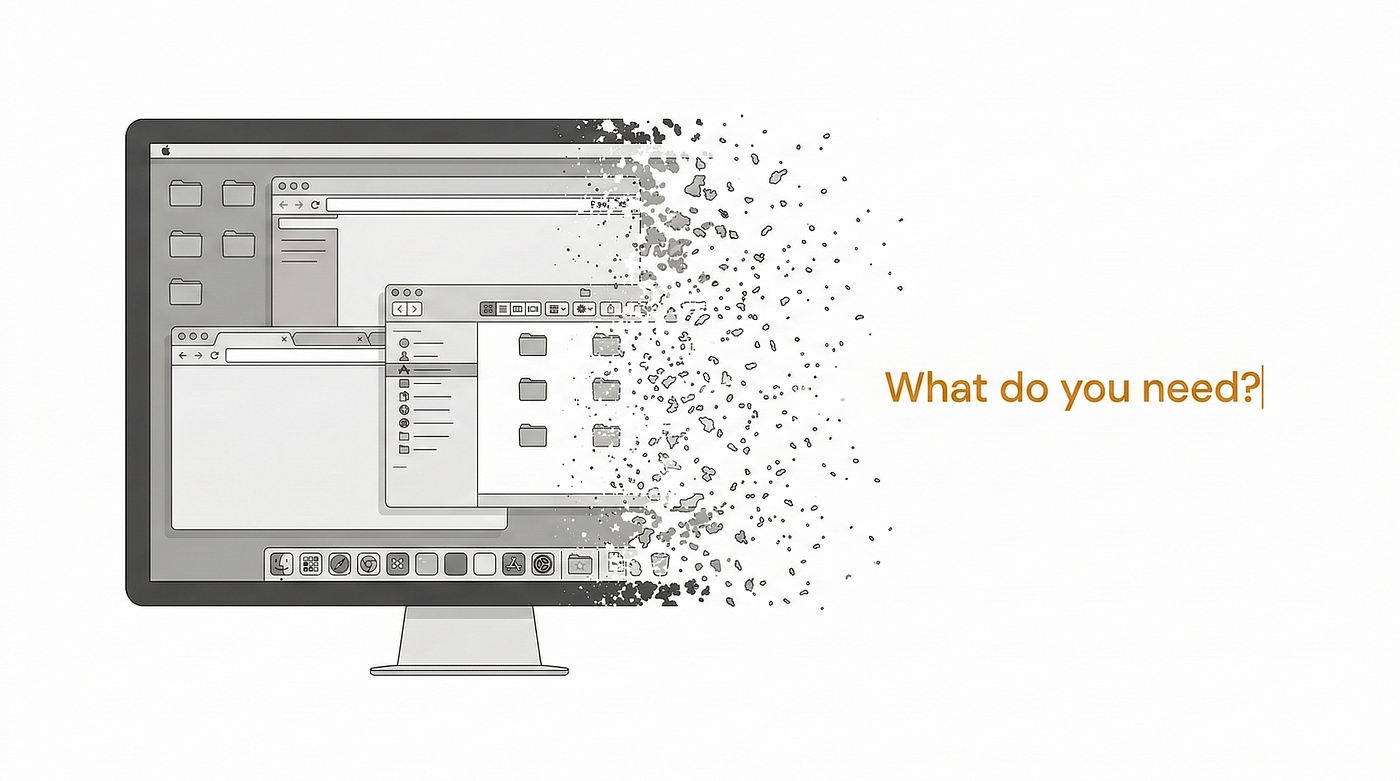
illustration by author
I’m not suggesting we ship dead-end checkouts of course, but I think it’s interesting that the success state of a flow and its most satisfying moment are not always in the same place, yet we design as though they are.
Browsing isn’t a leak
There’s a strong instinct in product work to read any session that doesn’t convert as a leak. Someone browsed and left without buying, so we reach for a reminder email or a saved-cart prompt to drag them back to the checkout. The unspoken assumption is that the browse was worthless unless it ended in a sale.
These apps offer a different perspective because they show how much pull the browsing has on its own. People will open an app and build a basket purely for the pleasure of it — exactly the behaviour we’ve been performing inside other products for years — a wishlist we curate and never buy from, or a Pinterest board for a house we’ll likely never own. We log all of it as failure but that anticipation can do a lot of work even when no money changes hands: it builds the desire that pays off later. The business wants the conversion, obviously, and it should. The mistake is treating the enjoyable browse as dead weight, then harassing people out of the one part of the experience that keeps them coming back to buy at all.
Most of the experience lives in the interface, not the transaction
Another interesting thing, especially for anyone who’s not a fan of microinteractions. Strip the real transaction out and what remains — the thing still doing all the work — is pure interface. The cart that fills, the star ratings, the estimated delivery time, the little courier coming towards your door: none of it is wired to anything real, and it still satisfies, which tells you how much of the emotional weight was being carried by the whole “choreography”.
We tend to treat those details as “nice to haves” laid over the “real” function. This fake app turns that around and suggests the feedback and the sense of progress were a large share of the value all along, and the transaction itself was almost negligible (in terms of enjoyment). That’s worth holding onto the next time a microinteraction gets cut for being non-essential. Essential to what, exactly? Your user may have come or might stay especially for that.

illustration by author
Presence can be the whole feature
The smoke-break sites bring a different lesson, this one for anyone building social or community features. You press start and a live counter shows how many strangers are “outside” at that moment, and you read the things they’ve typed into the room. Nobody chats to anybody, the comfort simply comes from knowing that other people are there at the same time.
We almost always build social features around interaction — messaging, replying, reacting, posting. This is a reminder that ambient co-presence, the simple knowledge that others are around, can be a deliverable in its own right, and a low-stakes otion that people might accept in places where full interaction feels like too much to ask.
What this changes about the brief
I don’t think of these apps as a model to copy one to one, of course. Most products need their transaction to complete, and for nearly everything we build a checkout that goes nowhere is an all-hands-on-deck bug to fix. What they offer tho, is a controlled experiment that isolates a variable we usually can’t see: by removing the outcome, they show you exactly how much of an experience was never about the outcome in the first place.
So next time I map a flow, I will try something different and I challenge you to do the same. I want to sit with the question these slightly silly apps put rather well: if I deleted the endpoint of this journey — the purchase, the confirmation — would anything of value survive? If the honest answer is nothing, then the flow is purely transactional and speed really is the only kindness we have to offer. The goal would be to find that something and protect it because the flows we’re proudest of — the fast, seamless ones — may be the ones spending the best part of the experience to save a few seconds, and a fake app shouldn’t be the only place that part is allowed to survive.
**Sources and further reading:** The dopamine sites and FoodNeverComes are reported in Fast Company and The Korea Times, with the wider context of youth burnout in ThePrint; the anticipatory nature of dopamine is summarised well in Psychology Today.
메타데이터
- post_id
- e9fef73f6bb3
- slug
- why-the-best-part-of-the-flow-isnt-the-end-e9fef73f6bb3
- url
- https://uxdesign.cc/why-the-best-part-of-the-flow-isnt-the-end-e9fef73f6bb3
- canonical_url
- https://uxdesign.cc/why-the-best-part-of-the-flow-isnt-the-end-e9fef73f6bb3
- author_url
- https://medium.com/@fabriziaa
- status
- ok
- fetched_at
- 2026-06-24 18:57:25