“Cancel anytime” is not a trust signal unless you show the steps
Last month, I was auditing our team’s operational SaaS stack (, and I decided to run an experiment.
“Cancel anytime” is not a trust signal unless you show the steps
Last month, I was auditing our team’s operational SaaS stack (, and I decided to run an experiment.
Last month, I ran an experiment with too many open tabs with a cold brew on table. I populated 16 SaaS accounts with real usage data and then tried to leave. I timed my exit across all 16. I clicked “cancel anytime” on 16 different products I was actively paying for.
The rest? One required an actual phone call to an overseas support center. Someone forced me into an interactive chatbot conversation where a bot kept asking “Are you sure?” in slightly different shades of passive-aggression.
Two buried the escape link six layers deep under
Settings → Account → Billing → Plan “Looking for something else?”
Yes, actually. Looking for the exit door.
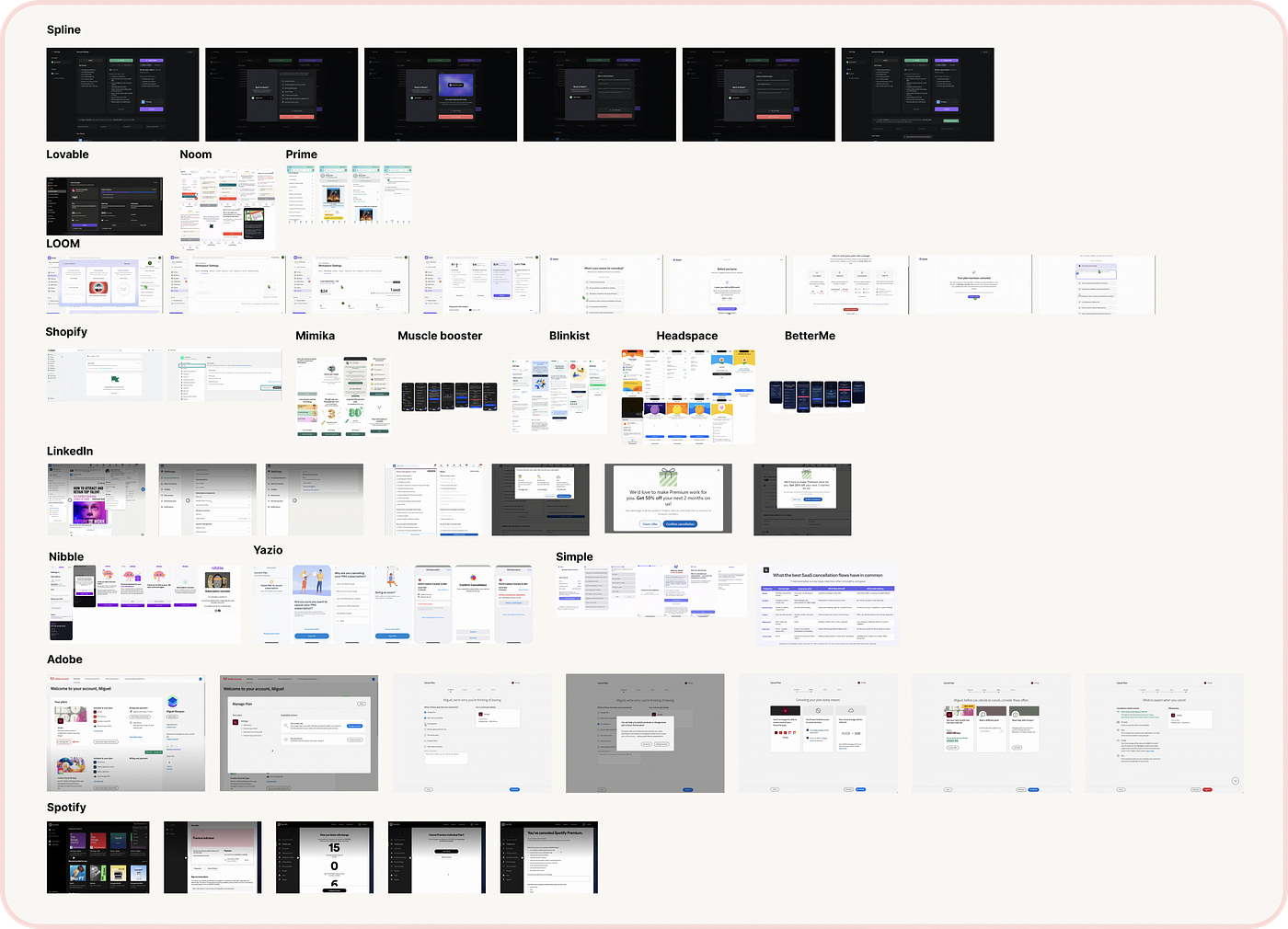
Screenshots from the different products that we looked at for this article!
One product straight up didn’t have a cancel button in the UI at all. I had to write a manual support email and wait 14 hours for a human to process it. (Whyyyy? still in 2026)
And yet, every single one of these platforms prominently displayed “cancel anytime” on their pricing page.
This is the sharpest trust gap in modern product design. The words “cancel anytime” are deployed during signup when a growth marketing team is desperate to reduce your anxiety about committing. But the actual exit experience is designed during a completely different lifecycle phase by an entirely different team: retention.
They never talk.
The signup copy promises complete freedom. The actual cancel flow delivers an intentional, defensive churn protection. The gap between what you promise at signup and what you deliver at cancellation is the fastest way to DESTROY the trust you spent months building.
Cancellation flow products audit
To see how deep the structural rot goes, I populated 16 accounts with real usage data, kept them active for a few days, and then timed my exit.
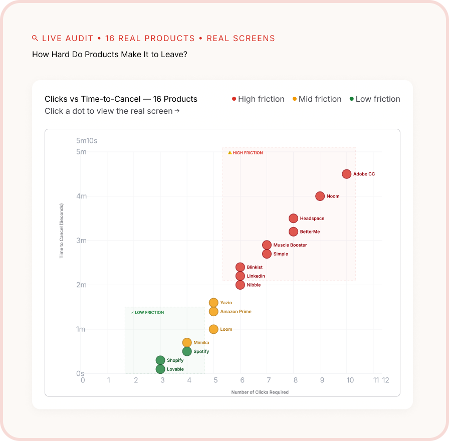
How hard do products make it to leave?
The behaviours split cleanly into three distinct categories:
Category 1: The Obstacle Course (9 of 16 products)
These platforms designed the user flow to systematically exhaust your patience until you surrendered to the subscription.
- The Metric:Average time: 4 minutes, 20 seconds. Average clicks: 11.
- The Tactic:Hiding the primary action behind deceptive layout labels like “Manage Plan” or “Downgrade.”
- The Danger:Two of these tools weaponized severe data anxiety, showing bright red warnings stating “your data will be permanently deleted” without offering a simple, temporary “pause account” alternative.
Category 2: The Guilt Trip (4 of 16 products)
These products didn’t build mechanical walls, but they weaponized emotional manipulation.
- The Metric:Average time: 1 minute, 40 seconds. Average clicks: 5.
- The Tactic:Deploying copy designed to make you feel like you are breaking up with a real human being.
- The Danger:Showing weeping cartoon characters, warning that “your team will be left stranded,” or exploiting behavioral loops (e.g., “If you cancel now, your 47-day streak will reset”). It feels desperate.
Category 3: The Clean Exit (3 of 16 products)
Two platforms handled cancellation in a way that actively increasedmy brand conviction as I was leaving.
- The Metric:Average time: 38 seconds. Average clicks: 3.
- The Tactic: A single, transparent summary page explaining exactly when access ends, what happens to the data archive, and how to reactivate with a single click.
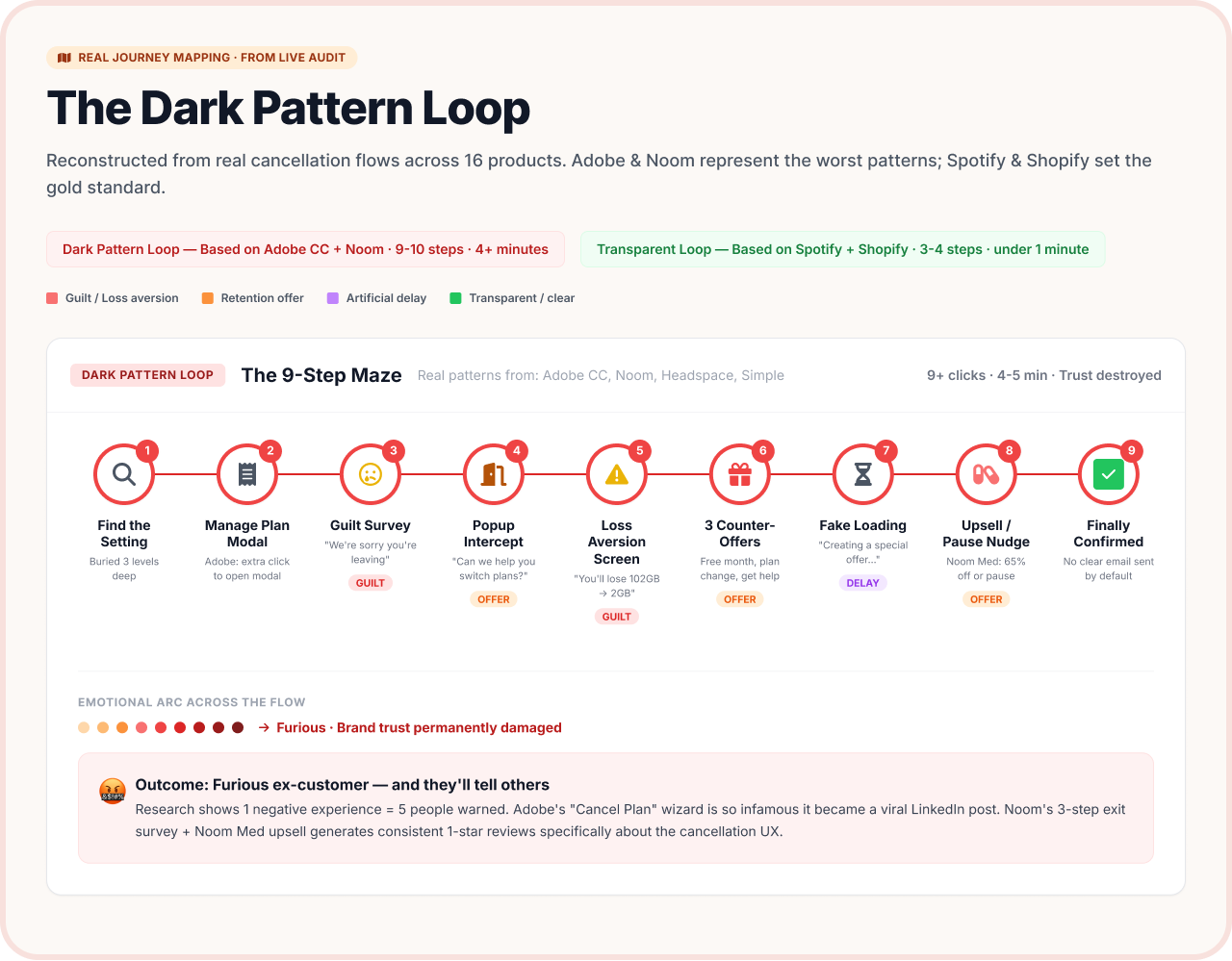
Designing the Trust-Preserving Cancel Flow
Based on the two platforms that treated me with respect, a pristine, high-integrity exit architecture follows a strict 4-step layout policy:
Step 1: Predictable Placement
Place the link exactly where the user expects to find it: Account → Subscription. Label it “Cancel subscription,” not “Change billing options.”
Step 2: The Consequence Summary
Dedicate a single screen to answering every single anxiety up front, before the user has to ask
- Your premium access will continue uninterrupted until the end of your billing cycle on July 12.
- Your historical configurations will be safely archived for 30 days before deletion. You can export them right here.
- You will not be charged again.
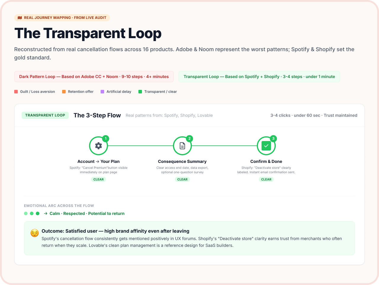
The transparency loop to make better cancellation
Step 3: The Low-Friction Pulse
Offer a single, optional question (“Mind telling us why we missed the mark?”) with a highly visible “Skip” button. Do not force text fields or multi-page feedback loops.
Step 4: Immediate Visual Confirmation
Render an unambiguous on-screen confirmation state immediately. Do not make the user wait for an email invoice to prove that the cancellation actually went through.
The total time for this entire flow? Under 60 seconds. Total clicks required? 3.
The Martech-Specific deep dive
In marketing utilities and ecommerce applications, cancellation anxiety is uniquely intense because users aren’t just leaving a software tool, they are disconnecting from their real-world audience.
When an online merchant tries to cancel an email or automation engine, they are paralyzed by three specific systemic anxieties that general SaaS doesn’t face:
- Subscriber Safety: If I click this button, does my hard-earned list of 5,000 customers vanish into thin air?
- **Active Automations:**Will my live post-purchase email sequences freeze mid-stream, leaving real shoppers stranded with half-finished experiences?
- Performance Logs: Will my historical open rates and campaign attribution data be wiped out forever?
The dark pattern loop from real SaaS products
A high-integrity martech cancel flow must state these exact structural consequences clearly:
“Your customer database remains fully exportable for 30 days. Active automations will continue executing until the end of your current billing cycle. Your campaign logs will be archived safely if you choose to return.”
That is three lines of text. And they eliminate every single drop of operational anxiety.
Make Leaving Easy
Frankly, treating a cancellation flow as a hostile interface is a LOSING strategy. (Given the context of 2026, with regulatory bodies globally enforcing strict consumer protection rules for digital subscriptions, clean exit loops are no longer just a qualitative design preference — they are a baseline legal boundary).
Psychology introduces a powerful human reality known as the peak-end rule: people evaluate an entire relationship based on how it felt at its most intense moment and at its absolute end.
If your exit flow is an 11-click maze of guilt trips, hidden gray links, and retention bots, that frustration becomes the permanent memory of your product.
Make leaving seamless, and coming back becomes an effortless choice. That is the real trust signal. Not two words on a pricing page. The actual, lived experience of being treated like a peer when you choose to go.
Thank you for reading and keep creating.
References
메타데이터
- post_id
- eb9c60e00cd5
- slug
- cancel-anytime-is-not-a-trust-signal-unless-you-show-the-steps-eb9c60e00cd5
- url
- https://medium.com/design-bootcamp/cancel-anytime-is-not-a-trust-signal-unless-you-show-the-steps-eb9c60e00cd5
- canonical_url
- https://medium.com/design-bootcamp/cancel-anytime-is-not-a-trust-signal-unless-you-show-the-steps-eb9c60e00cd5
- author_url
- https://medium.com/@riyajawandhiya
- status
- ok
- fetched_at
- 2026-06-09 15:37:30








