Typography as a System: Beyond Font Choices and Scale
How typography tokens, hierarchy, spacing, and accessibility work together to create a scalable design language.
Typography as a System: Beyond Font Choices and Scale
How typography tokens, hierarchy, spacing, and accessibility work together to create a scalable design language.
Disclaimer: I earn a small amount when Medium members read my work, so this article is set to members-only. Not a member? You can still read the full article using my friend link.
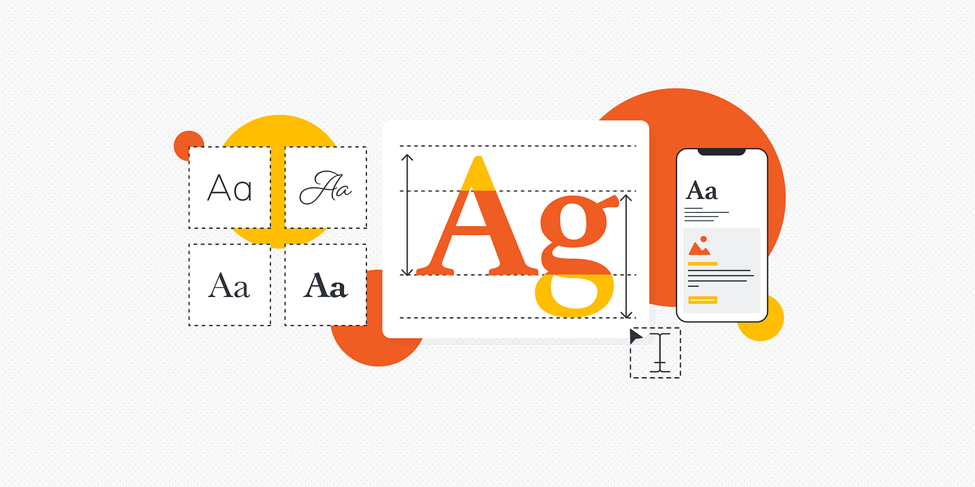
Typography becomes truly scalable when fonts, hierarchy, spacing, and responsive behavior are treated as a unified system rather than isolated style choices.
Why Typography Is More Than Picking a Beautiful Font
Typography often enters projects wearing a glamorous disguise. Teams gather around mood boards, browse font libraries, compare serif versus sans-serif options, and debate whether a typeface feels modern, premium, playful, or trustworthy. It feels exciting because selecting fonts resembles choosing clothes for a brand. You are giving personality to an experience. You are deciding how a product introduces itself to users before they even read a single word. This stage receives enormous attention because it is visible and emotionally satisfying. Yet selecting a typeface is only the beginning of a much larger challenge.
The difficult work begins after the font selection process ends. Suddenly questions start appearing from every direction. What happens when the same typography needs to work across web applications, iOS interfaces, and Android experiences? How should typography behave on tablets versus mobile devices? What changes when users enable dark mode? How should dense dashboards display information differently from spacious marketing pages? What happens when your product expands into multiple languages where text lengths and character structures behave differently? These questions rarely appear during the exciting font selection phase, but they determine whether typography becomes scalable infrastructure or recurring chaos.
Many design system teams quietly struggle here because typography starts behaving like an iceberg. The visible font choice represents only a small portion of the actual system. Beneath the surface lives hierarchy, spacing, semantics, accessibility, responsiveness, localization, tokens, and behavioral rules. Ignore those hidden layers and typography becomes inconsistent across products. Like constructing a building with beautiful paint but weak foundations, things might look acceptable initially, but cracks eventually appear.
The Illusion of Typeface-First Thinking
Many organizations believe typography begins with choosing fonts. Reality works differently. Typography starts with understanding communication needs and user behavior.
A beautiful typeface without a system behaves like a talented musician playing without sheet music. Individual notes may sound wonderful, but consistency disappears quickly.
What Typography Systems Actually Are
A typography system is not merely a collection of text styles organized inside design software. It is a structured framework defining how textual information behaves across products and experiences.
Typography systems establish relationships rather than isolated styles. They answer questions such as:
- How headlines differ from body text
- How content adapts to different devices
- How typography behaves in accessibility scenarios
- How text scales across experiences
- How visual hierarchy communicates meaning
Instead of asking, “Which font should we use?” typography systems ask, “How should information behave?”
From Visual Styling to Functional Infrastructure
Many teams initially view typography as decoration. As products scale, typography gradually transforms into infrastructure.
Think about roads in a city. Roads are not interesting because they exist. They become valuable because they create movement and organization. Typography functions similarly. Text helps users navigate experiences, understand priorities, and consume information efficiently.
The Difference Between Fonts and Systems
A font is a tool.
A typography system is a decision-making framework.
Confusing these concepts creates one of the industry’s most common mistakes.
Why Design Teams Quietly Struggle with Typography Systems
Typography complexity often remains hidden during early design phases because small products contain limited scenarios. Problems emerge when organizations scale.
Inconsistency Across Platforms
Every platform behaves differently.
Web environments support extensive customization and responsive flexibility.
iOS follows specific platform conventions around typography behavior and dynamic scaling.
Android introduces its own guidelines and implementation patterns.
The challenge is maintaining consistency without forcing every platform into identical behavior.
Teams commonly encounter issues like:
- Different line heights
- Different rendering behaviors
- Platform-specific spacing inconsistencies
- Font fallback problems
- Scaling mismatches
The result often feels subtle yet noticeable.
Users may not identify why interfaces feel inconsistent, but they sense friction.
Scaling Problems in Real Products
Typography systems become increasingly complex as products grow.
A startup website containing ten screens might survive with manually defined text styles.
Enterprise products rarely can.
As products expand, typography supports:
- Dashboards
- Forms
- Notifications
- Marketing pages
- Mobile experiences
- Data-heavy interfaces
- International products
Without systemization, managing these environments becomes exhausting.
Building the Foundation of a Typography System
Strong typography systems begin with purpose rather than aesthetics.
Defining Hierarchy and Purpose
Hierarchy helps users understand relationships between information elements.
A clear hierarchy answers questions such as:
- What deserves immediate attention?
- What supports primary information?
- What can remain secondary?
Hierarchy creates visual direction.
Without hierarchy, interfaces become crowded rooms where every person tries speaking simultaneously.
Creating Semantic Type Roles
Many modern systems move beyond labels like:
- Heading 1
- Heading 2
- Body Large
- Body Small
Instead, they introduce semantic roles:
- Display
- Headline
- Subtitle
- Body
- Caption
- Label
Semantic naming improves flexibility because roles describe purpose rather than appearance.
Designing Typography Across Platforms
Cross-platform consistency creates one of the biggest typography challenges.
Web, iOS, and Android Differences
Platforms behave differently for practical reasons.
Web experiences often support large layouts and responsive environments.
Mobile devices prioritize readability and interaction efficiency.
Important platform considerations include:
- Dynamic text scaling
- Native typography behaviors
- Accessibility settings
- Rendering differences
- Interaction environments
The goal is consistency in experience rather than identical visual outputs.
Responsive Typography Behaviors
Responsive typography extends beyond resizing text.
Effective systems adjust:
- Font size
- Line height
- Spacing
- Density
- Content hierarchy
Think of typography like water flowing through containers. The water remains the same, but the shape changes according to its environment.
Typography Tokens and Design Systems
Typography decisions become difficult to maintain when values remain hardcoded.
Turning Text Decisions into Scalable Rules
Typography tokens transform visual decisions into reusable variables.
Examples include:
- Font family tokens
- Font size tokens
- Weight tokens
- Line-height tokens
- Letter-spacing tokens
Tokens create centralized control.
Instead of modifying hundreds of interfaces manually, teams adjust shared values.
The system becomes easier to maintain and scale.
Designing for Themes, Density, and Accessibility
Typography behaves differently depending on context.
Dark Mode Considerations
Dark mode introduces more complexity than simply changing background colors.
Typography considerations include:
- Contrast adjustments
- Weight modifications
- Visual fatigue reduction
- Readability optimization
Text that performs well in light environments may behave differently against dark surfaces.
Dense Interfaces and Readability
Data-heavy products frequently require dense layouts.
The temptation is shrinking text aggressively to fit more information.
Smaller text often creates usability problems.
Density should improve efficiency rather than sacrifice readability.
Supporting Global Languages and Localization
Localization introduces some of typography’s most underestimated challenges.
The Multilingual Challenge
Languages behave differently.
Text expansion affects layouts.
Character structures vary significantly.
Reading directions change.
Common localization considerations include:
- Text length expansion
- Right-to-left layouts
- Character rendering behavior
- Font fallback strategies
- Language-specific spacing adjustments
Ignoring localization early often creates expensive redesign efforts later.
Common Typography System Mistakes
Many organizations repeat similar mistakes regardless of size or industry.
Scale Without Meaning
One frequent issue involves creating extensive type scales without defining clear purposes.
Teams produce:
- Ten heading sizes
- Eight body styles
- Multiple captions
- Numerous labels
The result becomes overwhelming.
Complexity without intention creates confusion rather than flexibility.
Systems should simplify decisions rather than multiply them.
The Future of Typography Systems
Typography continues evolving alongside technology.
AI, Variable Fonts, and Adaptive Experiences
Variable fonts allow dynamic adjustments across weight, width, and optical properties.
Artificial intelligence increasingly supports adaptive content experiences.
Future typography systems may automatically adjust based on:
- User preferences
- Device contexts
- Accessibility requirements
- Reading behavior
- Environmental conditions
Typography may eventually become increasingly responsive and personalized.
The challenge remains unchanged: maintaining consistency while supporting flexibility.
FAQs
1. What is a typography system in design systems?
A typography system is a structured framework defining how text behaves across products, including hierarchy, spacing, accessibility, responsiveness, and scalability.
2. Why are typography tokens important?
Typography tokens create reusable variables for typography decisions, helping teams maintain consistency and simplify updates.
3. Should web, iOS, and Android use identical typography?
Not necessarily. Experiences should feel consistent, but platform-specific behaviors often require implementation differences.
4. How does localization affect typography systems?
Localization changes text lengths, reading directions, character structures, and layout behavior, requiring adaptable typography strategies.
5. What is the biggest typography mistake organizations make?
Many teams focus heavily on choosing fonts while neglecting scalable systems and semantic structures.
Conclusion
Picking a great typeface is the easy part. The difficult work begins after excitement around font selection fades and reality starts introducing constraints. Products expand across platforms. Dark mode appears. Localization requirements emerge. Accessibility needs increase. Interfaces become denser. Suddenly typography becomes less about aesthetics and more about infrastructure.
Strong typography systems help organizations navigate this complexity. They transform isolated design choices into scalable rules. They create consistency without sacrificing flexibility. They allow teams to make decisions efficiently instead of repeatedly solving the same problems.
Typography is not simply visual decoration. It is one of the most important communication systems inside digital products. Fonts may give products personality, but systems give typography reliability. One creates style. The other creates structure.
The organizations that understand this difference build experiences that remain coherent across platforms, languages, and future technologies. The ones that do not eventually discover that beautiful fonts alone cannot prevent chaos.
메타데이터
- post_id
- ebf7d553470b
- slug
- typography-as-a-system-beyond-font-choices-and-scale-ebf7d553470b
- url
- https://www.designsystemscollective.com/typography-as-a-system-beyond-font-choices-and-scale-ebf7d553470b
- canonical_url
- https://www.designsystemscollective.com/typography-as-a-system-beyond-font-choices-and-scale-ebf7d553470b
- author_url
- https://medium.com/@madheshp
- status
- ok
- fetched_at
- 2026-07-09 21:48:21