Aerolíneas Argentinas Check-In Redesign Projectv
Improving the digital check-in experience for family travelers with low digital confidence
Aerolíneas Argentinas Check-In Redesign Projectv
Improving the digital check-in experience for family travelers with low digital confidence
Project Date: Summer 2026
Role: UX Research, Journey Mapping, Prototyping
Project Overview
For this project, I redesigned part of the Aerolíneas Argentinas mobile experience with a focus on digital check-in for family travelers.
The goal was to identify pain points in the current experience and create a simpler, more intuitive flow that helps travelers check in with confidence.
Tools Used
- Figma
- Medium
- Journey Mapping
- Mobile UX Design
The Problem
Every time my family travels, the same thing happens.
My parents open the Aerolíneas Argentinas app, try to complete check-in, and eventually ask me for help.
The issue isn’t that they don’t know how to use smartphones. They use WhatsApp, online banking, and other apps every day. The problem is that the check-in experience doesn’t clearly guide users through the process.
While reviewing the current experience, I noticed three recurring problems:
- Users are not clearly informed when check-in becomes available.
- The check-in entry point is difficult to find.
- Families must repeat the same process multiple times for each traveler.
These issues create confusion, frustration, and uncertainty before a trip even begins.
The Solution
Understanding the Journey
Before redesigning any screens, I wanted to understand the entire experience.
I created a customer journey map based on a family traveler persona inspired by my own mother.
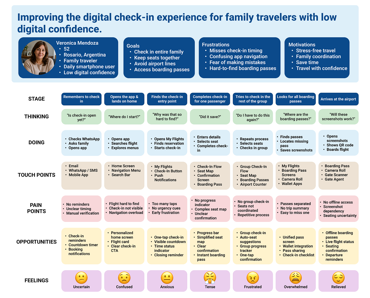
View Full Current-State Journey Map →
Key Insight
The biggest discovery was that users do not fail at one specific step.
Instead, small frustrations accumulate throughout the journey:
- Uncertainty about when check-in opens
- Difficulty finding the check-in flow
- Repeating actions for multiple travelers
- Managing separate boarding passes
By the end of the process, travelers feel less confident than they should.
Design Opportunity #1: Make Check-In Visible
The first improvement focuses on helping users know exactly when check-in is available.
Instead of requiring travelers to search through menus, the redesigned experience displays an upcoming flight directly on the home screen and provides a clear call-to-action.
Why? → If users miss check-in, the problem often begins before they even enter the process.
Design Opportunity #2: Group Check-In
The current experience treats every passenger individually.
The redesign introduces a group check-in flow where families can manage all travelers in a single experience.
Users can:
- Select passengers together
- Coordinate seats more easily
- Review information in one place
- Generate boarding passes at the same time
Why? → Families travel together. The app should support that behavior.
Design Opportunity #3: Boarding Pass Management
The final improvement focuses on reducing uncertainty after check-in.
Instead of searching through different screens or relying on screenshots, travelers can access all boarding passes from a centralized location.
Why? → Many users worry less about completing check-in than about finding their boarding passes later.
[embed]View Interactive Prototype →
Future State Journey Map
After identifying the pain points, I created a second journey map representing the redesigned experience.

View Full Future-State Journey Map →
Results
This project was not tested with real users, which is an important limitation. Most of the decisions were based on personal observations, journey mapping, and my own experience helping family members navigate the Aerolíneas Argentinas app.
Even without formal user testing, the project helped me identify how small usability issues can accumulate throughout an experience. What surprised me most was realizing that the biggest problem was not the number of steps in the check-in process. The real problem was that users often don’t know what to do next, whether they completed a step correctly, or where to find important information.
The redesign focused on reducing that uncertainty. Features such as a visible check-in reminder, a dedicated family check-in flow, progress indicators, and a centralized boarding pass hub were designed to make travelers feel more confident throughout the process rather than simply making the experience shorter.
One of the biggest lessons I learned from this project is that good UX design is often less about adding features and more about creating clarity. People are usually willing to spend a few extra seconds completing a task if they understand what is happening and feel in control of the process.
If I continued developing this project, my next step would be conducting usability tests with actual family travelers, especially parents and older users who do not consider themselves highly tech-savvy. Watching real users interact with the prototype would help validate the assumptions made during the redesign and reveal opportunities for further improvement.
More than anything, this project reinforced something I had already noticed from helping my own family travel: technology should make people feel more confident, not more dependent on someone else to complete a simple task.
Project Links:
메타데이터
- post_id
- ecb6da8dbfe0
- slug
- aerolíneas-argentinas-check-in-redesign-projectv-ecb6da8dbfe0
- url
- https://medium.com/@ag08772/aerol%C3%ADneas-argentinas-check-in-redesign-projectv-ecb6da8dbfe0
- canonical_url
- https://medium.com/@ag08772/aerol%C3%ADneas-argentinas-check-in-redesign-projectv-ecb6da8dbfe0
- author_url
- https://medium.com/@ag08772
- status
- ok
- fetched_at
- 2026-06-17 08:20:12






