Introducing DM Editor — A Visual Editor in React
Basic concepts & design for an open source visual editor
Introducing DM Editor — A Visual Editor in React
DM Editor's ideas & design concepts
Background
Online editing is a popular area and there were lot of ways, including here in Medium focusing much on writing experience :)
When it comes to page editing, there were traditional way like TinyMCE, which is quite powerful. While the page editing is not only about text and multimedia, it should have layout & interaction also — that's some tools like Elementor brings with. However Elementor is hooked into WordPress and also Elementor's server side & client are not separated.
Project
I started to think to create a visual editor in React, hoping to get benefit of React's visual DOM performance and ecosystem of components.
After months' development we got a beta version.
The React way brought benefits to both editors (real see what you get) and developers (creating a widget is like a normal component). I made this open source so all the platforms(eg. CMSes) / applications can use it.
Project website: https://dmeditor.io/ Github project: https://github.com/dmeditor/dmeditor/ (Welcome to use & contribute :))
Quick demo: https://demo.dmeditor.io/editor?d=demo
Main concepts
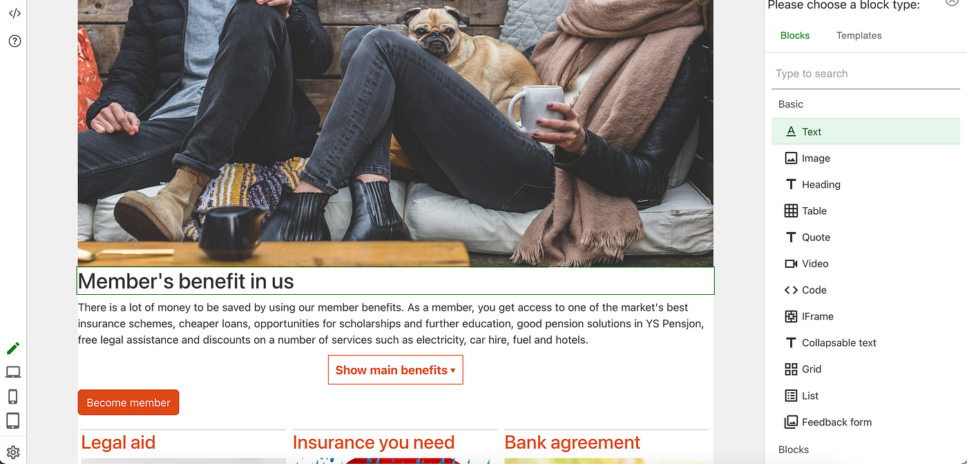
An example of DM Editor
Edit is view
With React's performance and components, it's possible to have good editorial experience, and make edit view almost identical to real view. One important thing is to edit in the display area, not in separate panel, even for interactive widget like tab, accordion, collapsible text.
Block based
Block based means it's not a text editor, but a real page visual editor, because a page is consist of blocks ( eg. grids, tabs ).
See result while changing
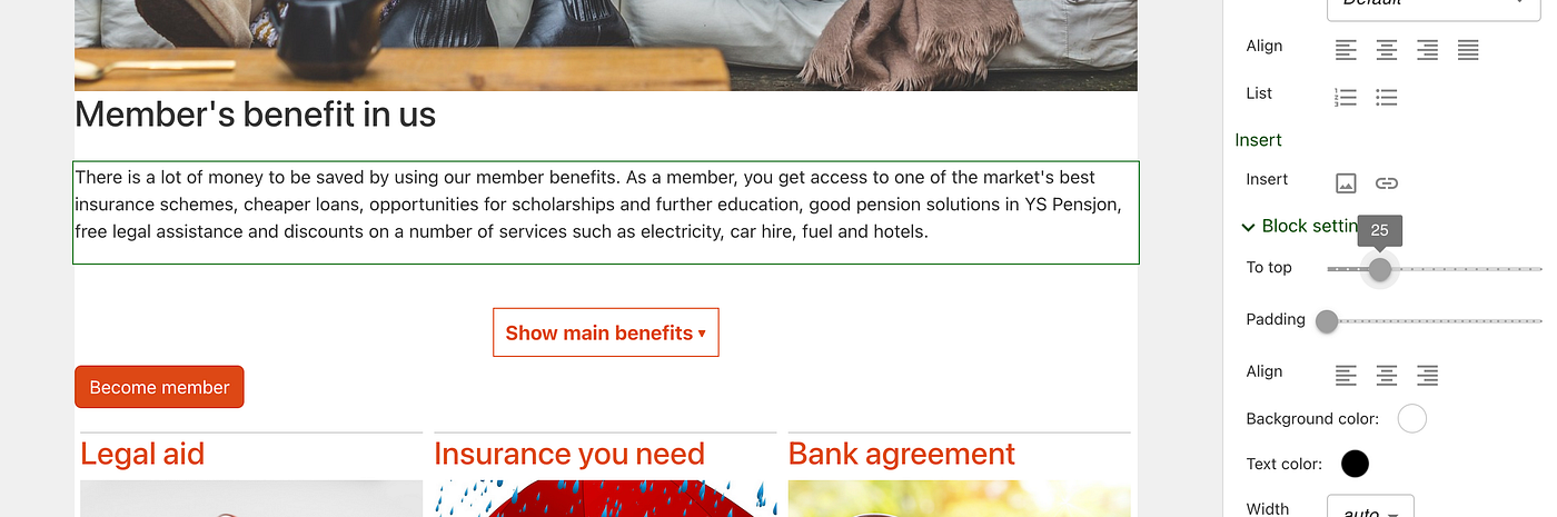
See the block moving while sliding “To top”
We try to use modern components to do change, like sliding, selecting and result can be seen while changing. Thanks to React platform there are many components like sliding/color picking we can use, with high performance.
Widget style
A widget style styles a widget using css, eg. change color / background in a heading's style. See further below about how to create a widget style.
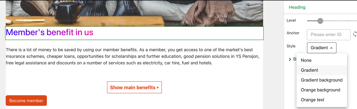
Select a style will result in customized display of a widget
Widgets inside widget
There are composite widgets which can contain other widgets: Grid and List:
- A grid is a widget whose children widgets are shown as a grid.
- A list a widget whose children are shown as up to down list.
Below is example of "collapsible text" inside grid:

A grid with 2 "collapsible text"
Widget template
A template is a widget with predefined data(including style).
A scenario is that editor can save any block as a template for further reuse, and the style and content of block will be included.
An interesting thing of template is, you can create complex grid using template feature. Below is a template with heading, text and image.

Select the template to insert
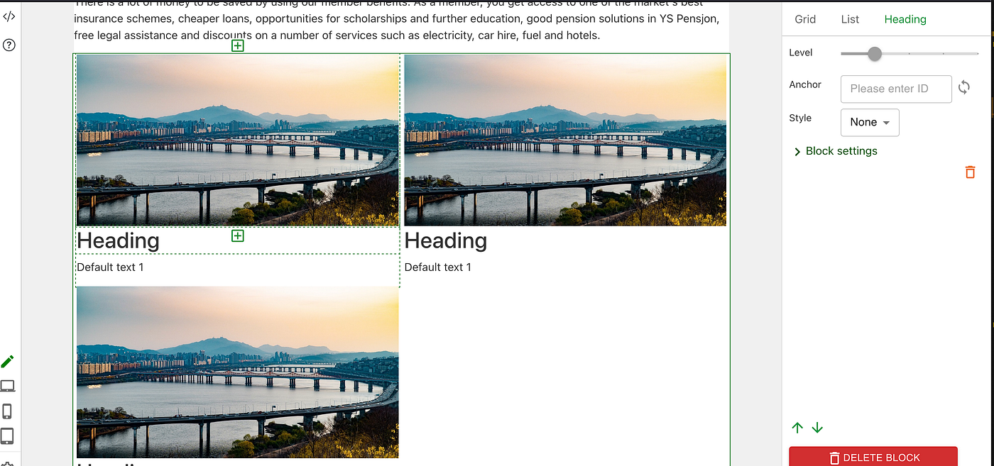
Add a 2 columns grid with predefined data
It's very useful to use template for frontpage blocks. See further below about example of how to create template.
SSR
Since it's aiming for outputting html for SEO, it needs to support Server Side Rendering. For NodeJS stack, DM Editor can be used directly in SSR(eg. in next.js).
For non-NodeJS stack, you can run a server behind to convert saved json into html&javascript and embed whole in html's div. We made a project for this: https://github.com/dmeditor/dmeditor-server .
Widgets
Built in widgets so far
- Basic widgets: Text(rich text), Heading, Image, Table, Quote, Code, Video, IFrame
- Interactive widgets: Tab, Accordion, Collapsible text
- Composite widgets: Grid, List(Collection of widget), Image Text
Content widgets
CMSes want automatic features, like showing latest 3 articles' title cover image in a grid.
It's possible to create a widget whose data source is dynamic. —These widgets is CMS dependent so it's not included in DM Editor.
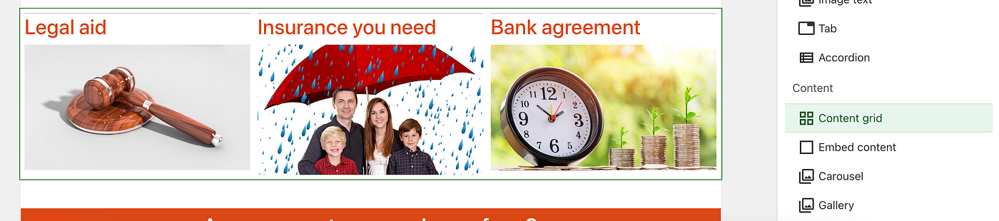
Show a content grid where content is from somewhere else
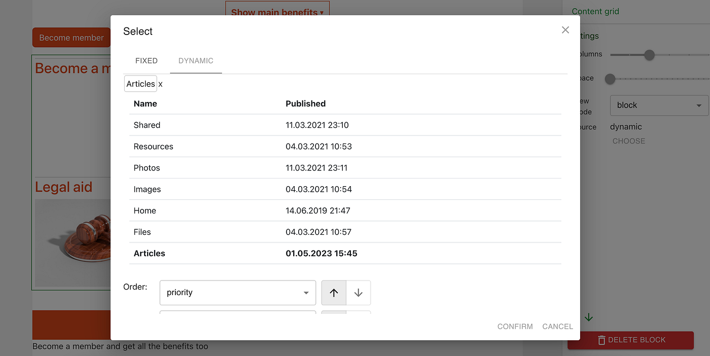
Select dynamic source
Application widgets
Any React application can be wrapped into a widget, and it's not iframe.
We try to make it super easy to create and style widget, so the editor can only click and select to get what he need, and see result immediately.
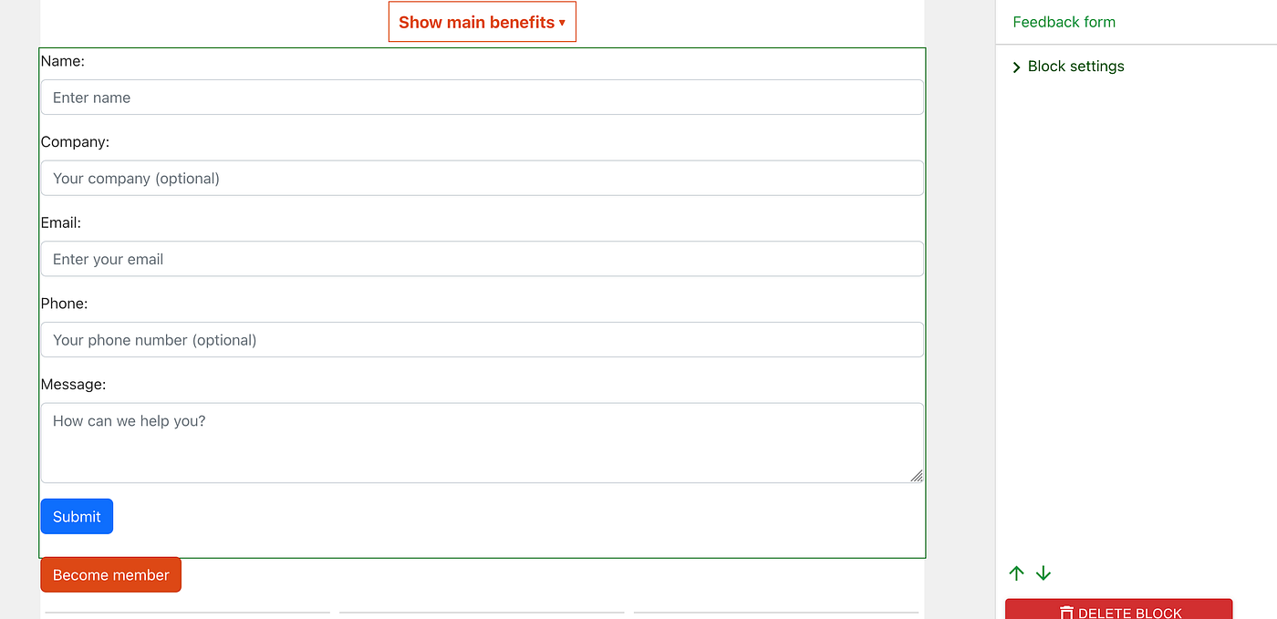
A sample feedback form showing real form — made in React
Create a widget style
Below is an example of changing heading background and make text center. The "Sample style" will be shown in the dropdown of heading's style property.
Note: We use emotion css so it's easy to manage css scope.
import { registerStyle } from "dmeditor";

registerStyle({
    blocktype: 'heading',
    identifier:'sample',
    name:'Sample style',
    css:css`background:#ffcc00;
    h2{
        text-align:center;
    }`
 }
);
Create a template
We register a template from App.tsx — a list containing an image, a heading(with Gradient style) and a text.
import { registerTemplate } from "dmeditor";

registerTemplate(
    { blocktype: 'list',
    id:'heading_text',
    name:'Heading text',
    data:{
        type: 'list',
        children: [
            {
             type:'image',
              data:{url:'https://cdn.jsdelivr.net/gh/dmeditor/templates@main/forsythia_1280.jpg'}
            },
            {
             type:'heading',
            settings:{level:2},
            style: 'gradient',
            data:'Heading'
            },
            {
             "type":"text", id:'a2', "data":[
                {type:"paragraph","children":[
                    {"text":"Default text 1"}
                ]},
              ]
            }
           ]
        }
     },
     );
Then the new template is shown in the menu as below:
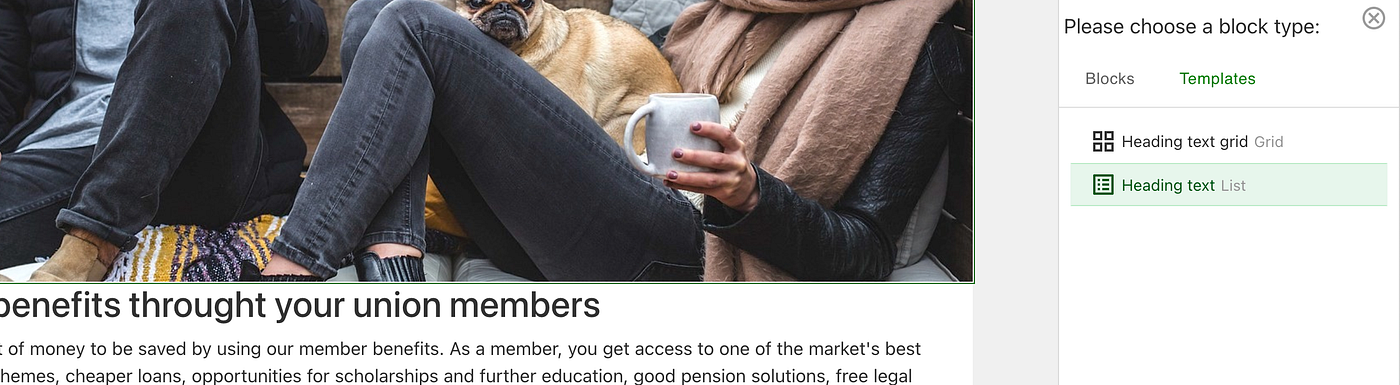
"Heading text" is in the template menu
The result looks like below. This template is useful when embedded in other widgets like Grid, Tab.
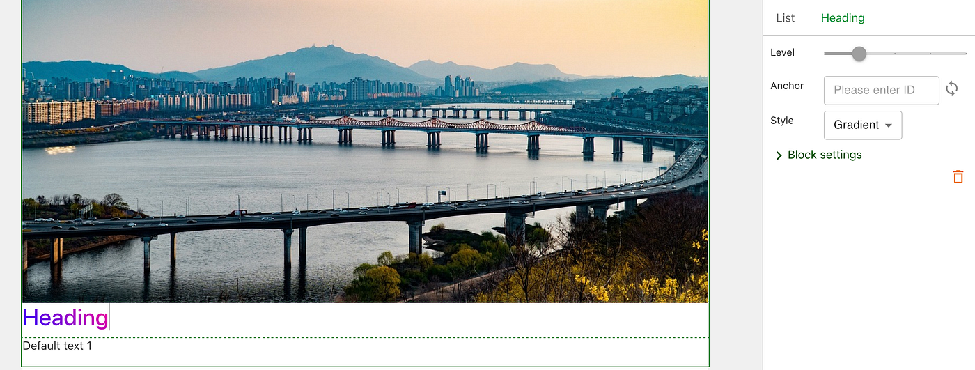
A template with image, heading, text
Note: to make complex template, you may need to create different styles and include style to the template.
Note: editor can create template also, just can only use existing widget styles.
Develop a widget
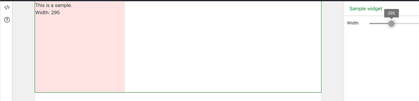
Creating a widget is as simply as creating a react component. Below is an example of showing width while sliding the width:
- Implement widget
export const SampleWidget = (props:ToolRenderProps)=>{
   ///add status control here
   const [width, setWidth] = useState(300);

    return <div>
    {/* property */}
            <BlockProperty blocktype={'sample'}>
                <PropertyItem label="Width">
                    <Slider aria-label="Width" valueLabelDisplay="auto" defaultValue={width} step={5} max={800} onChange={(e, v)=>setWidth(v as number)} />
                </PropertyItem>
            </BlockProperty>

            <div style={{width: width}} className={css`height:300px; background:#ffe3e3`}>
            {props.data.data} <br />
            Width: {width}</div>
            </div>
}

//Define toolSampleWidget
export const toolSampleWidget:ToolDefinition = {
    type: 'sample',
    name: 'Sample widget',
    menu:  {category:'basic',icon: <span>A</span> },
    initData: ()=>{return {type:'sample', data:'This is a sample.', settings:{}}},
    render: (props:ToolRenderProps)=><SampleWidget {...props} />
}- Register widget(can be in App.tsx)
import {registerTool} from 'dmeditor';

registerTool(toolSampleWidget);- Use it in DM Editor. Siding with width can change rectangle and width: <value>
메타데이터
- post_id
- ecfbff4bd9d
- slug
- introducing-dm-editor-a-visual-editor-in-react-ecfbff4bd9d
- url
- https://medium.com/@xcdubi/introducing-dm-editor-a-visual-editor-in-react-ecfbff4bd9d
- canonical_url
- https://medium.com/@xcdubi/introducing-dm-editor-a-visual-editor-in-react-ecfbff4bd9d
- author_url
- https://medium.com/@xcdubi
- status
- ok
- fetched_at
- 2026-06-27 07:40:21