VChart Extension New Feature: Unlock Data Regression and Trend Analysis with One Line of Code
In the field of data analysis and visualization, we often want more than just displaying discrete data points — we crave insights into the…
VChart Extension New Feature: Unlock Data Regression and Trend Analysis with One Line of Code
In the field of data analysis and visualization, we often want more than just displaying discrete data points — we crave insights into the underlying trends and patterns. Whether tracking the growth momentum of core product metrics, analyzing conversion effects of different strategies in A/B tests, or searching for potential relationships between key variables during business reviews, a smooth “trend line” always makes data stories clearer and more insightful.
To make trend analysis unprecedentedly simple, the VisActor VChart team has officially launched the Regression Line feature in the vchart-extension package. Now, with just one simple line of configuration, you can add powerful data regression and trend visualization capabilities to your charts.
Core Value: The VChart regression line extension aims to help users quickly and accurately overlay statistical regression lines on existing charts (such as scatter plots, line charts, bar charts, etc.), easily revealing potential relationships and development trends between data variables, providing intuitive references for data-driven decisions.
Core Capabilities Overview
VChart’s regression line extension is powerful and flexible, designed to meet various needs from quick exploration to in-depth analysis.
- Rich Regression Types: Built-in multiple commonly used regression algorithms to meet analysis needs in different scenarios.
- Linear Regression (linear): Explore linear relationships between variables.
- Polynomial Regression (polynomial): Fit nonlinear complex trends with support for custom degrees.
- Logarithmic Regression (logarithmic): Suitable for scenarios where growth rates are fast initially and slow later.
- Exponential Regression (exponential): Model trends where data grows exponentially.
- Loess Regression (loess): Locally weighted regression, excellent at capturing local data change trends.
- Kernel Density Estimation (KDE): Overlay smooth probability density curves on histograms.
- Empirical Cumulative Distribution (ECDF): Display the cumulative distribution of data.
- Seamless Integration with Multiple Chart Types: Can be easily combined with the most commonly used chart types in VChart.
- Scatter Plot: The classic scenario for regression analysis, intuitively displaying the fitting trend of two continuous variables.
- Bar Chart: Add overall trend references for discrete categorical data.
- Histogram: Combined with KDE or ECDF, gain deeper understanding of data distribution characteristics.
- Support for Grouped/Categorical Regression: When data contains multiple categories, regression lines can be calculated and drawn independently for each group, facilitating detailed comparative analysis.
- Highly Customizable Styles: Styles of regression lines, formula labels, confidence intervals, and other elements all support fine-grained configuration, ensuring visual effects perfectly blend with the overall design style.
Quick Start: Three Steps to Add Regression Lines to Scatter Plots
Adding regression lines to charts is very simple. Follow these three steps to enable this feature in your VChart project.
Step 1: Install and Import the Extension Package
First, make sure you have installed VChart and its extension package in your project.
# Using npm
npm install @visactor/vchart @visactor/vchart-extension
# Using yarn
yarn add @visactor/vchart @visactor/vchart-extension
Step 2: Register the Regression Line Component
Import and register the regression line component at your code entry point. This is the key to enabling all related features.
import VChart from '@visactor/vchart';
import { registerRegressionLine } from '@visactor/vchart-extension';
// Only need to call once
registerRegressionLine();
Step 3: Add Regression Line to Chart Configuration
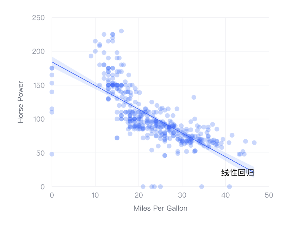
After registration, you can add regression lines in the chart spec through the append*RegressionLineConfig series of helper functions. Taking the most common scatter plot as an example:
import { appendScatterRegressionLineConfig } from '@visactor/vchart-extension';
// Assuming you already have a basic scatter plot spec
const spec = {
  type: 'scatter',
  data: {
    values: [
      { name: 'chevrolet chevelle malibu', milesPerGallon: 18, cylinders: 8, horsepower: 130 },
  { name: 'buick skylark 320', milesPerGallon: 15, cylinders: 8, horsepower: 165 },
  { name: 'plymouth satellite', milesPerGallon: 18, cylinders: 8, horsepower: 150 },
      // ... more data
    ]
  },
  xField: 'milesPerGallon',
  yField: 'horsepower',
};
// Add regression line configuration to spec
appendScatterRegressionLineConfig(spec, {
  type: 'linear' // Specify regression type as linear regression
});
// Now the spec contains regression line configuration and can be used for VChart rendering
const vchart = new VChart(spec, { dom: 'chart-container' });
vchart.renderSync();
It’s that simple! The rendered chart will automatically draw a linear regression line on top of the original scatter plot.
Advanced Configuration and Examples
The VChart regression line extension provides rich configuration options, allowing you to finely control the behavior and appearance of regression lines.
Key Configuration Options Explained
When using the append*RegressionLineConfig function, the second parameter config object supports the following key properties:
type: Specify the regression type. For example, in scatter plots, you can choose'linear','polynomial','logarithmic','exponential','loess'. In histograms, you can choose'kde','ecdf'.degree(orpolynomialDegree): Whentypeis'polynomial', used to specify the degree of the polynomial, default is 2. Higher degrees allow the curve to better fit data fluctuations, but risk overfitting.line: Used to configure the style of the regression line, such asstyle(line type, color, thickness, etc.).label: Configure the formula label at the end or top of the regression line, can customizetextandstyle.confidenceInterval: Configure the confidence interval, control its visibility throughvisible, and customize its fill style throughstyle.
Example: Style Customization
The following example will modify the type to implement a 3rd-degree polynomial regression line based on the previous scatter plot and customize the regression line style.
import { appendScatterRegressionLineConfig } from '@visactor/vchart-extension';
// Assuming you already have a basic scatter plot spec
const spec = {
  type: 'scatter',
  data: {
    values: [
      { name: 'chevrolet chevelle malibu', milesPerGallon: 18, cylinders: 8, horsepower: 130 },
  { name: 'buick skylark 320', milesPerGallon: 15, cylinders: 8, horsepower: 165 },
  { name: 'plymouth satellite', milesPerGallon: 18, cylinders: 8, horsepower: 150 },
      // ... more data
    ]
  },
  xField: 'milesPerGallon',
  yField: 'horsepower',
};
// Add regression line configuration to spec
appendScatterRegressionLineConfig(spec, {
  type: 'polynomial', // Supports 4 types: 'linear' | 'logistic' | 'lowess' | 'polynomial'
    polynomialDegree: 3,
    color: 'red',
    line: {
      style: {
        lineWidth: 2
      }
    },
    confidenceInterval: {
      style: {
        fillOpacity: 0.2
      }
    },
    label: {
      text: '3rd Degree Polynomial Regression'
    }
});
// Now the spec contains regression line configuration and can be used for VChart rendering
const vchart = new VChart(spec, { dom: 'chart-container' });
vchart.renderSync();
Example: Histogram and Kernel Density Estimation (KDE)
The regression line extension can also enhance the expressiveness of histograms. By overlaying KDE curves, you can more smoothly observe the “shape” of data distribution.
// This is a histogram spec with bin transformation
const spec = {
  type: 'histogram',
  data: { /* ... */ },
  type: 'histogram',
  xField: 'x0',
  x2Field: 'x1',
  yField: 'frequency',
};
// Attach KDE curves to it
appendHistogramRegressionLineConfig(spec, [
  {
    type: 'kde', // Supports 'kde' and 'ecdf'
    line: {
      style: {
        stroke: 'red',
        lineWidth: 2
      }
    },
    label: {
      text: 'KDE Kernel Density Estimation'
    }
  },
  {
    type: 'ecdf', // Supports 'kde' and 'ecdf'
    line: {
      style: {
        stroke: 'green',
        lineWidth: 2
      }
    },
    label: {
      text: 'Empirical Cumulative Distribution Function (ECDF)'
    }
  }
]);
Online Demo and Tutorial
Demo: https://visactor.com/vchart/demo/scatter-chart/scatter-regression-line
Tutorial: https://visactor.com/vchart/guide/tutorial_docs/Chart_Extensions/regression_line
Welcome to Connect
Finally, we sincerely welcome all friends interested in data visualization to join us and participate in the open-source development of VisActor:
VTable: VTable Official Website、VTable Github (Welcome to Star)
VisActor Official Website: www.visactor.io/ or www.viactor.com
Discord: discord.gg/3wPyxVyH6m
Feishu Group (External Network): Open Link to Scan QR Code
WeChat Official Account: Open Link to Scan QR Code
GitHub: github.com/VisActor
메타데이터
- post_id
- ed3e1344aa86
- slug
- vchart-extension-new-feature-unlock-data-regression-and-trend-analysis-with-one-line-of-code-ed3e1344aa86
- url
- https://medium.com/@xuanhun9/vchart-extension-new-feature-unlock-data-regression-and-trend-analysis-with-one-line-of-code-ed3e1344aa86
- canonical_url
- https://medium.com/@xuanhun9/vchart-extension-new-feature-unlock-data-regression-and-trend-analysis-with-one-line-of-code-ed3e1344aa86
- author_url
- https://medium.com/@xuanhun9
- status
- ok
- fetched_at
- 2026-07-14 10:54:51