Why Confused Users Never Tell You They’re Confused
The silence after a bad experience is not acceptance. It is the sound of someone deciding to leave without explanation.
Why Confused Users Never Tell You They’re Confused
The silence after a bad experience is not acceptance. It is the sound of someone deciding to leave without explanation.
The most expensive usability research I ever ran produced almost no actionable feedback. We had done everything right by conventional standards. We recruited representative users. We built a moderately realistic prototype. We ran twelve sessions over two weeks with a skilled moderator. At the end of each session, we asked participants how they found the experience.
The responses were almost uniformly positive. People said the interface was clean. They said it was easy to navigate. They said they thought other people would find it useful. A few had minor suggestions, a label that could be slightly clearer, a button that might benefit from more visual weight.
We shipped based on that research. Adoption was poor. Qualitative follow up several months later, done with different methodology, uncovered that a significant portion of new users had struggled with a core flow that the usability study participants had apparently sailed through without issue.
I went back and watched the session recordings more carefully. The participants had not sailed through. They had hesitated at exactly the same moments the post launch users struggled. They had taken wrong turns and self corrected. They had paused, looked uncertain, and then continued. None of that behavioral signal showed up in their verbal accounts of the experience because they had never mentioned it, and we had never asked the right questions to surface it.
The problem was not the research methodology in any technical sense. The problem was that confused users almost never tell you they are confused, and we had built a research process that assumed they would.

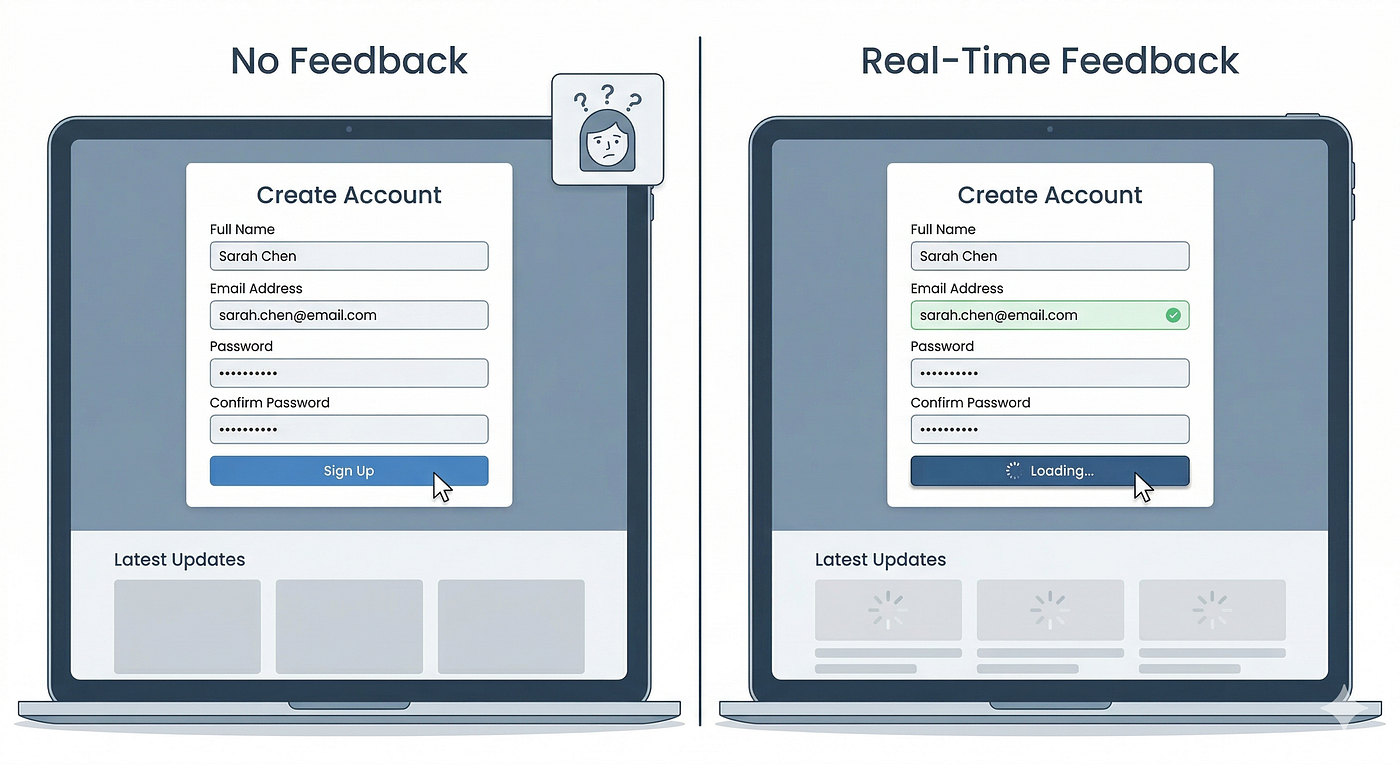
Image by: Google Nano Banana
The confusion that stays invisible
There is a specific emotional dynamic that happens when a person encounters confusion in a digital product, and understanding it clearly changes how you approach research and design work.
When someone sits down to use a piece of software and cannot immediately figure out what to do, they do not typically experience that as a product failure. They experience it, at least initially, as a personal failure. Something in the design of their own intelligence or attention has left them momentarily lost. The correct thing to do, from the perspective of this internal narrative, is to quietly figure it out rather than announce that they are struggling.
This narrative is reinforced by the social context of most usability research, even when researchers work hard to counteract it. A user being observed by a researcher, even a friendly and apparently non judgmental one, feels scrutinized at some level. Saying out loud “I do not understand what this does” feels more exposing than simply trying things until something works.
Steve Krug, whose work on usability testing remains some of the most practically useful writing in the field, has observed that users tend to blame themselves when things go wrong with software. The product industry spends enormous time and money communicating the sophistication of its tools, and that sophisticated framing means that a user who cannot figure out a sophisticated tool tends to assume the failure is theirs rather than the product’s.
This self attribution of confusion is the primary reason the feedback loop between confused users and product teams is so broken. The user experiences confusion. The user attributes the confusion to their own inadequacy. The user does not report the confusion because reporting it would require admitting the inadequacy. The product team sees no signal. The product does not improve. More users experience the same confusion and also stay quiet about it.
What users do instead of reporting confusion
If confused users do not tell you they are confused, what do they actually do. Understanding this is practically essential for designing better research methods and for interpreting behavioral data with more accuracy.
They try things. When a user cannot figure out what to do next, they will often click through a series of options, testing the interface with exploratory interactions that look like purposeful navigation but are actually trial and error. If you watch session recordings carefully, you can often identify this behavior pattern, a sequence of actions that has no apparent logic from the perspective of the task at hand but that makes sense as a form of interface probing.
They abandon the task without completing it. A user who cannot figure out how to complete a flow within a certain tolerance for frustration will simply stop. They may close the tab, put the device down, or navigate to a different part of the product entirely. They will not necessarily tell you why. They will not file a support ticket. They will simply leave, and unless your analytics are specifically capturing task abandonment at granular points in a flow, that departure will look like normal user behavior rather than a design failure.
They complete a workaround instead. Sometimes users who cannot accomplish the intended task will find a different, usually less efficient, path to a similar outcome. They will export data that should be available in a built in view. They will recreate something that should be persistent. They will contact support for something that should be self service. These workarounds are genuinely valuable signals about where design is failing, but they require specific research design to surface, because users doing workarounds often adapt to them quickly enough that they stop noticing the workaround is unusual.
They lower their expectations and accept the friction as normal. This is perhaps the most insidious pattern of all, because it is the one most likely to produce positive feedback in a user interview. A user who has struggled with the same interface repeatedly for weeks has often constructed a mental model that accepts the confusion as part of how the tool works. They are no longer experiencing it as confusion so much as complexity, and they may have developed genuine expertise in navigating the complex version of the interaction. When you ask them whether they find the product easy to use, they will say yes, because compared to their initial experience with it, it is. They have adapted. The confusion that new users experience is simply invisible to them now.
The social dynamics of usability sessions
Usability research introduces a specific social context that systematically biases the feedback toward positivity and obscures honest confusion. Understanding this bias is necessary to design research that actually catches what it is supposed to catch.
The first dynamic is social desirability. Participants in a research session, like participants in almost any social interaction, have a natural tendency to give responses they believe will be positively received. When a researcher asks how a participant found the experience, the social situation resembles an interview or a review more than an honest debrief, and the participant’s social instincts push them toward diplomatic rather than candid responses.
I have watched research participants apologize to moderators when the moderator’s product confused them. Think about that for a moment. A person being paid to help identify product problems apologized to the researcher for encountering one of those problems. The social pull toward protective niceness is strong enough to override the explicit purpose of the session.
The second dynamic is role expectation. Research participants generally understand, at least vaguely, that they are being asked to use a product and evaluate it. This creates a mild performance anxiety around using the product correctly. A participant who cannot figure out how to complete a task may worry that they are failing the performance, not just encountering a bad design. This anxiety makes them less likely to verbalize confusion and more likely to persevere through it silently.
The third dynamic is the observer effect. People behave differently when they know they are being watched. In the specific context of usability research, being watched tends to produce more careful, more deliberate behavior than ordinary usage. A user who would typically give up on a confusing flow after thirty seconds might persist through it for several minutes in a research session because giving up in front of an observer feels more definitive than giving up privately. This means usability sessions systematically overestimate the tolerance real users have for confusion, because the research context itself artificially increases that tolerance.
Why satisfaction scores cannot catch confusion
Net promoter scores, customer satisfaction surveys, and post session rating scales are the industry standard tools for measuring user experience quality. They are also structurally incapable of catching most of the confusion that actually drives poor product outcomes.
These tools all share a common structure. They ask for a global evaluation of an experience, usually at a point of relative calm removed from the actual moment of confusion. The evaluations they capture are shaped by the same retrospective memory dynamics I wrote about in another context, the tendency for overall experience ratings to be dominated by the peak moment and the final moment rather than by an average of all the moments throughout.
A user who encountered genuine confusion in the middle of a flow but successfully completed the task at the end will often rate the experience positively, because the completion felt like resolution and because the confusion that happened earlier in the session has been somewhat replaced in memory by the sense of accomplishment at the end. The confusion was real and expensive in the moment, but it has already been partially overwritten by the time the rating is collected.
A user who encountered the same confusion and did not complete the task might not appear in your satisfaction data at all, because satisfaction surveys typically reach users who stayed engaged long enough to be surveyed. The users most severely affected by confusing design are systematically underrepresented in satisfaction data because confusion at sufficient severity causes them to leave before the survey is delivered.
The result is that satisfaction scores tend to be most accurate for users who found the product least confusing, and least accurate for the users whose confusion is most costly and most in need of design attention.
The behavioral signals that confusion actually generates
If verbal feedback and satisfaction scores are unreliable for catching confusion, what is reliable. Behavioral data, interpreted correctly and with attention to the specific patterns that confusion generates, is considerably more honest than anything users will tell you directly.
Rage clicking is one of the most recognizable behavioral signatures of confusion. When a user clicks or taps the same element repeatedly in rapid succession, they are usually signaling that the element did not behave as they expected. The repetition is a form of insistence, an attempt to force the expected outcome through repeated application of the same action, and it is a reliable indicator of prediction failure and the confusion that follows.
Backtracking and repeated navigation to the same location is another reliable signal. When a user navigates to a page, leaves it, and returns to it multiple times within a short session, they are usually trying to reconcile a mental model with an interface that is not cooperating. The back and forth movement is the behavioral expression of the cognitive process of trying and failing to find a stable understanding of how the interface works.
Extended hover behavior over interface elements, particularly elements that ultimately do not get clicked, often indicates confusion about what an element does and uncertainty about whether interacting with it is the right move. Users who are confident in their understanding of an interface navigate with relatively decisive clicks. Users who are confused often hover and hesitate, exploring affordances visually before committing to an interaction.
Unusual session paths, flows that diverge significantly from the most common navigation paths through a product, can indicate confusion, but require careful interpretation because they can also indicate advanced usage patterns. The distinguishing factor is usually the presence of other confusion signals in the session, like backtracking or rage clicking, alongside the unusual path. An unusual path with no other confusion signals is probably intentional exploration. An unusual path combined with frequent backtracking is probably someone who got lost.
Form field abandonment and return is a specific pattern worth watching in any flow that involves data entry. When a user starts filling out a form, stops, and returns later to complete it, or starts entering information in one field and then switches to another before completing the first, they are often encountering confusion about what the field is asking for, what format is required, or what consequence completing the form will have.
Building research that catches what users will not tell you
The goal is not to abandon user interviews or usability sessions. It is to design them specifically around the reality that users will not verbally report confusion even when they experience it, and to complement verbal methods with approaches that capture behavioral and indirect signals instead.
i. Observation over interview as the primary data source.
The most accurate data about confusion comes from watching users use the product, not from asking them about it afterward. Session recordings, in person observation, and moderated sessions where the moderator observes primarily rather than asking questions all produce more honest data about confusion than any form of post experience survey. The verbal account of the experience is a reconstructed story shaped by social dynamics and retrospective bias. The behavioral record of the experience is the thing itself.
ii. Think aloud protocols with neutral prompting.
When verbal data is needed during sessions, think aloud methodology produces substantially more useful information than post task interviews. Asking users to narrate their thought process as they navigate generates in the moment confusion signals that retrospective interviews miss entirely. The key is neutral prompting that does not signal what the correct response is. “What are you thinking right now” is neutral. “Was that clear” is not, because it contains an implied preferred answer.
iii. Task based sessions with time limits that reflect real behavior.
Most usability sessions allow participants unlimited time to complete tasks, which artificially inflates completion rates because real users do not extend unlimited patience to confusing interfaces. Designing sessions with time limits that reflect actual user behavior, asking what a real user would give up after, produces completion rates and confusion signals that are considerably more predictive of real world performance.
iv. Explicit confusion mapping from behavioral data.
Rather than asking users where they found the product confusing, map confusion from behavioral data. Identify the specific moments in session recordings where rage clicking, backtracking, extended hovering, or unusual path divergence occurred, then catalog those moments across multiple sessions to identify consistent confusion points. This approach bypasses the social dynamics that prevent users from reporting confusion verbally and produces a map of actual confusion geography rather than a socially filtered account of it.
v. Intercept research with users in natural context.
One of the most valuable methods for catching real confusion is reaching users at the moment of difficulty rather than after it has passed. Support chat intercepts, in app feedback prompts triggered at specific abandonment points, and contextual interviews with users who have just experienced a confusing interaction all capture confusion closer to the moment it occurs, before retrospective reconstruction and social filtering have smoothed it away.
The specific problem with prototype testing
There is a particular version of this silence that occurs in prototype testing, and it is worth addressing directly because prototype testing is so central to most design teams’ validation process.
When users interact with a prototype, they are aware at some level that they are interacting with something incomplete, a work in progress that is being tested rather than a finished product they are expected to know how to use. This awareness changes the emotional calculus around confusion in a specific way. Confusion in a prototype feels more acceptable to voice because it can be attributed to the incompleteness of the prototype rather than to personal inadequacy. Conversely, confusion in a finished product carries the implication that you have failed to understand something you were supposed to be able to figure out.
This means prototype testing actually provides slightly more honest feedback about confusion than finished product testing, which is a counterintuitive finding that most teams do not act on. The implication is that explicitly framing usability sessions as prototype testing, and giving users explicit permission to be confused without judgment, produces more useful data than sessions where the product is presented as finished and the user might feel pressure to perform competence.
I saw this clearly in a side by side study where the same product was tested in two conditions. One group was told they were testing a finished product and asked to use it naturally. Another group was told they were testing an early prototype and their feedback would help improve it before launch. The second group reported significantly more confusion, gave more specific feedback about problematic moments, and produced session recordings with more visible behavioral confusion signals. The product was identical in both conditions. The framing of what confusion meant was different, and that framing changed what users were willing to reveal.
What good research actually costs in this context
I want to be honest about the practical difficulty here, because I think there is a tendency in writing about research methodology to describe the ideal approach without acknowledging why teams so often default to less rigorous alternatives.
Observation based research that captures behavioral confusion signals is time intensive. Watching twelve hours of session recordings in enough detail to identify rage clicking moments and unusual path patterns takes significantly more time than reading twelve survey responses. Intercept research that reaches users at moments of genuine confusion requires either real time monitoring systems or statistical approaches to identifying abandonment moments. Think aloud sessions require skilled moderation and careful analysis that adds significant time and cost compared to a post task rating scale.
Teams under time and resource pressure will default to the methods that produce data fastest, which tend to be the methods that capture verbal self reports rather than behavioral signals, because verbal reports can be collected and summarized quickly. The structural incentives of most product organizations push toward exactly the research approaches that are least likely to capture confusion honestly.
I do not think there is a clean solution to this tension that does not involve organizational change. But there is a practical minimum that represents a significant improvement over pure survey based validation without requiring a complete research overhaul. Watching five session recordings for every major feature, not for general impressions but specifically looking for the behavioral patterns that confusion generates, and using those observations to flag specific moments for qualitative follow up, produces meaningfully better confusion data than any number of satisfaction surveys at a cost that most teams can sustain.
Designing to reveal confusion at the moment it happens
Beyond research methodology, there are interface design choices that help surface confusion in real user behavior without requiring dedicated research sessions. These approaches share a common logic, making it easy and socially acceptable for confused users to signal their confusion at the moment they experience it rather than waiting for a researcher to ask the right question later.
Error states designed to encourage disclosure rather than shame are one of the most impactful interventions. An error message that says “Hmm, that did not work” and offers an explicit path to help is considerably more likely to generate user engagement than one that says “Invalid input” and offers nothing, because the first framing removes the self blame component that keeps confused users quiet.
Progressive disclosure patterns that reveal complexity only when needed prevent the confusion that comes from being presented with too much information simultaneously, but they also have a secondary effect of reducing the shame associated with needing more guidance. If complexity is hidden by default, discovering that you need it feels like a reasonable feature use rather than an admission that you could not figure out the simple version.
Inline help mechanisms that surface contextual guidance at the points of likely confusion, rather than directing users to a separate help center that requires admitting they need help, dramatically increase the rate at which confused users access assistance. The act of navigating away from the product to search for help in a separate context requires a deliberate acknowledgment of confusion that many users will avoid. Contextual help available directly at the moment of confusion bypasses that barrier entirely.
The cost of assuming silence means success
I want to return to where I began, the expensive research study that missed the confusion because we built a process that assumed users would tell us when they were struggling.
The cost of that assumption was not just the research budget. It was the engineering time spent building a feature that confused users. It was the months of product stagnation while we puzzled over poor adoption numbers that did not obviously trace back to any specific problem we could see. It was the trust of users who struggled and left without telling us why, some of whom never came back.
The silence of confused users is not an anomaly or a research failure. It is a predictable outcome of specific social and psychological dynamics that will apply to every product, in every usability study, in every satisfaction survey you will ever run. Understanding those dynamics does not make the silence disappear, but it does change how you interpret the absence of reported confusion and what methods you use to find the confusion that is hiding underneath that silence.
The users who are most confused will almost never tell you. Some of them have already left. Some of them have adapted and no longer notice the friction that new users still stumble over. Some of them are sitting in your usability sessions right now, pressing the wrong button a second time without comment, attributing the confusion to themselves, and waiting for the session to end so they can give you a four out of five rating and go home.
Your job is not to wait for them to speak up. Your job is to watch carefully enough that you see what they are not saying.
메타데이터
- post_id
- ee334316e4ce
- slug
- why-confused-users-never-tell-you-theyre-confused-ee334316e4ce
- url
- https://medium.com/design-bootcamp/why-confused-users-never-tell-you-theyre-confused-ee334316e4ce
- canonical_url
- https://medium.com/design-bootcamp/why-confused-users-never-tell-you-theyre-confused-ee334316e4ce
- author_url
- https://medium.com/@DeShawn-Harris
- status
- ok
- fetched_at
- 2026-07-14 17:46:58