6 Reasons Your Pricing Page Isn’t Converting (And How to Fix Each One)
Your pricing page is the most important page on your entire site.
6 Reasons Your Pricing Page Isn’t Converting (And How to Fix Each One)
Your pricing page is the most important page on your entire site.
Not your homepage. Not your features page. Your pricing page.
It’s where curiosity ends and commitment begins. By the time someone lands on it, they already know what you do. They’re not evaluating your product anymore — they’re evaluating whether it’s worth their money. That’s a completely different mental state, and most pricing pages are designed without that distinction in mind.
The result? Visitors who were ready to buy, leave without converting.
If you’re a UI/UX designer or building a SaaS product, understanding what kills pricing page conversions is one of the highest-leverage skills you can develop.
The fixes aren’t always about lowering your price — most of the time, they’re pure design and UX decisions. The kind you can prototype, test, and iterate on in Figma before a single line of code is written. (If you need a head start on pricing page components, **MadeinFigma** is worth bookmarking.)
Here are the six most common reasons your pricing page isn’t converting — and exactly how to fix each one.
Reason 1: Too Many Tiers, Too Many Choices

The instinct when building a pricing page is to offer options. More options means more people can find a plan that fits, right?
Wrong. More options means more people freeze.
This is one of the most well-documented phenomena in behavioral economics: choice overload. When users are presented with too many meaningfully different options, decision fatigue sets in. They don’t evaluate more carefully — they disengage entirely. The result isn’t a thoughtful choice. It’s no choice at all.
The paradox is that excess choice can actually feel stressful to users, and that stress becomes emotionally associated with your brand and product. The visitor doesn’t think “this product is complicated.” They think “I don’t know which one to pick” — and they leave.
Research consistently shows that three to four pricing tiers work best. Fewer than three looks incomplete. More than four creates decision paralysis. Five or more tiers produce analysis paralysis that actively suppresses conversions.
The fix:
Audit your current pricing structure. If you have more than four tiers, consolidate. The most effective structure is a three-tier model: a clear entry point for individuals or small teams, a middle tier positioned as the obvious default for most users, and a top tier (or enterprise contact option) for larger organizations.
Each tier should represent a meaningfully different type of customer — not just a different feature count. If the only difference between your Pro and Business plans is a usage limit, you don’t have two tiers. You have one tier with a confusing footnote.

Reason 2: Features Listed, Benefits Buried

Go look at your pricing table right now. Count how many of the line items are feature names versus outcome statements.
If your table reads like a product spec sheet — “API access,” “Custom fields,” “Advanced reporting,” “SSO support” — you’re writing for yourself, not for your buyer.
Features describe what a product does. Benefits describe what the user gains. The buyer doesn’t care that you have “Advanced reporting.” They care that they can track team performance without building a spreadsheet every Monday. Those are very different things to read, and they land completely differently in the mind of someone deciding whether to spend money.
The highest-converting pricing pages in SaaS don’t just list what’s included. They translate features into the specific outcomes users care about.
According to HubSpot’s 2024 pricing page analysis, pages that lead with outcomes convert 34% better than pages that lead with features. Concrete metrics seal the deal: “Save 10 hours weekly” significantly outperforms “Workflow automation” as a tier description.
The fix:
Go through every item in your pricing table and apply this filter: so what?
“API access” — so what? → “Connect to the tools your team already uses”
“Advanced reporting” — so what? → “Track what’s working without leaving the product”
“Priority support” — so what? → “Get answers in hours, not days”
You don’t need to rename every feature. But the headline value proposition of each tier — the one or two sentences that describe who it’s for — should be written in outcome language, not feature language.
Reason 3: No Clear Recommendation (You’re Making Users Do the Work)
Most pricing pages display three tiers and leave the user to figure out which one they need.
This is a mistake.
Users don’t want to choose — they want to be guided. When your pricing page presents three plans with equal visual weight and no signal about which one is right, users default to the most cognitively comfortable response: doing nothing.
The “Most Popular” or “Recommended” badge solves this. It’s one of the simplest and most consistently high-performing design decisions on any SaaS pricing page. It works because of a well-understood psychological mechanism: when we’re uncertain, we look for social signals. “Most popular” tells us that other people in our position chose this option — and if it worked for them, it’s probably safe for us.
Single-goal landing pages with one focused, prominent CTA reach 13.5% conversion rates, compared to 10.5% for pages with multiple competing CTAs — a 29% difference from simply making one path more obvious than the others.
ROI-focused testimonials placed near pricing tiers lift conversion by 38% compared to generic quotes elsewhere on the page.
The fix:
Pick one tier to highlight. Make it visually distinct — a darker card background, a colored border, a “Most Popular” or “Best for growing teams” badge. Don’t highlight two tiers. Don’t use the same visual weight for all three.
Go further: add a one-line description of who each tier is for at the top of each card. “For freelancers and solo designers.” “For growing product teams.” “For design agencies and enterprise.” This lets users self-select instantly rather than reading through every feature row trying to figure out if the plan applies to them.
Reason 4: Hidden Costs Are Destroying Trust

Nothing collapses pricing page trust faster than the user discovering, at the moment they’re about to commit, that the price they’ve been evaluating isn’t the actual price.
A seat limit buried in fine print. Per-user fees that kick in above a certain threshold. A separate charge for a feature that was implied as included. These aren’t just bad UX — they’re conversion killers with lasting consequences. A user who feels misled once rarely comes back.
This is one of the most concrete, measurable causes of pricing page abandonment in SaaS — and it’s almost entirely avoidable through transparent design.
A 2024 SaaS Benchmarking Report found that 67% of pricing page abandonment happens when customers suspect hidden costs. According to McKinsey research, 83% of B2B customers value transparency above brand reputation — and Deloitte data shows that 39% of consumers have switched to competitors specifically due to hidden costs.
For usage-based or variable pricing, research by TrustPilot found that 81% of consumers cite hidden fees as a primary reason for abandoning purchases.
The fix:
State everything, upfront. If users cost more above a certain number, say it on the pricing card — not in the tooltip, not in the FAQ, on the card itself. If annual billing is required for a certain price, make that immediately visible next to the price.
The counterintuitive truth: full transparency doesn’t hurt conversions, it helps them. Customers who understand exactly what they’ll pay convert more confidently and churn less than customers who feel surprised after signing up. Basecamp’s pricing page is frequently cited as an example of radical transparency — two simple plans, completely clear costs, and explicit “no long-term contracts” language. It’s not a coincidence that their conversion and retention rates are consistently strong.
For complex or usage-based pricing, consider adding an interactive pricing calculator directly on the page. It lets users input their expected usage and see a real number — which eliminates the anxiety of unknown costs entirely.
Reason 5: Weak or Missing Social Proof at the Decision Moment
Social proof on a marketing site is table stakes. A logo strip in the hero, a testimonials section below the fold — most SaaS products have this.
But social proof on a pricing page, placed specifically at the moment of hesitation, is a different and more powerful tool.
The psychology is simple: when someone is about to spend money, they experience a specific kind of anxiety. “Is this worth it? Have other people gotten value from this? Am I making a mistake?” Social proof answers those exact questions — but only if it’s placed at the exact moment the questions arise. A testimonial five scrolls up from the pricing table doesn’t help. A testimonial directly beside the “Start free trial” button does.
According to analysis from Spiegel Research (2025), customer testimonials on pricing pages that reference specific outcomes — “We reduced our lead generation cost by 43% in 90 days” — significantly outperform generic quotes because they answer the implicit question buyers have: Will this investment be worth it for my business?
Video testimonials on pricing pages increase conversion by 80% versus text-only formats, though they add 2–3 seconds to load time — a trade-off worth testing for your specific audience.
A well-placed display of customer count (“Used by 50,000+ teams”) or a recognizable logo strip immediately adjacent to the pricing CTA can increase confidence at the exact moment of commitment.
The fix:
Don’t move your social proof to the pricing page and call it done. Place it contextually — beside each pricing tier where it’s most relevant, not just in a single testimonials block at the bottom.
Match the testimonial to the tier. Put a quote from a freelancer next to the individual plan. Put a quote from a team lead next to the professional plan. Put a case study from an enterprise customer next to your enterprise option. The more the social proof reflects the reader’s own situation, the more powerfully it works.
One practical addition that almost no pricing pages use: a brief case study embedded directly in the pricing section. Not a separate page. A two-sentence result statement — “Acme Design used [Product] to cut their client handoff time by 3 hours per project.” — positioned right where the user is deciding. That’s the difference between social proof as decoration and social proof as conversion infrastructure.
Reason 6: The Page Breaks on Mobile (And You Haven’t Noticed)
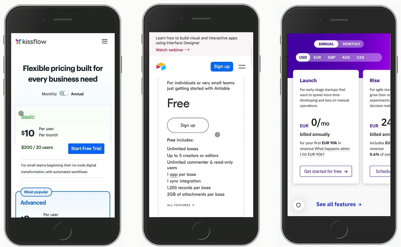
This one is uncomfortable to read, because it’s often invisible to the teams responsible for fixing it.
Most pricing pages are designed on desktop, reviewed on desktop, and approved on desktop. Then 60% of the traffic arrives on a phone, and the experience falls apart. Pricing tables collapse in ways that make tiers unreadable. CTAs stack awkwardly. Feature comparison rows become nearly impossible to parse on a 390px screen. Tier cards that look elegant side-by-side on a 1440px monitor look cramped and unclear when stacked vertically on mobile.
This isn’t a small problem. It’s a systematic conversion leak happening on the majority of your traffic.
As of mid-2025, approximately 64% of global web traffic comes from mobile devices, making mobile-first design non-negotiable for pricing pages. In 2026, 60% of SaaS users browse on mobile — your pricing page must work perfectly on small screens.
Hotjar’s 2025 analysis of 3,000 SaaS pricing pages found that the average pricing page converts at just 2.8%, but the top quartile achieves 6.5–12% — a gap almost entirely explained by page structure, psychological pricing design, and layout optimization rather than the actual prices charged.
The fix:
Open your pricing page on your phone right now. Then ask yourself three questions:
- Can I immediately tell which plan is recommended without scrolling?
- Can I read the feature differences between plans without zooming in or scrolling horizontally?
- Is the primary CTA visible and tappable within the first viewport?
If the answer to any of these is no, your mobile pricing experience is losing conversions daily.
The structural fixes are well-established: stack pricing cards vertically for mobile, replace dense comparison tables with expandable accordions so users can open the features they care about without reading all of them, make CTAs sticky so the conversion path is always visible as users scroll, and ensure touch targets are at minimum 44×44 pixels to prevent mis-taps.
For agencies building client pricing pages, this is also where a solid component library earns its keep. Pre-built, mobile-optimized pricing components — where responsive behavior is already designed and tested — eliminate this problem at the source rather than catching it in QA. The **MadeinFigma SaaS UI kits** includes pricing page sections built responsively from the start, so you’re not rebuilding the same patterns from scratch for every client.
The Common Thread
Read through all six reasons and a pattern emerges: most pricing page failures aren’t pricing problems. They’re communication and trust problems expressed through design.
Too many tiers is a failure to guide. Feature lists instead of benefits is a failure to empathize. No recommended tier is a failure to make a decision on the user’s behalf. Hidden costs are a failure of transparency. Missing social proof is a failure to provide reassurance. A broken mobile experience is a failure to meet users where they are.
Every one of these is fixable without changing your price by a single dollar.
The pricing page is the closest thing SaaS has to a checkout counter. It’s not where users fall in love with your product — it’s where they decide if they trust you enough to pay for it. Design it like that decision matters.
Because it does.
Building a pricing page or SaaS product UI? **MadeinFigma** has production-ready Figma components, pricing page sections, and full SaaS UI kits — so you can move from wireframe to polished design without starting from zero.
💡 Stay inspired every day with Muzli!
Follow us for a daily stream of design, creativity, and innovation. ***Linkedin | [Instagram](https://www.instagram.com/usemuzli/) | [Twitter](https://x.com/usemuzli)***

메타데이터
- post_id
- ee5d34a24434
- slug
- 6-reasons-your-pricing-page-isnt-converting-and-how-to-fix-each-one-ee5d34a24434
- url
- https://medium.muz.li/6-reasons-your-pricing-page-isnt-converting-and-how-to-fix-each-one-ee5d34a24434
- canonical_url
- https://medium.muz.li/6-reasons-your-pricing-page-isnt-converting-and-how-to-fix-each-one-ee5d34a24434
- author_url
- https://medium.com/@ryan.almeida86
- status
- ok
- fetched_at
- 2026-06-21 21:05:38