Dev Blog: Why does no one talk about Bruno?
Scaling the Expeditions: How Ignis Bruno Defined the “Noble-Bright” Aesthetic for Hiraya Expeditions
Dev Blog: Why does no one talk about Bruno?

Image Courtesy of Disney’s Encanto
Scaling the Expeditions: How Ignis Bruno Defined the “Noble-Bright” Aesthetic for Hiraya Expeditions
In the world of indie game development, we often joke about these things. But at Zenith Legion Interactive, we’ve spent the last month doing the exact opposite.
As we hit production of Hiraya Expeditions, we realized that our collaboration with the legendary Ignis Bruno, a veteran Magic: The Gathering (MTG) artist, wasn’t just a standard commission. It was a masterclass in professional art direction, technical iteration, and world-building.
You can check his portfolio here:
https://www.artstation.com/ignisbruno https://cara.app/ignaciobruno

Ignis’s real picture, by the way
Here is some of his work from Magic: The Gathering—Lord of the Rings Universes Beyond print run nonetheless.
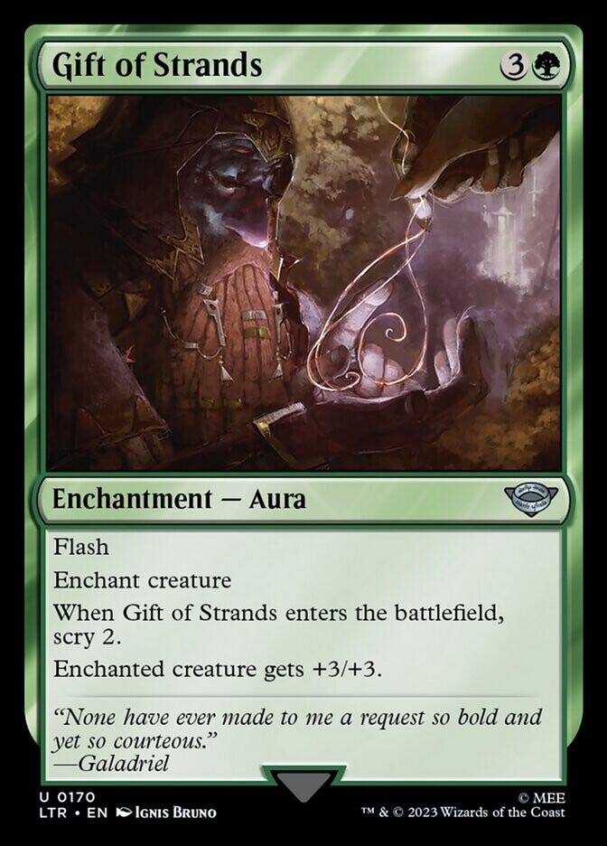
Images Courtesy of Wizards of the Coast, MTG and Ignis Bruno
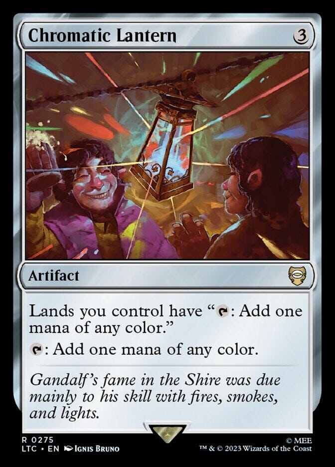
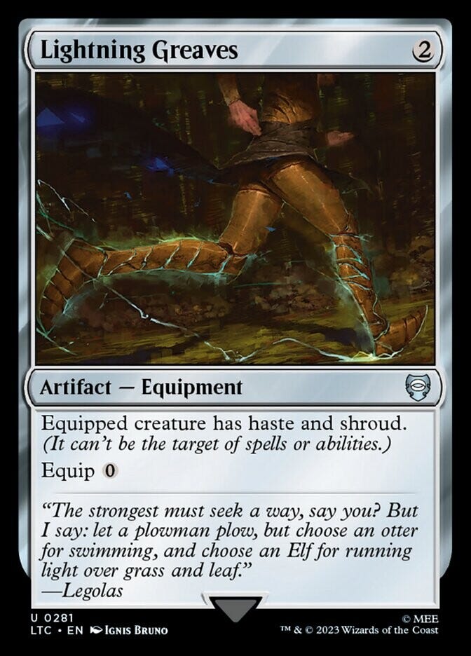
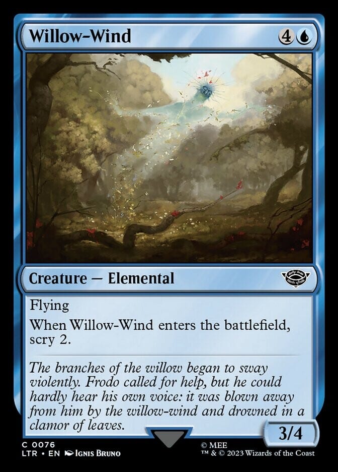
Images Courtesy of Wizards of the Coast, MTG and Ignis Bruno
Today, we’re pulling back the curtain on our development process to show how we took a high-concept “Techno-Fantasy” brief and turned it into a planetary-scale reality.
1. The Compositional Foundation: The “Rice Grain” Rule
When dealing with “Ancient Megastructures,” the biggest trap is losing the sense of scale. If everything is big, nothing is big. To solve this, we provided Ignis with a strict compositional anchor: the 80/20 rule.
The environment must command 80% of the canvas, leaving only 20% for the characters. But even within that 20%, we needed a scale reference. We called it the “Rice Grain Rule.”
Technical Anchor: A human explorer in the foreground should feel roughly the size of a single grain of rice compared to the entrance of the megastructure.
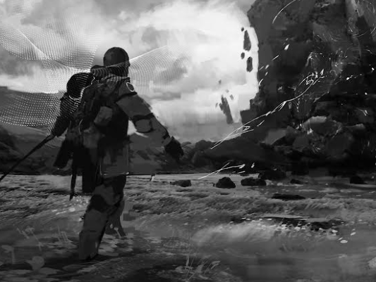

A black and white composition block-out showing the massive silhouette of the Hinubog/Monolith with a tiny red circle highlighting a human figure at its peak for scale.
In the initial sketch phase, Ignis placed a tiny explorer atop The Hinubog (the central monolith). This wasn’t just a detail; it was the “key” that unlocked the entire illustration. It instantly transformed a large rock into a planetary-scale engine.
Dev Tip: When building for scale, always place a familiar reference point (like a human silhouette) next to your largest asset early in the block-out phase. It prevents “scale creep” later in the rendering process.
2. Cultural Silhouettes: Defining the Kampilan
One of our core pillars is Cultural Fidelity. We didn’t want our delegates to look like generic knights or sci-fi marines. We wanted them to look like they belonged to a Philippine-inspired future.
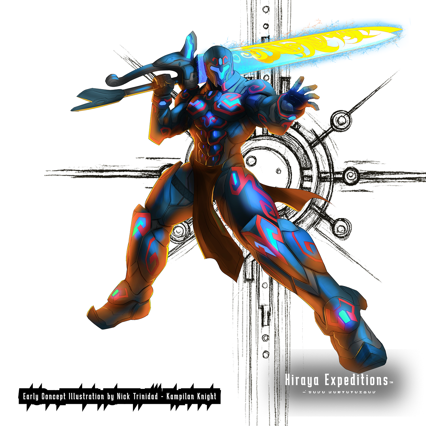
During the first color pass, the lead explorer’s blade read as a standard straight sword. While it looked “cool,” it didn’t look right. We pivoted the design toward the Kampilan.
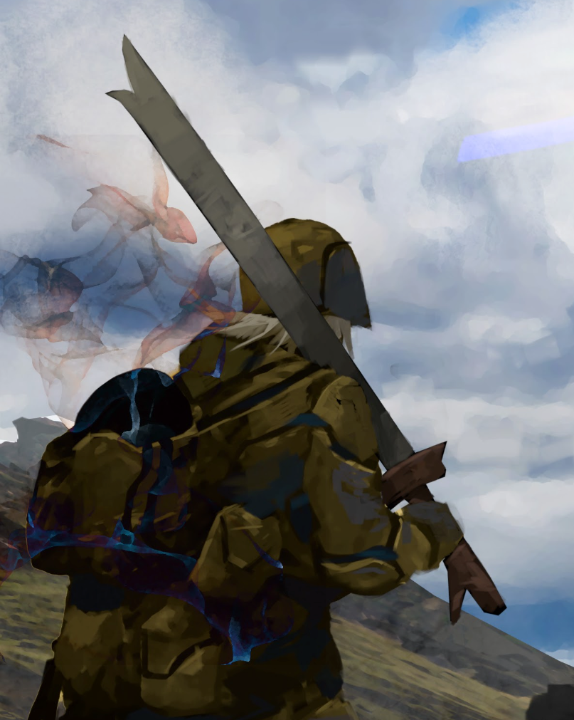

A comparison. Left: A standard sword silhouette (generic). Right: The Kampilan silhouette with its distinct bifurcated (split) tip and heavy D-guard hilt (cultural).
By flaring out the tip into a bifurcated shape and adding a heavy D-guard, the gear became a “Cultural Anchor.” It moved the needle from generic fantasy to specific, lore-rich storytelling.
3. Atmosphere & Color Theory: Noble-Bright vs. Grimdark
Many sci-fi games default to “Grimdark”—shadowy, oppressive, and desaturated. For Hiraya Expeditions, we chose Noble-Bright.
The world isn’t suffering; it is majestic. We asked Ignis to throw out the “dark and moody” constraints and lean into a vibrant, optimistic palette. This created a Dual-Source Lighting Logic:
- Human/Tactical (Cerulean Blue): Cold, sharp light from lanterns and neural nodes.
- Ancient/Esoteric (Pulsing Energy): A warm, rhythmic glow emanating from the structure itself.


A color script showing the contrast between the cold blue light of the human technology and the warm, ethereal glow of the ancient monolith.

A color script showing the contrast between the cold blue light of the human technology and the warm, ethereal glow of the ancient monolith.
This contrast ensures that even in a massive landscape, the player’s eye is immediately drawn to the interaction between human curiosity and ancient mystery.
4. The Material Pass: From Stone to Anomaly
The most critical pivot happened in the final week. Originally, the Hinubog read as a natural stone, a mountain overtaken by energy. But we wanted it to feel like an anomaly.
We requested a Material Pass to shift the texture from “matte rock” to glossy obsidian.
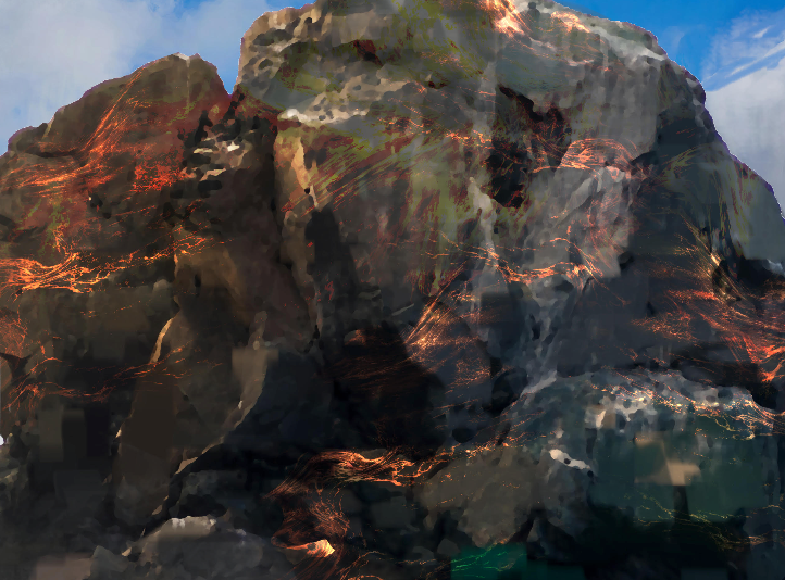
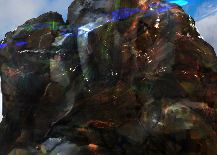
A close-up texture comparison. Left: Matte, earthy rock texture. Right: Glossy, reflective obsidian with sharp, high-contrast specular highlights.
By making the surface highly reflective, we allowed the vibrant colors of the sky to interact with the structure. The addition of sharp, “glass-like” specular highlights transformed the Monolith from a mountain into a piece of crystalline technology. It stopped being part of the landscape and started being a “Glitch in Reality.”
5. The Technical Handshake: Why the .PSD is King
Finally, we have to talk about the pipeline. Hiraya Expeditions uses a complex rendering system. To make the menu feel alive, we need to be able to “peel” the world apart.
Ignis delivered a surgical, multi-layered .PSD. This isn’t just a technical preference; it’s a production requirement.
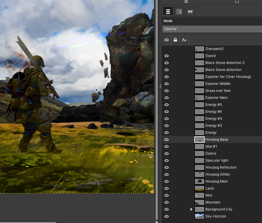
Layers shown on the right.
The “Human-Crafted” Receipt: In an era of generative AI, these layered files serve as our definitive proof of a 100% human-crafted workflow. Having the “layered receipts” protects our IP, the artist and ensures that every brushstroke is intentional, revisable, and built with integrity.
Working with a professional like Ignis Bruno is a reminder that great art is a conversation. It’s about setting technical anchors, respecting cultural silhouettes, and knowing when to push a material pass until it feels “otherworldly.”
Cover art is complete. And we are a step closer to launching the Expeditions.

Hiraya Expeditions Hero Image Illustrated by Ignis Bruno
Are you an artist or dev working on world-building? What are your “technical anchors” for scale? Let us know in the comments!
hirayaexpeditions #indiegamedev
Notice: Hiraya Expeditions® and all related names, designs, and content are claimed as the intellectual property of Zenith Legion Interactive. Unauthorized use, copying, or distribution is prohibited. All rights reserved.
메타데이터
- post_id
- ee847398cd0f
- slug
- dev-blog-why-does-no-one-talk-about-bruno-ee847398cd0f
- url
- https://medium.com/hiraya-expeditions/dev-blog-why-does-no-one-talk-about-bruno-ee847398cd0f
- canonical_url
- https://medium.com/hiraya-expeditions/dev-blog-why-does-no-one-talk-about-bruno-ee847398cd0f
- author_url
- https://medium.com/@proteandev
- status
- ok
- fetched_at
- 2026-06-14 11:28:49