Why Most PowerPoint Presentations Fail Visually — And How Editable Icons Fix the Problem
Most business presentations don’t fail because of bad information.
Why Most PowerPoint Presentations Fail Visually — And How Editable Icons Fix the Problem
Most business presentations don’t fail because of bad information.
They fail because the information looks impossible to process.
Too much text. Messy layouts. Generic visuals. Inconsistent graphics. And slides that feel outdated before the presentation even starts.
This is one of the biggest hidden problems in modern business communication.
People no longer consume presentations like documents. They consume them visually.
And that changes everything.
The Problem With Most Presentation Design
Open 90% of business presentations online and you’ll notice the same issues immediately:
- overloaded bullet points,
- random icon styles,
- low-quality graphics,
- inconsistent colors,
- and confusing visual hierarchy.
The presentation may contain useful information, but visually it feels chaotic.
That chaos creates friction.
And friction kills attention.
Whether you are presenting:
- business reports,
- startup pitches,
- marketing strategies,
- educational content,
- project proposals,
- or corporate profiles,
people understand information faster when visuals are structured properly.
That is why icons matter far more than most people realize.
Why Icons Became Essential in Modern Presentations
Modern presentations are no longer text-first.
They are communication systems built around visual scanning.
People don’t want to read large paragraphs during a presentation. They want quick understanding.
Icons help achieve that.
A well-designed icon instantly communicates concepts like:
- finance,
- marketing,
- healthcare,
- technology,
- education,
- business growth,
- analytics,
- customer service,
- security,
- communication,
- and operations.
Without forcing viewers to read excessive text.
That speed of understanding improves engagement dramatically.
The Real Reason Professional Presentations Look Better
Most people think professional presentations look good because of colors or animations.
That is wrong.
Professional presentations feel better because they maintain visual consistency.
That consistency comes from:
- typography,
- spacing,
- layout systems,
- and icon design.
When icons match in style, size, thickness, and alignment, the entire presentation immediately feels more organized and premium.
When icons are inconsistent, the presentation starts looking amateur — even if the content itself is strong.
Why Most People Waste Time Searching for Icons
Here’s the reality.
A huge amount of presentation-building time gets wasted on small repetitive tasks.
People spend hours:
- searching for icons online,
- downloading random PNG files,
- removing backgrounds,
- resizing graphics,
- matching styles,
- and fixing formatting issues.
That is operational inefficiency disguised as “design work.”
Professional teams avoid this by using structured editable icon systems instead of random internet graphics.
Editable PPT Icons Are More Powerful Than Static Images
Most free icons online are static images.
That creates problems immediately.
You cannot properly:
- recolor them,
- resize them cleanly,
- customize elements,
- or maintain consistent presentation quality.
Editable PPT icons solve this problem because they are designed directly for PowerPoint workflows.
This allows users to:
- change colors instantly,
- resize without quality loss,
- edit shapes,
- customize styles,
- and integrate visuals smoothly into presentations.
That flexibility saves enormous amounts of time.
Why Large Icon Libraries Matter
Many creators download small icon packs with limited categories.
Then halfway through the presentation, they realize important business topics are missing.
Now the design becomes inconsistent again.
Large editable icon libraries solve this issue by covering multiple industries and business scenarios in one system.
This includes icons for:
- business,
- finance,
- marketing,
- technology,
- healthcare,
- education,
- social media,
- eCommerce,
- startup operations,
- analytics,
- communication,
- security,
- customer support,
- and corporate workflows.
A complete icon system prevents visual inconsistency across projects.
PowerPoint Presentations Have Become Brand Infrastructure
Presentations are no longer “just slides.”
Today they are part of business identity.
Companies use presentations for:
- investor meetings,
- client onboarding,
- marketing strategy,
- webinars,
- training systems,
- business reports,
- educational content,
- and sales communication.
That means poor visual communication damages brand perception directly.
And in competitive industries, perception affects trust.
Why Simplicity Wins in Presentation Design
One major mistake people make is overdesigning slides.
Too many effects. Too many gradients. Too many decorative elements.
Professional presentations are usually simpler than people expect.
Clean icons, structured layouts, proper spacing, and visual clarity outperform complicated designs almost every time.
Because clarity communicates confidence.
Messy slides communicate confusion.
A Smarter Way to Build Better Presentations
Instead of searching for random graphics online repeatedly, many professionals now use structured editable icon systems from platforms like WhatDigit to speed up presentation design and maintain visual consistency.
One useful resource is:
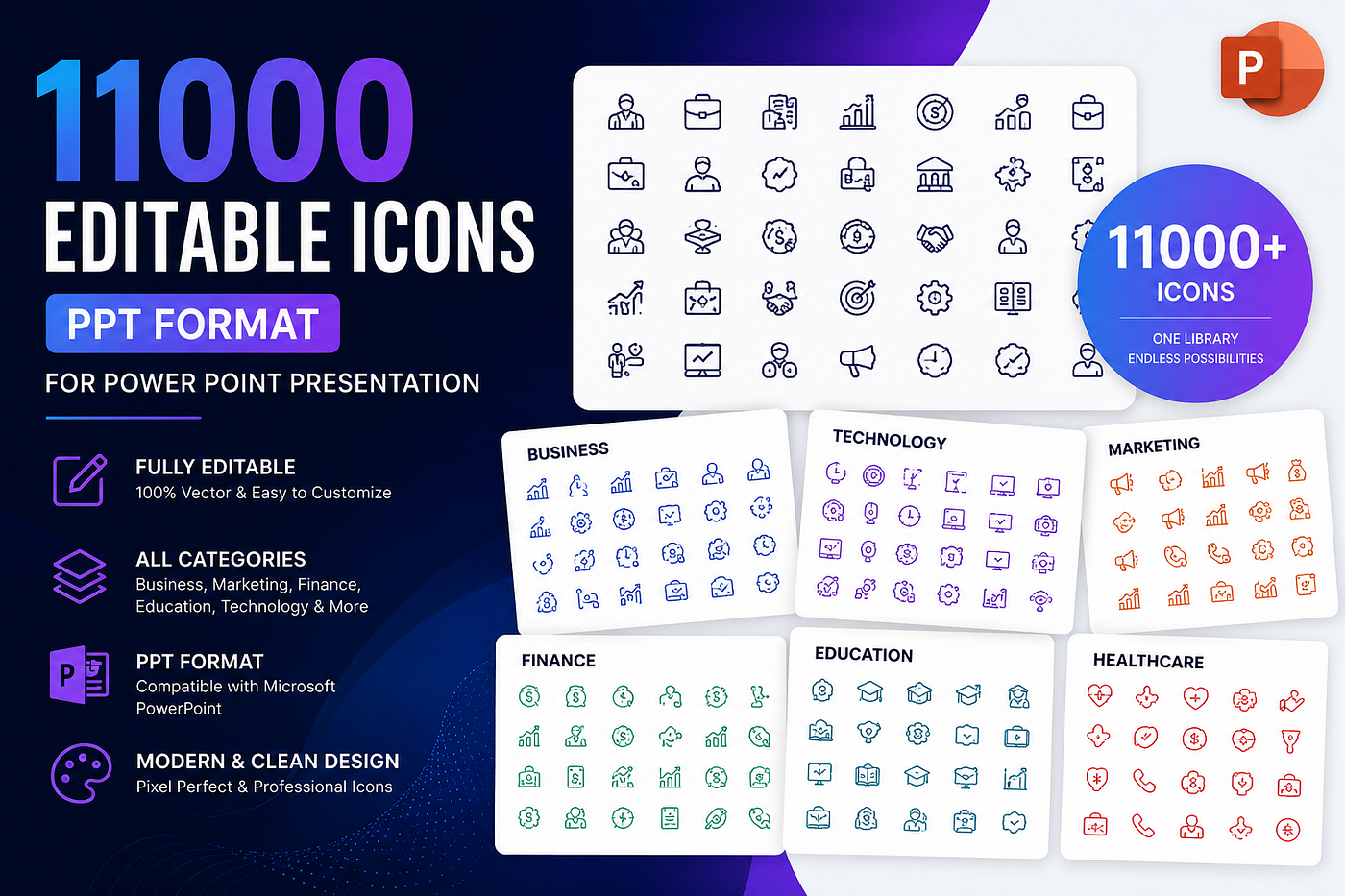
**11000 Editable Icons PPT Format for PowerPoint Presentation | All Categories Editable PPT Icons**
This type of presentation asset library helps creators, businesses, agencies, educators, startups, and marketers build professional presentations faster without wasting hours on manual design work.
The collection includes:
- 11,000 editable PowerPoint icons,
- multiple business and creative categories,
- PPT editable format,
- scalable vector-style editing,
- and presentation-ready visual assets for professional workflows.
Instead of rebuilding visual systems from scratch, teams can focus on communication and execution.
The Future of Business Communication Is Visual
Modern audiences consume information faster than ever.
That means presentations must become:
- cleaner,
- faster to understand,
- visually structured,
- and professionally organized.
Businesses that communicate visually will outperform businesses that overload people with text-heavy slides.
And as digital communication becomes more competitive, strong visual systems will become even more valuable.
Final Thoughts
Most presentation problems are not actually content problems.
They are visual communication problems.
A professional editable icon system improves:
- clarity,
- consistency,
- branding,
- presentation speed,
- and audience engagement.
Because modern presentations are no longer just about delivering information.
They are about making information instantly understandable.
메타데이터
- post_id
- eecc28540c20
- slug
- why-most-powerpoint-presentations-fail-visually-and-how-editable-icons-fix-the-problem-eecc28540c20
- url
- https://medium.com/@whatdigit19/why-most-powerpoint-presentations-fail-visually-and-how-editable-icons-fix-the-problem-eecc28540c20
- canonical_url
- https://medium.com/@whatdigit19/why-most-powerpoint-presentations-fail-visually-and-how-editable-icons-fix-the-problem-eecc28540c20
- author_url
- https://medium.com/@whatdigit19
- status
- ok
- fetched_at
- 2026-06-09 15:37:30