Multitouch Gestures in Jetpack Compose: The Complete Practical Guide
Multitouch gestures pinching to zoom, rotating with two fingers, and dragging content across the screen, are fundamental interactions that…
Multitouch Gestures in Jetpack Compose: The Complete Practical Guide
Multitouch gestures pinching to zoom, rotating with two fingers, and dragging content across the screen, are fundamental interactions that users expect in modern mobile applications. Whether you’re building a photo gallery, a map viewer, a PDF reader, or any visual application, implementing smooth and intuitive multitouch gestures is essential. Jetpack Compose, Android’s modern UI toolkit, provides elegant and powerful APIs that make implementing these gestures both straightforward and highly performant.
This comprehensive guide takes you through everything you need to know about multitouch handling in Compose, from the foundational concepts to production-ready implementations. You’ll learn how to build responsive, fluid interfaces that feel natural under users’ fingertips.
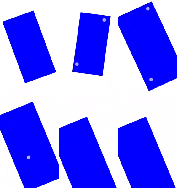
@Composable
private fun TransformableSample() {
    // set up all transformation states
    var scale by remember { mutableFloatStateOf(1f) }
    var rotation by remember { mutableFloatStateOf(0f) }
    var offset by remember { mutableStateOf(Offset.Zero) }
    val state = rememberTransformableState { zoomChange, offsetChange, rotationChange ->
        scale *= zoomChange
        rotation += rotationChange
        offset += offsetChange
    }
    Box(
        Modifier
            // apply other transformations like rotation and zoom
            // on the pizza slice emoji
            .graphicsLayer(
                scaleX = scale,
                scaleY = scale,
                rotationZ = rotation,
                translationX = offset.x,
                translationY = offset.y
            )
            // add transformable to listen to multitouch transformation events
            // after offset
            .transformable(state = state)
            .background(Color.Blue)
            .fillMaxSize()
    )
}
Understanding Multitouch Fundamentals
The Three Core Transformations
Multitouch gestures in Compose revolve around three fundamental transformations that users understand intuitively:
1. Zoom (Scaling)
Zooming changes the size of content through the classic “pinch” gesture. In Compose, zoom is expressed as a multiplicative factor rather than an absolute value. When you receive a zoomChange of 1.5, it means "increase the current size by 50%," not "set the size to 150% absolute."
This relative approach is crucial for smooth gestures:
- Current scale: 1.0 (100%)
- Zoom change: 1.5
- New scale: 1.5 (150%)
- Next zoom change: 1.2
- Final scale: 1.8 (1.5 × 1.2)
2. Rotate
Rotation involves twisting two or more fingers around a pivot point. Measured in degrees, rotation accumulates over the gesture’s lifetime. A rotationChange of 45 means "rotate 45 degrees clockwise from the current rotation angle."
Example sequence:
- Initial rotation: 0°
- First change: +30°
- Current rotation: 30°
- Second change: +45°
- Final rotation: 75°
3. Pan (Translate)
Panning moves content across the screen by dragging with one or more fingers. Measured as pixel offsets on both X and Y axes, pan also accumulates. An offsetChange of Offset(100f, -50f) means "move 100 pixels right and 50 pixels up from the current position."
Example sequence:
- Initial offset: (0, 0)
- First change: (50, 30)
- Current offset: (50, 30)
- Second change: (100, -50)
- Final offset: (150, -20)
The Architectural Principle: Separation of Concerns
One of the most elegant aspects of Compose’s multitouch system is its clear separation between gesture detection and transformation application. This isn’t just a nice architectural pattern — it’s a fundamental design decision that provides enormous flexibility.
What This Means:
The transformable modifier detects when users perform multitouch gestures and calculates the changes (zoom multipliers, pan offsets, rotation angles). However, it never directly modifies your UI state. Instead, it reports these changes through callbacks, giving you complete control over how gestures affect your application.
Why This Matters:
- Flexible Constraints: Easily limit zoom ranges (e.g., 0.5x to 5x), pan boundaries, or rotation angles
- Conditional Logic: Implement sophisticated behaviors like “only pan when zoomed in” or “disable rotation for small images”
- Complex Interactions: Combine multiple transformation sources (gestures + buttons + keyboard) seamlessly
- Performance Control: Debounce, throttle, or batch updates as needed for your specific use case
- Testability: Test gesture detection and transformation logic independently
Getting Started: Your First Transformable
Let’s build a complete, working multitouch example from scratch, understanding each piece as we go.
Step 1: Set Up State Variables
First, we need state variables to track all three transformations:
@Composable
fun BasicTransformable() {
    // Scale state: 1f = 100% (original size)
    var scale by remember { mutableFloatStateOf(1f) }

    // Rotation state: accumulated rotation in degrees
    var rotation by remember { mutableFloatStateOf(0f) }

    // Offset state: accumulated translation from original position
    var offset by remember { mutableStateOf(Offset.Zero) }
Why these specific state types?
mutableFloatStateOf(1f)forscaleandrotation: These are primitive float values. Using the specialized float state type is more efficient than boxing primitives inmutableStateOf.mutableStateOf(Offset.Zero)foroffset:Offsetis a data class containing two floats (x and y), so we use the standard state type.- All wrapped in
remember: This ensures the state survives recompositions. Withoutremember, the state would reset on every recomposition.
Step 2: Create the TransformableState
Next, we create the state handler that responds to gestures:
val state = rememberTransformableState { zoomChange, offsetChange, rotationChange ->
        // Apply zoom by multiplication
        scale *= zoomChange

        // Apply rotation by addition
        rotation += rotationChange

        // Apply pan by addition
        offset += offsetChange
    }
Understanding the Mathematics:
- Zoom: We multiply (
scale *= zoomChange) because zoom is relative. If the current scale is 2.0 and we receive a zoom change of 1.5, the new scale should be 3.0 (2.0 × 1.5), not 1.5. - Rotation: We add (
rotation += rotationChange) because rotation accumulates. If the user has already rotated 45° and rotates another 30°, the total should be 75°, not just 30°. - Pan: We add (
offset += offsetChange) because panning accumulates. Each drag gesture adds to the total displacement from the original position.
Getting this wrong (using assignment instead of accumulation) is the most common mistake and results in jerky, unnatural gestures.
Step 3: Apply Transformations to UI
Now we apply these transformations to our content:
Box(
        Modifier
            .fillMaxSize()
            .graphicsLayer(
                scaleX = scale,
                scaleY = scale,
                rotationZ = rotation,
                translationX = offset.x,
                translationY = offset.y
            )
            .transformable(state = state)
            .background(Color.Blue)
    )
}
Critical: Modifier Order Matters!
The order graphicsLayer → transformable → background is not arbitrary:
graphicsLayer: Applies visual transformationstransformable: Detects gestures in the original, untransformed coordinate spacebackground: Draws the actual content
If you place transformable before graphicsLayer, the touch-sensitive area would move with the visual transformation, creating a confusing experience where users must "chase" the content to continue gesturing.
The TransformableState Interface
Understanding the Interface
At the heart of the system is the TransformableState interface:
interface TransformableState {
    suspend fun transform(
        transformPriority: MutatePriority = MutatePriority.Default,
        block: suspend TransformScope.() -> Unit,
    )

    val isTransformInProgress: Boolean
}
The transform Function:
This suspend function is the gateway to all transformation operations. Any code that modifies zoom, pan, or rotation must execute within a transform block. This ensures mutual exclusion—only one transformation can occur at a time.
The transformPriority parameter is powerful:
MutatePriority.UserInput: Highest priority (gesture input)MutatePriority.Default: Normal priority (programmatic animations)- Higher-priority transformations can cancel lower-priority ones
This means a user can interrupt an ongoing programmatic zoom animation with a gesture, and the system smoothly transitions from automatic to manual control.
The isTransformInProgress Property:
This boolean tells you whether a transformation is currently active. Use it to:
- Show visual feedback during gestures (e.g., different cursor icons)
- Disable conflicting interactions (e.g., disable scrolling during zoom)
- Coordinate with other UI elements (e.g., hide controls during transformation)
- Implement gesture-aware animations
The TransformScope
Inside a transform block, you work within a TransformScope:
interface TransformScope {
    fun transformBy(
        zoomChange: Float = 1f,
        panChange: Offset = Offset.Zero,
        rotationChange: Float = 0f,
    )
}
This method is where transformation deltas are applied:
zoomChange: Multiplicative scale factor (1.0 = no change, 1.5 = increase by 50%, 0.8 = decrease by 20%)panChange:Offsetcontaining X and Y pixel changesrotationChange: Degrees to rotate (positive = clockwise, negative = counterclockwise)
Creating TransformableState
Use rememberTransformableState to create and remember state:
val state = rememberTransformableState { zoomChange, panChange, rotationChange ->
    // Your transformation logic here
    scale *= zoomChange
    offset += panChange
    rotation += rotationChange
}
Important: Always use rememberTransformableState in composables, never create TransformableState directly. The remember wrapper ensures the state survives recompositions and configuration changes.
The GraphicsLayer Modifier: Your Performance Secret
The graphicsLayer modifier is absolutely essential for smooth, performant transformations. Understanding why is key to building great multitouch experiences.
Why GraphicsLayer is Essential
1. GPU Acceleration
All transformations happen on the GPU, not the CPU. This is the difference between smooth 60fps animations and janky, stuttering interactions. The GPU is specifically designed for these types of matrix transformations.
2. No Layout Impact
graphicsLayer transforms the visual representation without triggering layout recalculation. The original layout bounds remain unchanged, which means:
- No expensive remeasurement of child composables
- No recomposition of parent composables
- Siblings aren’t affected by the transformation
3. Hardware Layer Caching
The modifier creates an offscreen buffer (hardware layer) that caches the rendered content. Subsequent transformations only need to transform this cached layer, not re-render the entire content tree. This is especially important for complex UIs with many nested composables.
4. Advanced Compositing
The compositingStrategy parameter gives you fine-grained control:
// Auto (default): Creates offscreen buffer when needed
CompositingStrategy.Auto

// Offscreen: Always renders to buffer first (for blend modes)
CompositingStrategy.Offscreen
// ModulateAlpha: Applies alpha without buffer (more efficient but different rendering)
CompositingStrategy.ModulateAlpha
Key Parameters for Multitouch
Modifier.graphicsLayer(
    scaleX = 1f,              // Horizontal scaling
    scaleY = 1f,              // Vertical scaling
    alpha = 1f,               // Opacity (0f to 1f)
    translationX = 0f,        // Horizontal offset in pixels
    translationY = 0f,        // Vertical offset in pixels
    rotationZ = 0f,           // 2D rotation in degrees
    transformOrigin = TransformOrigin.Center,  // Pivot point
    clip = false              // Whether to clip to bounds
)
For Standard Multitouch:
scaleX, scaleY: Set both to the same value for uniform scalingtranslationX, translationY: Pan offsetsrotationZ: 2D rotation (what users expect)transformOrigin: Default center is usually what you want
Advanced Options:
rotationX, rotationY: 3D rotations for perspective effectscameraDistance: Controls 3D perspective depthshadowElevation: Adds elevation shadowrenderEffect: Apply visual effects (blur, etc.)
Lambda vs. Parameter Syntax
// Parameter syntax - triggers recomposition when scale changes
Modifier.graphicsLayer(scaleX = scale, scaleY = scale)
// Lambda syntax - only updates layer, no recomposition
Modifier.graphicsLayer {
    scaleX = scale
    scaleY = scale
}
For frequently updating values (like during gestures), the lambda syntax is more performant because it reads state during the draw phase rather than composition phase.
Essential Production Patterns
These patterns are battle-tested and should be in every production app that uses multitouch.
Pattern 1: Implementing Constraints
Never ship a transformable without constraints. Users will zoom to absurd levels or pan into oblivion.
val state = rememberTransformableState { zoomChange, offsetChange, rotationChange ->
    // Constrain scale to reasonable range (0.5x to 5x)
    scale = (scale * zoomChange).coerceIn(0.5f, 5f)

    // Normalize rotation to 0-360 degrees
    rotation = (rotation + rotationChange).mod(360f)

    // Constrain panning to boundaries
    val maxOffset = 1000f
    offset = Offset(
        x = (offset.x + offsetChange.x).coerceIn(-maxOffset, maxOffset),
        y = (offset.y + offsetChange.y).coerceIn(-maxOffset, maxOffset)
    )
}
Why these specific ranges?
- 0.5x to 5x zoom: Below 0.5x content becomes too small to see; above 5x it becomes pixelated
- 0–360° rotation: Normalizing keeps the value manageable and prevents floating-point drift
- ±1000px pan: Adjust based on your content size; this prevents users from panning too far
Pattern 2: Content-Aware Pan Boundaries
For image viewers and similar apps, calculate boundaries based on actual content size:
@Composable
fun BoundedImageViewer(painter: Painter) {
    var scale by remember { mutableFloatStateOf(1f) }
    var offset by remember { mutableStateOf(Offset.Zero) }
    var imageSize by remember { mutableStateOf(IntSize.Zero) }
    var containerSize by remember { mutableStateOf(IntSize.Zero) }

    val state = rememberTransformableState { zoomChange, offsetChange, _ ->
        // Update scale with constraints
        scale = (scale * zoomChange).coerceIn(1f, 5f)

        // Calculate maximum allowed offset based on current zoom level
        val scaledWidth = imageSize.width * scale
        val scaledHeight = imageSize.height * scale

        // When zoomed in, content can be larger than container
        // maxX/Y is how far we can pan before hitting the edge
        val maxX = ((scaledWidth - containerSize.width) / 2f).coerceAtLeast(0f)
        val maxY = ((scaledHeight - containerSize.height) / 2f).coerceAtLeast(0f)

        // Apply pan with calculated boundaries
        offset = Offset(
            x = (offset.x + offsetChange.x).coerceIn(-maxX, maxX),
            y = (offset.y + offsetChange.y).coerceIn(-maxY, maxY)
        )
    }

    Box(
        modifier = Modifier
            .fillMaxSize()
            .onSizeChanged { containerSize = it }
    ) {
        Image(
            painter = painter,
            contentDescription = null,
            modifier = Modifier
                .graphicsLayer(
                    scaleX = scale,
                    scaleY = scale,
                    translationX = offset.x,
                    translationY = offset.y
                )
                .transformable(state = state)
                .onGloballyPositioned { coordinates ->
                    imageSize = coordinates.size
                }
        )
    }
}
The Math Explained:
When content is zoomed in beyond container size:
- Scaled content width:
imageSize.width * scale - Overflow:
scaledWidth - containerSize.width - Max pan in each direction:
overflow / 2(can pan half the overflow in each direction) coerceAtLeast(0f): When zoomed out, no panning should be allowed
Pattern 3: Conditional Panning (Only When Zoomed)
One of the most common patterns is to only allow panning when content is zoomed in. This prevents conflicts with scrollable parent containers:
val state = rememberTransformableState { zoomChange, offsetChange, rotationChange ->
    // Update scale with constraints
    scale = (scale * zoomChange).coerceIn(1f, 5f)

    // Update rotation
    rotation += rotationChange

    // Only allow panning when zoomed beyond 100%
    if (scale > 1f) {
        offset += offsetChange
    } else {
        // Auto-center when at minimum zoom
        offset = Offset.Zero
    }
}
Why this works:
- At 1x zoom (100%), content fits in the viewport — no need to pan
- When zoomed in, panning is necessary to explore the content
- Auto-resetting to
Offset.Zeroensures content re-centers when zooming out - Prevents confusing interactions with parent scrollables
Pattern 4: Smooth Reset with Animation
Users expect smooth transitions, especially when resetting transformations:
@Composable
fun TransformableWithReset() {
    var scale by remember { mutableFloatStateOf(1f) }
    var rotation by remember { mutableFloatStateOf(0f) }
    var offset by remember { mutableStateOf(Offset.Zero) }

    val state = rememberTransformableState { zoomChange, offsetChange, rotationChange ->
        scale *= zoomChange
        rotation += rotationChange
        offset += offsetChange
    }

    val coroutineScope = rememberCoroutineScope()

    Column {
        Box(
            Modifier
                .graphicsLayer(
                    scaleX = scale,
                    scaleY = scale,
                    rotationZ = rotation,
                    translationX = offset.x,
                    translationY = offset.y
                )
                .transformable(state = state)
                .fillMaxSize()
                .weight(1f)
                .background(Color.LightGray)
        )

        Button(
            onClick = {
                coroutineScope.launch {
                    // Calculate the deltas needed to return to initial state
                    val targetZoomFactor = 1f / scale  // If scale is 2f, we need 0.5f to get back to 1f
                    val targetRotation = -rotation     // Rotate back by negative of current rotation
                    val targetPan = -offset           // Move back by negative of current offset

                    // Animate all three transformations simultaneously
                    state.animateBy(
                        zoomFactor = targetZoomFactor,
                        rotationDegrees = targetRotation,
                        panOffset = targetPan,
                        zoomAnimationSpec = spring(
                            dampingRatio = Spring.DampingRatioMediumBouncy
                        ),
                        panAnimationSpec = spring(
                            dampingRatio = Spring.DampingRatioLowBouncy
                        ),
                        rotationAnimationSpec = tween(durationMillis = 400)
                    )

                    // Update state variables after animation completes
                    scale = 1f
                    rotation = 0f
                    offset = Offset.Zero
                }
            },
            modifier = Modifier
                .fillMaxWidth()
                .padding(16.dp)
        ) {
            Text("Reset All Transformations")
        }
    }
}
Animation Spec Choices:
spring()withDampingRatioMediumBouncyfor zoom: Creates a pleasant bounce effectspring()withDampingRatioLowBouncyfor pan: More pronounced bounce for positiontween()for rotation: Linear timing often feels better for rotation
Pattern 5: Double-Tap to Zoom
A standard interaction pattern users expect in image viewers:
@Composable
fun DoubleTapZoomable(painter: Painter) {
    var scale by remember { mutableFloatStateOf(1f) }
    var offset by remember { mutableStateOf(Offset.Zero) }

    val state = rememberTransformableState { zoomChange, offsetChange, _ ->
        scale = (scale * zoomChange).coerceIn(1f, 4f)
        offset += offsetChange
    }

    val coroutineScope = rememberCoroutineScope()

    Image(
        painter = painter,
        contentDescription = null,
        modifier = Modifier
            .fillMaxSize()
            .graphicsLayer(
                scaleX = scale,
                scaleY = scale,
                translationX = offset.x,
                translationY = offset.y
            )
            .transformable(state = state)
            .pointerInput(Unit) {
                detectTapGestures(
                    onDoubleTap = { tapOffset ->
                        coroutineScope.launch {
                            if (scale > 1f) {
                                // Currently zoomed in - zoom out with animation
                                state.animateBy(
                                    zoomFactor = 1f / scale,
                                    panOffset = -offset,
                                    rotationDegrees = 0f,
                                    zoomAnimationSpec = spring(
                                        dampingRatio = Spring.DampingRatioMediumBouncy
                                    )
                                )
                                scale = 1f
                                offset = Offset.Zero
                            } else {
                                // Currently at 100% - zoom to 200%
                                state.animateZoomBy(2f)
                                scale = 2f

                                // Optional: center on tap position
                                // This requires more complex math to calculate the offset
                            }
                        }
                    }
                )
            }
    )
}
User Experience Considerations:
- Double-tap toggles between 100% and 200% zoom
- Smooth spring animation makes the transition feel natural
- Alternative: Triple-tap for additional zoom levels (100% → 200% → 400% → 100%)
Pattern 6: Rotation Lock Toggle
For apps where rotation isn’t always desired:
@Composable
fun RotationLockableViewer(painter: Painter) {
    var scale by remember { mutableFloatStateOf(1f) }
    var rotation by remember { mutableFloatStateOf(0f) }
    var offset by remember { mutableStateOf(Offset.Zero) }
    var isRotationLocked by remember { mutableStateOf(false) }

    val state = rememberTransformableState { zoomChange, offsetChange, rotationChange ->
        scale *= zoomChange
        offset += offsetChange

        // Only apply rotation if not locked
        if (!isRotationLocked) {
            rotation += rotationChange
        }
    }

    Box(modifier = Modifier.fillMaxSize()) {
        Image(
            painter = painter,
            contentDescription = null,
            modifier = Modifier
                .fillMaxSize()
                .graphicsLayer(
                    scaleX = scale,
                    scaleY = scale,
                    rotationZ = rotation,
                    translationX = offset.x,
                    translationY = offset.y
                )
                .transformable(
                    state = state,
                    lockRotationOnZoomPan = isRotationLocked
                )
        )

        // Lock toggle button
        IconButton(
            onClick = { isRotationLocked = !isRotationLocked },
            modifier = Modifier
                .align(Alignment.TopEnd)
                .padding(16.dp)
        ) {
            Icon(
                imageVector = if (isRotationLocked)
                    Icons.Default.Lock
                else
                    Icons.Default.LockOpen,
                contentDescription = if (isRotationLocked)
                    "Unlock rotation"
                else
                    "Lock rotation"
            )
        }
    }
}
The lockRotationOnZoomPan Parameter:
When true, rotation is only enabled if the user's initial gesture is primarily rotational. If they start with a pinch or pan, rotation is disabled for that gesture. This prevents accidental rotation during zoom operations.
Real-World Complete Examples
Let’s build three complete, production-ready implementations you can use as templates.
Example 1: Professional Image Viewer
A full-featured image viewer with zoom, pan, indicators, and reset:
@Composable
fun ProfessionalImageViewer(
    painter: Painter,
    modifier: Modifier = Modifier
) {
    var scale by remember { mutableFloatStateOf(1f) }
    var offset by remember { mutableStateOf(Offset.Zero) }
    var imageSize by remember { mutableStateOf(IntSize.Zero) }
    var containerSize by remember { mutableStateOf(IntSize.Zero) }

    val maxScale = 5f
    val minScale = 1f

    val state = rememberTransformableState { zoomChange, offsetChange, _ ->
        val newScale = (scale * zoomChange).coerceIn(minScale, maxScale)

        // Calculate boundaries
        val scaledWidth = imageSize.width * newScale
        val scaledHeight = imageSize.height * newScale
        val maxX = ((scaledWidth - containerSize.width) / 2f).coerceAtLeast(0f)
        val maxY = ((scaledHeight - containerSize.height) / 2f).coerceAtLeast(0f)

        scale = newScale

        if (scale > 1f) {
            offset = Offset(
                x = (offset.x + offsetChange.x).coerceIn(-maxX, maxX),
                y = (offset.y + offsetChange.y).coerceIn(-maxY, maxY)
            )
        } else {
            offset = Offset.Zero
        }
    }

    val coroutineScope = rememberCoroutineScope()

    Box(
        modifier = modifier
            .fillMaxSize()
            .onSizeChanged { containerSize = it }
    ) {
        Image(
            painter = painter,
            contentDescription = "Zoomable image",
            contentScale = ContentScale.Fit,
            modifier = Modifier
                .fillMaxSize()
                .graphicsLayer(
                    scaleX = scale,
                    scaleY = scale,
                    translationX = offset.x,
                    translationY = offset.y
                )
                .transformable(
                    state = state,
                    canPan = { scale > 1f }
                )
                .pointerInput(Unit) {
                    detectTapGestures(
                        onDoubleTap = {
                            coroutineScope.launch {
                                if (scale > 1f) {
                                    state.animateBy(
                                        zoomFactor = 1f / scale,
                                        panOffset = -offset,
                                        rotationDegrees = 0f,
                                        zoomAnimationSpec = spring(
                                            dampingRatio = Spring.DampingRatioMediumBouncy
                                        ),
                                        panAnimationSpec = spring(
                                            dampingRatio = Spring.DampingRatioLowBouncy
                                        )
                                    )
                                    scale = 1f
                                    offset = Offset.Zero
                                } else {
                                    state.animateZoomBy(2f)
                                    scale = 2f
                                }
                            }
                        }
                    )
                }
                .onGloballyPositioned { coordinates ->
                    imageSize = coordinates.size
                }
        )

        // Zoom indicator
        AnimatedVisibility(
            visible = scale > 1f,
            modifier = Modifier
                .align(Alignment.TopEnd)
                .padding(16.dp),
            enter = fadeIn() + scaleIn(),
            exit = fadeOut() + scaleOut()
        ) {
            Surface(
                shape = RoundedCornerShape(8.dp),
                color = Color.Black.copy(alpha = 0.6f)
            ) {
                Text(
                    text = "${(scale * 100).toInt()}%",
                    modifier = Modifier.padding(horizontal = 12.dp, vertical = 6.dp),
                    color = Color.White,
                    fontSize = 14.sp
                )
            }
        }

        // Reset button
        AnimatedVisibility(
            visible = scale > 1f || offset != Offset.Zero,
            modifier = Modifier
                .align(Alignment.BottomEnd)
                .padding(16.dp),
            enter = fadeIn() + scaleIn(),
            exit = fadeOut() + scaleOut()
        ) {
            FloatingActionButton(
                onClick = {
                    coroutineScope.launch {
                        state.animateBy(
                            zoomFactor = 1f / scale,
                            panOffset = -offset,
                            rotationDegrees = 0f
                        )
                        scale = 1f
                        offset = Offset.Zero
                    }
                }
            ) {
                Icon(Icons.Default.Restore, "Reset zoom")
            }
        }
    }
}
Features Implemented:
- Content-aware pan boundaries
- Zoom percentage indicator
- Animated reset button
- Double-tap to toggle zoom
- Smooth spring animations
- Clean, intuitive UI
Example 2: Interactive Map Viewer
A map interface with rotation support and visual controls:
@Composable
fun InteractiveMapViewer(
    mapContent: @Composable () -> Unit
) {
    var scale by remember { mutableFloatStateOf(1f) }
    var offset by remember { mutableStateOf(Offset.Zero) }
    var rotation by remember { mutableFloatStateOf(0f) }
    var isRotationLocked by remember { mutableStateOf(false) }

    // Handles both touch and Ctrl+Scroll zoom automatically
    val state = rememberTransformableState { zoomChange, offsetChange, rotationChange ->
        scale = (scale * zoomChange).coerceIn(0.5f, 10f)
        offset += offsetChange

        if (!isRotationLocked) {
            rotation = (rotation + rotationChange).mod(360f)
        }
    }

    Box(modifier = Modifier.fillMaxSize()) {
        // Main map content
        Box(
            modifier = Modifier
                .fillMaxSize()
                .graphicsLayer(
                    scaleX = scale,
                    scaleY = scale,
                    rotationZ = rotation,
                    translationX = offset.x,
                    translationY = offset.y,
                    transformOrigin = TransformOrigin.Center
                )
                .transformable(
                    state = state,
                    lockRotationOnZoomPan = isRotationLocked
                )
        ) {
            mapContent()
        }

        // Control panel
        Column(
            modifier = Modifier
                .align(Alignment.TopEnd)
                .padding(16.dp),
            verticalArrangement = Arrangement.spacedBy(8.dp)
        ) {
            // Rotation lock toggle
            Surface(
                shape = CircleShape,
                color = if (isRotationLocked)
                    MaterialTheme.colorScheme.primary
                else
                    MaterialTheme.colorScheme.surface,
                onClick = { isRotationLocked = !isRotationLocked },
                modifier = Modifier.size(48.dp)
            ) {
                Box(contentAlignment = Alignment.Center) {
                    Icon(
                        imageVector = if (isRotationLocked)
                            Icons.Default.Lock
                        else
                            Icons.Default.LockOpen,
                        contentDescription = "Toggle rotation lock"
                    )
                }
            }

            // Compass indicator (shows north direction)
            Surface(
                shape = CircleShape,
                color = MaterialTheme.colorScheme.surface,
                modifier = Modifier.size(48.dp)
            ) {
                Box(
                    // Counter-rotate to always point north
                    modifier = Modifier.graphicsLayer(rotationZ = -rotation),
                    contentAlignment = Alignment.Center
                ) {
                    Icon(
                        imageVector = Icons.Default.Navigation,
                        contentDescription = "North indicator",
                        tint = MaterialTheme.colorScheme.primary
                    )
                }
            }

            // Zoom level indicator
            Surface(
                shape = RoundedCornerShape(8.dp),
                color = MaterialTheme.colorScheme.surface
            ) {
                Text(
                    text = "${(scale * 100).toInt()}%",
                    modifier = Modifier.padding(8.dp),
                    style = MaterialTheme.typography.bodySmall
                )
            }
        }
    }
}
Features Implemented:
- Full rotation support with toggle lock
- Compass that always points north
- Wide zoom range (50% to 1000%)
- Rotation lock prevents accidental twisting
- Clean control panel UI
Example 3: Photo Gallery with Pager
A swipeable gallery where each image can be zoomed:
@Composable
fun PhotoGalleryWithZoom(images: List<Painter>) {
    val pagerState = rememberPagerState(pageCount = { images.size })

    HorizontalPager(
        state = pagerState,
        modifier = Modifier.fillMaxSize()
    ) { page ->
        // Each page has its own transformation state
        var scale by remember { mutableFloatStateOf(1f) }
        var offset by remember { mutableStateOf(Offset.Zero) }

        val state = rememberTransformableState { zoomChange, offsetChange, _ ->
            scale = (scale * zoomChange).coerceIn(1f, 5f)

            // Only allow panning when zoomed in
            if (scale > 1f) {
                offset += offsetChange
            } else {
                offset = Offset.Zero
            }
        }

        Box(modifier = Modifier.fillMaxSize()) {
            Image(
                painter = images[page],
                contentDescription = "Image ${page + 1} of ${images.size}",
                contentScale = ContentScale.Fit,
                modifier = Modifier
                    .fillMaxSize()
                    .graphicsLayer(
                        scaleX = scale,
                        scaleY = scale,
                        translationX = offset.x,
                        translationY = offset.y
                    )
                    .transformable(
                        state = state,
                        canPan = { scale > 1f }
                    )
            )

            // Page indicator
            Text(
                text = "${page + 1} / ${images.size}",
                modifier = Modifier
                    .align(Alignment.TopCenter)
                    .padding(16.dp)
                    .background(
                        Color.Black.copy(alpha = 0.6f),
                        RoundedCornerShape(16.dp)
                    )
                    .padding(horizontal = 16.dp, vertical = 8.dp),
                color = Color.White
            )
        }
    }
}
Key Design Decision:
Each page maintains its own transformation state. This means:
- Zooming one image doesn’t affect others
- Users can compare images at different zoom levels
- State is preserved when swiping back and forth
- Prevents confusion when navigating between pages
The canPan predicate prevents conflict: when zoomed out (scale = 1f), horizontal drags navigate between pages. When zoomed in (scale > 1f), horizontal drags pan the image.
Advanced Features
The canPan Parameter
The canPan parameter is crucial for integrating transformable content with scrollable containers:
fun Modifier.transformable(
    state: TransformableState,
    canPan: (Offset) -> Boolean,  // This parameter!
    lockRotationOnZoomPan: Boolean = false,
    enabled: Boolean = true,
)
How it works:
The lambda receives the proposed pan offset and returns whether panning should be allowed:
// Only allow panning when zoomed in
canPan = { scale > 1f }

// Only allow horizontal panning
canPan = { offset -> offset.y == 0f }
// Allow panning only within bounds
canPan = { offset ->
    val newX = currentOffset.x + offset.x
    val newY = currentOffset.y + offset.y
    newX in -maxX..maxX && newY in -maxY..maxY
}
Why this matters:
Without canPan, a transformable image inside a LazyColumn would consume all pan gestures, preventing scrolling. With canPan = { scale > 1f }, pan gestures only work when zoomed in, allowing the parent to scroll normally at 1x zoom.
Lock Rotation on Zoom/Pan
The lockRotationOnZoomPan parameter prevents accidental rotation:
Modifier.transformable(
    state = state,
    lockRotationOnZoomPan = true  // Rotation only if detected first
)
How it works:
When true, the system checks which gesture type exceeds touch slop first:
- If rotation is detected first → all gestures work normally
- If zoom or pan is detected first → rotation is disabled for this gesture
This prevents the common frustration of accidentally rotating while trying to pinch-zoom.
Desktop Support: Automatic Ctrl+Scroll Zoom
One of the best features: Ctrl+Scroll zoom works automatically on desktop:
// This handles both touch gestures AND Ctrl+Scroll
Modifier
    .graphicsLayer(/* transformations */)
    .transformable(state = state)
The zoom formula: 2^(scrollPixels / 545)
This logarithmic formula ensures:
- Equal scroll distances produce equal zoom ratios
- Natural, predictable feel
- Consistent with other desktop apps
No configuration needed! The system automatically detects mouse input and enables Ctrl+Scroll handling.
Programmatic Animations
You can trigger smooth transformations programmatically, not just from gestures.
Individual Transformation Animations
Zoom Animation:
val coroutineScope = rememberCoroutineScope()

Button(onClick = {
    coroutineScope.launch {
        // Animate to 2.5x zoom
        transformableState.animateZoomBy(
            zoomFactor = 2.5f,
            animationSpec = spring(
                dampingRatio = Spring.DampingRatioMediumBouncy,
                stiffness = Spring.StiffnessLow
            )
        )
        // Update your state variable
        scale *= 2.5f
    }
}) {
    Text("Zoom to 250%")
}
Rotation Animation:
Button(onClick = {
    coroutineScope.launch {
        // Rotate 90 degrees clockwise
        transformableState.animateRotateBy(
            degrees = 90f,
            animationSpec = tween(
                durationMillis = 300,
                easing = FastOutSlowInEasing
            )
        )
        rotation += 90f
    }
}) {
    Text("Rotate 90°")
}
Pan Animation:
Button(onClick = {
    coroutineScope.launch {
        // Move 200px right, 100px up
        transformableState.animatePanBy(
            offset = Offset(x = 200f, y = -100f),
            animationSpec = spring(
                dampingRatio = Spring.DampingRatioNoBouncy,
                stiffness = Spring.StiffnessMedium
            )
        )
        offset += Offset(200f, -100f)
    }
}) {
    Text("Pan Right")
}
Combined Animations
Animate multiple transformations simultaneously:
Button(onClick = {
    coroutineScope.launch {
        // Zoom, pan, and rotate all at once
        transformableState.animateBy(
            zoomFactor = 2f,
            panOffset = Offset(-100f, -100f),
            rotationDegrees = 45f,
            zoomAnimationSpec = spring(stiffness = Spring.StiffnessMedium),
            panAnimationSpec = tween(durationMillis = 400),
            rotationAnimationSpec = spring(dampingRatio = Spring.DampingRatioHighBouncy)
        )

        // Update state variables
        scale *= 2f
        offset += Offset(-100f, -100f)
        rotation += 45f
    }
}) {
    Text("Zoom & Rotate")
}
Each transformation can have its own animation spec, allowing for creative effects like fast zoom with slow rotation.
Instant Transformations (No Animation)
For immediate changes:
Button(onClick = {
    coroutineScope.launch {
        transformableState.zoomBy(2f)
        scale *= 2f
    }
}) {
    Text("Instant Zoom")
}

Button(onClick = {
    coroutineScope.launch {
        transformableState.rotateBy(90f)
        rotation += 90f
    }
}) {
    Text("Instant Rotate")
}
Button(onClick = {
    coroutineScope.launch {
        transformableState.panBy(Offset(100f, 0f))
        offset += Offset(100f, 0f)
    }
}) {
    Text("Instant Pan")
}
Performance Optimization
Use Lambda Syntax for GraphicsLayer
// ✅ Better - only updates layer, no recomposition
Modifier.graphicsLayer {
    scaleX = scale
    scaleY = scale
    translationX = offset.x
    translationY = offset.y
}

// ❌ Worse - triggers recomposition when state changes
Modifier.graphicsLayer(
    scaleX = scale,
    scaleY = scale,
    translationX = offset.x,
    translationY = offset.y
)
Why this matters: The lambda version reads state during the draw phase rather than composition phase, avoiding expensive recompositions on every gesture frame.
Choose the Right Compositing Strategy
// For simple transformations without transparency
Modifier.graphicsLayer(
    scaleX = scale,
    scaleY = scale,
    compositingStrategy = CompositingStrategy.ModulateAlpha
)

// ❌ Worse - triggers recomposition when state changes
Modifier.graphicsLayer(
    scaleX = scale,
    scaleY = scale,
    translationX = offset.x,
    translationY = offset.y
)
Keep Transformation Callbacks Lightweight
// ✅ Good - fast callback
val state = rememberTransformableState { zoomChange, panChange, rotationChange ->
    scale *= zoomChange
    offset += panChange
    rotation += rotationChange
}

// ❌ Bad - blocks gesture handling
val state = rememberTransformableState { zoomChange, panChange, rotationChange ->
    scale *= zoomChange
    offset += panChange
    rotation += rotationChange

    // Don't do expensive work here!
    processImage()
    updateDatabase()
    performComplexCalculation()
}
The transformation callback runs on every gesture frame (potentially 60+ times per second). Keep it fast — just update state variables. Defer heavy work to other places.
Use Efficient State Types
// ✅ More efficient for primitives
var scale by remember { mutableFloatStateOf(1f) }
var rotation by remember { mutableFloatStateOf(0f) }

// ❌ Less efficient (boxing overhead)
var scale by remember { mutableStateOf(1f) }
var rotation by remember { mutableStateOf(0f) }
// ✅ Correct for objects
var offset by remember { mutableStateOf(Offset.Zero) }
Troubleshooting Guide
Issue 1: Jerky or Laggy Transformations
Symptoms: Gestures don’t feel smooth; visible stuttering during zoom/pan.
Solutions:
- Ensure you’re using
graphicsLayerfor transformations - Use lambda syntax:
.graphicsLayer { scaleX = scale } - Remove expensive operations from transformation callbacks
- Check that you’re not triggering recomposition unnecessarily
Verification:
// Add logging to check frame rate
val state = rememberTransformableState { z, p, r ->
    Log.d("Transform", "Frame at ${System.currentTimeMillis()}")
    scale *= z
    // If logs show gaps > 16ms, investigate performance
}
Issue 2: Transformations Jump or Reset Unexpectedly
Symptoms: Content suddenly jumps to a different position or scale during gestures.
Solutions:
- Always use
rememberTransformableState, never create directly - Ensure correct mathematical operations:
scale *= zoomChange(multiply, not assign)offset += offsetChange(add, not assign)
Wrap state in remember:
// ✅ Correct
var scale by remember { mutableFloatStateOf(1f) }
val state = rememberTransformableState { z, p, r ->
    scale *= z  // Multiply!
}

// ❌ Wrong - will jump
var scale by remember { mutableFloatStateOf(1f) }
val state = rememberTransformableState { z, p, r ->
    scale = z  // Don't assign directly!
}
Issue 3: Can’t Pan Content
Symptoms: Pan gestures don’t work or parent container scrolls instead.
Solutions:
Check canPan predicate returns true:
.transformable(state = state, canPan = { scale > 1f })Verify state is being updated:
val state = rememberTransformableState { z, p, r ->
    scale *= z
    if (scale > 1f) {
        offset += p  // Make sure this line executes
    }
}
Check for parent scrollables consuming events:
// Disable parent scroll during zoom
val scrollEnabled = scale <= 1f
LazyColumn(userScrollEnabled = scrollEnabled) {
    // ...
}
Issue 4: Touch Targets Don’t Match Visual Position
Symptoms: Touch-sensitive area doesn’t follow the transformed content; gestures feel disconnected.
Solution: Ensure correct modifier order:
// ✅ Correct - touch area stays stable
Modifier
    .graphicsLayer(/* transformations */)  // First
    .transformable(state)                  // Second
    .background(Color.Blue)

// ❌ Wrong - touch area moves with visual
Modifier
    .transformable(state)                  // Wrong order!
    .graphicsLayer(/* transformations */)
Issue 5: Ctrl+Scroll Zoom Not Working on Desktop
Symptoms: Mouse wheel with Ctrl doesn’t zoom.
Solutions:
Ensure enabled = true (default):
.transformable(state = state, enabled = true)Verify composable fills space and receives events:
Box(
    Modifier
        .fillMaxSize()  // Must have size to receive events
        .graphicsLayer(/* ... */)
        .transformable(state)
)
Check no parent is consuming scroll events
Best Practices Summary
Core Principles
- Separation of Concerns: Gestures detect, you decide how to transform
- Delta-Based Updates: Always multiply zoom, add pan/rotation
- Modifier Order:
graphicsLayerbeforetransformable, always - GPU Acceleration: Use
graphicsLayerfor smooth 60fps performance - Accessibility First: Provide button controls for all users
Implementation Checklist
State Management:
- ✅ Use
rememberTransformableStatein composables - ✅ Multiply zoom:
scale *= zoomChange - ✅ Add rotation:
rotation += rotationChange - ✅ Add pan:
offset += offsetChange - ✅ Use
mutableFloatStateOffor primitives - ✅ Wrap everything in
remember
Constraints:
- ✅ Always implement
coerceInfor scale - ✅ Calculate content-aware boundaries
- ✅ Reset offset when at minimum zoom
- ✅ Normalize rotation to 0–360°
Performance:
- ✅ Use lambda syntax:
.graphicsLayer { scaleX = scale } - ✅ Keep callbacks lightweight
- ✅ Choose appropriate
CompositingStrategy - ✅ Profile on real devices
User Experience:
- ✅ Smooth animations for programmatic changes
- ✅ Visual feedback (zoom percentage, etc.)
- ✅ Reset button with animation
- ✅ Double-tap to zoom toggle
- ✅ Accessibility controls
Conclusion
Multitouch gesture handling in Jetpack Compose provides a sophisticated yet approachable system for creating natural, responsive user interfaces. The key to success is understanding the fundamentals and applying the patterns consistently.
Key Takeaways
- Start Simple: Begin with basic
transformable+graphicsLayerand add features incrementally - Always Constrain: Never ship without reasonable limits on zoom, pan, and rotation
- Think Accessibility: Provide button controls and semantic information for all users
- Optimize Wisely: Use lambda syntax for
graphicsLayerand keep callbacks fast - Test on Devices: Real gestures on actual hardware reveal issues emulators miss
Resources:
메타데이터
- post_id
- eeebe83066fe
- slug
- multitouch-gestures-in-jetpack-compose-the-complete-practical-guide-eeebe83066fe
- url
- https://medium.com/@ramadan123sayed/multitouch-gestures-in-jetpack-compose-the-complete-practical-guide-eeebe83066fe
- canonical_url
- https://medium.com/@ramadan123sayed/multitouch-gestures-in-jetpack-compose-the-complete-practical-guide-eeebe83066fe
- author_url
- https://medium.com/@ramadan123sayed
- status
- ok
- fetched_at
- 2026-07-16 22:20:29