A short guide to temporal heat maps
Whether you call them heat maps, heatmaps, carpet plots or raster diagrams, they are in many cases the most insightful visualization…
A short guide to temporal heat maps
Whether you call them heat maps, heatmaps, carpet plots or raster diagrams, they are in many cases the most insightful visualization technique for time series. After a short explanation of their principle, this story will explain the strengths of temporal heat maps and offer some guidance as to when and how best to use them — including the Python code to get you started.
Temporal heat maps in a few words
Temporal heat maps display time series on a rectangular grid, with color representing values and position on the grid indicating the corresponding time, whereby one axis represents a period of time of fixed duration (day, week, year) and the second axis indicates the time point within this period of time. This story will focus on the case of daytime heat maps, where position on the x axis represents the date and position on the y axis represents the time of day.
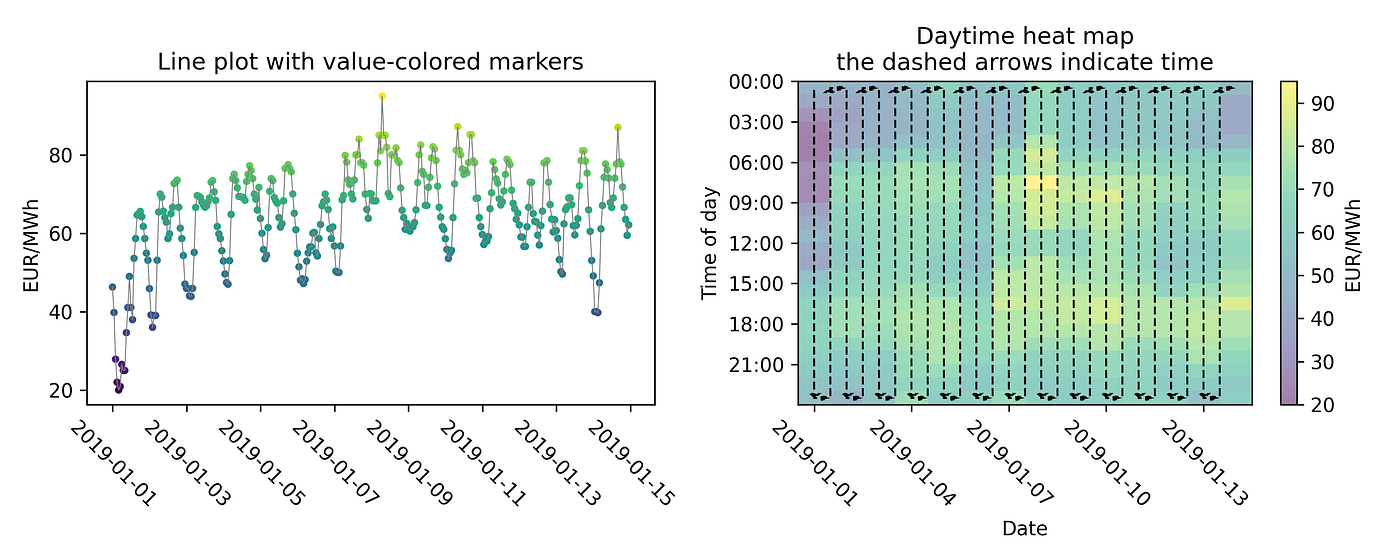
The same time series (two weeks of day-ahead spot prices for IT-Centre-North in EUR/MWh) displayed as a line plot (left) and as a daytime heatmap (right)
As an example, I will be using one year of hourly electricity prices as recorded in this time series dataset from open power system data.
Why temporal heat maps
The following aspects make temporal heat maps a powerful time series visualization:
- Information density. Temporal heat maps offer an information density unmatched in other visualization types, using virtually every pixel. As opposed to line plots, which can be both cluttered and empty in some areas (actually, in most cases, most of the area occupied by a line plot is empty), heat maps unfold all data points on a full rectangle without any lost space.
- Highlighting of periodic patterns. Daily heat maps, for instance, are the best way to visualize daily patterns, along with seasonal variations and other changes over time. The human eye and brain is adept at discerning patterns in images, whether it be horizontal or vertical lines and bars, color gradients etc., all of which have an interpretation in a heat map.
- Identification of events, their frequency and duration. While showing all the data, a daytime heat map also allows the reader to identify the date and time of particular events with good precision. Even if the data does not exhibit a daily period, a daily heat map can be useful in showing, for instance, short events (from a few minutes to a few hours), their duration and their frequency (how many a day), as well as how all this evolves over time.

One year of day-ahead spot prices for IT-Centre-North in EUR/MWh) displayed as a heat map.
The heat map above examplifies these three aspects:
- For such year-long hourly time series containing several thousands of points, the heat map provides the following insights, which the already very cluttered line plot (see below) does not.
- Two green-yellowish horizontal patterns across the whole image correspond to higher prices in the morning and early evening (rather typical for electricity prices).
- A bright yellow vertical line clearly shows the day with the highest prices (this is in January).
- The attentive observer will also notice thin vertical lines of darker/bluer color distributed at regular short intervals: these are weekly (weekend) patterns.
- Occurrences of very low prices (dark blue) can also be identified and located (one case around noon during spring, and some cases at night in December), despite their short duration of a few hours each.

One year of day-ahead spot prices for IT-Centre-North in EUR/MWh) displayed as a line plot. This is quite cluttered and does not reveal anything about the daily/weekly patterns in the data.
When to use temporal heat maps
The strengths of temporal heat maps described in the previous paragraph should already have given you a few hints. To sum it up, temporal heat maps can be a great fit when:
- A given (daily, weekly, etc.) periodicity or seasonality is expected.
- The data appears too complex for a line plot, for instance because it exhibits a variety of temporal patterns occurring at different frequencies.
- Discrete or even categorical data, which do not render well on line plots, are a good fit for temporal heat maps (provided the right colormap is chosen).
When not to use temporal heat maps
Despite my love for heat maps, I am aware of the fact that they are not the best time series visualization in every case. In particular, you might want to avoid them if the following cases:
- When a simpler visualization is sufficient. In particular, this can be the case for very short or smooth time series data.
- When it is too much information for the recipient. Not only are temporal heat maps a bit less intuitive than line plots — which means they might need a word of introduction for some recipients — their information density, which I already praised, is not always desirable. Thus, avoid heat maps if you want to convey a short message rather than have people get lost in contemplation of the daat.
- When exact quantities or ratios of the displayed quantity are of primary importance. Representing numerical values with color has the drawback that actual values and their ratios are not as accurately recognized by us humans as in visualization coding quantities as lengths.
A daytime heat map in Matplotlib
Enough prose, you probably want to start heatmapping already. Here is how you can create a date/daytime heat map in Python using Matplotlib, starting from a pandas Series. You might notice drawing the heat map image is a matter of few lines of code, but there is some overhead to format the axes adequately.
def daytime_heatmap(
    time_series,
    freq=pd.Timedelta("1H"),
    im_kwargs=None,
    n_days_per_x_tick=60,
    n_hrs_per_y_tick=3,
    date_format="%Y-%m-%d",
    ax=None,
    cbar_title="",
):
    """Plot a daytime heat map of a time series

    Args:
        time_series (pd.Series): a pandas time series
        freq (pd.Timedelta): frequency with which to resample the time series
        im_kwargs (dict): kwargs to pass to plt.imshow
        n_days_per_x_tick (int): number of days per x tick
        n_hrs_per_y_tick (int): number of hours per y tick
        date_format (str): format of x axis ticks
        ax (plt.Axes): Matplotlib axes to plot on
        cbar_title (str): title of colorbar
    """

    if im_kwargs is None:
        im_kwargs = {}

    # resampling and pivoting
    time_series = time_series.resample(freq).mean()
    long_df = pd.DataFrame(time_series)
    long_df.columns = ["value"]
    long_df["date"] = long_df.index.normalize()
    long_df["daytime"] = long_df.index - long_df["date"]

    short_df = long_df.pivot_table(columns="date", index="daytime", values="value")

    if ax is None:
        _, ax = plt.subplots(figsize=(10, 5))

    # the actual heatmap plotting
    img = ax.imshow(short_df, interpolation="none", **im_kwargs)
    plt.colorbar(img, label=cbar_title)

    # formatting y axis ticks (time of day)
    daytimes = sorted(list(set(long_df["daytime"])))
    n_per_y_tick = int(pd.Timedelta(f"{n_hrs_per_y_tick}H") / freq)
    y_ticks = np.arange(0, len(daytimes), n_per_y_tick)

    def daytime_string(time_delta):
        return f"{time_delta.components.hours:02d}:{time_delta.components.minutes:02d}"

    y_tick_labels = [daytime_string(daytimes[i_tick]) for i_tick in y_ticks]
    ax.set_yticks(y_ticks - 0.5, labels=y_tick_labels)

    # formatting y axis ticks (time of day)
    dates = sorted(list(set(long_df["date"])))
    x_ticks = np.arange(0, len(dates), n_days_per_x_tick)
    x_tick_labels = [dates[i_tick].strftime(date_format) for i_tick in x_ticks]
    ax.set_xticks(x_ticks, labels=x_tick_labels)
    ax.set_xlabel("Date")
    ax.set_ylabel("Time of day")
    ax.set_title("Daytime heat map")
Two details before you leave:
- As with other visualization techniques, and perhaps even more, color is key. This means choosing the right palette or colormap (an art and a science, on which you can find lots of information online), and also thinking about scaling (in particular, a few outliers can push all the “normal” data to one end of the color space, but you will see that soon enough). In the above code, change the colormap through a
cmapkey inim_kwargs. - Avoid smoothing/interpolation, which can yield meaningless artifacts. This is the meaning of
interpolation="none"in the above code.
Conclusion
I hope that this story has convinced you of the value of heat maps for visualizing time series, and that you will be able to recognize the next time series calling for a heat map and enjoy the result. For other time series, it may also be that a line plot, a scatter plot, a calendar plot or a lasagna plot is a more suitable visualization, or a good complement to a daily time series heat map, but these are for other stories.
메타데이터
- post_id
- eef64deee0a1
- slug
- a-short-guide-to-temporal-heat-maps-eef64deee0a1
- url
- https://medium.com/@spectalizer/a-short-guide-to-temporal-heat-maps-eef64deee0a1
- canonical_url
- https://medium.com/@spectalizer/a-short-guide-to-temporal-heat-maps-eef64deee0a1
- author_url
- https://medium.com/@spectalizer
- status
- ok
- fetched_at
- 2026-08-16 10:18:15