Why Sublimation Prints Look Different After Pressing
Learn why sublimation prints change color after pressing, what causes dull or faded results, and how to get more accurate transfers every…
Why Sublimation Prints Look Different After Pressing
Learn why sublimation prints change color after pressing, what causes dull or faded results, and how to get more accurate transfers every time.
You finally print your sublimation design, the colors look bright on paper, and everything seems perfect. Then you press it onto the shirt, mug, or tumbler, and suddenly the colors look completely different.
This is one of the most confusing parts of sublimation printing for beginners. A design that looked faded before pressing may become vibrant afterward. Other times, colors shift in the wrong direction and end up dull, muddy, or oversaturated.
The good news is that most color changes during sublimation are normal. The bad news is that some color changes signal problems with heat settings, moisture, pressure, or materials.
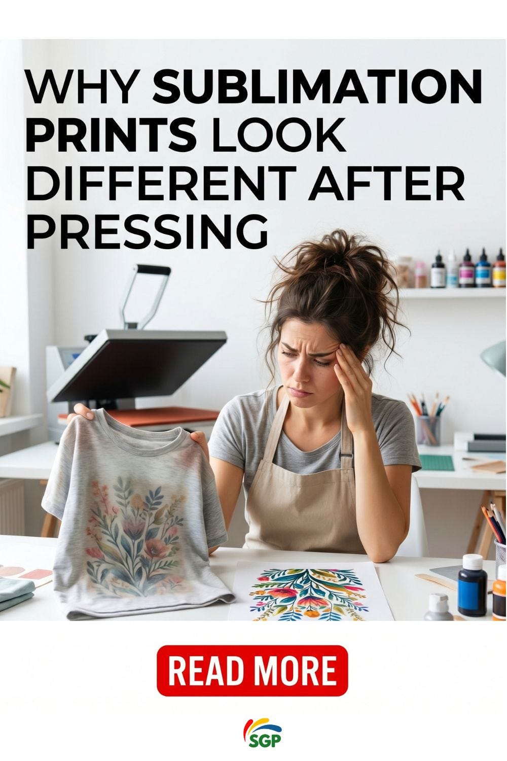
Why Sublimation Prints Change After Heat Pressing
Sublimation ink behaves differently from regular printer ink.
Before pressing, sublimation ink sits on transfer paper in a dry state. During pressing, heat turns the ink into gas. That gas bonds with polyester fibers or polymer coatings.
This chemical change is why sublimation colors often look dull or washed out before pressing but vibrant afterward.
In most cases, faded-looking paper prints are completely normal.
What Normal Sublimation Changes Look Like
A healthy sublimation transfer usually follows this pattern:
- Print looks muted on paper
- Colors appear slightly gray or flat
- Final pressed product becomes brighter
- Blacks deepen after pressing
- Reds and blues become more saturated
Many beginners panic too early because they judge the transfer before heat activation.
The real test happens after pressing.
When Color Changes Mean Something Is Wrong
Not every color shift is normal.
Some changes point to production issues that affect print quality and consistency.
Signs of a Problem
Watch for these warning signs:
- Colors turn brown or yellow
- Blacks become dark green
- Images look blurry after pressing
- Colors appear faded even after transfer
- Uneven color saturation across the design
- Dull prints on polyester garments
- Strange color patches or ghosting
These usually come from incorrect heat, poor materials, moisture, or color management problems.
The Biggest Reasons Sublimation Prints Look Different
Incorrect Heat Settings
Temperature controls everything in sublimation.
Too little heat prevents the ink from fully activating. Too much heat burns the transfer or shifts colors badly.
Common heat mistakes include:
- Press temperature too low
- Press temperature too high
- Uneven heat distribution
- Short pressing time
- Excessive pressing time
Many cheap heat presses struggle with temperature accuracy. A machine set to 400°F may actually run much hotter or colder.
That difference matters more than most beginners realize.
Moisture in the Material
Moisture is one of the most overlooked sublimation problems.
Even slight humidity inside shirts, paper, or blanks can interfere with gas transfer during pressing.
This often causes:
- faded areas
- color inconsistencies
- blurry edges
- washed-out designs
A quick pre-press for 5 to 10 seconds removes hidden moisture and improves consistency.
Poor Quality Polyester or Coating
Sublimation only bonds properly with polyester or polymer-coated surfaces.
Low-quality blanks often produce disappointing colors because the coating cannot absorb sublimation gas correctly.
This becomes obvious with:
- cheap tumblers
- low-polyester shirts
- bargain sublimation blanks
- inconsistent coatings
A shirt advertised as “sublimation friendly” may still produce weak colors if the polyester content is too low.
For apparel, 100% polyester usually produces the strongest and brightest results.
Why Prints Look Dull Before Pressing
This part confuses almost everyone at first.
Sublimation prints are not supposed to look vibrant on transfer paper.
The ink reaches its full color only after heat activates it. Before pressing, the print often appears:
- faded
- chalky
- low contrast
- washed out
That does not mean the print failed.
Many beginners waste ink by reprinting designs that were already correct.
ICC Profiles and Color Management Problems
If your pressed colors look completely wrong, color management may be the issue.
An ICC profile controls how colors translate from screen to printer.
Without proper color management:
- blues may print purple
- blacks may appear green
- skin tones may look unnatural
- saturation may become inconsistent
This becomes more obvious on detailed graphics and photographs.
Common Color Management Mistakes
- Using generic printer settings
- Wrong paper profile
- Incorrect color mode
- Double color correction
- Cheap third-party ink without calibration
Professional sublimation setups rely heavily on consistent ICC profiles.
Beginners often skip this step and wonder why their colors never match the screen.
Pressure Problems During Pressing
Pressure affects how evenly sublimation gas transfers into the material.
Too much pressure can distort the image. Too little pressure creates uneven transfers.
You may notice:
- faded corners
- patchy saturation
- blurry edges
- inconsistent blacks
Medium pressure works best for most sublimation projects.
Heavy pressure is not always better.
Why Different Materials Change Color Results
Not all blanks react the same way.
The exact same print can look different on:
- shirts
- tumblers
- ceramic mugs
- mousepads
- aluminum panels
Each material absorbs sublimation differently.
A design that looks perfect on a polyester shirt may appear darker on ceramic or more muted on fabric blends.
This is why experienced sublimation businesses test every new blank before selling products.
How to Get More Accurate Sublimation Colors
Use Consistent Heat Settings
Avoid changing settings randomly between projects.
Track:
- temperature
- pressure
- pressing time
- paper type
- blank type
Consistency matters more than chasing “perfect” settings online.
Test Small Before Large Orders
Large production runs amplify small mistakes.
Always test:
- one shirt
- one tumbler
- one mug
before committing to bulk production.
This simple habit saves expensive material waste.
Upgrade Cheap Blanks Carefully
Low-cost blanks often create unpredictable results.
The hidden cost is wasted time, ruined transfers, and inconsistent customer satisfaction.
Reliable sublimation suppliers usually cost more upfront but reduce failure rates dramatically.
Store Paper and Shirts Correctly
Humidity damages sublimation consistency.
Keep materials:
- dry
- sealed
- room temperature
- away from moisture
Paper exposed to humidity often produces weaker transfers.
Common Beginner Mistakes That Ruin Sublimation Colors
Judging the Print Before Pressing
This is the biggest beginner mistake.
Sublimation paper prints are supposed to look dull.
The final transfer is what matters.
Using Cotton Shirts
Sublimation does not work properly on standard cotton.
The ink needs polyester fibers to bond permanently.
Cotton usually creates:
- faded prints
- weak colors
- poor durability

Ignoring Heat Press Accuracy
Not all heat presses display true temperatures.
A temperature gun or heat test strips help verify accuracy.
This matters more than upgrading printers early on.

How Professionals Keep Sublimation Colors Consistent
Experienced sublimation businesses focus on systems, not guesswork.
That usually means:
- standardized heat settings
- calibrated color profiles
- consistent suppliers
- humidity control
- tested workflows
Most color problems come from inconsistency, not lack of creativity.
Good sublimation printing is mostly process control.
Read the full breakdown here:
https://subligeniusprint.com/why-sublimation-prints-look-different-after-pressing/
Frequently Asked Questions
Why does sublimation ink look faded before pressing?
Sublimation ink activates fully only after heat pressing. Dull-looking prints on paper are completely normal.
Why do my sublimation colors look dull after pressing?
This usually comes from low heat, moisture, poor polyester content, or low-quality blanks.
Can too much heat ruin sublimation colors?
Yes. Excessive heat can scorch materials, distort colors, and create yellow or brown discoloration.
Why does black sublimation ink look green?
Improper color profiles, incorrect temperature, or poor-quality ink often cause black tones to shift green.
Does sublimation work on cotton shirts?
Standard sublimation works best on polyester. Cotton usually produces faded and short-lasting results.
메타데이터
- post_id
- ef2f5940bcf5
- slug
- why-sublimation-prints-look-different-after-pressing-ef2f5940bcf5
- url
- https://medium.com/@subligeniusprint/why-sublimation-prints-look-different-after-pressing-ef2f5940bcf5
- canonical_url
- https://medium.com/@subligeniusprint/why-sublimation-prints-look-different-after-pressing-ef2f5940bcf5
- author_url
- https://medium.com/@subligeniusprint
- status
- ok
- fetched_at
- 2026-06-29 02:33:43