A Digital Map of DER SPIEGEL’s 2023 Journalism
To directly access the interactive map, click here.
A Digital Map of DER SPIEGEL’s 2023 Journalism
To directly access the interactive map, click here.
21,432,901 words — some of them printed in our weekly magazine, and the entirety available online. This is the number of words DER SPIEGEL published throughout the year, a number that hasn’t changed much over the last decade. Devoting five hours daily to reading in 2023 would be required to cover every published word, and this doesn’t include our podcasts, stories, videos, and audio content. Even our most engaged 1% of subscribers spend half this time with our content daily. While some tech companies harvest our articles to feed their data-hungry language models, it’s unlikely any of our actual readers have fully digested every written word produced over the year. Going back to the 1980s, our tree-based magazine used to have around one million words over the course of one year. This vast corpus is the result of countless hours of work from our editorial teams and contributors.
Sit now, and watch the words.
Open the window and let each article in. Let them flow into the room in a stream, all of the words, hundreds of thousands of them, let them fill the space, let them hang in the air, tiny sparkling motes of language. Let them drift, and organize. Let them be carried by eddies of usage and syntax until they find a place to rest. When they’ve settled, when they’ve coated every surface like ash, get up and walk the room, see each word and its neighbors, read the room like a map.
Jer Thorp, Living in Data (2021)
This room of words is imaginary, but the map of meaning that defines it is real. I converted DER SPIEGEL’s textual output into computable numbers. With the help of large language models, each article is assigned a vector that denotes its spatial relationship to other articles in the corpus. Such vectors are foundational to the emerging news recommendation systems that numerous publishers are adopting, set to change how readers interact with and perceive news platforms. Large language models play a pivotal role in this evolution, offering sophisticated and user-friendly methods to comprehend both content and user preferences. At the heart of these models are embeddings, which transform unstructured text into computable data, which then can be turned into (interactive) visualizations, rendering the vast array of content we produce more tangible to all, inside and outside of DER SPIEGEL.
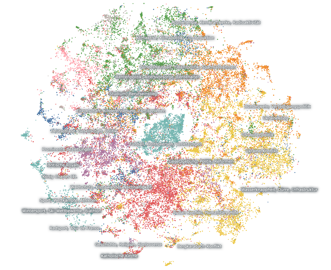
Interactive Map of DER SPIEGEL’s 2023 Publications (Screenshot)
Sit now, and watch the words.
Near the door, there’s a gathering of technology-related articles: topics like OpenAI, artificial intelligence, ChatGPT, and TikTok mingle with mentions of Elon Musk, Twitter, Apple and smartphones. Look upwards to the ceiling, and you’ll notice terms like mobility, SUVs, battery production, alongside energy infrastructure, car industry and Tesla. Directly beneath your seat, you’ll discover an array of articles on German politics, with elections densely grouped together. Close to the window, there’s a section dedicated to politicians, flanked by discussions about various political parties and controversies.
In this room, each article has naturally gravitated towards those with similar themes, creating a unique spatial organization based on affinity. Sit now, and watch the words. You will probably find yourself in good company, recognizing familiar articles from your year’s reading, each a reflection of your interests and knowledge. You may also come across articles and topics you have missed amidst the endless flow of information. This is where news recommender systems can come in, as they guide you to content that aligns with your interests yet expands your horizons.
On a technical note
To create the interactive map, I used Nomic Atlas, a platform designed to provide algorithms for dimensionality reduction, clustering, labeling and visualization. Initially, raw text or, in our scenario, preprocessed embeddings (read below for more context), are fed into their system.
Currently tailored for the English language, I employed the OpenAI completion API to generate custom labels. By submitting articles summaries of each cluster back to the API, I could create labels that accurately reflected the content. Nomic Atlas generously incorporated these custom labels manually — a feature I hope will become automated in the future. The platform also allows for various metadata, such as text length, editorial department, or their inherent cluster labels, to be overlaid as a color layer to enhance the visualization. Due to the custom labels, I encountered some problems with the visualization legend displaying incorrect data. Nonetheless, the tool is exceptionally valuable for exploring textual data both fast and deep. When paired with a Large Language Models, Nomic becomes an even more powerful instrument for analysis.
Thanks for reading!
I hope you liked it, if so, just make it clap. Please don’t hesitate to reach out.

My well-used copy of Living in Data (2021) by Jer Thorp
메타데이터
- post_id
- efa4ca5b072f
- slug
- a-digital-map-of-der-spiegels-2023-journalism-efa4ca5b072f
- url
- https://medium.com/@helloheld/a-digital-map-of-der-spiegels-2023-journalism-efa4ca5b072f
- canonical_url
- https://medium.com/@helloheld/a-digital-map-of-der-spiegels-2023-journalism-efa4ca5b072f
- author_url
- https://medium.com/@helloheld
- status
- ok
- fetched_at
- 2026-06-28 10:39:35