Redesign Transfer Feature for BCA mobile
Hello readers, my name is Ignatius Adikka Putra 29 years old from Indonesia. Currently, I am student studying in UI/UX design at Dibimbing…

Get to Know the Designer
Hello readers, my name is Ignatius Adikka Putra 29 years old from Indonesia. Currently, I am student studying in UI/UX design at Dibimbing Bootcamp. In this article I would like to share my UI/UX study case that I made along my studying progress.
Before exploring UI/UX design, I was a product designer working on tricycles and baby walker utilizing Solidworks to produce plastic parts and toys for the existing product. Moving on to challenge myself as a bicycle specification maker specialist for kids bikes and adult bikes working across supply chain, manufacture, and marketing team to deliver the best products for the market across the globe.

Let’s start the study case journey, I hope you will follow along the way. Happy reading.
Empathize with the Situation
Not everybody enjoys the convenience of utilizing mobile banking, the elderly population, in particular, still facing challenges in keeping up with digitalized transactions. They need more attention and guidance in order to be able to understand and operate such technology seamlessly.
The Urgency
Based on the data from Statistics Indonesia (BPS) , Indonesia is on ageing population structure from 2021. The elderly population raised from 9.93% in 2020 to 11.93% in 2025, demands serious attention through development policies that are oriented towards the welfare of the elderly.
Supporting the Indonesian government in development towards the welfare of the elderly, mobile banking development aims to follow attention towards the digital well-being contribution of the elderly.
BCA mobile app chosen for this study case due to the growth of their mobile banking users and transactions, these factors led to interest in discovering the user behavior in utilizing mobile banking and problems to address.
About BCA mobile
Pioneering in Indonesia’s mobile banking service, BCA mobile was the first mobile banking from bank BCA since 2011 with many users today.
Bank BCA awarded as the World’s Strongest Banking Brand in 2024, with mobile banking transactions increasing 24% YoY in 3rd quarter of 2025 and 29% YoY growth of their mobile banking users in September 2025. This achievement reflecting bank BCA he symbol of trust in Indonesia’s finance sector. Source : Bca Official Instagram Page, Source : Bisnis Indonesia

Define through Research
A survey questionnaire was published to reach the right respondent, extracting their insights, and found some respondents who are willing to be interviewed through an online Zoom meeting session. This crucial part needed to be done as the effort to empathize and address what needed to be overcome and what are their expectations in the future.
Respondent Criteria
- Age : 60–75 years old.
- Gender : Male and Female.
- Utilizes mobile banking for daily financial needs.
- Willingness to be interviewed online (2–5 respondents).
Data collection process
Survey questionnaire data collected and gathered in Google Spreadsheets. After filling the survey questionnaire, 2 respondents are willing to be interviewed using Zoom online meeting sessions, sharing their experiences and expectations passionately.
Affinity Diagram
Exploring the in-depth interview from 2 respondents containing insights are extracted into affinity diagram and grouping all the insights into 4 themes to be able to understand and prioritize on which area to focus on.

From the affinity diagram above, The insights are beginning to look more understandable by clustering all the insights into 4 area to focus on and know how the elderly feels, what they thinks, says, and does in utilizing the mobile banking on their phones.
Key Insights
Based on affinity diagram previously, we can observed that the elderly are able to make transactions using mobile banking on their phones because they are familiar with the steps they need to do. However, they expect to be protected while using mobile banking and options to avoid mistakes and fear that will lead the elderly using conventional methods and this matter will make elderly population technological gap even bigger from others.

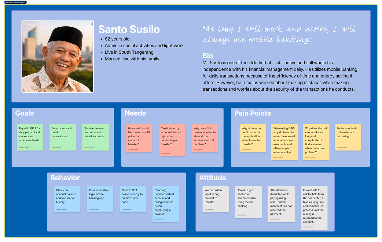
User Persona
Extracted from key insights, User persona is made to represent the typical elderly user of BCA mobile app to summarize :
- Needs
- Pain points
- Attitude
- Behavior
- And goals.
Customer Journey Map
From this customer journey map, two journey phases picture that the elderly feel worried and fear of doing something wrong during the journey phase transaction, and continue feeling worried at the confirmation journey phase that the transaction might fail and if it fail they have to give more time to tackle the problem.
These two area are going to be the focus area for development, as the objective to provide user-friendliness and base-on this research background to contribute digital well-being for the elderly.

Ideation
How Might We?
By focusing on the transaction and confirmation phases of the journey, the next step is to refer back to the insights related to the focus area to address the problem and stimulate creative ideas by asking the question “How Might We?”

Crazy 8
Conducted a crazy 8 session as an idea exploration answering the how might we question.

Impact Effort Matrix

Based on the Impact-Effort Matrix, these three ideas have a high impact and require little effort to implement.
- TOP 3 IDEAS (High impact — Low effort) :
- Idea 1 Improve existing buttons, typography, and information hierarchy.
- Idea 2 Enhance readability on sensitive information such as amount to transfer and beneficiary account detail.
- Idea 3 provide clear confirmation by enhance the readability to help the elderly noticing and take further action by checking the transaction details.
Before working on the user flow, information architeture, and the low-fidelity wireframe, benchmarking BCA mobile to it’s other siblings from bank BCA conducted to make sure the consistency of information hierarchy, and how each product presenting it’s information for the users through it’s layout and button placement.


User flow and Information Architecture

Please access the end-to-end user flow and IA ( information architecture ) from this link
Wireframe
Based on the user flow and information architecture, wireframe were made as the implementation of the information and flow to present what are the pages and what are the information shown on each page on the journey.


Design System
The design develop further by implementing the atomic design from brad frost, this project design system started with creating smallest and stand alone components as the atom , continued to the creation of molecules (atom+atom) and organism (molecules+molecules/atom)


Mockup
Mockup were made to represent what are the final product will look like, and this mockup are the base of interactive prototype development to be tested to BCA mobile elderly user to validate the solution.

Prototype
In this section, prototype developed to let the user interact and test the product. User are given the freedom in amount and transfer information through the interactive keyboard and field on the prototype.
[embed]
Usability Testing
To be able to validate the solution to the problem face by the elderly. Usability testing conducted moderated to observe the behavior of the user and let them say what they think about the improvement with think aloud method.


With the usability testing plan and scenario prepared for the participant to test, these are the insights from participants whom tested the prototype.


Insight and Recommendation

Conclusion
Overall the elderly participant feels the experience of enhance confidence in utilizing transfer feature with bigger text provided and bigger buttons to tap on. The usability testing validated the solution to the pain point. However iterate process must be proceed due to major shortcoming in displaying amount without dots to divide the 0, this might lead the elderly to confusion in checking the amount inserted.

Thank you for reading my UI/UX study case, I hope you enjoy this end-to-end process from research to testing. If you have any feedback please let me know, I hope we are able to communicate further. Reach me out through my linkedin profile.
메타데이터
- post_id
- efedf0a42da0
- slug
- get-to-know-the-designer-efedf0a42da0
- url
- https://medium.com/@ignatius_adikka/get-to-know-the-designer-efedf0a42da0
- canonical_url
- https://medium.com/@ignatius_adikka/get-to-know-the-designer-efedf0a42da0
- author_url
- https://medium.com/@ignatius_adikka
- status
- ok
- fetched_at
- 2026-08-20 14:57:12




