From Rows to Revenue: A Sales Story
Raw sales data is… well, boring. Thousands of rows, endless columns, and way too many numbers. I wanted to change that.
From Rows to Revenue: A Sales Story
Raw sales data is… well, boring. Thousands of rows, endless columns, and way too many numbers. I wanted to change that.
So I built a Sales Dashboard — something simple enough for a busy manager to scan in seconds, but powerful enough to reveal what’s really going on in the business.
And honestly? The findings surprised me.
How I Built It
I pulled publicly available sales data, cleaned it up in Excel, and built visuals with pivot tables and slicers. Nothing fancy, but it gets the job done.
The goal wasn’t to impress with tech skills — it was to make the numbers actually speak.
📊 What the Dashboard Shows
At a glance, you can see:
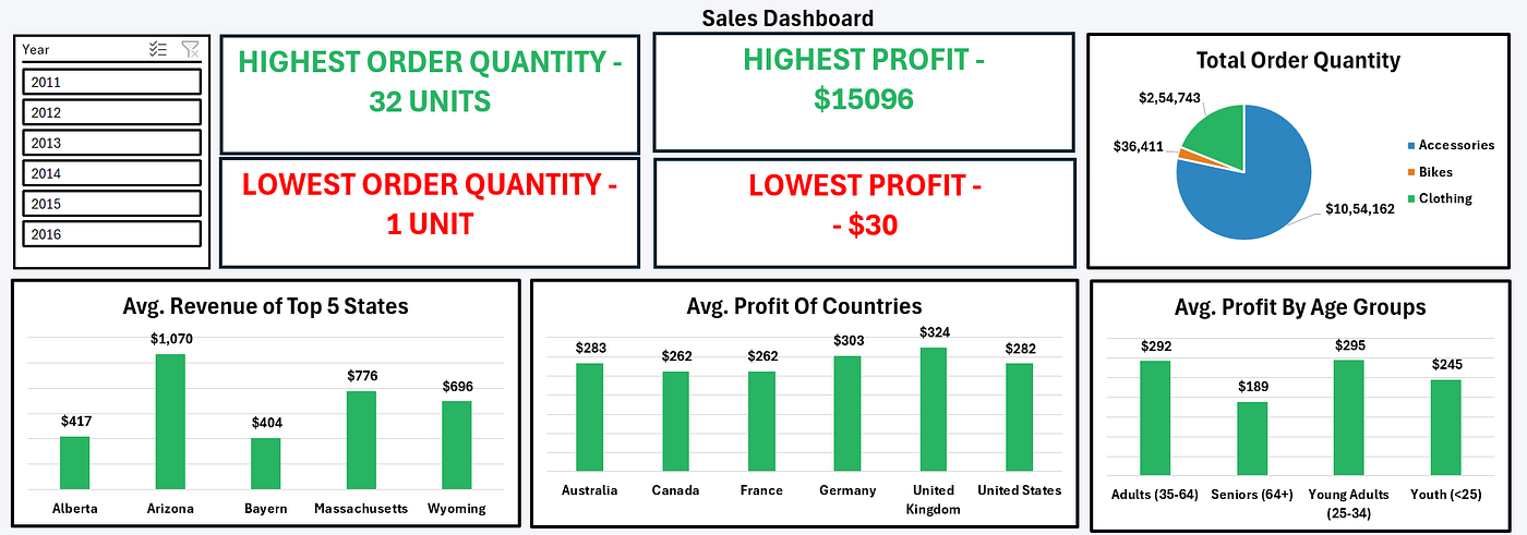
- Highest order placed → 32 units
- Lowest order placed → just 1 lonely unit
- Best single profit → $15,096
- Worst single profit → a small loss of $30
The dashboard also breaks things down by states, countries, and customer age groups.
Insights That Stood Out
1. Some States Punch Above Their Weight
- Arizona is the clear revenue champ with an average of $1,070
- Massachusetts and Wyoming follow behind
- Bayern and Alberta sit at the bottom with ~$400 each
2. The UK Loves to Buy
- United Kingdom leads profits with an average of $324
- Germany and the US aren’t far behind
- Canada and France trail around $262
3. Young Adults Are Big Spenders
This one really stood out:
“Young Adults (25–34) bring in the highest average profit: $295. Seniors (64+)? Just $189.”
Turns out, the younger crowd is driving more profit than the older, “established” buyers. That’s gold for anyone thinking about marketing strategy.
Why It Works
Here’s why this dashboard actually works in real life:
- KPIs up front → no scrolling, just the essentials
- Colors with meaning → green for profit, red for loss
- Filters by year → trends at your fingertips
- Charts that tell a story → pie for product mix, bars for easy comparisons
Quick Summary
- Revenue (State): Arizona leads with $1,070, while Bayern is the lowest with $404.
- Profit (Country): The United Kingdom tops the list at $324, while France and Canada are lowest at $262.
- Profit (Age Group): Young Adults (25–34) generate the highest average profit at $295, while Seniors (64+) are the lowest at $189.
- Order Quantity (Single): The largest single order was 32 units, while the smallest was just 1 unit.
- Profit (Single Order): The best profit recorded was $15,096, while the lowest was a loss of $30.
Dashboards don’t just crunch numbers — they tell stories.
This one told me that Arizona drives the most revenue, the UK brings the best profit, and young adults are the surprise heroes of sales.
If raw spreadsheets are a blur of numbers, a dashboard is the pair of glasses that finally brings everything into focus.
메타데이터
- post_id
- f1e925fb8a2c
- slug
- from-rows-to-revenue-a-sales-story-f1e925fb8a2c
- url
- https://medium.com/@soham.shukla.2004/from-rows-to-revenue-a-sales-story-f1e925fb8a2c
- canonical_url
- https://medium.com/@soham.shukla.2004/from-rows-to-revenue-a-sales-story-f1e925fb8a2c
- author_url
- https://medium.com/@soham.shukla.2004
- status
- ok
- fetched_at
- 2026-06-09 15:37:30




