Here’s What Love Looks Like as a Design Brief.
On empathy, distance, and the moment a phone call from a founder reminded me why I chose design in the first place.
Here’s What Love Looks Like as a Design Brief.
On empathy, distance, and the moment a phone call from a founder reminded me why I chose design in the first place.
There’s a phone call that changes your relationship with a project before it even starts.
For me, it was the founder of TheHyWing reaching out and saying simply: this is what I have in mind. This is what I want to build. This is what I want you to design.
Most times, a brief like that sends your mind straight to deliverables. Timelines. Screens. Components.
This time, the only thing that came to mind was my grandmother.
The Province I Worry About
She lives far from me. In a province I know well — one that doesn’t do anything halfway when it comes to weather. High winds. Severe heat. Brutal cold. The kind of climate that is unforgiving even to people in perfect health.
My grandmother is not in perfect health. She’s asthmatic. And she’s an outdoor worker every single day, she gets up and goes to her business, stepping outside into whatever the sky has decided to throw at her lungs that morning.
I can’t be there. I can’t check the forecast for her. I can’t be the one standing at the door saying “today is a bad air day, stay inside” or “it’s too cold, take the extra layer” or “cover your nose before you step out, the wind is strong today.”
That helplessness that specific, quiet anxiety of loving someone who is far away and vulnerable is something I carried long before I became a designer. And when the founder described what TheHyWing was meant to do, I realized: someone else had felt it too.
When a Founder’s Vision Meets a Designer’s Memory
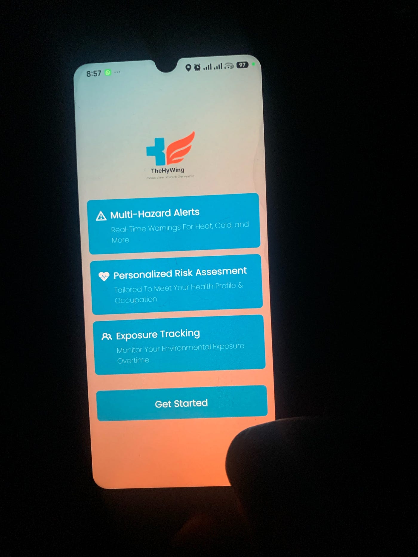
The vision was clear. An app for people like my grandmother. Weather alerts. Hydration tracking. Health condition logging. Symptom triage. In-app doctor consultations. A guardian monitoring dashboard so that the people who love her can watch over everything from wherever they are.
On paper, those are features. In my head, they were answers to questions I had been living with for years.
The weather alert wasn’t a notification system. It was something that would tell her when the air was too harsh for her chest. The health condition log wasn’t a data entry form. It was a record of her asthma, her symptoms, her body — accessible and trackable so nothing slipped through the cracks. The guardian dashboard wasn’t a monitoring tool. It was me, from another province, finally able to breathe a little easier.
That’s what happens when a project meets a personal truth. It stops being a job. It becomes a responsibility.
Designing with Love as the Brief
I want to say something about empathy in design that I think gets lost in the way we talk about it professionally.
Empathy maps and user personas are useful. I use them. But they are tools for approximating something that, when it’s real, needs no approximation. When the person you’re designing for isn’t a persona but an actual human being someone with a name, a province, a chronic condition, a daily routine that puts them at risk , empathy stops being a methodology and becomes something more like moral obligation.
Every screen I designed for TheHyWing had to earn its place. Not because of a design principle. Because I kept asking: would this make sense to her? Would she understand this immediately? Is this one tap too many? Would she dismiss this notification or actually read it?
Designing for someone you love is the fastest way to become ruthless about simplicity. You stop adding things because they look good. You stop keeping things because they impressed a stakeholder. You only keep what genuinely serves the person on the other end.
That’s the standard love sets. And once you’ve designed to that standard, it’s very hard to go back.
The Moment the Screen Became Real
TheHyWing is currently in beta. And yesterday, I held a working version of it in my hands for the first time.
I want to describe that feeling carefully, because I think it matters for every designer who is in the middle of something difficult and wondering whether any of it is worth it.
It felt surreal first. Then it felt earned. Then, quietly, it felt like it was always supposed to exist.
Because there are grandmothers in provinces with brutal winters and high winds, with asthma and outdoor jobs and grandchildren who love them enormously from far away. And now there’s something they can hold in their hands that watches over them when the people who love them can’t be there to do it themselves.
That’s not a feature. That’s a relationship, mediated by design.
What I Want Other Designers to Take From This
Find the person.
Not the user. Not the demographic. Not the persona with the stock photo face and the three bullet-point pain points.
The actual, specific, real person your product is for. Give them a name. Know what province they live in. Know what their body deals with every morning before they even step outside. Design every screen as though they are going to use it tomorrow, and you are going to find out whether it helped.
The best work of your life will not come from chasing trends. It will come from the day someone describes a problem and you think: I know this feeling. I’ve been carrying it. Let me design my way through it.
Let love be a brief. Let care be a north star. Let the person on the other side of the screen be real enough that cutting corners feels like a betrayal of someone you know.
That’s when design stops being a skill and starts being a practice.
That’s when a screen becomes something you can hold.
Pixel by pixel. ❤️
UX Design #ProductDesign #Empathy in Design #Healthcare Technology #Design Thinking #WomeninTech #AfricanDesigners #Healthtech #MobileHealth #UserExperience #ProductDevelopment #InclusiveDesign
메타데이터
- post_id
- f25e86fc84d7
- slug
- heres-what-love-looks-like-as-a-design-brief-f25e86fc84d7
- url
- https://medium.com/@ambaioweijoyce/heres-what-love-looks-like-as-a-design-brief-f25e86fc84d7
- canonical_url
- https://medium.com/@ambaioweijoyce/heres-what-love-looks-like-as-a-design-brief-f25e86fc84d7
- author_url
- https://medium.com/@ambaioweijoyce
- status
- ok
- fetched_at
- 2026-06-09 15:37:30