The Multi-Timeframe Edge: How Top-Down Analysis Transforms Your Trading Accuracy
Master the Art of Aligning Monthly, Weekly, Daily, and Intraday Timeframes for High-Confluence Entries
The Multi-Timeframe Edge: How Top-Down Analysis Transforms Your Trading Accuracy
Master the Art of Aligning Monthly, Weekly, Daily, and Intraday Timeframes for High-Confluence Entries
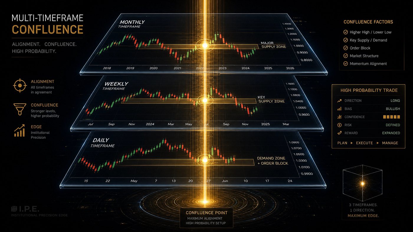
The Multi-Timeframe Edge: How Top-Down Analysis Transforms Your Trading Accuracy
Why Single Timeframe Trading Is Like Driving With One Eye Closed
Imagine trying to navigate a busy highway while wearing a blindfold that blocks everything except what’s directly in front of your car. You might avoid the immediate obstacles, but you’d have no context about where the road is heading, what traffic looks like ahead, or whether you’re driving into a construction zone. This is exactly what single-timeframe traders are doing. They’re so focused on the 15-minute or 1-hour chart that they completely miss the bigger picture, and that missing context is what causes them to take low-probability trades, get stopped out on noise, and wonder why their perfectly good setups keep failing.
The market operates on multiple timescales simultaneously. The monthly chart shows the macro trend that has been developing for years. The weekly chart reveals the intermediate structure. The daily chart shows the current directional bias. The 4-hour chart identifies key support and resistance zones. The 1-hour and 15-minute charts provide execution timing. When all these timeframes align and tell the same story, you have what professional traders call ‘confluence,’ and confluence is where the highest-probability trades live. When timeframes disagree, you have conflict, and trading conflict is a recipe for inconsistent results.
In this article, I’m going to teach you the exact top-down analysis process that institutional traders use to align multiple timeframes and identify trades with exceptional probability. You’ll learn how to read the monthly and weekly charts for macro context, how to use the daily chart for directional bias, how to identify key levels on the 4-hour chart, and how to time your entries on the 1-hour and 15-minute charts. This multi-layered approach will fundamentally change how you look at the markets and dramatically improve your trading accuracy.

Top-down analysis flows from the weekly chart through daily to 4-hour execution levels
Looking for a system with built-in multi-timeframe analysis? The Goldmine Strategy uses institutional MTF alignment for daily bias determination. **Get it here**
Step 1: Reading the Monthly and Weekly Charts for Macro Context
The monthly chart is where you understand the long-term story of a currency pair. Is EUR/USD in a multi-year downtrend since the Eurozone crisis, or has it been consolidating for a decade? Is GBP/JPY riding a long-term bullish wave driven by interest rate differentials? The monthly chart answers these big-picture questions and provides the structural framework within which all shorter-term movements occur. You don’t trade off the monthly chart directly, but you absolutely must know what it’s telling you.
The weekly chart is where macro context meets tradeable structure. On the weekly timeframe, you can identify the major swing highs and lows that define the long-term trend. You can see which levels have held as support or resistance over months and years. You can spot the overall market structure: is price making higher highs and higher lows (bullish), lower highs and lower lows (bearish), or is it trapped in a broad range? The weekly chart gives you the directional bias that should guide all your shorter-term trading decisions. If the weekly chart is bullish, you should be primarily looking for long setups on the lower timeframes. If it’s bearish, focus on shorts. Trading against the weekly trend is fighting an uphill battle that most traders are not equipped to win.
When analyzing the monthly and weekly charts, pay special attention to major psychological levels and round numbers. Levels like 1.0000 in EUR/USD or 150.00 in USD/JPY are not just numbers. They are battlegrounds where enormous institutional orders accumulate. Price often stalls, reverses, or consolidates at these major levels for weeks. Knowing where these levels are on the higher timeframes prevents you from taking a bullish position just below a major weekly resistance or a bearish position just above a major weekly support. The higher timeframe context doesn’t just tell you what to trade. It tells you what NOT to trade, which is equally valuable.

Higher timeframe trend alignment showing bullish continuation across weekly and daily
Step 2: Using the Daily Chart for Directional Bias
The daily chart is where you determine your trading bias for the current session and the days ahead. This is the timeframe that answers the most important question in trading: which direction should I be trading? A bullish daily chart means you should be looking for buying opportunities. A bearish daily chart means you should be focused on selling. A ranging daily chart means you should either trade the range boundaries or wait for a breakout. The daily chart provides the directional filter that prevents you from taking trades against the dominant market force.
On the daily chart, focus on three elements: trend direction, key levels, and price action context. For trend direction, use a simple 20-period exponential moving average (EMA). If price is above the 20 EMA and the EMA is sloping upward, the daily trend is bullish. If price is below a downward-sloping 20 EMA, the trend is bearish. This simple filter eliminates a huge number of low-probability trades. For key levels, mark out the most recent swing highs and swing lows, as well as any obvious support and resistance zones that price has reacted to multiple times. These are the levels you’ll reference when planning entries on lower timeframes.
Price action context on the daily chart tells you whether the market is trending strongly, consolidating, or preparing for a potential reversal. Strong trending markets produce large directional candles with small wicks. Consolidating markets produce small, indecisive candles with long wicks and overlapping bodies. Markets preparing for reversal often show momentum divergence, where price makes a new high but indicators like RSI fail to confirm. Understanding this context helps you choose the right strategy for current conditions. Trend-following strategies work best in trending markets. Range-bound strategies work in consolidation. Counter-trend approaches are reserved for markets showing clear reversal signals. Using the wrong strategy for the current market condition is one of the most common mistakes amateur traders make.

When multiple timeframes align in the same direction, confluence creates high-probability entries
Master multi-timeframe analysis with institutional precision. The Institutional Code System uses MTF alignment as its core framework.
Get Instant Access to The Institutional Fx Code
Step 3: The 4-Hour Chart — Where Zones and Levels Come Alive
The 4-hour chart is the bridge between the strategic daily bias and the tactical execution timeframes. This is where you identify the specific zones where you want to trade. On the 4-hour chart, you can see the recent structure with enough detail to mark precise support and resistance zones, order blocks, fair value gaps, and trendlines. These become your roadmap for the trading sessions ahead. When price reaches one of these predetermined zones, you start paying close attention to the lower timeframes for entry signals.
The 4-hour chart also helps you manage expectations about what type of move is likely. In a strong trend, the 4-hour chart will show clear impulse waves in the trend direction followed by shallow, brief pullbacks. These are the conditions where you want to be aggressive about entering with-trend positions. In a weaker trend or consolidation, the 4-hour chart will show choppier price action with deeper pullbacks that take longer to complete. In these conditions, you need to be more conservative, using tighter risk management and taking profits more quickly. The 4-hour chart’s character tells you whether the market is offering high-quality setups or whether you should be more selective.
One of the most valuable uses of the 4-hour chart is identifying areas where multiple technical factors converge. A support zone that aligns with a 50% Fibonacci retracement, a bullish order block, and a round number creates a powerful confluence area where the probability of a bounce is significantly higher than at any individual factor alone. These confluence zones are where you want to focus your attention. When price approaches a 4-hour confluence zone that aligns with your daily bias, you have the setup for a potentially excellent trade. The 4-hour chart transforms your daily bias into specific, actionable zones.

Zooming in from higher timeframes reveals precise entry zones on lower timeframes
Step 4: Timing Entries on the 1-Hour and 15-Minute Charts
The 1-hour and 15-minute charts are your execution timeframes. You don’t use these charts to determine bias or identify major zones. You use them to time your entry with precision. Think of the higher timeframes as your strategic plan: they tell you WHERE to trade and in WHICH direction. The lower timeframes are your tactical execution: they tell you WHEN exactly to enter and where to place your stop loss and target. This separation of strategy and execution prevents the common mistake of trying to make directional decisions on a 15-minute chart, which inevitably leads to overtrading and getting whipsawed.
Here’s how the execution process works. You’ve determined from the daily and 4-hour charts that EUR/USD is bullish and approaching a key support zone at 1.0850. You switch to the 1-hour chart and wait for price to reach that zone. When it does, you look for a confirming signal: a bullish engulfing candle, a pin bar, a morning star pattern, or momentum divergence on the RSI. This confirmation is your green light that the zone is holding and a bounce is likely. You then drop to the 15-minute chart for even more precise timing, looking for a micro-structure break in your favor or a precise candlestick signal that gives you the tightest possible entry with the smallest stop loss.
The beauty of this approach is that your stop loss placement becomes obvious. Because you’ve identified the key 4-hour level that makes the trade valid, your stop loss goes just beyond that level. If the 4-hour support at 1.0850 is what makes the trade attractive, then a break below 1.0840 (giving 10 pips of buffer) invalidates the setup and triggers your stop. This logical stop placement, derived from the actual structure that created the trade idea, is far superior to arbitrary stops based on fixed pip amounts. It also means that when your stop is hit, you can close the trade with confidence, knowing that the structural reason for the trade no longer exists.

Precise entry timing on lower timeframes after higher timeframe analysis is complete
Get the complete MTF trading system. The Goldmine Trading Arsenal includes multi-timeframe strategies for all market conditions.
Get Instant Access to The Goldmine Trading Arsenal
Handling Timeframe Conflict: When Charts Disagree
Not all trading days offer clean timeframe alignment. Sometimes the weekly chart is bullish while the daily chart shows bearish momentum. Sometimes the 4-hour chart is ranging while the 1-hour chart is trending. These conflicts are not problems to be solved. They are signals to be interpreted. When timeframes disagree, the market is telling you that conditions are mixed and the probability of any single trade working out is lower than usual. This is your cue to reduce position size, be more selective, or stay out entirely.
The general rule for handling conflict is that higher timeframes always take precedence. If the weekly and daily charts are bullish but the 4-hour chart is pulling back, you interpret the pullback as a buying opportunity within the larger uptrend, not as a reason to go short. If the daily chart is bearish but the 4-hour chart is bouncing, you view the bounce as a temporary correction within the downtrend, not as a reason to go long. The higher timeframe provides the context; the lower timeframe provides the timing. When they conflict, context wins.
However, there are times when the conflict is so severe that the best trade is no trade at all. When the monthly chart is bearish, the weekly is bullish, the daily is ranging, and the 4-hour is chopping, the market is sending a clear message: it doesn’t know where it’s going, and neither should you. These are the days when even experienced traders sit on their hands. There is no law that says you must trade every day. In fact, the traders who make the most money long-term are often the ones who trade the least, waiting only for those rare moments when everything aligns and the probability of success is genuinely high. Learning to recognize when timeframes are in conflict and adjusting your approach accordingly is a hallmark of professional trading.

When timeframes disagree, the best trade is often no trade at all
The Power of Triple Screen Confirmation
One of the most powerful applications of multi-timeframe analysis is what I call the ‘Triple Screen’ approach. This method requires confirmation from three specific timeframes before you take a trade. For example, you might require the daily chart to show a bullish trend, the 4-hour chart to show price at a key support zone, and the 1-hour chart to show a clear reversal pattern. Only when all three screens confirm do you enter. This triple confirmation dramatically filters out low-probability setups and ensures that you’re only trading when the odds are genuinely in your favor.
The specific timeframes you use for your Triple Screen depend on your trading style. Swing traders might use weekly-daily-4H. Day traders might use daily-4H-1H. Scalpers might use 4H-1H-15M. The principle remains the same regardless of which timeframes you choose. Screen 1 (the highest timeframe) establishes directional bias. Screen 2 (the middle timeframe) identifies the key zone or level. Screen 3 (the lowest timeframe) provides the precise entry trigger. When all three screens align, you have a trade with exceptional confluence. When any screen fails to confirm, you pass and wait for the next setup.
The Triple Screen approach naturally reduces overtrading because it requires patience for all conditions to align. A trader using this method might take only 3–5 trades per week instead of 3–5 trades per day. But the quality of those trades is dramatically higher. A single high-confluence Triple Screen trade is worth more than ten low-quality trades taken without proper confirmation. Over the course of a month and a year, this quality-over-quantity approach produces far superior results with much lower stress and drawdown.

Professional traders monitor multiple timeframes across several screens
Building Your Daily Multi-Timeframe Routine
To make multi-timeframe analysis a practical part of your trading, you need a daily routine. Here’s the routine that professional MTF traders follow. Start with the weekly chart. Determine the overall trend and mark the major support and resistance levels. Note whether the weekly chart is making higher highs and higher lows (bullish), lower highs and lower lows (bearish), or neither (ranging). This takes about 5 minutes per instrument but provides the foundational context for everything else.
Next, drop to the daily chart. Determine your daily bias based on the trend, key levels, and recent price action. Write this bias down. If the daily chart is bullish, your plan is to look for long opportunities on lower timeframes. Mark the key support zones where you’d be interested in buying and the resistance zones where you might take profits. This daily preparation takes another 5–10 minutes but gives you a clear plan for the session.
Then, analyze the 4-hour chart to identify the specific zones where you’ll be looking for entries. Mark these zones clearly on your chart and set alerts so you know when price approaches them. Finally, when an alert triggers, drop to your execution timeframe (1H or 15M) and wait for your specific entry signal. Execute with your predetermined stop loss and target, then move on to the next setup. This routine transforms trading from reactive guesswork into systematic execution. You always know what you’re looking for, where you’re looking for it, and what you’ll do when you find it.
The Confluence Multiplier: Why MTF Analysis Dramatically Improves Results
Multi-timeframe analysis doesn’t just slightly improve your trading. It transforms it. When you trade with the weekly trend, the daily bias, and a 4-hour confluence zone all aligned, your win rate jumps dramatically. A strategy that wins 50% of the time on a single timeframe might win 65–70% of the time when filtered through multi-timeframe confluence. This improvement comes from eliminating the trades that look good on one timeframe but violate the structure of higher timeframes. These ‘seemingly good’ trades are responsible for a huge portion of unnecessary losses.
Beyond win rate, MTF analysis improves your risk-to-reward ratios. When you enter at a key 4-hour zone that aligns with the daily trend, your stop loss can be placed tightly beyond the structural level that invalidates the trade. Meanwhile, your target can be set at the next significant level on the daily or 4-hour chart, which is often 2–4 times your risk. These favorable risk-to-reward setups are much easier to identify when you can see the full structural landscape across multiple timeframes. On a single timeframe, what looks like a good risk-to-reward might actually be a trade into major resistance that you couldn’t see without the higher timeframe perspective.
The psychological benefits of MTF analysis are equally significant. When you have confidence that your trade aligns with the weekly, daily, and 4-hour trends, you can hold through normal pullbacks without panic. You know that the larger forces are on your side, which makes it easier to let trades develop to their full potential. Single-timeframe traders constantly get shaken out by minor price fluctuations because they lack the contextual confidence that comes from knowing the bigger picture. Multi-timeframe traders are like surfers who know which way the tide is flowing. They can ride the waves with confidence because they understand the ocean’s movements beyond just the wave in front of them.
Ready to master multi-timeframe analysis? Explore all our MTF-based trading strategies at the FXM Brand store
About FXM Brand
FXM Brand creates practical digital products that help traders make steady income online. Our strategies have helped hundreds of traders pass prop firm challenges, grow micro-accounts, and achieve financial freedom through systematic, rule-based trading.
Browse FxM Brand Store and get access to top level strategies and systems. Below are our top selling strategies and systems ::
THE GOLDMINE TRADING ARSENAL
The complete 7-strategy system for traders who want consistent profits, passed prop firms, and financial freedom.
🚀 THE GOLDMINE ELITE SYSTEM (For Elite Traders)
Your ALL-IN-ONE blueprint to unprecedented trading mastery! Includes strategy, AI automation, and mentorship. For Pro Traders ready to invest in top level systems and proven mentorship program guaranteed to pribt consistent income weekly.
The Ultimate FXM Trading Pack
The Bitcoin Goldmine Scalper + Goldmine Strategy + $20 Trader + Oracle AI System + Trading Journal.
The Goldmine Strategy (Most Popular)
This is the core strategy of The Goldmine Strategy, it tailored for Gold trading and works during Asian session. The Goldmine Strategy V2 reveals the system we use to execute this strategy to other pairs. The V2 is included in both The Goldmine Trading Arsenal and The Ultimate FXM Trading Pack.
The Monarch FX Strategy 🏆
Scalp GBP/USD with precision using this specialized institutional system.
The Institutional Code System™
The ultimate premium Forex & Gold trading package for serious traders in 2025.
The Alpha Desk Fx System
This is a 3 Sessions Strategies — Each session has it strategy — The strategies are tailored for Asian Session, New York and London. With this, you can execute trades during any sessions that works with you.
Custom Offer — Goldmine VIP Signals
Get 1 month of high-probability signals based on the Goldmine Strategy.
👉 Explore the full store here: FXM Brand
메타데이터
- post_id
- f33e4d240435
- slug
- the-multi-timeframe-edge-how-top-down-analysis-transforms-your-trading-accuracy-f33e4d240435
- url
- https://medium.com/@fxmbrand/the-multi-timeframe-edge-how-top-down-analysis-transforms-your-trading-accuracy-f33e4d240435
- canonical_url
- https://medium.com/@fxmbrand/the-multi-timeframe-edge-how-top-down-analysis-transforms-your-trading-accuracy-f33e4d240435
- author_url
- https://medium.com/@fxmbrand
- status
- ok
- fetched_at
- 2026-06-09 15:37:30