Adding an Icon, Tile, and Toolbox Category to a Mendix Pluggable Widget
Too often I import a nice-looking widget from the Mendix Marketplace that I can hardly find back in the Toolbox in Studio Pro. They all…
Adding an Icon, Tile, and Toolbox Category to a Mendix Pluggable Widget
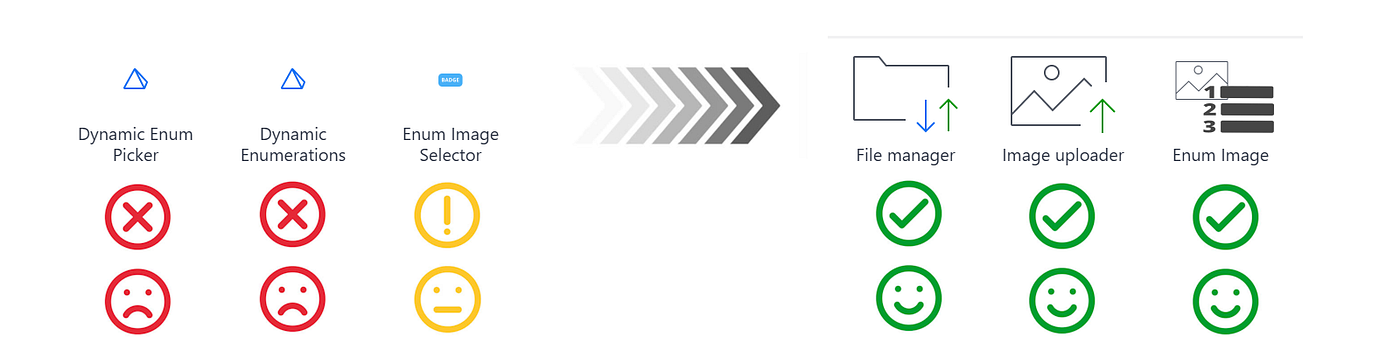
Too often I import a nice-looking widget from the Mendix Marketplace that I can hardly find back in the Toolbox in Studio Pro. They all have the anonymous (default) pyramid icon and clutter up in the Add-ons category.
When you build a custom pluggable widget for Mendix Studio Pro, three things make it look professional in the toolbox: a recognisable icon, a larger tile image, and placement in the right category.
This might sound like cosmetic work, but it has a real impact on productivity. In a project with dozens of widgets in the toolbox, a developer scanning for the right component will rely heavily on icons and categories. A widget that blends in with the defaults is a widget that gets overlooked, or worse, gets drag-dropped into the wrong place because it was the first thing that looked vaguely right.
The good news is that the modern Mendix pluggable widget tooling makes all three of these things surprisingly easy to set up. This article walks you through each one.
1. Toolbox category
Studio Pro organises widgets into categories in the Toolbox panel. You control which category your widget appears in via the <studioProCategory> element in your widget's XML file. The widget's XML file is located in the source directory (src/YourWidget.xml). Here an example of the file with the name, description and Studio Pro category of your widget.
<widget ...>
<name>Your Widget</name>
<description>What it does</description>
<studioProCategory>Images, videos & files</studioProCategory>
...
</widget>Note: Because the file is XML, an ampersand must be written as
&. WritingImages, videos & filesdirectly will cause an XML parse error.
Common category values
Studio Pro has a handful of common categories. You are able to add your widget to one of the common categories, but you are also able to add your own new category. Place your widget in a category in a way that it is easily findable for a developer during the development process.
Category stringWhere it appears in the toolboxDisplayDisplayImages, videos & filesImages, videos & filesInput elementsInput elementsButtonsButtonsMenus and navigationNavigationData containersData containersLayoutsLayouts
If you omit <studioProCategory> entirely, Studio Pro places the widget under Add-ons.
Using a custom category
You are not limited to the built-in list. If none of the standard categories fits your widget, just write whatever name makes sense:
<studioProCategory>Charts & graphs</studioProCategory>Studio Pro will create that category in the toolbox automatically. This is especially useful when you are delivering a suite of related widgets — grouping them under a shared custom category (for example, your company name or product name) makes it immediately clear they belong together and are maintained by the same team.
A few naming tips:
- Keep the name short enough to read at a glance in the toolbox panel.
- Match the capitalisation style of the built-in categories (title case,
&for ampersands in XML). - Avoid overly generic names like
CustomorMisc- those are just as unhelpful asAdd-ons.
2. Icon and tile — the modern way
Choose an image for your icon and tile that is visually telling something about the functionality of your widget. By choosing the right image, you not only make your widget stand out, but you also help developers a lot in quickly finding the widget they are looking for.
Since pluggable-widgets-tools v9+, the build tool automatically picks up icon and tile images from the src/ folder when they follow the correct naming convention. There is no need to embed base64 data in the XML anymore.
File naming convention
Place PNG files in src/ using the widget's class name (Pascal-case, no spaces):
FilePurposeRecommended sizeYourWidget.icon.pngIcon shown in the toolbox list64 × 64 pxYourWidget.tile.pngTile shown in toolbox tile view256 × 192 pxYourWidget.icon.dark.pngIcon for Studio Pro dark theme64 × 64 pxYourWidget.tile.dark.pngTile for Studio Pro dark theme256 × 192 px
The dark-theme variants are optional but recommended for a polished result.
Example folder structure
The pluggable widgets tool expects your files to be in the right place in the right folder. Here’s an example of the source folder with the icon and tile files we talked about.
src/
├── YourWidget.xml
├── YourWidget.tsx
├── YourWidget.icon.png          ← 64 × 64
├── YourWidget.icon.dark.png     ← 64 × 64  (optional)
├── YourWidget.tile.png          ← 256 × 192
├── YourWidget.tile.dark.png     ← 256 × 192 (optional)
└── components/
The build tool (pluggable-widgets-tools build:web) bundles these files into the .mpk automatically - nothing else needs to change.
Deriving the icon from the tile
If you already have a 256 × 192 tile image, you can scale it down to 64 × 64 for the icon. Any image editor works. With Node.js (no extra dependencies) you can also do it in a build script using bilinear sampling, but an image editor gives better results for complex artwork.
3. Creating good widget images
The technical setup is the easy part. Getting images that actually look good and communicate clearly is where most of the effort goes. Here is some practical guidance.
Choosing the right tool
You do not need anything fancy. Any of these work well:
- Figma (free tier) — great for creating clean, vector-based artwork that scales well. Export to PNG at the required dimensions.
- Paint.NET or GIMP — free, open-source, handles PNG with transparency well. Good for pixel-level control at small sizes.
- Adobe Illustrator / Photoshop — if you already have a license, these work perfectly.
- Inkscape — free vector editor, similar workflow to Illustrator.
For most widget icons, a vector tool like Figma or Inkscape is the best starting point because you can export to any size without quality loss.
Design tips for icons
At 64 × 64 pixels, detail disappears fast. Keep these rules in mind:
- Use a single, bold shape. A complex multi-element illustration becomes a muddy blob at small sizes. One clear silhouette is better than three detailed ones.
- Use strong contrast. The icon will appear on both a light and a dark Studio Pro background (if you supply dark-theme variants). Avoid light grey on white or dark navy on black.
- Leave breathing room. Do not fill the canvas edge to edge. A small amount of padding keeps the icon from looking cramped next to text in the toolbox list.
- Use transparency. PNG supports an alpha channel. Use a transparent background rather than a white or coloured background so the icon blends naturally with any Studio Pro theme.
- Be consistent across your widget suite. If you are building multiple widgets for the same project or product, use the same colour palette and visual style. This reinforces that they belong together.
Light vs. dark variants
If you supply only one set of images, use artwork with strong contrast on a transparent background — it will be acceptable in both themes even without dedicated variants.
For a truly polished result, create dedicated dark-theme images. Typically this means inverting or lightening the main colour so it reads well on a dark background. A pure-white icon on a transparent background, for example, works well in dark mode but disappears in light mode.
Image creation workflow in practice
A simple workflow that works well:
- Design the tile (256 × 192) first — at this size you have room to get the design right.
- Export the tile as
YourWidget.tile.png. - Scale the canvas down to 64 × 64 and simplify if necessary.
- Export as
YourWidget.icon.png. - Create dark-theme variants by adjusting colours and export with the
.darksuffix.
4. The old way — base64 in XML (avoid)
Earlier widget tooling required embedding the icon as a base64-encoded PNG directly inside EnumImage.xml:
<icon>iVBORw0KGgoAAAANSUhEUgAAABAAAAAQ...</icon>This approach still works but has several drawbacks:
- The XML file becomes very large and hard to read.
- You cannot have separate light/dark variants.
- Updating the image means re-encoding and pasting a new base64 string.
Use the file-based approach described above for all new widgets.
5. Complete example
src/EnumImage.xml (relevant parts):
<?xml version="1.0" encoding="utf-8"?>
<widget id="conventsystems.enumimage.EnumImage" pluginWidget="true" ...>
<name>Enum Image</name>
<description>Displays the image of an enum value</description>
<studioProCategory>Images, videos & files</studioProCategory>
<properties>
...
</properties>
</widget>src/ folder:
EnumImage.icon.png          (64 × 64)
EnumImage.tile.png          (256 × 192)
EnumImage.icon.dark.png     (64 × 64)
EnumImage.tile.dark.png     (256 × 192)
Run the build:
npm run buildStudio Pro will show the widget under Images, videos & files with your custom icon and tile. No XML changes are needed when you update the images — just replace the PNG files and rebuild.
6. Troubleshooting
If the icon, tile, or category does not appear as expected after rebuilding, work through the following checks.
The widget still shows the default pyramid icon
- Verify the file names match the widget’s class name exactly, including capitalisation. The class name comes from the
idattribute of the<widget>element in the XML file - it is the last segment after the last dot. Forid="conventsystems.enumimage.EnumImage"the class name isEnumImage, so the icon file must beEnumImage.icon.png. - Check that the files are in the
src/folder, not indist/or the project root. - Make sure you are running a full build (
npm run build), not just a type check. - Open the
.mpkfile (it is a ZIP archive) and verify the PNG files are bundled inside. If they are missing, the build step is not picking them up.
The category appears as “Add-ons”
- Check for a typo in
<studioProCategory>. The value is matched as a plain string - any mismatch (extra space, wrong capitalisation) results in a new category instead of joining an existing one, or falls back to Add-ons. - If the element is present but empty (
<studioProCategory></studioProCategory>), Studio Pro treats it as absent and falls back to Add-ons.
The icon looks blurry or distorted
- Make sure the source PNG is exactly 64 × 64 pixels. Supplying a larger image and letting Studio Pro scale it down tends to produce poor results at small sizes.
- If you derived the icon from the tile by scaling, try simplifying the artwork first (reduce detail, thicken strokes) and then scale — this gives a much sharper result.
Dark-theme icon is not showing
- Confirm the file is named with the
.darksegment:YourWidget.icon.dark.png, notYourWidget.dark.icon.png. - Rebuild after adding the file — Studio Pro reads the bundled
.mpk, not the source folder directly.
7. Conclusion
Making your widget look professional and recognisable is not a hell of a job. The modern pluggable widgets tooling handles almost everything automatically — you just need to supply the right image files with the right names and set a single XML element for the category.
The effort you put in here pays off every time a developer opens the toolbox and finds your widget immediately, without having to scroll through a list of identical pyramid icons. That is a small thing, but small things add up to a good developer experience.
I think finding the image that best represents your widget is the hardest part. Once you have found the right one, it is just a matter of preparing the right files and placing them in the right folders. The pluggable widgets tool will do the rest for you.
Happy making!
메타데이터
- post_id
- f3848e1bf0e3
- slug
- adding-an-icon-tile-and-toolbox-category-to-a-mendix-pluggable-widget-f3848e1bf0e3
- url
- https://medium.com/mendix/adding-an-icon-tile-and-toolbox-category-to-a-mendix-pluggable-widget-f3848e1bf0e3
- canonical_url
- https://medium.com/mendix/adding-an-icon-tile-and-toolbox-category-to-a-mendix-pluggable-widget-f3848e1bf0e3
- author_url
- https://medium.com/@luch.klooster_52449
- status
- ok
- fetched_at
- 2026-06-10 08:17:25