What are the signs that an optic is actually designed for practical use, not just specs?
A spec sheet can make almost any optic look impressive.
What are the signs that an optic is actually designed for practical use, not just specs?
A spec sheet can make almost any optic look impressive.
High magnification. Long detection range. Multiple modes. Big numbers. Clean product photos. A list of features long enough to make you feel like you’re getting something serious.
But once you take an optic outside, the spec sheet matters a lot less than people think.
The real question is simple: does it still make sense when your hands are cold, the light is bad, the target is moving, and you don’t have time to dig through a menu?
That’s where practical design shows up.
Good optics are easy to use before they are exciting to read about
A practical optic usually feels understandable within the first few minutes.
That does not mean it has to be basic. A rangefinder, thermal scope, or outdoor optic can still have advanced features. But the important controls should be obvious. Power, mode switching, brightness, ranging, image adjustment — these things should not feel like a puzzle.
A lot of spec-focused optics hide simple tasks behind too many button presses. That might look fine in a showroom or review video, but it becomes annoying in real use.
A practical optic respects the fact that people use it under pressure. Hunters, golfers, hikers, landowners, and outdoor users are not always standing still in perfect weather with both hands free.
Button placement tells you a lot
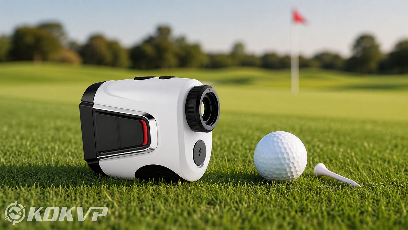
One underrated sign of good design is button layout.
Can you find the main button without looking? Can you operate it with gloves? Is there enough separation between controls so you don’t hit the wrong one? Does the button have a clear click, or does it feel vague?
These small things matter more than people admit.
An optic can have great glass or a strong sensor, but if the buttons are poorly placed, the whole device feels clumsy. Practical design usually shows up in these boring details.
The brands that take field use seriously tend to think about how the device is held, not just how it is photographed.
The display should be readable, not just colorful
A display that looks sharp indoors may not be great outdoors.
Practical optics usually give you a display that is easy to read in different conditions: bright sun, dusk, wooded areas, fog, or low contrast backgrounds. Brightness adjustment should be simple. The reticle or reading should not disappear when the background changes.
For thermal scopes, image clarity matters, but so does how the image is presented. Too much visual clutter can slow you down. For rangefinders, the distance reading should be fast and visible without forcing you to stare at the screen.
The best display is not always the flashiest one. It is the one you can understand quickly.
Specs should match real use cases
Some optics advertise numbers that sound great but are not always relevant.
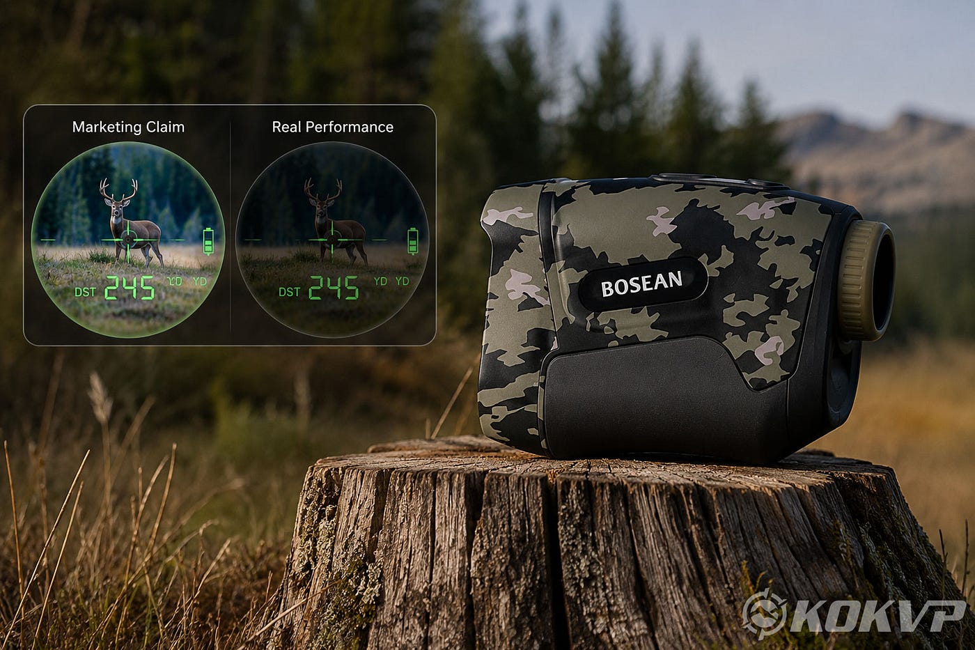
For example, a very long maximum range may look impressive, but many users care more about fast, repeatable readings at realistic distances. A thermal scope may list a detection range, but the practical question is whether you can identify useful detail at the range you actually use.
That difference matters.
There is nothing wrong with strong specifications. Specs help you compare products. But specs should support real use, not replace it.
A practical optic gives you the performance you need most often, not just the biggest number on the page.
Weight and balance matter more than people expect
People often check size and weight, but they do not always think about balance.
A device can be technically “lightweight” and still feel awkward if the shape is wrong. A scope can look compact but make a setup feel front-heavy. A handheld rangefinder can have decent dimensions but still feel slippery or uncomfortable.
Practical design means the optic feels natural in the hand or on the platform where it belongs.
This is especially important for long outdoor sessions. A little discomfort becomes a big issue after repeated use.
Battery design should be realistic
Battery life is one of those specs that can be misunderstood.
A product may list a long battery runtime, but practical design also asks:
Can the battery be replaced or charged easily? Is the charging port protected? Does the device give a clear low-battery warning? Does cold weather affect performance badly? Can you carry spare power without making things complicated?
For outdoor optics, power management is not just a convenience issue. It can decide whether the device is useful when you actually need it.
Menus should be short and logical
A common sign of a spec-first optic is a menu system that feels like it was built by engineers for engineers.
A practical optic does not force users to remember strange icons, deep settings, or confusing mode names. The menu should feel predictable. You should be able to change common settings quickly and leave deeper adjustments for when you actually need them.
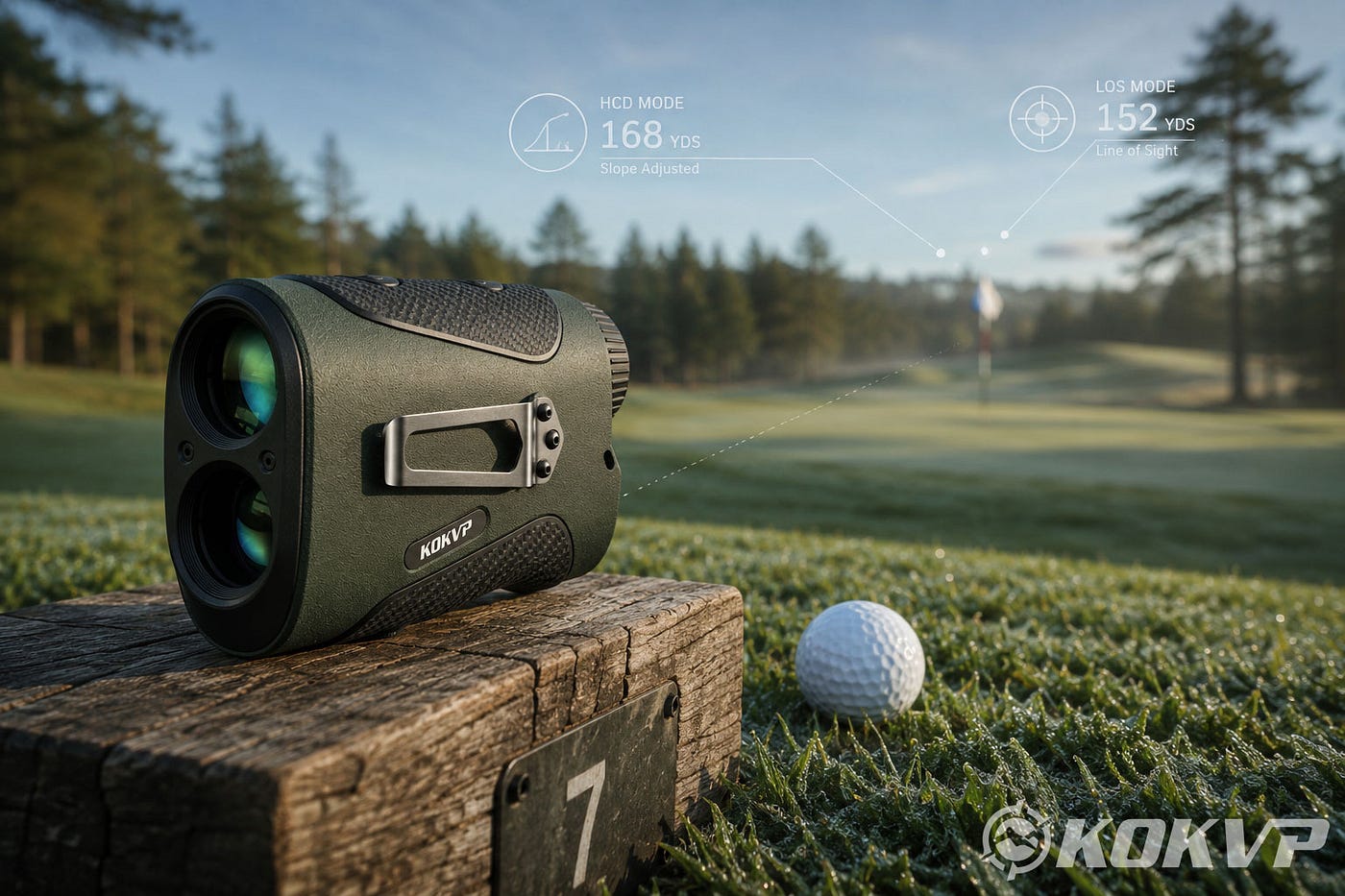
This is where some newer optics brands are starting to pay more attention. Companies like **KOKVP**, for example, are in product areas where usability matters a lot — rangefinders and thermal scopes are not products people buy just to look at on a desk. They have to work outside, in changing light, with limited time. That kind of category naturally pushes design toward simpler controls and clearer field performance.
That does not mean any one brand gets everything right automatically. But it does mean shoppers should look at how the product is meant to be used, not just what the spec table says.
Durability is not only about being “rugged”
Almost every outdoor optic claims to be durable.
The better question is: durable in what way?
Can it handle vibration? Can it deal with light rain or dust? Are the lens covers useful or just decorative? Does the housing feel solid without being oversized? Are the adjustment points protected?
Practical durability is quiet. It is not always dramatic. It is the kind of durability that keeps the optic working normally after being carried in a bag, used in wet grass, bumped against gear, or handled with dirty hands.
A product does not need to look tactical to be durable. Sometimes the most practical designs are plain and boring, because they are built around use instead of appearance.
Fast operation beats feature overload
Feature overload is a real problem in optics.
More modes are not always better. More settings are not always better. More screen options are not always better.
In practical use, speed matters. You want to turn the optic on, get the view or reading you need, and make a decision.
That is why a simple, reliable rangefinder can be more useful than a feature-heavy one that takes too long to operate. It is also why a thermal scope with a clean interface may be more valuable than one with too many display layers.
A practical optic reduces hesitation.
Look for signs of field thinking
When judging an optic, I usually look for signs that the product was designed around real situations.
Not just “What does it claim?” but:
Would I understand this quickly in bad light? Would I trust the reading or image without double-checking constantly? Would the buttons make sense with gloves? Would the display still be readable outside? Would I want to carry this for a full day? Would a beginner be able to use it without reading the manual three times?
Those questions reveal more than a spec sheet.
Practical design feels boring until you need it
The funny thing about practical design is that it often does not sound exciting.
A clear display. A comfortable grip. A simple menu. A protected charging port. Good button feedback. Reasonable weight. Reliable readings.
None of that sounds as dramatic as a huge range number or a long feature list. But those are the things that make an optic feel dependable.
When someone buys an optic only for specs, they may get something that looks impressive online. When someone buys for practical design, they usually get something they actually keep using.
And that is the difference.
Specs help you compare. Practical design helps you trust the tool once you are outside.
메타데이터
- post_id
- f41c9eebdbd8
- slug
- what-are-the-signs-that-an-optic-is-actually-designed-for-practical-use-not-just-specs-f41c9eebdbd8
- url
- https://medium.com/@velluvangadniyamuddin/what-are-the-signs-that-an-optic-is-actually-designed-for-practical-use-not-just-specs-f41c9eebdbd8
- canonical_url
- https://medium.com/@velluvangadniyamuddin/what-are-the-signs-that-an-optic-is-actually-designed-for-practical-use-not-just-specs-f41c9eebdbd8
- author_url
- https://medium.com/@velluvangadniyamuddin
- status
- ok
- fetched_at
- 2026-06-11 06:59:45