[Quick Digest] Assessment of Smart-Beta ETFs — A Quantitative Analysis
I am in the process of building a suite of analytic tools to evaluate and compare different ETFs, and figured smart-beta ETFs are perfect…
[Quick Digest] Assessment of Smart-Beta ETFs — A Quantitative Analysis
I am in the process of building a suite of analytic tools to evaluate and compare different ETFs, and figured smart-beta ETFs are perfect examples to test out these tools. In the following, I will use one of the popular smart-beta ETFs, the momentum factor ETFs, as example and run them through my quantitative tools.
The Momentum Factor
The momentum factor refers to the tendency of winning stocks to continue performing well in the near term, and losing stocks to continue performing poorly. There are many versions of how to define momentum mathematically, one of which is the performance for the past 12 months for any given security (some version exclude the most recent month when calculating performance). In reality, many of these momentum factors are highly correlated to each other.
Momentum Factor ETFs
Many momentum factor ETFs exist, and they diff based on which asset universe to use for investing, such as region, market cap, etc. Some of them even blend momentum factor with other smart-beta factors to make the product more attractive.
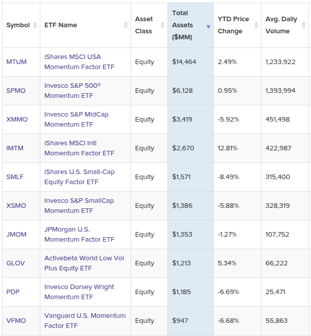
In the following, I will pick six momentum factor ETFs that invest in the U.S. large cap stocks, and use VTI (Vanguard Total Stock Market Index Fund ETF) as a benchmark when comparing these ETFs.
- MTUM: iShares MSCI USA Momentum Factor ETF
- SPMO: Invesco S&P 500® Momentum ETF
- JMOM: JPMorgan U.S. Momentum Factor ETF
- VFMO: Vanguard U.S. Momentum Factor ETF
- FDMO: Fidelity Momentum Factor ETF
- QMOM: Alpha Architect U.S. Quantitative Momentum ETF
Quantitative Analysis
In the following, I will primarily use the historical performances (total returns) for these ETFs for analysis. For fair comparison, only overlapped historical prices are included for analysis, i.e., I will use the latest inception date of these ETFs (Feb 2018) as a common start date for their price data.
Historical Total Returns And Volatilities
- Returns: measures the annualized total returns (dividend reinvested) of different period
- Volatilities: measures how volatile the monthly returns are for each ETF
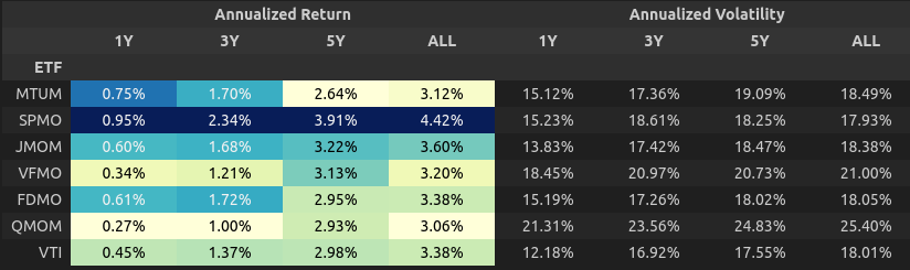
NOTE: “ALL” means the full common period, which is since Feb 2018.
Looking at the left of the table, SPMO did a real good job as it not only has been beating benchmark VTI consistently over different periods, but also has been the best performer among the six momentum ETFs.
The right portion of the table shows the volatility of each ETF, with most of them between 15% to 20% (annualized).
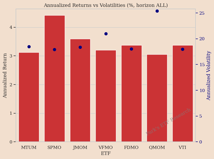
The graph below gives a better view of the returns and volatilities (red bar is for returns, dots are for volatilities). During the overlap period:
- SPMO achieved better annualized return (4.4% every year) with similar level of volatility (18%) compared with benchmark VTI and other momentum ETFs
- QMOM has among the highest volatilities (25%)
Beta Against Benchmark
Beta is defined as the amount of benchmark embedded in a product. It can be calculated using simple linear regression with the return history of a given ETF against the benchmark returns of the same history. Linear regression also produces a term called intercept, which in this case is the extra return an ETF generates in excess to its beta term, and can be interpreted as the “Smart” return the ETF is trying to generate.
We now perform linear regression for each of the six ETFs against VTI.

The title on each chart has the following format, where the beta and SmartReturn are the slope and intercept from linear regression.
ETF=β∗VTI+SmartReturn
We now compare the betas and SmartReturns of each ETF:
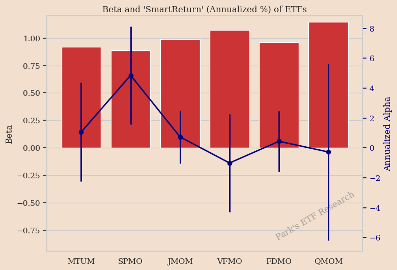
- The betas (red bars) of all ETFs are near 1, which is expected as these ETFs are built around some index (of large cap stocks) that is not far away from VTI
- QMOM notably has the highest beta, 1.15, and this is consistent with our observation above that QMOM has the highest volatility among all the six ETFs.
- ‘“SmartReturn”(dots with error bars) for these ETFs are quite different, with SPMO being the highest, and VFMO and QMOM being negative of the study period.
- Also worth noting is the fact that not only SPMO has the highest average SmartReturn, the bottom of its error bar is also above 0, which indicates it’s statistically meaningful.
Market Participation Rates
We define two participation rates:
- Upside Participation Rate: when market is up more than 5% a month, how much does each of these ETFs perform as a fraction of the market performance
- Downside Participation Rate: when market is down more than 5% a month, how much does each of these ETFs perform as a fraction of the market performance
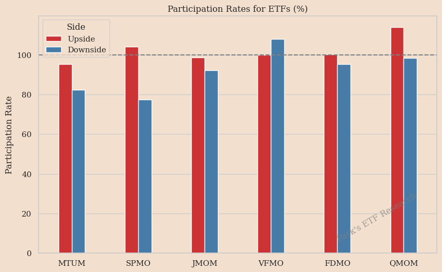
A few observations:
- SPMO and QMOM have upside participation rate above 100%, indicating when market has strong performances, these two tend to do even better than the market
- MTUM and SPMO has among the lowest downside participation rates, which means when market has a downturn, these two tend to do less worse than the market
In general, you want to pick assets that have high upside participation rate and low downside participation rate. In this picture, SPMO is arguably the winner.
Tracking Error and Active Returns
- Tracking Error: defines how closely a security tracks its benchmark.
- Active Returns: defined as the return of a security in excess of the return of its benchmark
Statistically, Active Return is the average of the return differences between an ETF and its benchmark, and Tracking Error is the standard deviation (scaled) of the differences.
The following table and graph show the Active Returns and Tracking Errors of these ETFs.
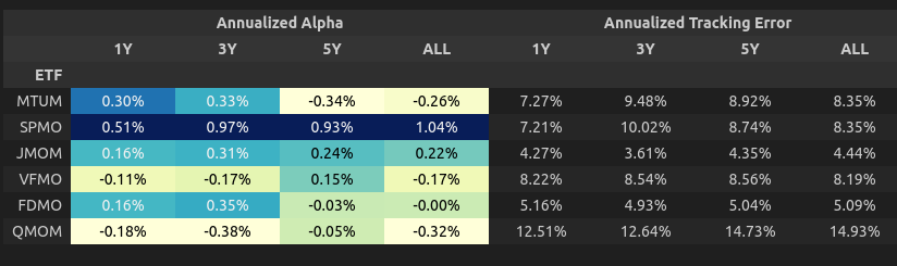
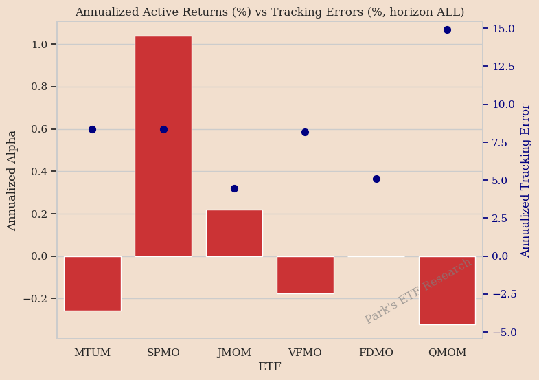
- SPMO again has the highest active returns
- JMOM has the lowest tracking error (4.4%), while QMOM has the largest (14.9%).
A low tracking error like JMOM indicates that the ETF is trying not to stay too far away from its benchmark index. A high tracking error like QMOM indicates it tries to make larger bets away from its benchmark.
We can also view the distribution of their active returns the following way, which can tell some interesting things about these products:
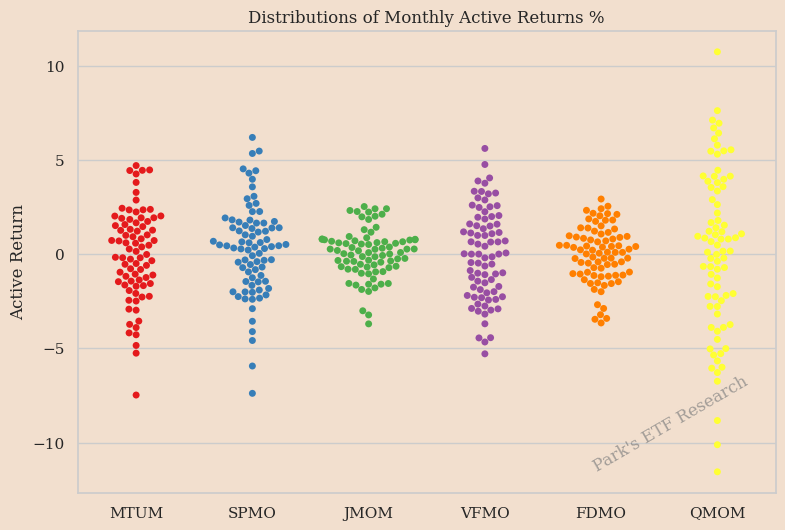
- The distributions of active returns for JMOM and FDMO are shorter and wider compared with others, meaning they are more “like” benchmark returns than others
- The distribution of QMOM is very thin, indicating it has wild swings and may make large bets, consistent with what we saw above
Exposures to Common Factors
We want to explore whether an ETF has similar characteristics to some of the common factors studied in academia and industry. This information enables us to have a peek into how the ETF was constructed under the hood.
The way I study this is to take the active return time series of the common factors, and then run a multi-linear regression of ETF active returns against these common factor returns. The coefficients from the multi-linear regression, which I call “Loading”, tell us whether and how much the ETF is “similar” to a given common factor.
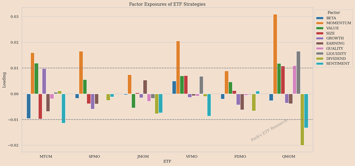
The chart above displays the “Loading” on the common factors for each of the six ETFs.
- Without exception, the Momentum Loading (orange color) of each ETF is the largest compared with other factor loadings. This is expected because these ETFs are momentum ETFs, hence by definition they should have relatively large exposure to momentum factor
- The momentum loading of QMOM is the largest compared to the momentum loadings of other ETFs. This could mean QMOM makes large momentum bets when sizing the portfolio
- SPMO is more of a “pure” momentum strategy: its other factor loadings are relatively smaller than its momentum loading
- MTUM and QMOM are sort of a “mixed” play, as they seem to load factors other than momentum, and not in a trivial way. For example, both of them seem to like value (green bar) stocks, while QMOM seems to dislike dividend (lightblue bar) stocks.
This is still work in progress. If you have any good suggestions about how to evaluate/compare ETFs, please drop your comments below and I might implement them in my package.
메타데이터
- post_id
- f4d874b2fca4
- slug
- quick-digest-assessment-of-smart-beta-etfs-a-quantitative-analysis-f4d874b2fca4
- url
- https://medium.com/@parksir/quick-digest-assessment-of-smart-beta-etfs-a-quantitative-analysis-f4d874b2fca4
- canonical_url
- https://medium.com/@parksir/quick-digest-assessment-of-smart-beta-etfs-a-quantitative-analysis-f4d874b2fca4
- author_url
- https://medium.com/@parksir
- status
- ok
- fetched_at
- 2026-08-05 17:50:33