The monument they weren’t sorry for
I streamed part of the dedication ceremony on Thursday, June 18, the day before the Obama Presidential Center opened to the public on…
The monument they weren’t sorry for
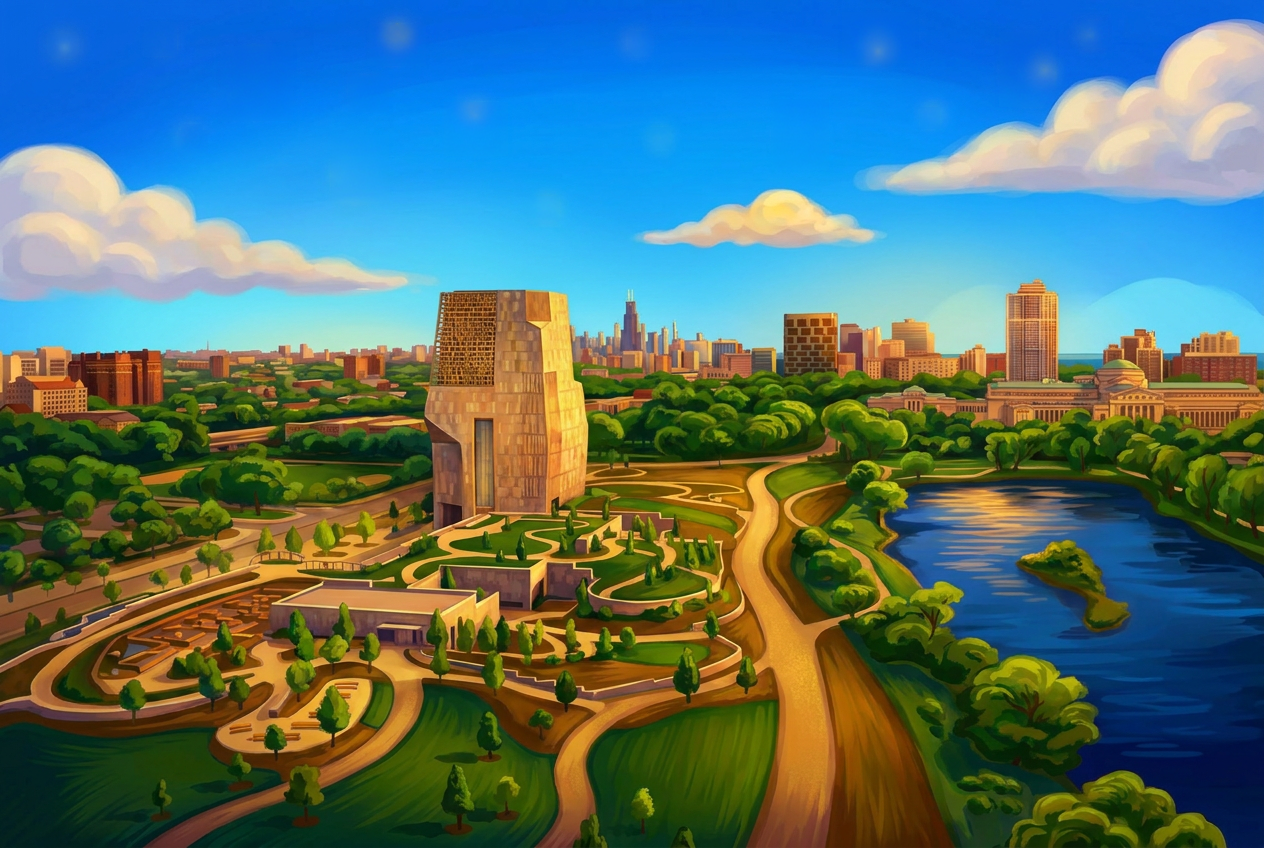
I streamed part of the dedication ceremony on Thursday, June 18, the day before the Obama Presidential Center opened to the public on Juneteenth.
The center sits on a 19-acre campus in Hyde Park and is anchored by a 225-foot tower designed by Tod Williams Billie Tsien & Associates, in collaboration with Chicago-based Interactive Design Architects. The architects have described the form as four hands coming together, and Obama himself pushed them toward something more monumental when early concepts read as too quiet. The result is a building that wants to be felt before it’s understood.
Critics have not been kind. “Obamalisk.” “Obamausoleum.” A “blind, ominous alien spacecraft.” Tsien’s response: “I’m not sorry that it’s monumental.”
I’m with her! I love the brutalism — a building this consequential shouldn’t whisper.
What gets me as a design director is the top of the tower carries an excerpt from Barack Obama’s 2015 speech on the 50th anniversary of the Selma-to-Montgomery march:
You are America. Unconstrained by habit and convention. Unencumbered by what is, ready to seize what ought to be. For everywhere in this country, there are first steps to be taken, there is new ground to cover, there are more bridges to be crossed. America is not the project of any one person. The single most powerful word in our democracy is the word “We.” “We The People.” “We Shall Overcome.” “Yes We Can.” That word is owned by no one. It belongs to everyone. Oh, what a glorious task we are given to continually try to improve this great nation of ours.
Pentagram designed the letterforms, five feet tall, precast in concrete and pigmented to match the granite cladding so they read as part of the structure. From inside the Sky Room, visitors can look out through the negative space of those letters onto the surrounding neighborhood. I love how the typography is part of the architectural work because most signage systems separate message from material but this one fuses them.
What I appreciate most as a CPACC-certified accessibility practitioner was this wasn’t bolted on. There’s a full accessibility framework designed alongside the architecture. The Museum runs on a Universal Experience Point system, a custom assistive technology layer offering visual and audio descriptions, touchscreen navigation, and media customization. Blind and low-vision visitors get braille signage, tactile artifact replicas, and tactile wayfinding maps on every level. Deaf and hard-of-hearing visitors get hearing loops, assistive listening devices, and ASL on-screen interpretation built into the digital exhibits. There’s a downloadable sensory guide and social narrative for neurodivergent visitors, two dedicated Wellness Rooms, and accessible seating across every venue on campus, including the auditorium and library.
Opening a presidential center on Juneteenth isn’t incidental. It’s a statement about whose history gets monumentalized, and when. I truly hope to visit it one day.
메타데이터
- post_id
- f6932ff07c16
- slug
- the-monument-they-werent-sorry-for-f6932ff07c16
- url
- https://medium.com/@jerlyn/the-monument-they-werent-sorry-for-f6932ff07c16
- canonical_url
- https://medium.com/@jerlyn/the-monument-they-werent-sorry-for-f6932ff07c16
- author_url
- https://medium.com/@jerlyn
- status
- ok
- fetched_at
- 2026-06-27 23:56:40