Really Good Week — Day 2
Basic design course romance & “Fuck the Grid” poster design process
Really Good Week — Day 2
Basic design course romance & “Fuck the Grid” poster design process

Hello helloooo!! 👋
I’ll create collage art today. Recently, a friend of mine from the faculty, who is creating abso-fucking-lutely great collage art (he doesn’t only create, but also sells them as NFTs — this guy is lit!), may be inspired me while deciding on that, and maybe he put some candles in my head, right now I’m gonna turn them into the fire 🚒
Right here, at this time, I’m writing these sentences; I didn’t start to work yet, still thinking about what I can create.
Let me be honest, always, the first thing that comes to my mind is typographic design, cuz y’know, it’s easier to create, just big typeface and bum! — it’s done. But I would like to overcome this laziness and create different stuff than I usually do 😪
For this reason, in the last couple of weeks, I started to create physical pieces too!!
What a hilarious text → ef☻ x physical pieces… lol. I can’t believe my eyes. Cuz, if somebody from my term is reading this, could easily understand why; → I suck at craftmanship.
In the first year of the industrial design department, there was a course named “Basic Design.” It was there for both semesters of the first year ❤️🩹 Before giving any details and explanation, I might say that → I fucking hate(d) it. Sad but true.
What was the course → The course started revolving around the, as some of you might guess, basic design principles like contrast, hierarchy, dominancy, and blablabla. I think I was doing good when it came to understanding the things said and explained regarding the principles. However, when it comes to creating something representing, for example, contrast, I was sucking at it. My grades were terrible too because of that course — Look, I started crying and blaming the course☻— Moreover, negative shit never ends, including my relationship with instructors. As soon as writing the previous sentence, I started thinking like “Why was I not able to get along well with instructors?” but, actually, there is no closely related or direct answer to that question. Sometimes, I just don’t like people due to the looks on their faces (which makes me feel guilty or irritated), a judgemental approach, or just an inhumane act. And, more importantly, I have some problems with the authorities 🏛️
I just saw a spider on the ground → I’m in faculty right now, might need to be up all night — and went to discover him??? her???… Hmm, I don’t know which pronoun the spider prefers 🤡 I think I’ll be using this spider on my artwork today, took some pictures of the spider and will mask them in PS! 🕸️
Let’s continue with the basic design course → Above in some line, I just mentioned, “I was doing good understanding…”. Yes! Believe me, I was doing really good while dealing with the theoretical part. The biggest reason, at that time, I was excited as fuck 🤩 It was my first year in the department I wanted so bad. After the classes, I was reading an article over an article with respect to the basic design. And thanks to my ambition, I never stopped there and asked some stupid questions to instructors, to friends, to mentors. I was completely happy about that I was curious and wanted to dig deep. One thing that remained in my mind through the academic romance ❤️🔥 was that I was really wondering something about a piece of work being asymmetrical and balanced at the same time. Maybe, I had a hard time understanding the terms asymmetric… Oh, stop right there.
I just remembered what I was wondering madly → Why are asymmetrical compositions more appealing to our eyes than symmetrical compositions? Why do we, humans, prefer to perceive asymmetrical creations more? — Yes! Right now, I’m so happy that I remembered the very meaningful question from the first year. And realized that I still wonder about it and don’t know why 🤔 I need some research papers, I think, or maybe thoughts from people I am highly being influenced!
Last thing about this topic → No matter what, I was hating the basic design course; it was damn helpful and inspiring for me. This course might be the most effective thing in my life that helped me to discover the researcher side of me. Anything we were being taught in that course was only brief explanations and assignments, and the rest was on us. That made me scroll through pages, discover incredible topics, jump between the articles and learn different ideas upon different topics, challenge and question the basic assumptions, and finally start the route of ef☻.
Thank you, basic design & its instructors! Overall, it was a pleasant and nice experience. If my grades were higher, I might use more attractive wording for the compliments 🤠
Back to poster → Ohh, we were talking about different areas of creativity (digital & physical), and look where we end 🍃 As I said the last couple of weeks, I created some physical creative work too, & it was good considering being the beginner. Also, some of them were not only for the will of creating, a course that I’m taking made me create too. Maybe, at some point, I might be sharing my physical works too. But now, seems like not today.
After talking about paragraphs of the basic design course, I decided to create a poster that revolves around the basic design principles but in a collage way??? Let me leave here, and start creating the work 🎆
By the way → You fully witnessed my idea creation??? — ideation??? — thoughtful to aware??? process. Sometimes I really can’t find any words to describe things in my head, even if they are simple and familiar words 🤡 I just talked about basic design and gonna create something closely related. Good for us!
Initial → Hey! I just started thinking about the poster, and as I said, I’m gonna somehow involve basic design shit and do it by using the image of a spider 🕷️ Right now, I’m surfing through the websites that I can find inspiration and remembering what was the basic design principles completely and how can I create a poster that represents them. The website I’m making use of is https://www.smashingmagazine.com — I don’t know what this website does in-depth, but I know they share helpful articles. I was using this website mostly because I was a first-year student taking the basic design course.
However, yesterday in one of my e-mails — again subscription — I saw an article, and the heading attracted me 🧲 clicked the text link 👆 and boom 💥 Smashing Magazine. If you like to read what you are interested in, go check the website.
But right now, I have a hard time finding an article that summarizes and gives the principles; therefore, I’ll check the first-year documents instructors provided 🤡 back to the first year!… After a couple of minutes, I went to google classroom and checked for the classroom and saw that I had left all of them 😔 Okay, let’s keep searching for a helpful article.
Oh, the font? → Checked awwwards.com website, saw the “site of the day,” and found the font they use — GT America. Examined it and believed that it was a good fit. The reason I believe it is a good fit is typeface has so many variations and weights inside — compressed, condensed, default, extended & expanded — which creates for me a great space, for example, visualizing the contrast principle → expanded black x compressed thin. Today, I might accept all fonts except serif, script and bitmap and handwritten, and… so on — as the typography is not the main point of this work. Spider is the focal point! 🦋
Coming here after completing the artwork and knowing there is not even a leg of a spider on the poster, the previous sentence looks funny 🤓
Process Visuals ↓
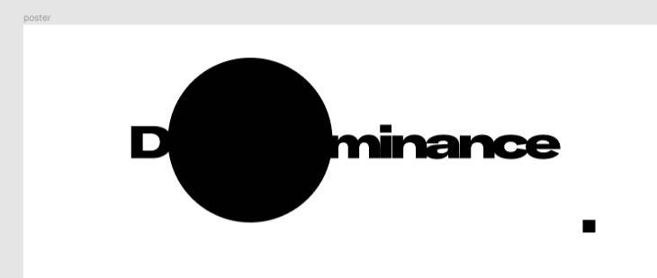
what a cheap trial!!! like a cheap pick-up line!!! okay, let’s put o back to its place 😷
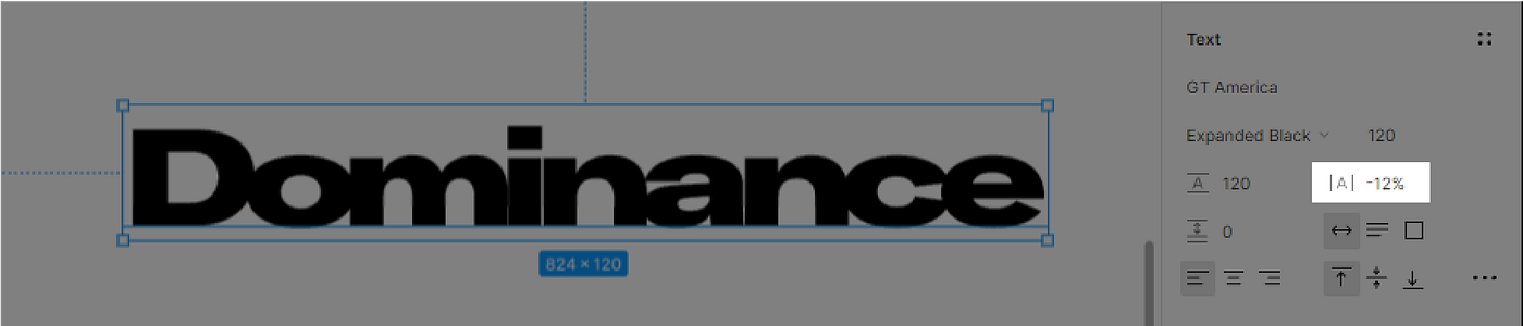
to make it more visually heavy mark (if you narrow your eyes, you’ll se no text, only a black mark) decreased the letter spacing ℹ️
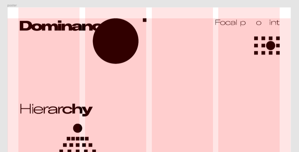
why not interacting the symbols/elements with the texts??? → then, I started with dominance. also, you can see the grid too! it’s the same yesterdays work!

right, where I decided to use letters to create elements 🤡 it just came after I decreased number of squares in focal point part → let’s go with the new idea (which happens to be final idea!!)

for now happy about the result! 🙌 also, I decided only to use expanded version of the typeface, as when I use other variations too, it just gets complicated
Ohhh, I totally forgot to use the spider!!! How did I forget that 😢 Maybe I’ll use it for tomorrow 🤡
Finalized Visuals ↓
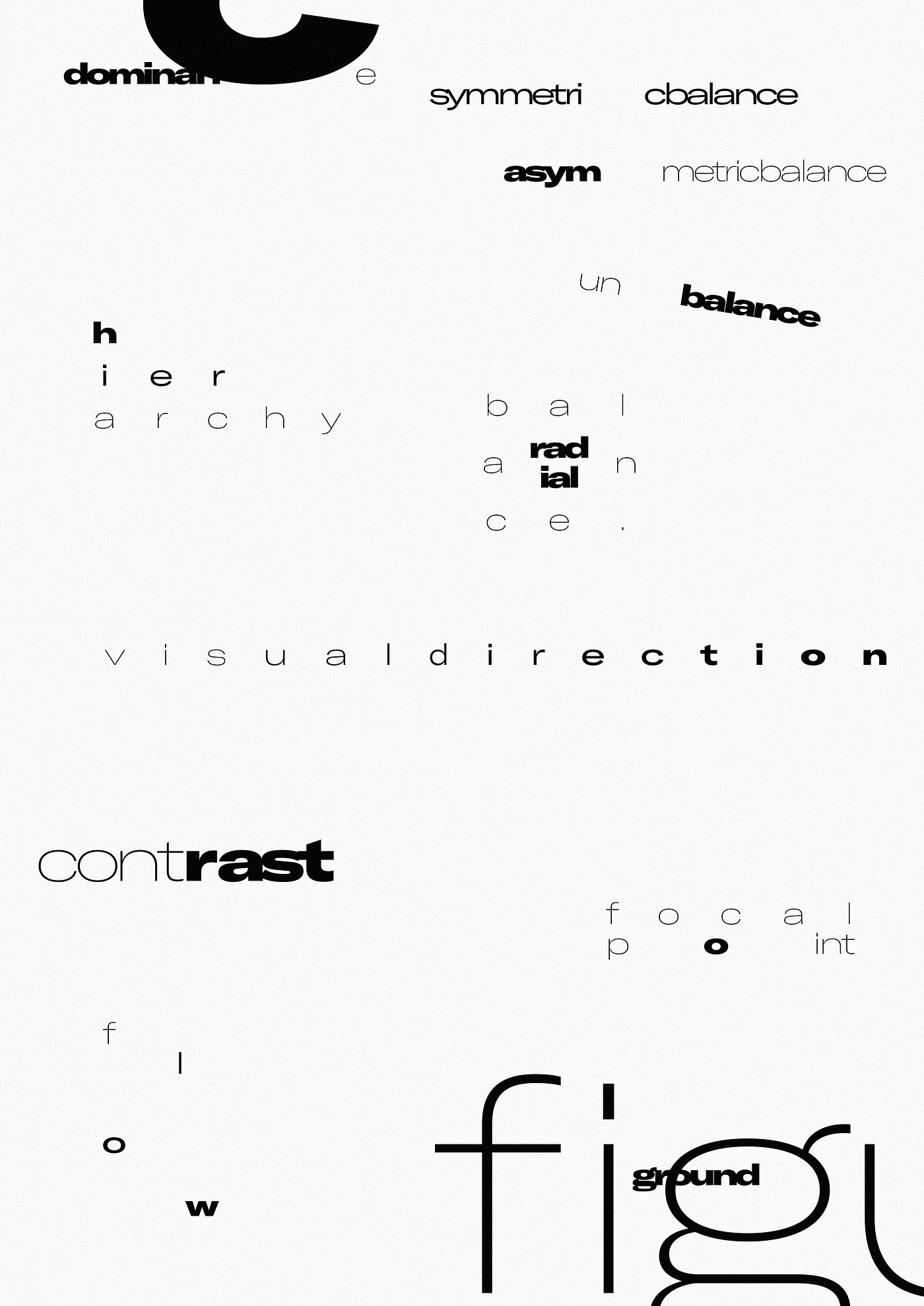
default-no-texture
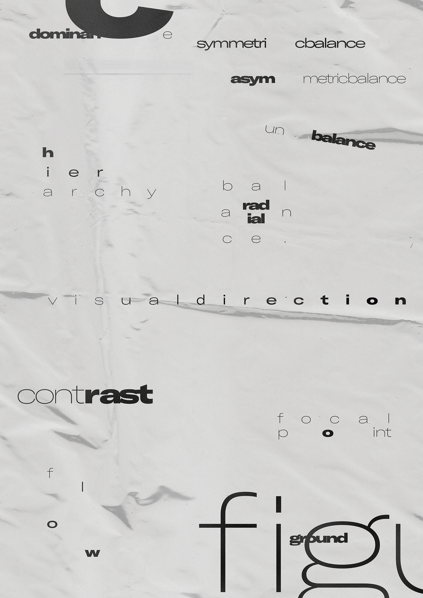
default-plastic(but•somehow•paper•looking)-texture
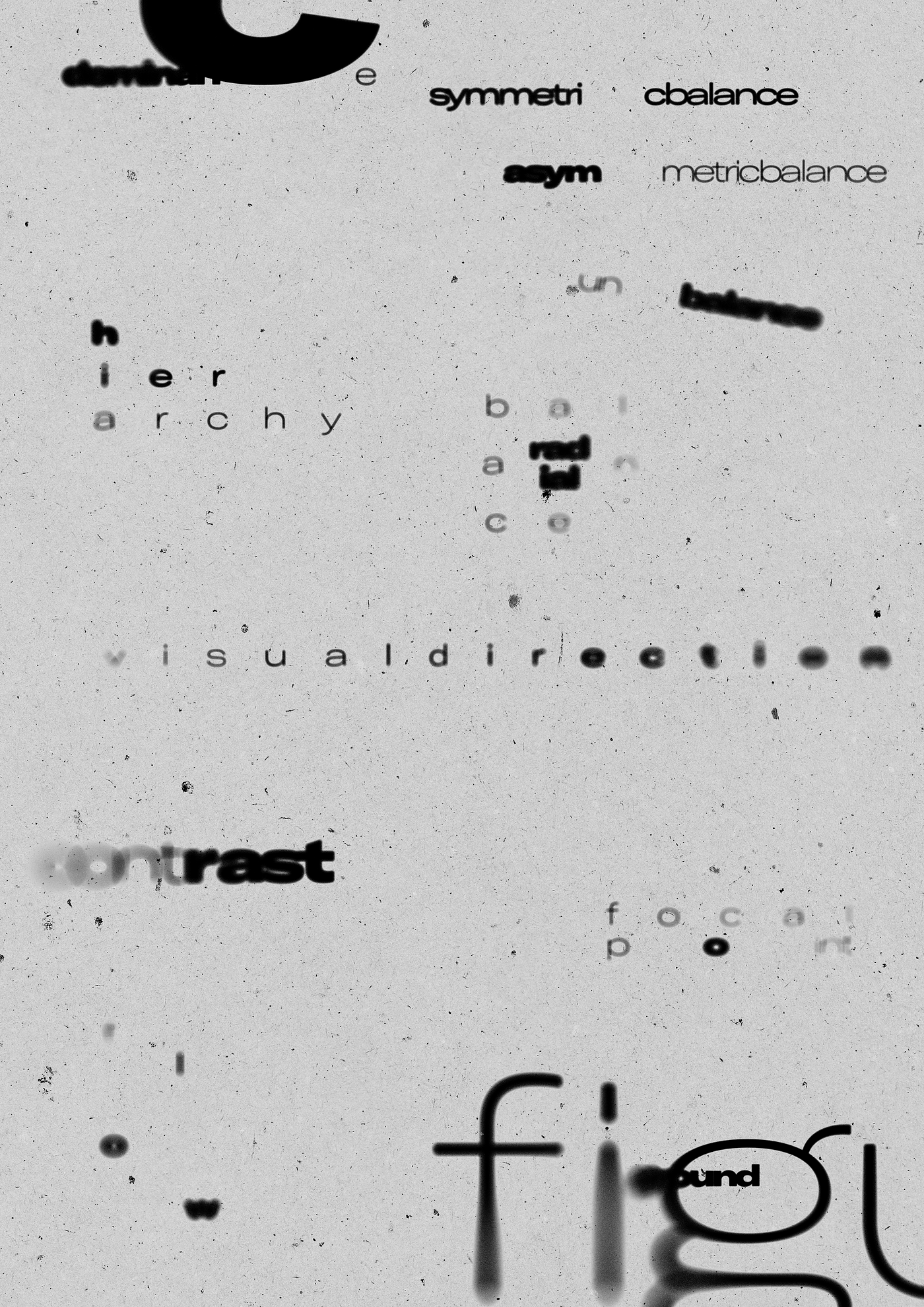
blurred-dust-texture
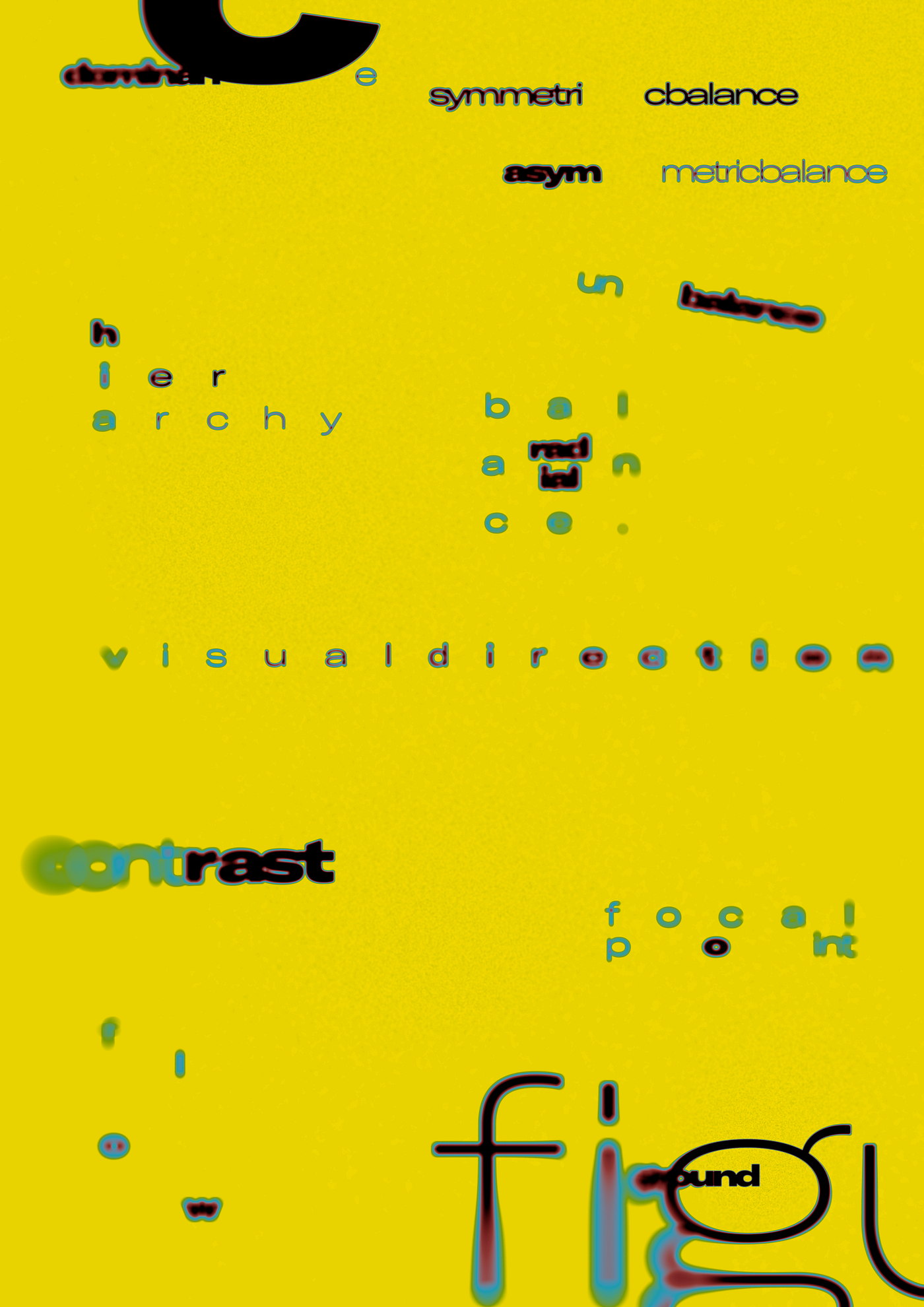
colored-(was•not•sure•to•share)-texture
Last thing I would like to say → It is sad to see some design decisions that have been taken more cleverly while adding textures on the final design in PS 🥲
Thank you! 💛

메타데이터
- post_id
- f8086fe68502
- slug
- really-good-week-day-2-f8086fe68502
- url
- https://medium.com/@efbakir/really-good-week-day-2-f8086fe68502
- canonical_url
- https://medium.com/@efbakir/really-good-week-day-2-f8086fe68502
- author_url
- https://medium.com/@efbakir
- status
- ok
- fetched_at
- 2026-07-25 21:21:24