The big M&M’s color investigation you could’ve totally lived without
How colors manipulate our brain, and why switch them up? A deep dive into M&M's product tactics and controversies.
The big M&M’s color investigation you could’ve totally lived without
How colors manipulate our brain, and why switch them up? A deep dive into M&M's product tactics and controversies.
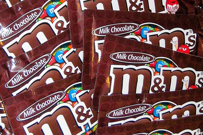
Photo via joshmadison.com
Some days, when I want absolutely nothing except to stuff myself with candy, the right pocket of my jacket is full of M&Ms. The left pocket is for dog treats because, regardless of what I want, my chihuahua still owns me. Sometimes I forget which pocket is which, and things get pretty disgusting.
Anyway. I fell down a rabbit hole of M&Ms.
Color is one of the oldest psychological tricks in product marketing and branding. Few companies use it more carefully than Mars, Incorporated, the big brother of confectionery.
My goal was to understand:
- what colors exist in the palette and why,
- how the palette has changed over the years,
- what kinds of perceptions users have about differently colored M&Ms, and
- how (and whether) Mars uses color and users’ perceptions of it in its product strategy.
(Good articles begin by defining the thing they’re about, so let me get this out of the way…
M&Ms is a brand of candy — pieces of chocolate covered in a colorful sugar shell).
Classic colors and data fallacies
As of 2026, the “classic” M&M colors are blue, brown, green, orange, red, and yellow.
Each color has its own mascot. This a powerful marketing tool when used correctly — something Mars has both succeeded and failed at.
There is this percentage (%) of color distribution going around the internet for the “plain” milk M&M’s bag:
- 13% — brown
- 13% — red
- 14% — yellow
- 16% — green
- 20% — orange
- 24% — blue
In this case, “color distribution” means how often each color appears within a bag.
It is doubtful, however, that these percentages are true. I smell a conspiracy. A contagious disease called “an unreliable source.”
This disease spreads far beyond candy statistics. It infects pretty much every corner of the internet where people use numbers.
One example that immediately comes to mind is the time GitHub published research claiming that AI increased developers’ productivity — which turned out to rely on questionable methodology and data interpretation (here’s a video if anyone’s interested in a diversion):
[embed]
Going back to candy.
The problem is that the original source for the M&Ms' “official” color distribution is gone. There are only ghost-like traces scattered across the internet.
Apparently, it came from an email from Mars signed “Your Friends at Masterfoods USA, A Division of Mars, Incorporated”. This data can be found online as early as 2007. For years, the internet has treated a random email as if it were the standard. It’s a common fallacy of internet research.
The verdict is: there is no official color distribution. It’s a myth — or at least internet folklore — just like many other claims surrounding M&M colors.
Through various mini-studies conducted by different people over the years, blue, orange, and green usually appear the most often in the bags— at least according to the Reddit users with too much time on their hands or the ones who are reaaalllyyyy into M&Ms — while red, yellow, and brown tend to lag slightly behind.
M&M’s production is freaking gigantic. Do you really expect them to count every color?
So, I’m happy to report that the myth about blue M&Ms being the most common because “blue seems unique and consumers choose it more often” is exactly that: a myth.
A giant under a daffodil
While searching for an official color distribution percentage, I naturally ended up on the official M&M’s website. I found, as you already know, exactly nothing. But as a UX-content-product-whatever writer, I simply could not resist sharing a few idiotic gems from the copy.
- Family company (yeah, right)
“Over our rich 100+ year history, there have been many new products, services, and segments. But one thing remains: we’re still a family business at heart.”

Such a corporate giant calling itself a “family business” feels a bit like a giant hiding under a daffodil. Technically true, maybe? But also absurd once you look at the scale of it.
Mars, Incorporated is one of the largest confectionery corporations on Earth. It has enough market power to shape what entire countries snack on (I swear all Ukrainian candy brands nowadays belong to Mars).
From a UX and branding perspective, the phrase “family business” is not neutral. It activates a very specific mental image. Like this:

The Bakers Café via tripadvisor
But when a corporation the size of Mars uses the same label, it collapses the distinction between a multinational empire and a genuinely small business. Real family confectionery businesses struggle precisely because products like M&M’s, Snickers, Twix, Milky Way, Skittles, Bounty — all owned by the giant — dominate shelf space.
So, I don’t know, maybe at least pretend to be less evil?
2. Confusing numbers in the copy
Also, I got really confused because it said “our rich 100+ year history” and “M&M’s were introduced in 1941,” which clearly is not 100+ years ago. I had to retrace my steps to understand that they were talking about different things.
Another proof that people don’t read on the internet, huh?

Isn’t it 85 years, not 100+?
3. First candy in space?
On the same history page, M&M’s claims to have become “the first candy in space” in the 1980s. Which is only half true and annoying.
Different sweets and candy-like foods had already been used during space missions long before that. Even Yuri Gagarin, the first man in space, had jam in a tube, some cookies, and — oh, great old times— a gun.

USSR-produced “space food” from Museum of Yuri Gagarin website
What Mars really means is that M&M’s became the first branded candy in space. Which is a different claim, and a much more, well, sponsored one.
Why it’s not the same as Skittles
In the famous “Taste the Rainbow” Skittles candy — also owned by the giant— color distribution is less interesting to me because each color is assigned to a specific fruity flavor.

Skittles logo via Logos-World
Green means lime, yellow means lemon, orange means orange, and so on, because there is a direct cognitive association between color and taste. Which brings us to the next section:
Different colored M&M’s taste different?
According to Wikipedia, each colored M&M does not have a different flavor, all possess the same chocolate taste.
However, people do report that different colors of M&M taste differently.
Why is that?
Research on flavor perception shows that color affects how humans experience (literally, taste) taste. In one study, users rated brown M&M’s as significantly more “chocolatey” than green ones. Which doesn’t make sense.
The reason is that the brain does not understand taste separately from vision. It combines learned associations into one sensory experience. Color is one of the buttons that control our brains.
Brown is cognitively associated with chocolate, cacao beans, coffee, etc., so people perceive it as tasting more chocolatey.
M&M’s colors and superstitions
There are many “superstitions” around M&Ms that organically developed among consumers in the 20th century.
If the last candy in a bag is red, make a wish and it will come true. If the last candy is yellow, you should call in sick and stay home. Orange M&Ms bring good luck, while brown ones are said to bring bad luck… and so on, and so on.
The crazy part is that green M&Ms were considered an aphrodisiac starting in the 1970s. And Mars has successfully cashed in on the urban myth.
How to cash in on an erotic myth about your candy
According to some media, the company initially avoided directly acknowledging the rumor, but eventually decided to weaponize it as branding.
Ms. Green, in the past and now just “Green,” was introduced as the first female “spokescandy” in 1997 and was immediately sexualized.
Just look at this ad from 2001:
[embed]
And from a UX and marketing perspective, this makes perfect sense. Humans anthropomorphize objects extremely easily, so… why not? At one point, the brand even released Valentine’s packs containing only green M&Ms, fully acknowledging the aphrodisiac myth.
In 2022, there came an “inclusive” redesign, where Green lost some of her sexual styling in favor of sneakers.
Green will wear trainers in order to ‘reflect confidence and empowerment as a strong female’ who is ‘known for much more than her boots’.
That triggered a small internet meltdown.

Old design on the left vs. new inclusive design on the right
Some critiqued the change as a poor attempt at being inclusive, but most of the backlash stemmed from the conservative side, who critiqued the change for being “too woke”. A petition was created on *Change.org *that called for Mars to bring Green’s original design back, and it garnered over 20 thousand signatures.
The timeline of M&M's colors
One of the easiest ways to adapt consumer perception without changing the product itself is through color.
Over the decades, Mars changed the M&M color palette multiple times, responding to cultural trends, health concerns, marketing experiments, and shifting consumer preferences:
Timeline showing how M&M’s colors changed from 1941 to the present via X
Red M&Ms were discontinued from 1976 to **1987 **due to a federal regulation identifying Red Dye №2 as a possible health risk (cancer). Mars decided to remove red M&Ms to avoid consumer panic, even though they did not use that dye (the red M&Ms nowadays are colored with carmine.)
This is an example of perception management outweighing technical reality, as users react to perceived risk rather than a real one. The visual association alone was enough for distrust.
No more light brown MMs
The tan candies had existed since 1949, replacing the original purple M&Ms, and for years, nobody questioned why a candy built around visual variety contained what was literally “another brown.”
It might be because the 1940s American commercial design leaned toward muted, earthy, and reassuring color palettes shaped by wartime practicality and postwar consumer culture.

Example of an old palette via Reddit. Do so many links to Reddit threads disqualify my article from being somewhat “adequate”? Probably.
By the mid-1990s, Mars decided to refresh the palette — but instead of redesigning the product internally, the company turned the decision into a public event. This was a clever use of the IKEA effect — when people help create something, they value it more.
In 1995, consumers were invited to vote on which new color should replace tan: blue, pink, or purple. More than 10 million people participated, and blue won with 54% of the vote.
Here’s an ad introducing the new mascot (the plot of the ad is questionable — but I guess it’s not “Blackface” if it’s blue?):
[embed]
What’s interesting is that the “tan” aesthetic nostalgia never fully disappeared. Safe, warm, slightly faded palettes still return in cycles because they communicate comfort, familiarity, and emotional stability.
You can still see echoes of 1940s–1970s earth-tone aesthetics in:
- café brandings,
- “organic” packaging,
- cottagecore visuals,
- retro UI palettes,
- film color grading,
- and modern wellness branding.
So the tan M&M was not just a random candy color. It reflected a broader visual culture — one that consumers still emotionally respond to decades later:

This consumer has very negative things to say about Blue M&Ms :(
The 1995 blue M&M vote would not be the last time consumers were invited to shape the brand. Mars discovered something extremely valuable during the campaign: people became emotionally attached to the product when they were allowed to participate in symbolic decisions.
The giant would use polls again and again to engage the community.
Predidential candy
Just a fun fact: since 1988, Mars has supplied customized Presidential M&Ms containing red, white, and blue M&Ms.
Photo of patriotic M&Ms via Reddit
These replaced cigarettes as the gift given to guests of the president of the United States on board Air Force One and in other presidential locations.
Getting the blues
People do not consume products rationally. They consume symbols, emotions, memories, and stories.
Unlike my favorite Moka pot company, Mars understood something many products still fail to grasp: people rarely fall in love with just candy. They fall in love with perception, participation, and emotional association with said candy.
So, love it or hate it… M&Ms are sticking with us for a while.

This newly opened bag of M&M’s with a disproportionate amount of blue ones — Reddit
P.S. If you want to read something else about color theory, check out my article about purple — how it rules finances, murder, and magic.
메타데이터
- post_id
- f836bd2697ec
- slug
- the-big-m-ms-color-investigation-you-could-ve-totally-lived-without-f836bd2697ec
- url
- https://uxdesign.cc/the-big-m-ms-color-investigation-you-could-ve-totally-lived-without-f836bd2697ec
- canonical_url
- https://uxdesign.cc/the-big-m-ms-color-investigation-you-could-ve-totally-lived-without-f836bd2697ec
- author_url
- https://medium.com/@kindenvy
- status
- ok
- fetched_at
- 2026-06-22 07:15:07