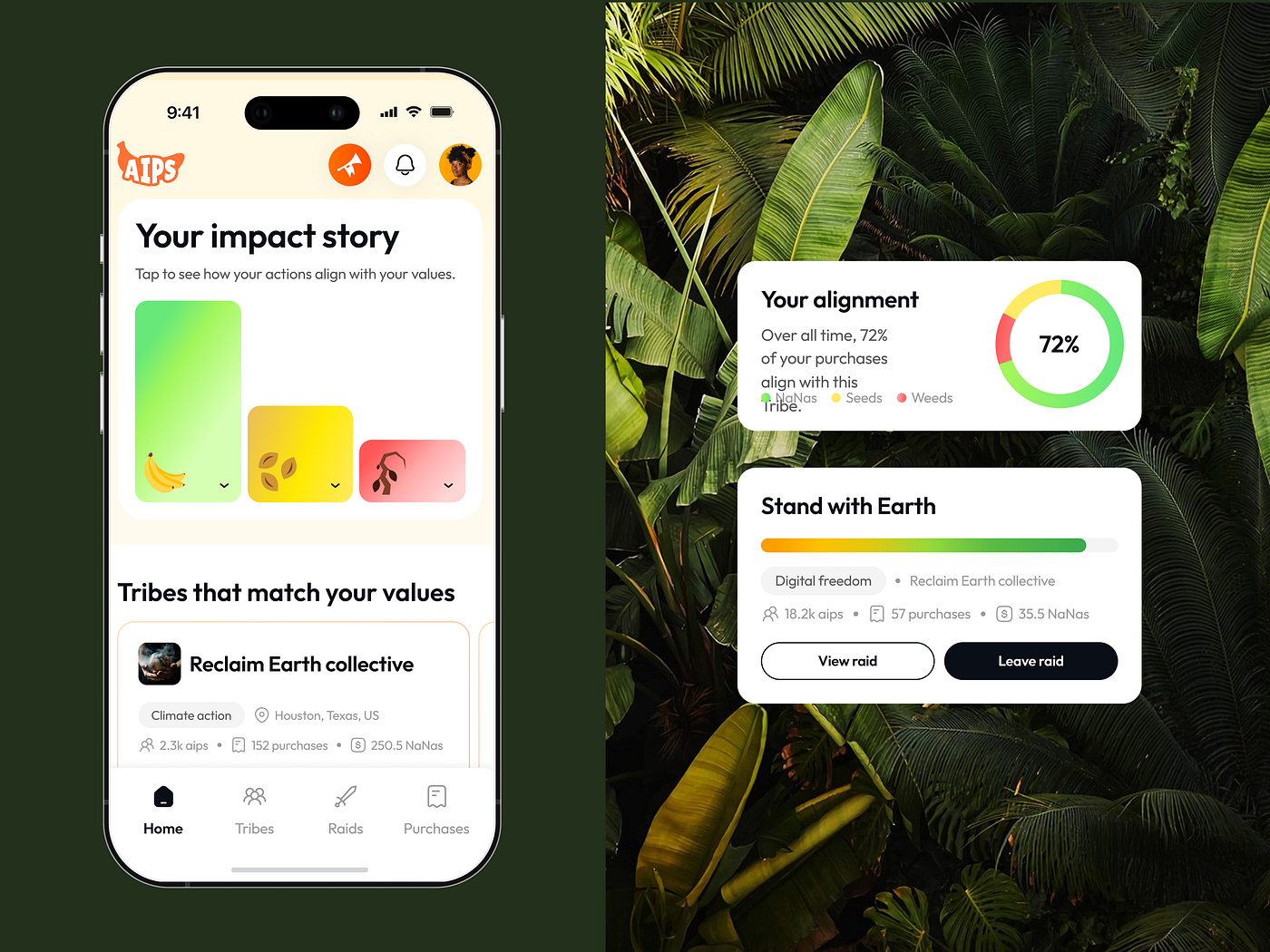
Building Visual Communication Between the Brand and Interface Design
Getting to know the client means going beyond the interface analyses and references study. Studying DNA of the brand, its history, users…
Building Visual Communication Between the Brand and Interface Design
Getting to know the client means going beyond the interface analyses and references study. Studying DNA of the brand, its history, users and tone of voice to build appropriate visual communication is exactly what can help to create outstanding visual experience.
Weekly we in 01 Design are having lectures for the team, prepared by CEO or Design Director in order to make our design solutions deeper and more interesting. This article is based on our today's lecture devoted to the construction of the visual experience based on brands DNA. “Back when I worked as a PR manager in art and fashion, we used to create brands tone of voice and unique positioning on the market, thinking specially about the visual, references, communication and interaction with users. Every choice of the photo, font, color has a great meaning and most likely when you see certain shapes and patterns used on the interface that means the whole professional team worked on them and was studying their effect on users in order to build accurate communication between the brand and the end user”, — Kseniya Kovaleva, our CEO said, — “that usually has to be represented in UI/UX to keep consistency and build accurate communication”.
So where do we start? To create deep visual communication we need to understand the brand perfectly, break it into small pieces, take a close look at each one and then gather back in a better and more accurate form. So, let’s begin from scratch.
Part 1: Understanding Brand and Making Deep Discovery
When we speak about brand discovery, the process is often reduced to a familiar and comfortable checklist:
— analyzing the current interface — reviewing competitors — studying user feedback and user flows
While these steps are important, they frequently overshadow a set of deeper, more strategic processes — ones that ultimately define whether a design solution is meaningful or merely functional.
1. Immersing Into the Brand Context
The first, and often underestimated, step is gathering general brand intelligence. When a new client or task appears, the most obvious move is also the most effective: search. Look up the project name, read existing articles, explore previous versions of the website, scan customer reviews, and understand the business beyond the interface.
If the product is entirely new and information is scarce, the approach must shift. In this case, we zoom out and study the industry itself. For example, if we are designing a new banking product, we explore existing banking solutions, examine how financial apps function today, analyze recent industry news, and build a mental model of the ecosystem the product will enter.
This phase does not require weeks of research. Thirty to sixty minutes is more than enough to step into the project’s world and grasp the discourse of the niche — its language, tensions, and expectations.
2. Understanding Competitors Beyond Screenshots
Competitive analysis cannot be limited to visual references or UI screenshots. Without understanding the essence of a product, designers inevitably make avoidable mistakes: diluted messaging, irrelevant visuals, mismatched illustrations, broken hierarchy, or outdated imagery that survives simply because the focus drifted from the brand to the interface.
An interface is not an isolated artifact. To design it well, we must understand what the product offers, how it positions itself, and why it exists in the market. When direct information about the product is incomplete — or even when it exists but lacks clarity — competitors become invaluable sources of insight.
This is where analysis should move beyond “interface review” and into content, narrative, and meaning. What do competitors say? How do they frame their value? What language do they use, and what problems do they emphasize? Even a simple exercise — collecting competitor websites and breaking down their messaging — can dramatically improve design relevance.
Design starts to fail the moment it stops asking what it is actually communicating.
3. Decoding the Brand’s Communication DNA
Marketing teams do not make random decisions. Colors, patterns, typography, imagery, and visual systems are the result of deliberate choices made by specialists, often after hours — or months — of exploration and testing. Ignoring these decisions at the interface stage is not efficiency; it is erasure.
Understanding a brand’s communication DNA means asking why these choices exist. Why this color palette? What does this pattern express? What tone does the typography carry? What cultural or emotional references are embedded in the visuals?
This is where the work becomes less mechanical and more intellectual. It requires thinking, questioning, and — yes — actively challenging assumptions. AI can be a powerful collaborator here: showing it colors, patterns, logos, or typefaces and asking why, what they signal, and how they might be interpreted. The goal is not blind acceptance, but hypothesis-building.
Over time, this skill becomes intuitive. Until then, persistent inquiry — especially in the form of “why this?” and “why now?” — helps reveal the direction in which the company sees itself evolving.
A strong interface cannot exist in isolation from a company’s vision. When it does, it becomes decorative rather than strategic.
Part 2: Getting to Know Tone of Voice and Setting Visual Communication Up
When tone of voice is created — usually by marketing or PR teams — it rarely starts with visuals. Instead, it begins with language. More precisely, with a system of statements that defines how a brand speaks, what it emphasizes, and what it deliberately avoids.
This type of work requires time, intention, and strategic thinking — and once it exists, it must be reflected in design. For an interface designer, familiarity with these statements is not optional; it is foundational. In most mature products, they are included in the brand book and serve as a conceptual backbone for visual communication.
However, there are many cases where such a framework simply does not exist.
When tone-of-voice principles are missing, visual communication loses its anchor. The interface no longer extends the brand’s voice — it replaces it with assumptions. And because visual language is an organic continuation of verbal tone, the absence of one makes the other unstable.
In these situations, designers are forced to step into a hybrid role and articulate a provisional tone of voice themselves. Not for marketing or sales purposes, but strictly for the user experience. This approach is especially relevant for web and mobile applications — far more than for marketing websites — because here the dialogue with the user is continuous, contextual, and functional. We must understand how we speak to the user and what we are actually saying to them.
In a way, this process resembles creating user personas — but instead of describing the user, we describe the interface’s behavior and intent. Conceptually, it aligns closely with the logic of the Minimum Loveable Product: stripping away excess and defining what genuinely creates value.
Practically, this means writing five to seven internal statements that clarify, for example:
— what core action the application enables the user to perform effortlessly — what principle defines the experience (for instance, gamification, clarity, or speed) — which element plays a central role in delivering value (a knowledge base, AI assistant, reward system, or something else entirely)
By doing this, we deconstruct the brand into its most basic components — its atoms. This makes it structurally clear where emphasis should be placed. If gamification is defined as the core value, then it is logical for the interface to highlight reward systems, dynamic feedback, expressive pop-ups, or playful illustrations. The design decisions stop being decorative and become inevitable.
Once tone of voice is articulated, visual communication can be built coherently. Take banking as an example. The most valuable aspect of user dialogue in financial products is trust — transparency, security, and control. Users need to feel where their money is and what is happening to it. This immediately raises questions of color, contrast, rhythm, and visual patterns.
At first, the solutions may seem predictable. This is where tone of voice adds depth. Who is the product for? What is the additional value? If the target audience is younger, we might introduce unexpected colors, as seen in products like Wise. If the product operates in crypto, we might borrow patterns or visual metaphors from that ecosystem. Tone of voice allows us to transform a standard solution into a layered, more intellectually engaging one.
After layout and color comes typography — a decision that deserves particular care. Typeface selection should not be reduced to readability or aesthetics alone. Typography communicates character. Is it technological or restrained? Does it feel precise, progressive, neutral, or expressive? Taking even ten to twenty minutes to look at typography from a distance — emotionally rather than technically — often reveals whether it supports or undermines the intended tone.
Finally, and perhaps most importantly, comes visual imagery.
Photography plays a decisive role in shaping brand perception. It is essential to evaluate:
— the emotion the image evokes — its color grading and stylistic language — the level of metaphor and abstraction it introduces
For progressive or editorial products, fashion-inspired photography with clean, bright lighting often works better. For more intimate or human-centered products, high-quality film photography can create a sense of authenticity and presence. What should be avoided are literal, obvious associations — illustrating ideas “head-on.” A website about lighting does not benefit from a smiling person turning on a lamp. It benefits from metaphor: studio lights, shadows, controlled illumination — imagery that speaks indirectly and intelligently.
Every visual choice must belong to the brand’s aesthetic logic. Editorial brands require artistic, disciplined imagery. Technological products do not require stock photos of skyscrapers and people in suits; they benefit far more from abstract references — space, systems, motion — that express progress without cliché.
At this point, visual communication stops being decoration. It becomes language.
Part 3: Boosting Your Visual Education
It is impossible to propose a compelling design solution without visual literacy. The familiar excuse of “not enough time outside of work” may sound realistic, but it does little to support long-term growth as a designer. Over time, it quietly becomes a professional limitation.
So what is visual literacy, really? In simple terms, it is the accumulation of visual experience — the result of having seen thousands of references. This includes platforms like Dribbble, Awwwards, Contra, and X, but also extends far beyond them. It is not passive scrolling; it is exposure, comparison, and internalization.
What does this give us in practice?
First, the ability to find relevant references faster at the beginning of a new project. Second, a stronger orientation within visual styles and directions — knowing what exists, what is overused, and what feels contemporary. Third, and most importantly, creative acceleration. When you have already seen enough “examples within the topic,” inventing something new becomes easier and faster. Originality rarely appears in a vacuum — it emerges through recombination.
The brain stores visual data remarkably well. Strong visual impressions are difficult to erase, which is precisely why visual literacy is as fundamental as basic education. Setting aside even fifteen to thirty minutes — after work or during a break — to browse platforms like Dribbble or Awwwards is not optional if one intends to develop professionally.
That said, design-only exposure is not enough to create truly interesting solutions.
This is where complex moodboards become essential. A strong example is our own 01 Universe — a living system that must be revisited weekly. Its value lies in curated complexity: it allows designers to absorb high-quality content from multiple disciplines rather than from interface design alone.
What differentiates a complex moodboard from a basic one? Most studios build moodboards purely from UI references. We go further — working with emotion, color, texture, and cultural context. This already represents a more advanced layer of thinking.
The highest level, however, is the ability to think and communicate through analogy, drawing not from design itself but from adjacent disciplines such as:
— photography — painting — cinema — literature
A strong illustration of how visual education fuels brand work can be found in the projects of Obys. It is nearly impossible to create consistent, conceptually rich visual systems — especially those addressing socially meaningful themes — without genuine interest in culture, history, and literature. Visual coherence at that level does not come from trends; it comes from depth.
This is why, alongside general visual exposure, it is critical to actively develop visual education through:
— curated collections on Contra — podcasts — following institutions such as MoMA and MOKO on Instagram — analyzing performances (even a simple AI-assisted search can surface compelling references) — reading literature beyond design: psychology, art theory, brand manifestos, and collectible editions — studying paintings and visual archives — researching cinema, which offers one of the clearest frameworks for understanding color, rhythm, composition, and directorial intent
Only by exploring related creative disciplines do we learn to speak in analogies with confidence and precision. The difference is similar to a conversation with someone who has read only a single fairy tale versus someone who reads regularly — the gap is noticeable from the first sentence.
The same principle applies to interface design. Visual language becomes richer, subtler, and more intelligent when it is informed by a broad cultural and artistic foundation. Without it, even technically correct solutions remain shallow.
Modern design lays far beyond simple interfaces and it’s critically important to consider this during the design creation in order to apply outstanding visual experience and create consistent, exceptional decisions in design.
메타데이터
- post_id
- f86eb998bf99
- slug
- building-visual-communication-between-the-brand-and-interface-design-f86eb998bf99
- url
- https://medium.com/zero-one-design/building-visual-communication-between-the-brand-and-interface-design-f86eb998bf99
- canonical_url
- https://medium.com/zero-one-design/building-visual-communication-between-the-brand-and-interface-design-f86eb998bf99
- author_url
- https://medium.com/@01design
- status
- ok
- fetched_at
- 2026-06-13 07:35:29