Power BI Dashboard Design: A Simple Beginner’s Checklist
Creating a Power BI dashboard is easy.
Power BI Dashboard Design: A Simple Beginner’s Checklist
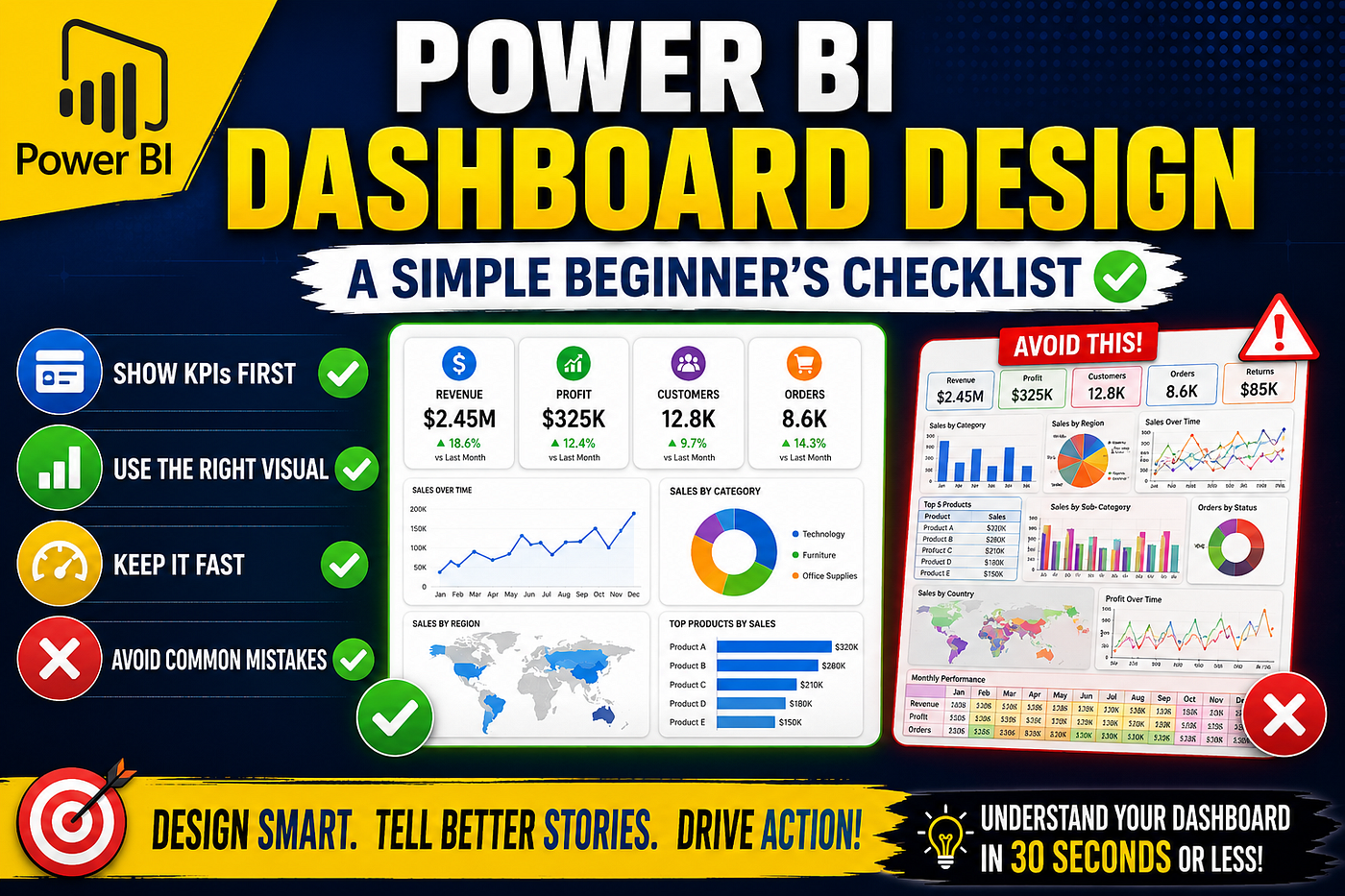
image by Anurodh kumar
Creating a Power BI dashboard is easy.
Creating a dashboard that people actually use is much harder.
Many beginners focus on adding more charts, more KPIs, and more visuals. The result is often a cluttered dashboard that looks impressive but makes it difficult for users to find answers.
The best dashboards are not the most complex ones. They are the ones that help users understand important information quickly.
If you’re just getting started with Power BI, this simple checklist will help you build dashboards that are clean, effective, and easy to understand.
1. Start With a Goal
Before adding any visuals, ask yourself:
What business question am I trying to answer?
A dashboard should have a clear purpose.
Examples:
- Which products generate the most revenue?
- Which regions are underperforming?
- How are sales trending over time?
Without a clear goal, dashboards become collections of random charts rather than decision-making tools.
Best Practice
Focus on actionable insights instead of displaying every available metric.
2. Show Key KPIs First
Users should immediately see the most important numbers when they open a dashboard.
Common KPIs include:
- Revenue
- Profit
- Customers
- Orders
Place these metrics at the top of the report.
This allows decision-makers to understand business performance within seconds.
Best Practice
Use Card visuals for important KPIs and keep them visible without scrolling.
3. Use the Right Visual
Different visuals serve different purposes.
Choosing the wrong chart can make insights difficult to understand.
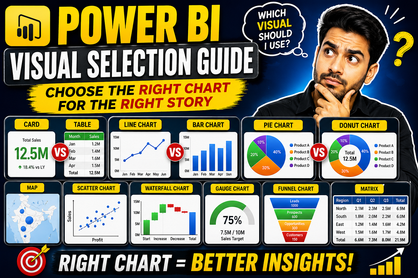
Quick Visual Guide
GoalBest VisualCompare CategoriesBar ChartShow TrendsLine ChartShow ProportionsPie/Donut ChartShow LocationsMap
Best Practice
Always select visuals based on the story you want to tell, not because they look attractive.
4. Keep It Fast
A slow dashboard frustrates users and reduces adoption.
Even beautiful reports become useless if they take too long to load.
Simple Optimization Tips
- Remove unused columns
- Use a Star Schema
- Optimize DAX measures
- Reduce unnecessary visuals
Best Practice
Prioritize performance from the beginning rather than trying to fix it later.
5. Make Filtering Easy
Users often want to explore data from different perspectives.
Filters and slicers make this possible.
Useful slicers include:
- Date
- Region
- Department
- Product Category
Best Practice
Keep slicers simple and place them where users can easily find them.
6. Avoid Common Dashboard Mistakes
Many beginner dashboards suffer from the same issues.
Common Mistakes
❌ Too many visuals
❌ Too many colors
❌ Tiny text
❌ Unclear titles
❌ Overcrowded layouts
Remember that simplicity improves usability.
If users need several minutes to understand a dashboard, the design probably needs improvement.
The Golden Rule
A great dashboard should answer important business questions quickly.
A useful rule of thumb is:
A user should understand your dashboard in 30 seconds or less.
If users can instantly identify key metrics, trends, and insights, your dashboard is doing its job.
Dashboard design is not about adding more visuals.
It’s about presenting information in a way that helps people make decisions faster.
Whenever you build a Power BI dashboard, remember these six principles:
✅ Start with a goal
✅ Show key KPIs first
✅ Use the right visual
✅ Keep it fast
✅ Make filtering easy
✅ Avoid common mistakes
Master these fundamentals and you’ll create dashboards that are not only visually appealing but also genuinely useful for business users.
The best Power BI dashboards don’t just display data — they tell a story and drive action.
메타데이터
- post_id
- f8941c5238a8
- slug
- power-bi-dashboard-design-a-simple-beginners-checklist-f8941c5238a8
- url
- https://medium.com/powerbi-microsoft-fabric/power-bi-dashboard-design-a-simple-beginners-checklist-f8941c5238a8
- canonical_url
- https://medium.com/powerbi-microsoft-fabric/power-bi-dashboard-design-a-simple-beginners-checklist-f8941c5238a8
- author_url
- https://medium.com/@anu.ckp.1313
- status
- ok
- fetched_at
- 2026-06-21 22:26:41