Why Modern SaaS Apps All Look the Same
Open ten startup websites right now.

Why Modern SaaS Apps All Look the Same
Open ten startup websites right now.
I promise you this is what you’ll see:
A glowing gradient. A soft purple button. A fake analytics dashboard. Some floating cards. A headline about “supercharging workflows.” Maybe a tiny badge that says “Powered by AI.”
And somewhere in the middle of all this, a founder is proudly whispering:
“We wanted the brand to feel modern.”
Modern SaaS ui design has quietly become one giant shared Google Drive folder where everybody copies everybody else and pretends they invented shadows.
Honestly, this is one of the reasons I started building **MadeinFigma** differently. Not as another AI tool that spits out identical dashboards, but more like a design library built to help designers mix, tweak, and create interfaces that actually feel like they belong to a real product with a personality.
The weird part is that none of this happened intentionally.
Nobody woke up one morning and said: “You know what the internet needs? Another dashboard with rounded corners and a sidebar.”
But here we are.
Every product looks suspiciously related now. Like they all attended the same design bootcamp and came back wearing beige sweaters and talking about “clean systems.”
And honestly?
I kind of get it.
Because making a SaaS product look “safe” has become easier than making it look memorable.
The Great SaaS Clone War

At some point, every SaaS company collectively agreed on a visual formula:
- Sidebar on the left
- Metrics cards at the top
- Charts in the middle
- User avatar in the top right
- Purple gradient somewhere
- Rounded corners large enough to land aircraft on
Done.
Congratulations. You are now officially a startup.
There’s a reason this keeps happening.
Most SaaS founders are terrified.
Not in a dramatic way. In a quiet “please don’t let users think this app is weird” kind of way.
So instead of creating something distinctive, they copy products users already trust.
If your app vaguely resembles:
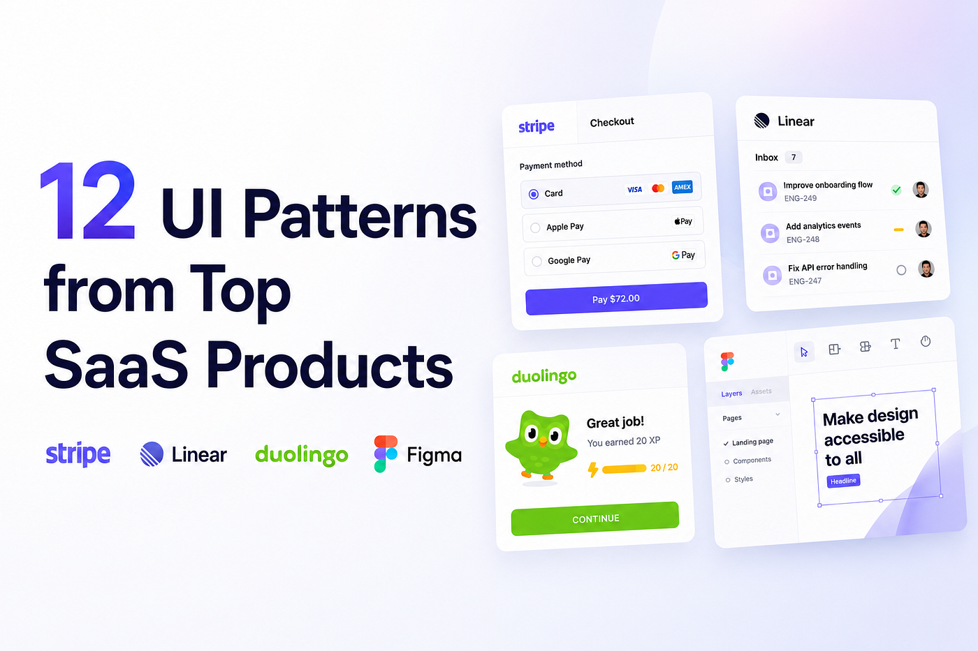
- Notion
- Linear
- Stripe
- Slack
- Figma
…people subconsciously assume your product is probably legitimate.
This is the same psychological phenomenon where cafes put Edison bulbs everywhere because one cool coffee shop did it in Brooklyn 11 years ago.
Nobody knows why anymore. We just continue the ritual.
Everyone Designs From The Same Inspiration Sources

A lot of this comes from the fact that modern designers work faster than ever now.
Between AI generators, templates, UI kits, and component libraries, entire products can be assembled in hours.
The problem is that most AI tools generate the average of what already exists.
That’s why so many interfaces end up feeling weirdly familiar.
Ironically, the most useful design resources today are probably the ones that still leave room for interpretation instead of generating everything for you. That’s partly the thinking behind **MadeinFigma**. The goal was never “click button, receive generic startup.” It was giving designers flexible sections, flows, and components they can combine in their own way so products still feel human.
The Rise Of “Safe” Design
A lot of SaaS ui design today is driven by one thing:
Fear.
Nobody wants to make a product that looks outdated. Nobody wants users saying: “This feels old.”
So everybody moves toward the same visual center.
Minimal. Clean. Muted. Rounded. Friendly. Soft shadows. Tiny blur effects.
The result?
The internet now looks like one giant operating system.
Every website feels like it was assembled using the same starter pack:
- Inter font
- Gray backgrounds
- 8px spacing system
- Purple accent color
- “Get Started” CTA
- Abstract 3D blob floating somewhere for emotional support
And look, none of these things are bad individually.
The problem is that everybody uses all of them together.
It’s like showing up to a party wearing the exact same outfit as 400 other people and still expecting someone to say: “Wow. Incredible style.”
AI Is Making This Worse

We need to talk about this.
AI-generated interfaces are accelerating sameness at an almost concerning speed.
Why?
Because AI models are trained on existing design patterns.
Which means AI naturally generates the average of what already exists.
So if the internet already has thousands of similar SaaS dashboards, AI happily creates even more.
You ask AI for: “Modern SaaS dashboard UI.”
And it immediately gives you:
- sidebar
- cards
- charts
- rounded corners
- gradients
- purple
Basically the design equivalent of chicken and rice.
Efficient. Predictable. Suspiciously familiar.
The scary part is that average design is becoming incredibly easy to generate.
Which means taste becomes more important than execution.
Anybody can create a clean interface now.
The real challenge is creating something memorable without making it unusable.
That balance is hard.
Very hard.
Because the moment designers try to be “different,” things can go south quickly.
Suddenly the navigation is hidden behind interpretive dance. The buttons disappear. Nothing aligns properly. Users start stress sweating.
There’s a thin line between unique and “what am I looking at?”
SaaS Products Are Optimized For Conversion, Not Personality
This is another reason everything feels identical.
Most products today are designed by metrics.
Not emotion.
Founders care about:
- conversion rates
- activation rates
- retention
- onboarding completion
- churn reduction
All valid things.
But optimization slowly removes personality from products.
Over time every interface becomes hyper-efficient.
Clean. Fast. Frictionless.
And somehow… completely forgettable.
It’s the airport effect.
Modern airports are optimized brilliantly. But emotionally they feel like giant beige waiting rooms where time no longer exists.
Many SaaS apps now feel exactly like that.
Perfectly functional. Completely soulless.
The Curse Of Design Systems
This one hurts because design systems are genuinely useful.
But they’ve also contributed massively to visual sameness.
Large SaaS companies created beautiful systems with reusable patterns. Smaller startups copied them. UI kits copied them again. Then templates copied the UI kits. Then AI trained on the templates.
Now every dashboard contains the same:
- cards
- tables
- filters
- dropdowns
- modals
- charts
Even the empty states look identical now.
How many times have you seen: “Nothing here yet.”
Alongside a tiny illustration of a smiling folder?
Why is the folder smiling? What does it know?
Minimalism Became The Default Personality
There was a time when software had character.
Old apps were weird. Messy. Sometimes ugly. But memorable.
Now everything wants to feel “clean.”
Minimalism stopped being a design choice and became a personality replacement.
Some startups remove so much visual identity that their websites feel legally obligated to whisper.
No contrast. No boldness. No weirdness. No opinions.
Just calm gray rectangles floating peacefully into eternity.
At this point some landing pages feel like guided meditation apps for accountants.
The Irony Is Users Barely Notice Most Of This
Here’s the funny part.
Most users genuinely do not care about half the things designers obsess over.
Users want:
- clarity
- speed
- trust
- simplicity
That’s it.
Nobody signs up for payroll software and says: “Wow. Incredible border radius consistency.”
The reason many modern SaaS products succeed despite looking identical is because familiarity reduces friction.
People already understand these patterns.
They know where the settings are. They know what cards do. They understand sidebars.
Sameness is boring for designers.
But for users? Sameness often feels comfortable.
And honestly, comfort converts.
So How Do You Make A SaaS Product Feel Different?
This is the real question.
Because making something unique just for the sake of uniqueness usually ends terribly.
You don’t want users opening your product and feeling like they accidentally joined a futuristic escape room.
The answer is not reinventing everything.
It’s adding intentional personality.
That can come from:
- typography
- writing style
- motion
- illustrations
- pacing
- onboarding
- humor
- interactions
- brand voice
- tiny interface details
Products like Linear stand out because they feel opinionated. Not chaotic. Not loud. Just intentional.
That’s the difference.
Most SaaS products feel assembled. Great products feel authored.
You can sense when someone actually cared.
The Real Problem Is Nobody Wants To Risk Looking Weird
This is honestly what it comes down to.
Founders are scared of looking unprofessional. Designers are scared of looking outdated. Teams are scared of making the wrong choice.
So everybody chooses the safest possible direction.
And safety slowly creates sameness.
Ironically, the products people remember most are usually the ones willing to feel slightly different.
Not broken. Not confusing. Just human.
That’s what modern SaaS products are missing.
Humanity.
Everything became polished. Optimized. Structured.
But very few products feel alive anymore.
메타데이터
- post_id
- f99de1192fac
- slug
- why-modern-saas-apps-all-look-the-same-f99de1192fac
- url
- https://medium.com/@ryan.almeida86/why-modern-saas-apps-all-look-the-same-f99de1192fac
- canonical_url
- https://medium.com/@ryan.almeida86/why-modern-saas-apps-all-look-the-same-f99de1192fac
- author_url
- https://medium.com/@ryan.almeida86
- status
- ok
- fetched_at
- 2026-06-09 15:37:30