Widget Size Still Not Enough? iOS 27 Gives You a 4×6 Canvas
iOS 27’s extra-large widget is not just “one more size.” For developers, it changes the design problem.
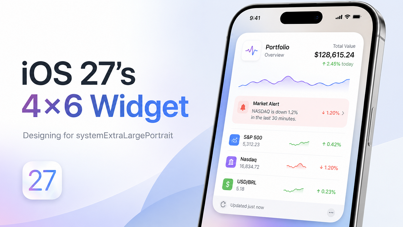
Widget Size Still Not Enough? iOS 27 Gives You a 4×6 Canvas
iOS 27’s extra-large widget is not just “one more size.” For developers, it changes the design problem.
A small widget can get away with showing one number. A medium widget can show a little context. A large widget can show a summary. But a 4×6 widget has enough room to become something more useful: a compact dashboard.
The mistake is obvious: take the old large widget, add more rows, and call it done.
That is not using the new space well.
The real question is:
What can the user understand in two seconds without opening the app?The key idea
WidgetKit already gives developers the tool that matters: WidgetFamily.
When WidgetKit loads a timeline, the system passes context about the widget’s size and shape. In the view layer, SwiftUI also exposes the current family through:
@Environment(\.widgetFamily) private var familyThat means your widget should not have one layout stretched across every size. Each family should own a different level of information.
For iOS 27’s extra-large portrait widget, the key family is:
.systemExtraLargePortraitThink of it as a new information tier, not just a bigger rectangle.
Core example: a portfolio widget that uses the new size correctly
Problem:
A stock portfolio app already has a widget.
On small sizes, it shows one key signal.
On the new 4×6 widget, it should show more context without becoming a dense stock table.
Naive approach:
// Bigger widget, more rows.
// This fills the space, but still makes the user scan manually.
ForEach(entry.stocks.prefix(12)) { stock in
    StockRow(stock: stock)
}
Better approach: use WidgetFamily to change the information hierarchy.
import WidgetKit
import SwiftUI

struct PortfolioEntry: TimelineEntry {
    let date: Date
    let totalValue: String
    let dailyChange: String
    let alert: String
    let stocks: [Stock]
}

struct Stock: Identifiable {
    let id = UUID()
    let symbol: String
    let change: String
}

struct PortfolioWidgetView: View {
    @Environment(\.widgetFamily) private var family

    let entry: PortfolioEntry

    var body: some View {
        switch family {
        case .systemSmall:
            VStack(alignment: .leading) {
                Text(entry.stocks.first?.symbol ?? "Portfolio")
                    .font(.headline)

                Text(entry.stocks.first?.change ?? entry.dailyChange)
                    .font(.title.bold())
            }

        case .systemMedium, .systemLarge:
            VStack(alignment: .leading, spacing: 8) {
                Text("Portfolio")
                    .font(.headline)

                Text(entry.totalValue)
                    .font(.title.bold())

                Text("Today \(entry.dailyChange)")
                    .font(.subheadline)
            }

        case .systemExtraLargePortrait:
            VStack(alignment: .leading, spacing: 12) {
                Text("Portfolio")
                    .font(.headline)

                Text(entry.totalValue)
                    .font(.system(.title, design: .rounded).bold())

                Text("Today \(entry.dailyChange)")
                    .font(.subheadline)

                Text(entry.alert)
                    .font(.callout)
                    .padding(8)
                    .frame(maxWidth: .infinity, alignment: .leading)
                    .background(.quaternary, in: RoundedRectangle(cornerRadius: 10))

                Text("Top movers")
                    .font(.headline)

                ForEach(entry.stocks.prefix(4)) { stock in
                    HStack {
                        Text(stock.symbol).bold()
                        Spacer()
                        Text(stock.change)
                    }
                    .font(.caption)
                }
            }

        default:
            Text("Portfolio")
        }
    }
}
The code is simple, but the design decision is important:
systemSmall              -> one signal
systemMedium/systemLarge -> summary
systemExtraLargePortrait -> dashboard
The extra-large widget does not simply show more stocks. It shows:
Portfolio value
-> Today’s change
-> One important alert
-> A few supporting movers
That is much easier to scan.
Why this works
A bigger widget only helps if it reduces the user’s thinking.
A list of twelve stocks gives the user more data, but not necessarily more clarity. A dashboard gives the user structure: current state, important exception, and supporting detail.
That structure is exactly what the new widget size is good at.
For a portfolio app, the user’s real question is not:
What are all my stock prices?It is usually:
Is anything important happening right now?The 4×6 canvas finally gives enough room to answer that question without opening the app.
One practical detail: do not rely on exact pixel assumptions. Widget sizes can vary by device, placement, and platform. Write flexible SwiftUI layouts, avoid hard-coded heights, and let each WidgetFamily define the information density.
Practical rule
When a widget gets bigger, do not increase row count first.
Increase decision quality first.
Use the extra space like this:
Primary state
-> Important exception
-> Supporting detail
If your extra-large widget is just your large widget with more rows, redesign it.
Conclusion
- iOS 27’s extra-large widget size is valuable because it creates room for hierarchy.
- The key WidgetKit idea is to branch layout by
WidgetFamily. systemExtraLargePortraitshould be designed as a compact dashboard, not a stretched large widget.- A good widget helps the user decide whether they need to open the app.
- Interview-friendly sentence: widget families are not just sizes; they are contracts for different levels of information density.
메타데이터
- post_id
- fb9fe89287d2
- slug
- widget-size-still-not-enough-ios-27-gives-you-a-4-6-canvas-fb9fe89287d2
- url
- https://medium.com/@foks.wang/widget-size-still-not-enough-ios-27-gives-you-a-4-6-canvas-fb9fe89287d2
- canonical_url
- https://medium.com/@foks.wang/widget-size-still-not-enough-ios-27-gives-you-a-4-6-canvas-fb9fe89287d2
- author_url
- https://medium.com/@foks.wang
- status
- ok
- fetched_at
- 2026-07-13 06:23:13