Data Analysis vs. The Tyranny of the Average | Timur Siraziev
Why defining boundaries matters more than big data. A former journalist analyzes 100k+ UK charity grants to find the "Unit of Trust."
The Tyranny of the “Average”, How Data Hides the World You Actually Live In.

A former journalist and charity shop manager explains why defining your terms matters more than calculating the mean.
In my charity shop in Falmouth, my mornings begin with bags of donations.
I have to make a decision every few seconds, is this a high quality vintage coat, or just old fabric pretending to be one?
If I put everything on the shelves without a filter, the shop quickly turns into a warehouse of noise, full of objects, but empty of value.
In the evenings, as a Data Analyst Apprentice, I do exactly the same thing.
Only this time, the bags are spreadsheets.
Recently, I worked with the 360Giving database, nearly 450,000 UK charity grants (2022–2024).
To a headline hungry journalist, that number screams Big Data.
To anyone who has read Tim Harford’s How to Make the World Add Up, it signals danger.
Because big numbers do not automatically mean useful insight. Very often, they mean the opposite.
Here is why I spent weeks cutting that dataset down to more than 100,000 community grants, and why the average so often tells the wrong story.
⸻
1. The Scissors of Definition.
Before trusting any statistic, Tim Harford asks a simple question, what are we actually counting?
If you treat UK grants as one undifferentiated pile, the data becomes meaningless.
It mixes multi million pound NHS contracts and government infrastructure funding with a 500 pound grant for a local youth club.
Average those together, and you get a number that represents nothing anyone actually experiences.
To reach what I think of as the human scale of funding, I had to be ruthless.
I picked up my analytical scissors and cut out government tenders, universities, and large institutional recipients.
I was not interested in Big Data.
I was interested in relevant data.
⸻
2. The Art of Boundaries, Why 1,000 to 100,000 Pounds.
Data analysis rarely fails because of bad maths.
It fails because of missing boundaries.
To understand how community funding really works, I set two strict limits.
The micro floor, 1,000 pounds.
Below this level, grants are often individual bursaries or emergency payments. They are vital, but they are not organisational funding.
The corporate ceiling, 100,000 pounds.
Above this level, you are no longer in a charity shop, you are in a boardroom. These grants are typically secured by professional bid writing teams and large institutions.
Between these two boundaries lies the space where real community organisations operate, groups without data departments, but with deep local knowledge and vision.
This filtering left 112,516 grants.
Not smaller data, clearer data.
⸻
3. 10,000 Pounds as a Unit of Trust.
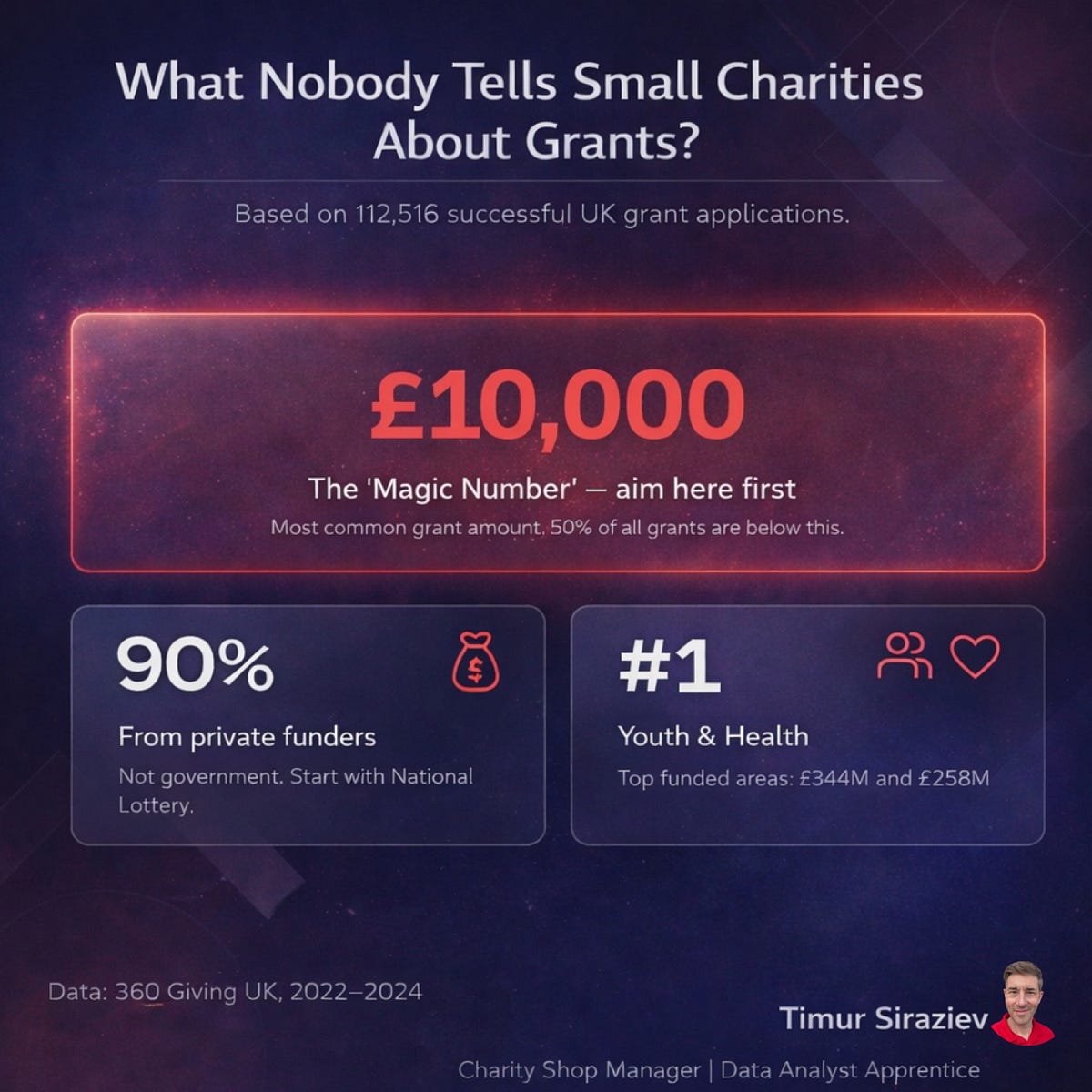
Once the noise was removed, a pattern emerged.
The most common grant amount in this space is not 5,000 or 20,000 pounds.
It is 10,000 pounds.
Statistically, this is the mode.
Socially, it is something more interesting.
10,000 pounds appears to function as a unit of trust, an amount funders feel comfortable awarding without demanding industrial scale reporting, yet large enough to genuinely move a local project forward.
This signal disappears completely if you rely on averages.
It only becomes visible once boundaries are clearly drawn.
⸻
4. Meaning Over Magnitude.
Twenty five years in newsrooms taught me that magnitude sells.
450,000 grants analysed sounds impressive.
But as an analyst, I now know that 112,516 well defined records can tell a far more truthful story.
One example, after filtering, it became clear that around 90 percent of community level funding comes from private trusts and the National Lottery, not from government sources.
That reality was invisible until the average was dismantled.
⸻
Technical Note, Under the Hood.
For those curious about the mechanics, the process involved working with the GrantNav dataset from 360Giving, excluding institutional recipients such as NHS bodies, councils, and universities, applying value boundaries to isolate community scale funding, and comparing mean, median, and mode to understand how outliers distort perception.
The conclusion was not hidden in complex models.
It was hidden behind poor definitions.
⸻
I am still a storyteller.
I just stopped using adjectives, and started drawing boundaries.
Timur Siraziev
Charity Shop Manager, Data Analyst Apprentice, Recovering Journalist
메타데이터
- post_id
- fbb5fbf83598
- slug
- data-analysis-vs-the-tyranny-of-the-average-timur-siraziev-fbb5fbf83598
- url
- https://medium.com/@ts231278/data-analysis-vs-the-tyranny-of-the-average-timur-siraziev-fbb5fbf83598
- canonical_url
- https://medium.com/@ts231278/data-analysis-vs-the-tyranny-of-the-average-timur-siraziev-fbb5fbf83598
- author_url
- https://medium.com/@ts231278
- status
- ok
- fetched_at
- 2026-07-13 06:23:13