Machine Learning Series (Part 18): Climbing the ROC Mountain: Understanding ROC Curves and AUC
In Part 17, we explored the Precision–Recall curve and learned that there is no single threshold that perfectly optimizes both precision…
Machine Learning Series (Part 18): Climbing the ROC Mountain: Understanding ROC Curves and AUC

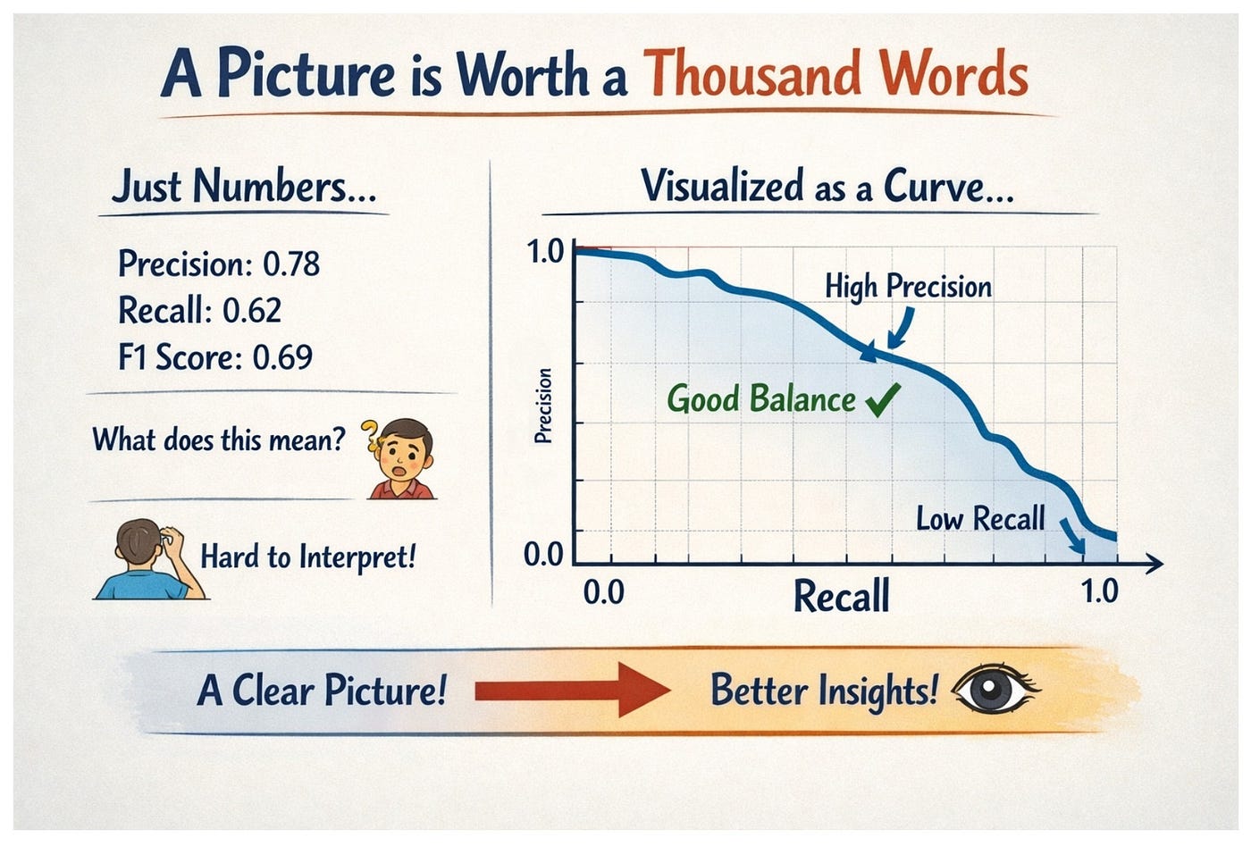
Image Courtesy : ChatGPT
In Part 17, we explored the Precision–Recall curve and learned that there is no single threshold that perfectly optimizes both precision and recall. Instead, we must analyze how the model behaves across different thresholds.
But how do we evaluate the model across all thresholds simultaneously?
That is where the Receiver Operating Characteristic (ROC) curve comes into play. ROC is similar to the Precision Recall curve (PR curve), but the difference is, the Precision–Recall curve plots Recall on the x-axis and Precision on the y-axis. But the ROC plots the True Positive Rate (TPR) against the False Positive Rate (FPR). Sounds again like a tongue twister for us right?! Let me clarify.
True Positive Rate (TPR): True Positive Rate is the same as recall. It is another name for it. It is also known as Sensitivity. But this term is more often used in clinical trials instead of the term recall.
Just recollecting the formula of Recall = TP/(TP+FN)
Hence when someone says TPR, you can straight away use the formula of recall as both are the same.
False Positive Rate: False Positive Rate measures how many actual negative instances are incorrectly classified as positive. Out of the actual negatives, how many did the model misclassify as positives. To help you with an example, classifying a patient ‘not having heart disease’ as ‘having heart disease’. In our binary classification, FPR will be the no. of digits wrongly classified as 5s but are actually not.
Now, this FPR is equal to 1-TNR. Read it back! It is not TPR which we saw above, it is TNR, the True Negative Rate. While Recall is called Sensitivity, TNR is known as Specificity.
Can you try how the formula for TNR will be based on our TP,FP,TN,FN understanding? Take a minute or so.
.
.
.
.
.
.
.
Well, as we had seen TNR is the True Negative Rate, it is the ratio of the no. of true negatives to the total no. of true negatives present.

So the correct true negatives are divided by the correct true negatives and the false positives. The denominator TN+FP represents the total number of actual negative instances in your dataset. As FPR is 1-TNR it equals 1-specificity.

So the ROC plots Sensitivity against 1-Specificity. So now we can correlate that for our binary classifier, the ROC plots the percentage of the no. of instances correctly as 5s (recall) to the percentage of the no. of instances wrongly classified as 5s (FPR aka 1-specificity).
from sklearn.metrics import roc_curve
fpr,tpr,thresholds=roc_curve(y_train_5,y_scores)

import matplotlib.patches as patches
style = "Simple, tail_width=0.5, head_width=4, head_length=8"
kw = dict(arrowstyle=style, color="k")
a3 = patches.FancyArrowPatch((0.2, 0.9), (0.1, 0.7),
                             connectionstyle="arc3,rad=.5", **kw)

idx_for_90_precision=(thresholds<=threshold_for_90_precision).argmax()
tpr_90,fpr_90=tpr[idx_for_90_precision],fpr[idx_for_90_precision]

plt.plot(fpr,tpr,linewidth=2,label="ROC curve")
plt.plot([0,1],[0,1],'k:',label="Random classifier's ROC curve")
plt.plot([fpr_90],[tpr_90],"ko",label="Threshold for 90% precision")
plt.xlabel("False Positive Rate (Fall-Out)")
plt.ylabel("True Positive Rate (Recall)")
plt.legend(['ROC curve','Random classifier ROC curve','Threshold for 90% precision'],loc='lower right')
plt.text(0.15, 0.8, "Higher threshold")
plt.gca().add_patch(a3)
plt.show()
In the above code, we plot the ROC curve, which shows how the True Positive Rate (TPR) changes with the False Positive Rate (FPR) as the threshold varies.
We also mark a point on the curve corresponding to the threshold where the model achieves 90% precision, showing the TPR and FPR values at that threshold. The below is the output:

We can see that as the recall value increases, the False Positive Rate also increases.
The center dotted line shows the ROC of a random classifier. A random classifier is not an actual model, a random classifier assigns random labels to the instances. It randomly assigns positive and negative labels. For such random classifiers, the FPR rate increases linearly with the TPR rate meaning it will form a diagonal line. That’s why we have explicitly drawn a straight line at (0,0) to (1,1).
Interesting Fact: The term Receiver Operating Characteristic (ROC) comes from World War II radar systems. Radar receivers detected signals from aircraft, but they also picked up noise from birds, weather disturbances, and other environmental factors. Engineers analyzed how changing the detection threshold affected the radar’s ability to correctly detect real targets versus producing false alarms. This analysis produced the ROC curve, which is now used to evaluate machine learning classifiers.

Image Courtesy : ChatGPT
Area Under the Curve (AUC):
As we had seen, the more the curve is to the top left, the better is the model’s performance. How do we know that the ROC curve is good for the model? How far is the curve towards the top left is identified by the area it has covered. The closer the curve is to the top-left corner, the more the area under the curve — better is the classifier. Hence, it is the area under the ROC curve which is being used as a metric AUC for a further better evaluation. The Area Under the Curve (AUC) is the single number that summarizes this performance across all possible thresholds.
For a perfect classifier, the area under the curve is 1. For a random classifier, the area under the curve is 0.5 and for a worst performing classifier, the area under the curve is less than 0.5
Hence an AUC below 0.5 means the classifier performs worse than random guessing.
from sklearn.metrics import roc_auc_score
roc_auc_score(y_train_5,y_scores)
As we had seen for a well performing classifier, the area will be very close 1. For our SGD classifier, the area is 0.96
For a hypothetical perfect model, this is how the AUC will be.

Here we are, done with our evaluation metrics tour! We had learnt so much on the metrics of a classification model from part 14 to part 18 which covered accuracy, precision, recall, F1 score, the precision-recall tradeoff, the PR curve, ROC and the AUC. Hope it was an informative segment of this ML blog series. In the next blog onwards we will continue implementing our different types of classification models — part 19 is on multiclass classification.
메타데이터
- post_id
- fc0045ff87ba
- slug
- machine-learning-series-part-18-climbing-the-roc-mountain-understanding-roc-curves-and-auc-fc0045ff87ba
- url
- https://medium.com/@yogeswariyrsk/machine-learning-series-part-18-climbing-the-roc-mountain-understanding-roc-curves-and-auc-fc0045ff87ba
- canonical_url
- https://medium.com/@yogeswariyrsk/machine-learning-series-part-18-climbing-the-roc-mountain-understanding-roc-curves-and-auc-fc0045ff87ba
- author_url
- https://medium.com/@yogeswariyrsk
- status
- ok
- fetched_at
- 2026-07-12 03:01:25