Khaki: The Colour That Doesn’t Ask for Attention
If you remember Taare Zameen Par, you might remember Ishaan Awasthi running through the school corridors in his khaki uniform shorts…
Khaki: The Colour That Doesn’t Ask for Attention
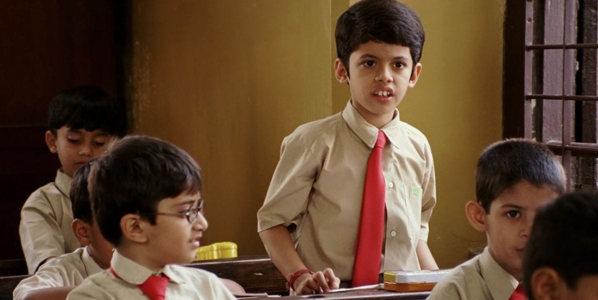
If you remember Taare Zameen Par, you might remember Ishaan Awasthi running through the school corridors in his khaki uniform shorts. Before the story tells us about dyslexia, before we understand his inner world, the uniform has already done its silent job. It has erased wealth. It has erased fashion. It has erased the question, “Who is wearing the better clothes today?”
That is the strange power of khaki.
Some colours shout. Red wants attention. Black wants authority. White wants perfection. Khaki does something unusual.
It quietly disappears.
That is probably why it has survived for more than a century.
The word “khaki” itself comes from the Persian and Urdu word meaning “dust.” Imagine naming a colour after dust. Not after gold. Not after silk. Dust.
It sounds almost insulting.
Yet it is one of the most successful colours ever designed for uniforms.
Psychologists often say colours influence perception. Bright colours stimulate the brain. They demand attention. Neutral earth tones do the opposite. They reduce distraction. They create a feeling of stability. Khaki belongs to that family of earth colours. It doesn’t excite the eyes. It calms them.
For a classroom full of energetic children, this is not a small advantage.
Schools are already full of movement friends, laughter, competition, exams, playground politics. A uniform should reduce visual noise, not add to it. Khaki quietly tells every student, “Today, your clothes are not the most interesting thing about you.”
That is an elegant psychological trick.
There is another practical reason.
Children don’t walk like museum visitors.
They slide on playgrounds, climb compound walls, sit on dusty grounds, kick footballs, and somehow manage to collect every form of dirt known to humanity.
Khaki forgives all of this.
Dust doesn’t announce itself on khaki the way it does on white. A small stain disappears into the fabric’s natural colour. Parents spend less time worrying. Schools spend less money replacing uniforms.
Sometimes practicality is smarter than beauty.
This practical thinking also explains why many organizations embraced khaki.
The Rashtriya Swayamsevak Sangh [RSS] famously adopted khaki shorts in its early years. There were practical and symbolic reasons. Khaki was inexpensive, durable, widely available, and already associated with discipline and organized service because of its long military history. The shorts eventually became an instantly recognizable part of the organization’s identity. In 2016, the organization replaced the traditional khaki shorts with brown trousers, reflecting changing preferences while keeping the broader emphasis on simplicity and uniformity.
Khaki also became closely associated with policing in India.
Walk into almost any Indian town, and the colour immediately communicates something.
Authority.
Not loud authority.
Steady authority.
The khaki uniform worn by many Indian police forces has historical roots going back to the nineteenth century. The colour was chosen because it hid dust and heat better than bright uniforms and was practical for India’s climate. Over time, the colour itself became a symbol. Today, one doesn’t even have to read the badge. From a distance, khaki often says, “The police are here.”
That is remarkable branding achieved without a logo.
Interestingly, khaki doesn’t command respect because it is beautiful.
It commands respect because it has repeated the same message for generations.
Consistency creates meaning.
Schools accidentally benefit from this same phenomenon.
When every morning begins with the same colour, students slowly separate identity from appearance. The fastest runner, the quiet reader, the mathematics genius, the cricket captain — all wear the same fabric.
The conversation shifts from “What are you wearing?” to “What can you do?”
That is education’s real purpose.
Perhaps this is why Ishaan’s khaki uniform in Taare Zameen Par feels so appropriate. The film reminds us that beneath identical uniforms live completely different minds. One child struggles to read. Another solves equations effortlessly. One fears the classroom. Another owns it.
The uniform makes them look the same.
The story reminds us they are not.
Maybe that is the hidden wisdom of khaki.
It was never meant to make everyone identical.
It was meant to stop clothes from becoming the difference, so that character, curiosity, kindness, and talent could become the difference instead.
For a colour named after dust…
That is quite an extraordinary achievement.
메타데이터
- post_id
- feaecc66487e
- slug
- khaki-the-colour-that-doesnt-ask-for-attention-feaecc66487e
- url
- https://medium.com/@baloography/khaki-the-colour-that-doesnt-ask-for-attention-feaecc66487e
- canonical_url
- https://medium.com/@baloography/khaki-the-colour-that-doesnt-ask-for-attention-feaecc66487e
- author_url
- https://medium.com/@baloography
- status
- ok
- fetched_at
- 2026-07-09 01:49:10




