Turning Abstract Psychology Into Visual Storytelling: A Prompt-by-Prompt Breakdown
A few months back I had a script line that just sat there. “He kept moving because stillness meant facing what he’d built his life…
Turning Abstract Psychology Into Visual Storytelling: A Prompt-by-Prompt Breakdown
A few months back I had a script line that just sat there. “He kept moving because stillness meant facing what he’d built his life avoiding.” Eight different prompts later, I still had a man standing in a hallway. Nothing wrong with the hallway. Nothing right with it either. The image had no idea what the sentence meant.
That’s the actual problem with turning psychology into visuals, and almost nobody talks about it directly. Most “AI prompt” content is about getting a pretty picture. This is about something narrower and harder: making sure the picture is the idea, not just decoration sitting next to it.
I write video essays built around psychological concepts — sovereignty, avoidance, the gap between who someone performs as and who they are when no one’s watching. Every line of a script gets its own visual. No skipping the hard ones, no falling back on a generic shot of someone walking through fog because fog is “moody” and you ran out of ideas at 1am. I’ve done that. It’s lazy and viewers can tell, even if they can’t say why.
So here’s the actual method, walked through one script section at a time, with the prompts I used and — more useful — why the first version of each one failed before the second one worked.
The character problem nobody mentions
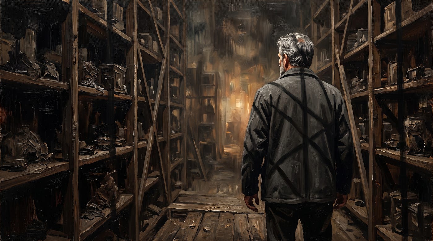
Before any of this works, you need one anchor. Same man, every single shot, across the entire piece. Not because consistency is some technical nicety — because abstract psychological content already asks a lot of the viewer. If the face keeps changing, the brain spends its attention re-identifying who it’s looking at instead of feeling what’s happening to him. I lock mine early: middle-aged, hard dry brush strokes, features left slightly abstract rather than photorealistic, same build, same general wardrobe logic. I describe him the same way in every prompt, almost word for word, like a character bible you’re not allowed to break.
Skip this step and everything downstream gets harder. I learned that the expensive way, on a four-part series where I let the model “interpret” the man differently in part three. Viewers noticed before I did.
Line one: “He used to believe stillness was weakness.”
First attempt: a man standing motionless in a stark room, looking contemplative. Technically correct. Completely flat. “Contemplative” is not a direction, it’s a description of the absence of one — it tells the model to default to neutral, and neutral reads as nothing.
What actually worked:
Oil painting, hard dry brush, impasto texture. Middle-aged man standing rigid in the center of a dim industrial room, shoulders pulled back too straight, like someone holding a pose rather than resting in one. Single harsh light source from above casting his shadow long and sharp across cracked concrete floor. Face abstract, jaw set hard, eyes unreadable. Cold blue-grey palette except for one warm crack of light at the edge of frame he is not looking toward. Cinematic wide shot, slight low angle.
The fix wasn’t more detail for its own sake. It was specificity about posture — “holding a pose rather than resting in one” does more psychological work than “stillness” ever could, because it shows the effort behind the stillness. That’s the whole trick with abstract lines: the word in the script is the concept, but the prompt needs the tell. The thing a person would actually do with their body that betrays the concept.
Line two: “Every system he built was a wall dressed as a foundation.”
This one nearly broke me. “Wall dressed as foundation” is a metaphor about self-deception, and metaphors translate badly to literal images if you take them literally. My first three attempts tried to show an actual wall built like a foundation. Looked like a construction diagram. Embarrassing.
The version that worked abandoned the metaphor’s literal objects and kept its emotional shape instead:
Oil painting, same hard brush texture, impasto. The man surrounded by towering shelving units stacked with ledgers, blueprints, and locked boxes, arranged almost like fortress walls around him, structure framed so the shelves dwarf him rather than support him. Warm amber lighting from below, throwing distorted shadows upward across his face — light coming from the wrong direction, unsettling. He stands at the center looking calm, but his hand grips the edge of a shelf slightly too hard, knuckles catching the light. Cinematic framing, symmetrical composition that feels just slightly too perfect, almost staged.
“Light coming from the wrong direction” is doing the heaviest lifting in that prompt. Wrong-direction lighting reads as unease before a viewer consciously registers why. And the hand gripping the shelf “slightly too hard” — that’s the physical tell again, the small detail that contradicts the calm face and tells the truth the dialogue won’t say outright.
Line three: “The first crack didn’t feel like freedom. It felt like falling.”
Easy to overcorrect here and go full chaos — shattering glass, debris flying, the works. I tried that. It looked like a movie trailer for an action film, not a psychological beat. Too loud for what the line is actually doing, which is quiet and disorienting, not explosive.
Oil painting, hard dry brush, impasto texture. Same man, off-balance, one foot stepping back as if the floor shifted beneath him, arms not yet reacting, caught in the half-second before instinct kicks in. Behind him, one of the towering shelves from the previous shot has a single visible crack running through it, faint light bleeding through the gap. Palette shifts from amber to a colder, thinner blue, like temperature dropping. Tight composition, slightly tilted horizon line to suggest instability without showing motion blur.
“Caught in the half-second before instinct kicks in” is a strange instruction to give an image model, and that’s exactly why it works. It’s asking for a moment that’s psychologically true rather than visually obvious — the gap between something happening and a person reacting to it. The tilted horizon does the rest. No falling debris needed.
Line four: the line everyone wants to skip
There’s always one line in a script that’s purely internal — a thought, not an action. “He realized the wall had never kept anything out. It had only kept him in.” No event. No object. Just recognition. These are the ones people give up on and replace with a generic “man looking thoughtful” shot, and it’s the single biggest tell that a video was assembled rather than directed.
I treat these as the most important shots in the whole sequence, not the ones to phone in.
Oil painting, hard dry brush, impasto texture. The man standing inside the same shelving structure, but now seen from behind it, looking out — framing reversed so what looked like protection in the earlier shot now reads as confinement, vertical shadows from the shelves falling across him like bars. He’s not moving. His expression has shifted only slightly from the first shot — same set jaw, but eyes no longer unreadable, now focused, almost grieving. Warm light from outside the structure he cannot quite reach. Cinematic medium shot, composition deliberately echoing the very first frame of the sequence but inverted.
That last instruction — echoing the first frame, inverted — is the actual craft. Recognition as a concept isn’t visual on its own. But recognition shown through a composition that calls back to where the character started, with just enough changed, reads instantly even to someone who hasn’t been paying close attention to the dialogue. The image is doing memory work for the viewer.
Checking the sequence as a whole, not shot by shot
Here’s the part that gets skipped most often, mostly because it’s boring and there’s no prompt to show for it. Once all four shots exist, I lay them out side by side before moving on to anything else. Not to admire them. To check whether the emotional arc actually reads as a progression when you look at the images alone, no script, no voiceover, nothing.
The first time I did this with the sequence above, shot three was wrong. Not bad on its own — wrong in context. The temperature shift from amber to blue happened too early, before the character had earned it, so by the time I got to shot four the “recognition” moment had nowhere left to go visually. I’d already spent the coldest light I had. Had to go back and warm shot three slightly, push the real cold into shot four instead, so the drop actually lands where the realization happens rather than one beat too soon.
This is the kind of error that’s invisible inside a single prompt and obvious the second you zoom out. Lighting temperature, composition echoes, where the shadows fall, how rigid or loose his posture is from shot to shot — these all need to move in one direction across a sequence, the same way a piece of music builds. Generate four great images in isolation and you can still end up with a sequence that feels random, because nothing in any single prompt told the model about the other three.
I keep a short note for each sequence now — just a line or two per shot describing where the light is, where the body tension is, what’s changed since the last frame. Takes five minutes. Saves the redo.
What I’d tell someone starting this
Stop reaching for the literal object in the sentence. “Wall,” “stillness,” “falling” — none of those words should show up as the main subject of your prompt unless the sentence is genuinely about a physical wall. They’re carrying an emotional state, and your job is to find the body language, the lighting direction, the composition choice that carries the same weight without illustrating the dictionary definition.
And don’t let the model pick the face twice. I’ll say that one again because it’s the mistake I see most: people nail one beautiful shot and then let every subsequent prompt drift a little, and three shots later the audience is looking at a stranger.
The four-shot sequence above took me eleven generations to land, not four. I’m not showing you a clean process. I’m showing you what the clean process looks like after you throw out the seven attempts that didn’t earn their place in the sequence.
메타데이터
- post_id
- feb079aef434
- slug
- turning-abstract-psychology-into-visual-storytelling-a-prompt-by-prompt-breakdown-feb079aef434
- url
- https://medium.com/@adnanhaiderarwriter/turning-abstract-psychology-into-visual-storytelling-a-prompt-by-prompt-breakdown-feb079aef434
- canonical_url
- https://medium.com/@adnanhaiderarwriter/turning-abstract-psychology-into-visual-storytelling-a-prompt-by-prompt-breakdown-feb079aef434
- author_url
- https://medium.com/@adnanhaiderarwriter
- status
- ok
- fetched_at
- 2026-07-13 06:23:13