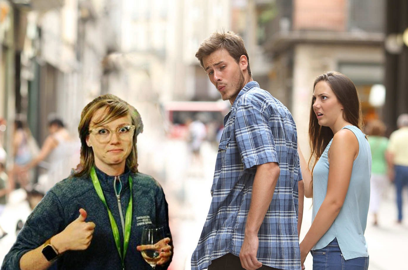
Girl Behind the Otter
Two years ago, the SB Hacks Team introduced the sea otter mascot across its website, social media, and swag items. We wanted to give you a…
Girl Behind the Otter
Two years ago, the SB Hacks Team introduced the sea otter mascot across its website, social media, and swag items. We wanted to give you a behind-the-scenes look at our mascot and the Girl Behind The Otter.
Tina Shi, our current Design Lead, is the otter artist. An incoming junior at UC Santa Barbara, Tina has been with our organization since Fall 2018. Her favorite battle gear layout is Adobe Photoshop and her trusty iPad. Through a Zoom interview, Tina discussed her design process for the sea otter and gave us an insider’s look at her drafted sketches.

Q: What does the otter mean to you?
For me, the otter is my child. The otter is some kind of an embodiment of my passion towards SB Hacks. I wanted to make something that is a fun and cool mascot for this hackathon — so when people look at this otter, they can make the connection to SB Hacks. This otter is essentially a way for me to connect with people who are interested in the hackathon and the SB Hacks organization itself.
Here’s a walkthrough of the sketches and drawings Tina showed us. The design process started with settling down on a style.
I wanted to try vector art or a flat-style for two reasons. It was trending at the time, and it served as a good design challenge.


“I started with a geometric style, but I didn’t have much luck with the first otter … it looks like a tater tot. I started with a basic oval shape, but the legs weren’t geometric enough, and the otter was more derpy than cute. Next, I moved on to two different oval shapes and came out with a bowling pin. The main issue was that I wanted to go for a lean and cute appearance but still be something people recognize as a ‘cool’ otter. There are still too many fine details for this otter and this pin-shape made this version too chubby.”


She cycled through various versions, playing with different shapes. Can you spot the totter-otter? At this point, Tina attempted a more realistic looking otter by referencing otter photos with a realistic color scheme. There was also a bandanna edition where she tried to give the otter more character to tie the mascot specifically to SB Hacks — emphasis on having fun and our unique location by the beach.


Here’s a set of example graphics with the otter mascot. Fun Fact: the back-to-school visual on the right never made it onto social media. But it was truly how Tina felt about school starting again.
Q: Hardest/easiest part about making the otter?
The hardest part about making the otter was drawing in a style I’ve never used before: geometric and vectorized. Transitioning from a more fluid and fine-tine style to something more representational while pinpointing what kind of energy I wanted the otter to have was also difficult.
The easiest part about the design process was coming up with the color scheme. Most of the color choices were very logical and followed otter photos, including a dark and light variation.
Q: When you were creating the otter, where did you draw inspiration from?
There was a lot of googling and time spent on browsing through images of actual sea otters. It also helped to reference other aquatic/marine creatures. I focused on understanding the most simplistic and minimalist features of the otter to best represent its essence.
I also looked at what draws people to certain elements to convey the energy and idea that you want the audience to understand. Other forms of inspiration also came from looking at other vector art otters and getting a feel for what works, what doesn’t, and how I can make that unique in my own design.
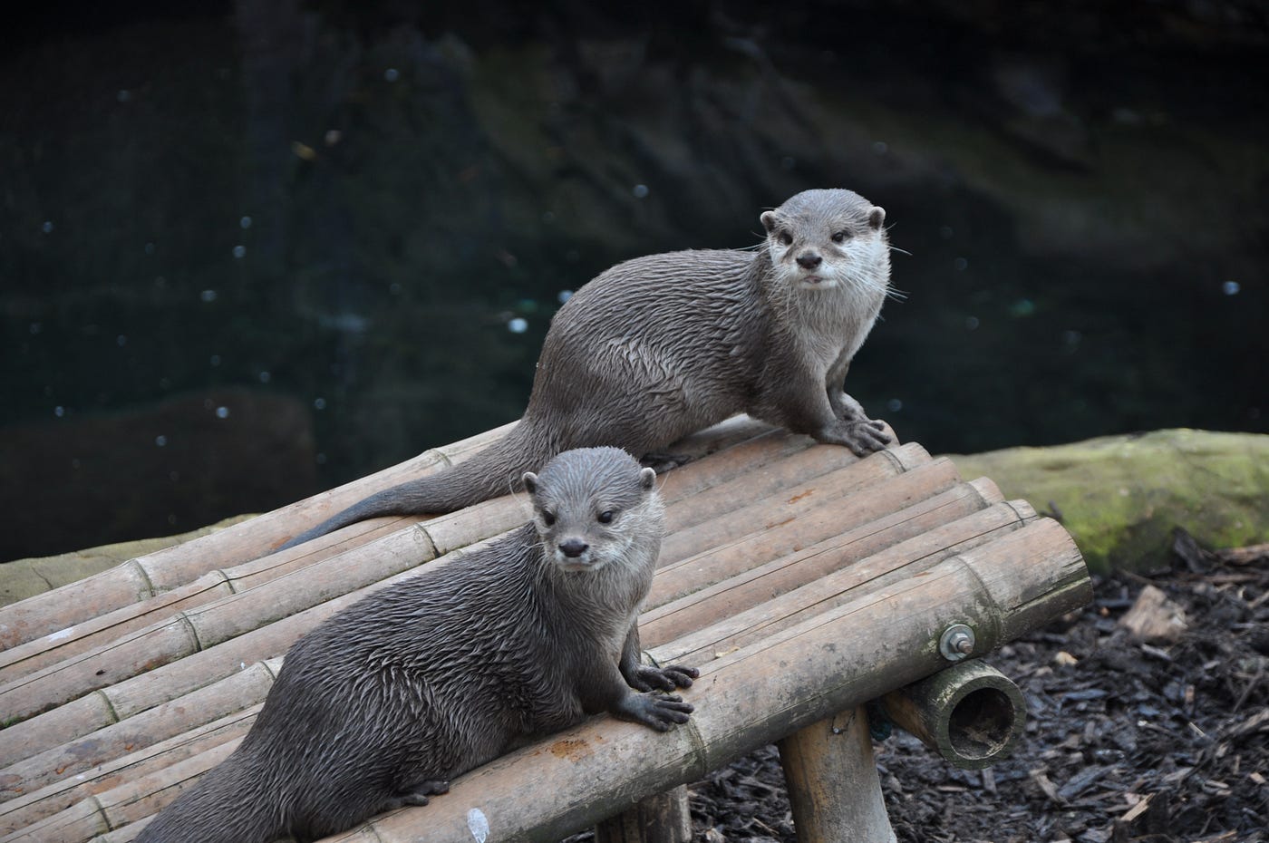


Photos by Charlie Seaman (top left), Andreas Schantl (top right), and Anchor Lee (bottom) on Unsplash
Q: What inspires you as a designer?
This is a cliché line but a lot of it is from observation. It’s sometimes a “in the moment” thing where you are feeling something, and if that’s an energy you want to capture then you think of what shape would be representative of that feeling. Maybe it’s a smoother curve, maybe a more jagged shape, or a more rounded or more squarish shape. For the color, it could be a very vibrant color or more dulled down color. You have to figure out how to contrast these colors to give the exact emotion for the design.
Sometimes inspirations are entirely disconnected. There is an idea but you can’t quite grasp it, and you have to look through different resources online such as images, articles, or other people’s illustrations for inspiration. Sometimes out of nowhere it will click, and the idea forms in your mind.
Q: How does the otter relate to the SB Hacks mission statement about community?
From a design aspect, the specific colors I picked for the otter were ones that would fit well with the blue background. Blue appeared a lot in last year’s sea theme, so I picked this color combination because it contrasts well but at the same time goes together well. For SB Hacks, this is a way of showing that we are an ocean school and build community as our hackers.
From a more conceptual standpoint, why the otter became the mascot is from the fact that Santa Barbara is a city with a lot of marine life. Obviously there are many sea animals, but the sea otter is pertinent to the Santa Barbara ecosystem. It is the main predator to sea urchins and sea urchins are the major product of Santa Barbara.
At the same time, the sea otter is essential to the ecosystem, and therefore having it as the mascot for the hackathon shows that our hackers are essential to this community. They are the ones who build this community, grow this community, and improve this community. For this reason we hope that SB Hacks would be the place to help our hackers hone their skills, better themselves, and make some projects that they will be proud of. We want to promote a sense of belonging as someone who is passionate about technology and passionate about making a project that matters.
[Hackers] are the ones who build this community, grow this community, and improve this community.
Q: Favorite slack emoji?
I like the question mark one, because it’s the first one I tried to animate and I thought it would be really fun to see the otter in action. Another reason is that when people ask questions in the main slack channel, many people will have similar questions. I included that emoji so hackers can “+1” the question by reacting to it with the confused otter emoji.

Tina’s favorite slack emoji?
Q: Is there anything you would change about how the otter is presented right now?

The beloved SB Hacks otter in all its glory.
Maybe because I’m not super comfortable with vector art, but when I’m trying to pose the otter in a different pose, it can be difficult. I don’t know how the geometric body and the geometric arm are going to look like together. Sometimes I think I should have designed it slightly better so it could be easier on the designer. At the same time, one of my main concerns is that people do not recognize that the mascot is an otter. Perhaps there’s a better way to preserve and capture the essence of the otter.
I am both a fan and not a fan of the elongated body. It looks awkward when you are trying to make the otter sit because only the feet sit but the rest of the otter is not. However I’m quite proud of the elongated body in the extension deadline extension visual I made. I think it is a fun thing to play with.
Other than that, I would change the presentation of the otter to have a more cool factor because right now it’s mainly “cute.” I am concerned if that’s appealing to a majority of the hackers. However, the otter was pretty well received from all the stickers and badges from SB Hacks VI, so I would say overall it’s a pretty successful design.
Written by Jayleen Li and Esther Liu from the SB Hacks Team
메타데이터
- post_id
- 1663178d7b41
- slug
- girl-behind-the-otter-1663178d7b41
- url
- https://medium.com/@ucsbhacks/girl-behind-the-otter-1663178d7b41
- canonical_url
- https://medium.com/@ucsbhacks/girl-behind-the-otter-1663178d7b41
- author_url
- https://medium.com/@ucsbhacks
- status
- ok
- fetched_at
- 2026-08-17 18:13:03