Designing a Website as Bold as the Brand: The Java Factory Case Study
When Java Factory, a coffee brand came to us for a website design, the brief was simple to say and hard to execute: make the site feel…
Designing a Website as Bold as the Brand: The Java Factory Case Study
When Java Factory, a coffee brand came to us for a website design, the brief was simple to say and hard to execute: make the site feel exactly as loud, flavorful, and fun as the product itself.
Here’s how we turned that brief into a live, animated, motion-rich website and what the process taught me about balancing creative ambition with usability, structure, and stakeholder alignment.
The Problem
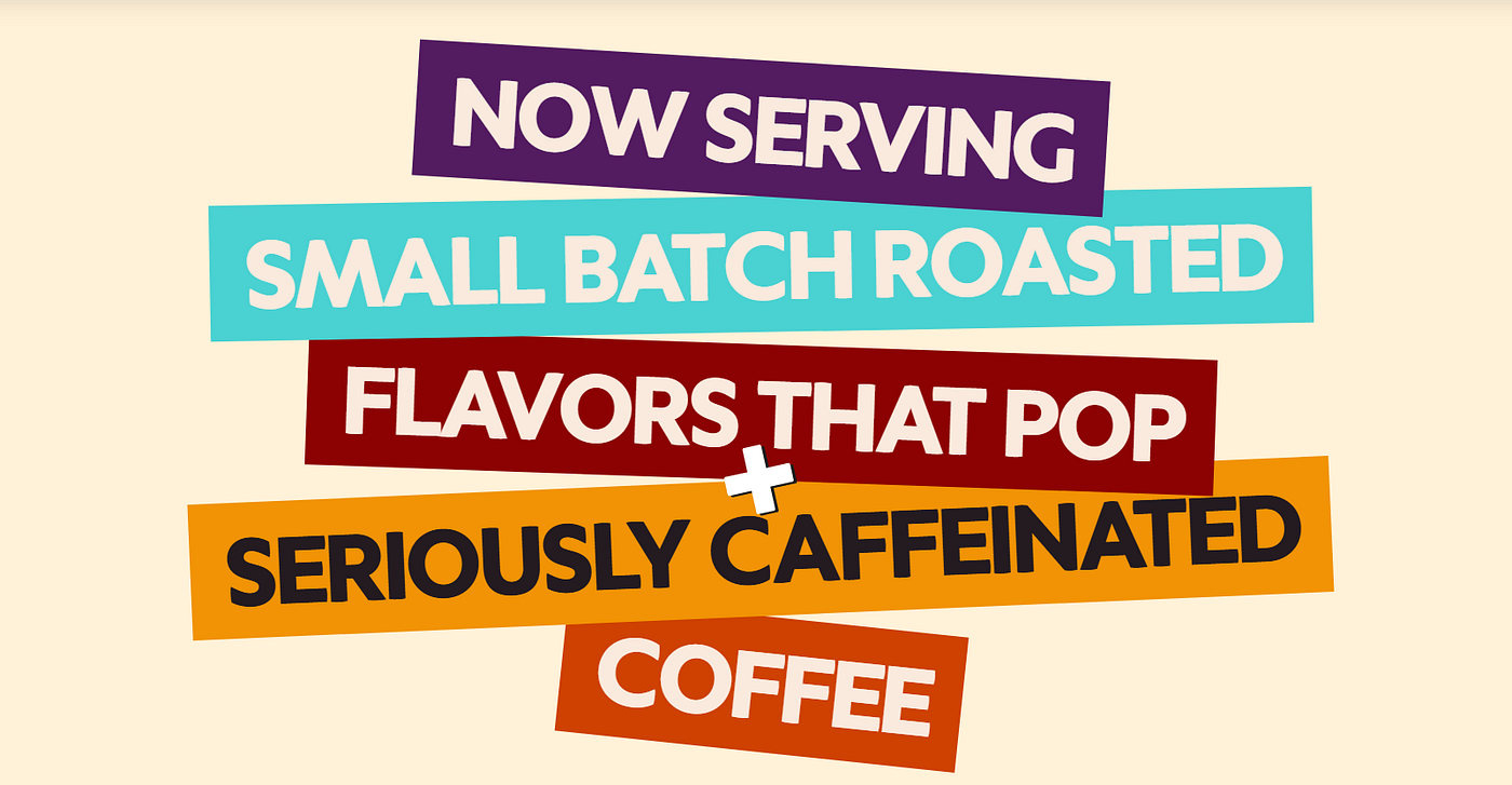
Java Factory’s brand personality was already strong, bold flavors, playful naming, a fearless tone. The gap between who the brand was and how the site felt was the core problem to solve.
The challenge wasn’t “make it prettier.” It was: how do you translate a brand’s personality something felt through packaging, copy, and tone into a digital experience that still functions as a clear, navigable e-commerce site? Bold and fun can easily tip into chaotic and confusing if the structure underneath isn’t solid.
The Approach
- Wireframe first, decorate second. Instead of jumping straight into high-gloss visuals, we built a draft of detailed high-fidelity wireframe of the all the pages first. This let the client visualize every section, confirm content needs, and approve the structure before a single animation or color decision was locked in. It also gave us a shared reference point to align on where motion and interaction should live decided early, not bolted on later.
- Design direction rooted in brand attributes, not aesthetics alone. We translated Java Factory’s personality into four concrete design principles: colorful and expressive, animated and energetic, playful but premium, and smooth/scroll-driven. Every visual decision palette, typography, motion was tested against those four filters rather than personal taste, which kept the design defensible when stakeholders asked “why this and not that.”
- Systemized the color and motion language. Bright, bold palettes were mapped to each coffee category so users could navigate by feel, not just by label. Micro-animations were layered in at each scroll point, and copy like “Bursting with Flavor” and “Spill the Beans” reinforced the same energy in words that the visuals carried in motion.
Key Challenges (and Trade-offs)
Two problems tested the balance between creative ambition and usability:
- The category section. Java Factory sells six distinct product bundles, each needing its own visual identity to stand apart while still reading as one cohesive brand system. The trade-off was individuality vs. consistency: too much distinction per bundle risks a disjointed page; too little makes six products feel indistinguishable. We resolved it with a shared structural template (layout, spacing, interaction pattern) and let color and imagery carry the differentiation.
- The bundle animation section. The client wanted something memorable, not decorative flourish for its own sake. That meant every custom animation had to earn its place: does this motion help the user understand or choose a product, or is it just movement? We weighed delight against performance and usability throughout, a website that’s fun but slow, or fun but confusing, fails the original brief just as much as a boring one does.
This is the part of the project I’d point to most for how I think about product decisions generally: every creative choice was pressure-tested against a clear objective, and where objectives competed, we made an explicit call rather than trying to satisfy both halfway.
The Outcome
The final site:
- Created an immersive, interactive brand experience through purposeful animation
- Simplified navigation and user flow with a clearer content hierarchy
- Made the six product bundles and flavor lines easier to browse and compare
- Strengthened brand storytelling by aligning visual tone, motion, and copy into one consistent voice
You can see it live at javafactory.com.
What This Project Reinforced for Me
Working across UX research, UI design, motion, and content direction on this project sharpened something I now think about as a mindset shift toward product thinking: strong design isn’t just about making something look good, it’s about making deliberate trade-offs against a clear objective, structuring decisions before layering on polish, and being able to explain why a choice was made, not just that it was.
메타데이터
- post_id
- 003e83c9d800
- slug
- designing-a-website-as-bold-as-the-brand-the-java-factory-case-study-003e83c9d800
- url
- https://medium.com/@maharjanruhi/designing-a-website-as-bold-as-the-brand-the-java-factory-case-study-003e83c9d800
- canonical_url
- https://medium.com/@maharjanruhi/designing-a-website-as-bold-as-the-brand-the-java-factory-case-study-003e83c9d800
- author_url
- https://medium.com/@maharjanruhi
- status
- ok
- fetched_at
- 2026-08-13 00:24:06