The Professional CSS Handbook: Learn CSS Architecture, SCSS, LESS, Frameworks, and Scalable UI…
A practical, real-world guide to mastering CSS styling, preprocessors, scalable architecture, and modern frontend workflows used in…
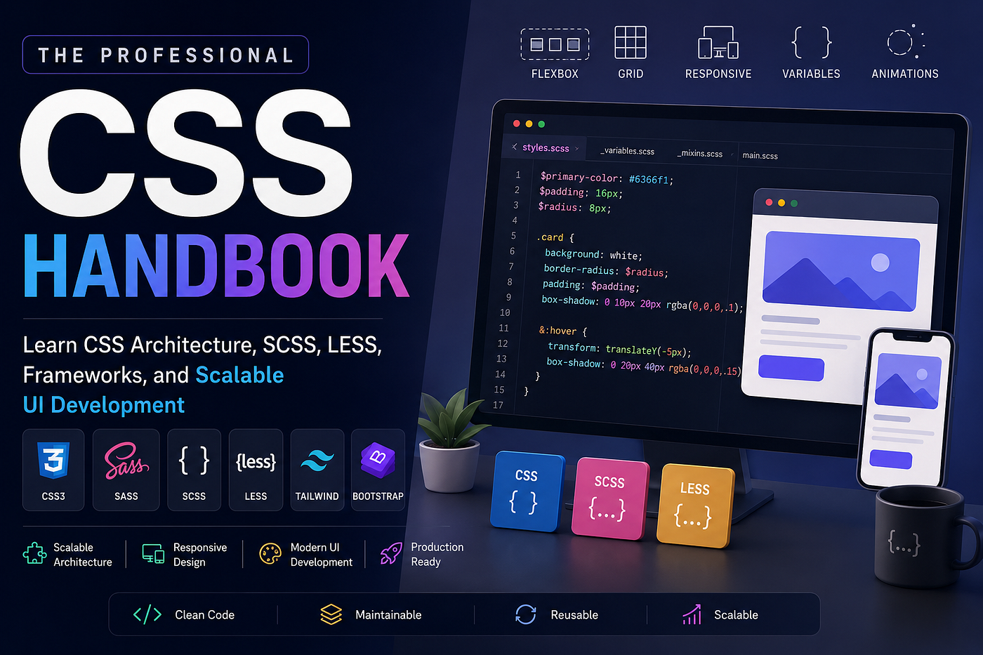
The Professional CSS Handbook: Learn CSS Architecture, SCSS, LESS, Frameworks, and Scalable UI Development
A practical, real-world guide to mastering CSS styling, preprocessors, scalable architecture, and modern frontend workflows used in professional applications.
The Professional CSS Handbook: Learn CSS Architecture, SCSS, LESS, Frameworks, and Scalable UI Development
🚨 HIRING: Tech Talent 💰 $50–$120/hr | 🔥 Multiple Roles
Frontend • Backend • Full Stack • Mobile • AI/ML • DevOps 👉 **Apply Here**

The Complete CSS Mastery Guide
CSS is one of the first technologies every frontend developer learns.
But becoming truly good at CSS takes much longer than most developers expect.
At first, CSS feels simple:
color: blue;
margin: 20px;
Then real-world projects happen.
Suddenly you’re dealing with:
- broken layouts
- responsive issues
- inconsistent spacing
- huge stylesheets
- specificity wars
- dark mode
- animations
- maintainability problems
- framework conflicts
- performance bottlenecks
This is where many developers get frustrated.
The truth is:
Modern CSS is no longer just “styling.”
It’s architecture, scalability, maintainability, accessibility, responsiveness, and developer experience combined.
In this guide, you’ll learn:
- Core CSS fundamentals
- Modern layout systems
- Responsive design
- CSS architecture
- Sass, SCSS, and LESS
- CSS frameworks
- Performance optimization
- Production-level best practices
- Common mistakes developers make
- Real-world frontend engineering insights
By the end, you’ll understand how professional frontend developers structure and scale CSS in real applications.
Table of Contents
- What CSS Actually Does
- Understanding the CSS Cascade
- Selectors Explained Properly
- The Box Model
- Positioning in CSS
- Flexbox Mastery
- CSS Grid Explained
- Responsive Design
- Media Queries
- CSS Variables
- Animations and Transitions
- Modern CSS Architecture
- Introduction to Sass and SCSS
- LESS Explained
- SCSS vs LESS
- CSS Frameworks
- Utility-First CSS
- Tailwind CSS
- Bootstrap
- Performance Optimization
- Accessibility in CSS
- Common CSS Mistakes
- Production-Level Best Practices
- Final Thoughts
What CSS Actually Does
HTML creates structure.
CSS creates presentation.
Think of HTML as the skeleton of a house and CSS as:
- paint
- lighting
- spacing
- furniture
- decoration
- responsiveness
Without CSS, websites still work.
They just look terrible.
Example:
<button>Login</button>Without CSS:
- plain browser button
- no spacing
- no branding
- no hover state
With CSS:
button {
  background: #2563eb;
  color: white;
  padding: 12px 20px;
  border-radius: 8px;
}
Now it feels like a real product.
Understanding the CSS Cascade
This is one of the most misunderstood concepts in CSS.
CSS stands for:
Cascading Style Sheets
The “cascade” decides which styles win.
Example:
button {
  color: blue;
}
button {
color: red;
}Result:
redBecause the later rule overrides the earlier one.
But specificity also matters.
Example:
button {
  color: blue;
}
.primary-button {
color: red;
}The class selector is more specific.
So the text becomes red.
Common Specificity Problems
Many beginners do this:
div .container ul li a span {
  color: red;
}
This becomes impossible to maintain later.
Instead:
.nav-link {
  color: red;
}
Cleaner. Scalable. Readable.
Selectors Explained Properly
Element Selector
p {
  color: gray;
}
Targets all <p> tags.
Class Selector
.card {
  padding: 20px;
}
Most commonly used in production.
ID Selector
#header {
  background: black;
}
Avoid heavy reliance on IDs in scalable applications.
Attribute Selector
input[type="email"] {
  border: 1px solid blue;
}
Very useful for forms.
The Box Model
Every element in CSS is a box.
The box consists of:
- Content
- Padding
- Border
- Margin
Visual structure:
Margin
 └ Border
    └ Padding
       └ Content
Example:
.card {
  width: 300px;
  padding: 20px;
  border: 1px solid #ddd;
  margin: 20px;
}
Important Real-World Advice
Always use:
box-sizing: border-box;Why?
Because width calculations become predictable.
Professional projects usually start with:
* {
  margin: 0;
  padding: 0;
  box-sizing: border-box;
}
Positioning in CSS
CSS positioning confuses almost everyone initially.
Static
Default positioning.
Relative
Moves relative to itself.
position: relative;
top: 10px;
Absolute
Positioned relative to nearest positioned parent.
position: absolute;
top: 0;
right: 0;
Fixed
Stays fixed on screen.
Useful for:
- sticky chat buttons
- floating navigation
- back-to-top buttons
Flexbox Mastery
Flexbox changed frontend development completely.
Before Flexbox:
- developers used floats
- layouts were painful
- vertical centering was annoying
Now:
.container {
  display: flex;
}
That single line unlocks powerful layouts.
Common Flexbox Properties
Horizontal Alignment
justify-content: center;Vertical Alignment
align-items: center;Space Between Items
justify-content: space-between;Real-World Navbar Example
.navbar {
  display: flex;
  justify-content: space-between;
  align-items: center;
}
This is used in thousands of real applications.
CSS Grid Explained
Flexbox is one-dimensional.
Grid is two-dimensional.
Use Grid when building:
- dashboards
- galleries
- admin panels
- card layouts
Example:
.grid {
  display: grid;
  grid-template-columns: repeat(3, 1fr);
  gap: 20px;
}
Why Grid Matters
Without Grid:
- complicated layout hacks
- nested containers
- fragile responsive systems
With Grid:
- cleaner structure
- easier maintenance
- better scalability
Responsive Design
Modern websites must work on:
- mobile
- tablets
- laptops
- desktops
- ultra-wide monitors
Responsive design is no longer optional.
Common Responsive Mistake
Many beginners use fixed widths:
width: 1200px;This breaks on mobile.
Better:
max-width: 1200px;
width: 100%;
Media Queries
Media queries allow styles based on screen size.
Example:
@media (max-width: 768px) {
  .sidebar {
    display: none;
  }
}
Real Production Advice
Design mobile-first.
Why?
Because:
- mobile traffic dominates
- easier scaling upward
- cleaner architecture
Example:
.card {
  width: 100%;
}
@media (min-width: 768px) {
.card {
width: 50%;
}
}CSS Variables
CSS variables make themes and reusable systems much easier.
Example:
:root {
  --primary-color: #2563eb;
  --spacing: 16px;
}
Usage:
button {
  background: var(--primary-color);
  padding: var(--spacing);
}
Why Variables Matter in Real Projects
Without variables:
- color duplication
- inconsistent spacing
- painful theme updates
With variables:
- centralized design systems
- dark mode becomes easier
- maintainability improves dramatically
Animations and Transitions
Animations improve user experience when used properly.
Transition Example
button {
  transition: background 0.3s ease;
}
button:hover {
background: black;
}Common Beginner Mistake
Overusing animations.
Too much animation causes:
- distraction
- performance issues
- poor UX
Good animation should feel subtle.
Modern CSS Architecture
Large CSS files become messy quickly.
Professional teams organize CSS carefully.
Common Architecture Approaches
BEM
Example:
.card {}
.card__title {}
.card--active {}
Benefits:
- predictable naming
- scalable components
- fewer conflicts
Utility Classes
Example:
.mt-4
.flex
.items-center
Popularized by Tailwind CSS.
Introduction to Sass and SCSS
As projects grow, plain CSS becomes repetitive.
This is where preprocessors help.
Sass adds:
- variables
- nesting
- mixins
- functions
- reusable logic
SCSS Example
$primary-color: #2563eb;.button {
background: $primary-color; &:hover {
background: darkblue;
}
}Compiled CSS:
.button {
  background: #2563eb;
}
.button:hover {
background: darkblue;
}Why SCSS Is Popular
SCSS feels close to normal CSS.
Developers can transition easily.
Most modern teams prefer SCSS syntax over older Sass syntax.
Nesting in SCSS
Example:
.navbar {
  padding: 20px;
.logo {
font-size: 24px;
}
}Important Warning About Nesting
Too much nesting becomes dangerous.
Bad:
.nav {
  .container {
    .wrapper {
      .item {
        .link {
        }
      }
    }
  }
}
This creates overly specific CSS.
Keep nesting shallow.
Mixins in SCSS
Mixins reduce duplication.
Example:
@mixin flex-center {
  display: flex;
  justify-content: center;
  align-items: center;
}
Usage:
.modal {
  @include flex-center;
}
LESS Explained
LESS is another CSS preprocessor.
Example:
@primary: blue;.button {
color: @primary;
}LESS and SCSS solve similar problems.
SCSS vs LESS
SCSS Advantages
- larger ecosystem
- more community support
- widely adopted
- better tooling
LESS Advantages
- simpler learning curve
- lightweight syntax
Today, SCSS is more commonly used in modern frontend projects.
CSS Frameworks
CSS frameworks speed up development.
They provide:
- prebuilt utilities
- responsive systems
- reusable components
Popular frameworks include:
- Bootstrap
- Tailwind CSS
- Bulma
- Foundation
Bootstrap
Bootstrap became popular because it solved responsive UI problems quickly.
Example:
<div class="container">
  <div class="row">
    <div class="col-md-6">
      Content
    </div>
  </div>
</div>
Benefits:
- fast development
- consistent UI
- responsive grid
Bootstrap Downsides
Without customization:
- websites look similar
- larger CSS bundles
- unused styles
Tailwind CSS
Tailwind changed modern frontend styling.
Instead of writing custom CSS:
<button class="bg-blue-500 text-white px-4 py-2 rounded">
  Login
</button>
Why Developers Love Tailwind
Benefits:
- faster UI development
- consistent spacing
- easier maintenance
- fewer CSS files
- utility-first workflow
Common Tailwind Criticism
Some developers say:
“HTML becomes messy.”
Example:
<div class="flex items-center justify-between p-4 bg-white rounded shadow">But many teams prefer this because:
- styles stay near components
- less context switching
- easier refactoring
When to Use Which Approach
Use Plain CSS When
- learning fundamentals
- small projects
- custom designs
Use SCSS When
- medium-to-large projects
- reusable design systems
- scalable architecture
Use Tailwind When
- building apps rapidly
- component-driven development
- modern React/Next.js projects
Performance Optimization
CSS can affect performance significantly.
Common Performance Problems
Large Stylesheets
Huge CSS bundles slow loading.
Unused CSS
Many frameworks ship unused styles.
Tools like PurgeCSS help remove them.
Expensive Animations
Animating properties like:
width
height
top
left
can hurt performance.
Prefer:
transform
opacity
These are GPU-optimized.
Accessibility in CSS
Good styling must also support accessibility.
Important Accessibility Practices
Sufficient Color Contrast
Bad:
color: #ccc;
background: white;
Hard to read.
Focus States
Never remove focus outlines carelessly.
Bad:
outline: none;Keyboard users rely on focus indicators.
Responsive Text
Avoid tiny fonts.
Minimum readable sizes matter.
Common CSS Mistakes Developers Make
Using !important Everywhere
This becomes a maintenance nightmare.
Deep Selector Nesting
Creates specificity problems.
Ignoring Mobile Layouts
Desktop-only development fails in production.
Hardcoding Values Everywhere
Use variables and design tokens.
Writing Unstructured CSS
Eventually becomes impossible to scale.
Production-Level Best Practices
Organize Styles Properly
Example structure:
styles/
 ├ base/
 ├ components/
 ├ layouts/
 ├ utilities/
 ├ pages/
 └ themes/
Use Design Tokens
Centralize:
- spacing
- colors
- typography
- shadows
Prefer Reusable Components
Avoid copy-paste styling.
Create scalable systems.
Use Consistent Naming
Consistency matters more than perfection.
Test Responsiveness Early
Do not wait until the end of development.
Keep CSS Maintainable
Future developers should understand your styles easily.
That includes future you.
Real-World Engineering Advice
The best frontend developers are not the ones writing the fanciest CSS.
They are the ones writing:
- maintainable CSS
- scalable systems
- readable architecture
- predictable styling
- performant interfaces
In professional development:
Maintainability beats cleverness.
Every time.
The Future of CSS
Modern CSS keeps evolving rapidly.
Features like:
- container queries
- CSS layers
- nesting support
- subgrid
- view transitions
are making CSS more powerful than ever.
This is one reason frontend engineering has become increasingly exciting.
Final Thoughts
CSS is often underestimated.
But in real-world applications, CSS directly affects:
- user experience
- accessibility
- performance
- maintainability
- scalability
- product quality
The difference between beginner CSS and professional CSS is not about memorizing properties.
It’s about understanding:
- layout systems
- responsive thinking
- architecture
- consistency
- scalability
- developer experience
The best way to improve is simple:
Build real projects.
Experiment constantly.
Break layouts.
Fix them.
Refactor messy code.
Learn how production systems evolve.
That experience is where real frontend growth happens.
And once CSS truly “clicks,” frontend development becomes significantly more enjoyable.
Thank you for being a part of the community
Before you go:

👉 Be sure to clap and follow the writer ️👏️️
👉 Follow us: **Linkedin| [Medium](https://medium.com/codetodeploy)**
👉 CodeToDeploy Tech Community is live on Discord — **Join now!**
Disclosure: This post includes affiliate and partnership links.
메타데이터
- post_id
- 169905e937c7
- slug
- the-professional-css-handbook-learn-css-architecture-scss-less-frameworks-and-scalable-ui-169905e937c7
- url
- https://medium.com/codetodeploy/the-professional-css-handbook-learn-css-architecture-scss-less-frameworks-and-scalable-ui-169905e937c7
- canonical_url
- https://medium.com/codetodeploy/the-professional-css-handbook-learn-css-architecture-scss-less-frameworks-and-scalable-ui-169905e937c7
- author_url
- https://medium.com/@thestackdeveloper01
- status
- ok
- fetched_at
- 2026-06-20 20:29:01